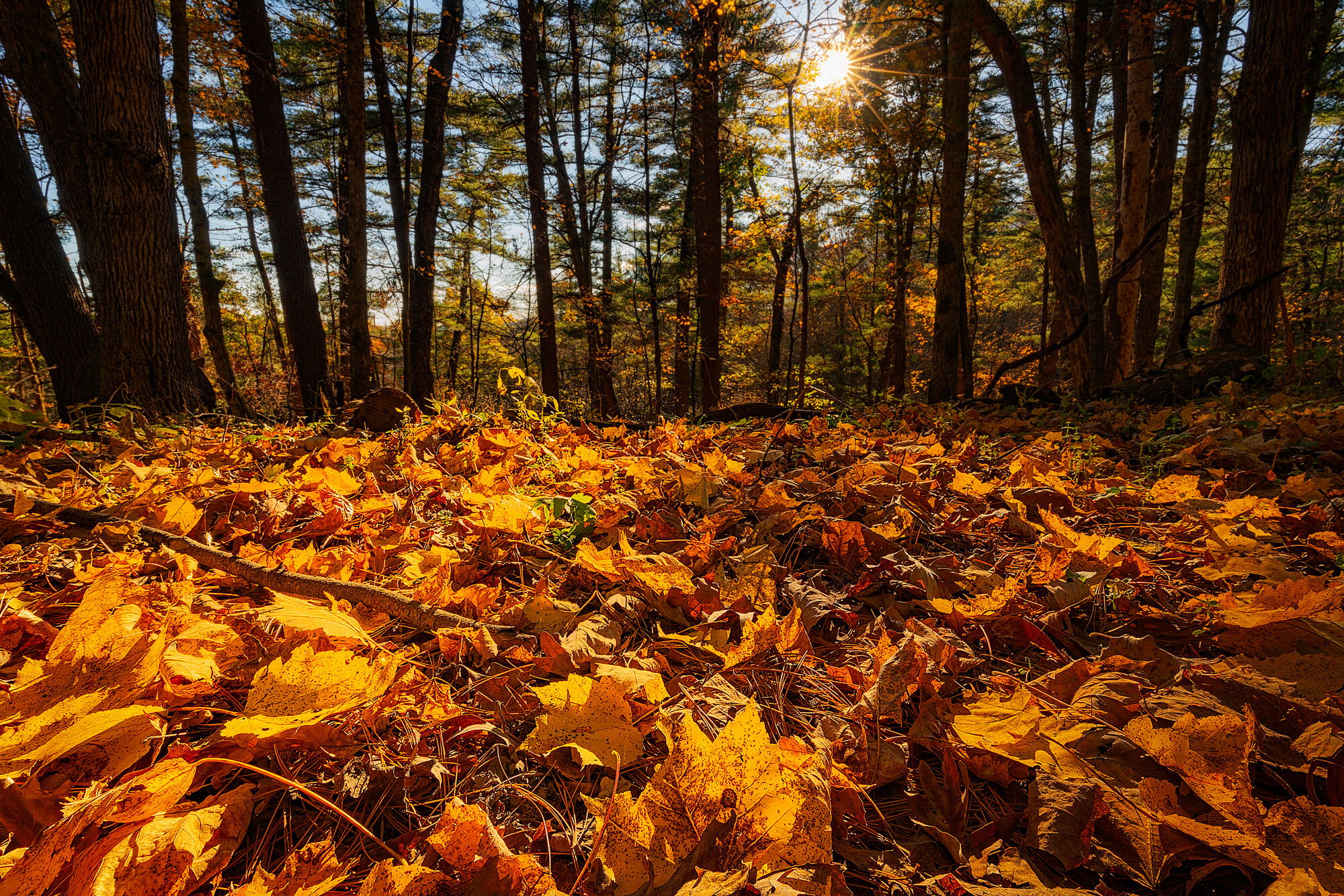
In the upper Midwest, the beauty of autumn colors takes a bit of the edge off the lack of aggressively spectacular landscapes (though there is much beauty to find here at any time of year). In any case, a bluebird October afternoon wandering amongst the maples, oaks, white pines, and hemlocks of Wisconsin’s Kickapoo Valley Reserve yielded this scene, made from a position as low to the ground as I could manage. Too bad jpegs aren’t scratch and sniff, as the wonderful smells of autumn in a mixed forest are as much a part of the sensory experience as is the bright colors and the play of light.
Specific Feedback Requested
I welcome any and all feedback (this is my first post on this website). I think the composition does a reasonable job of capturing the mood of the moment in that place, but I’m still learning how to best process my images using the various tools of Photoshop (especially luminosity masks), so I’d be especially interested in hearing your critique in this area. This is a two-image focus stack, and I I did use a combination of spot healing and cloning to remove a small but noticeable area of lens flare. Believe it or not, this is actually a somewhat desaturated version (15% ) of the original raw file, but I am still concerned that the colors are a bit too overpowering.
Technical Details
Is this a composite: No
ISO 200, 17 mm , f/22 at 1/6 sec (both images of a two-image focus stack); lens corrections and initial tonal corrections in Lightroom, focus stack, lens flare removal, sharpening and final tonal adjustments and modest desaturation in Photoshop using the TK8 plug-in by Tony Kuyper.
Hi Jeff! Welcome to NPN! This is a fine first post. Beautiful warm light on the colorful fall scene. The colors are a bit strong but it doesn’t look unnatural to me.
Just had to open your photo first today since I recognized the name in the title and it’s such an inviting fall image. Welcome to NPN - nice to see another Wisconsinite joining us. I’m up by Tomahawk and have been down to the Driftless once, but keep meaning to get down there again.
I like the perspective very much and the way the light is variable - stronger on the left and softer on the right. The bigger trees are balanced, but they do draw the eye quite a bit, especially the ones on the left. If you have other compositions with mostly smaller trees it would be interesting to compare. Also if you have some that are less evenly spaced in terms of the ground and the trees. It’s basically half and half and that seems a bit static to me. The trees aren’t doing much here so maybe if you crop some to feature the leaves more, although I know the sun star was probably deliberate. The colors are rich and possibly the yellow channel is close to clipping. Overall a super representation of fall - the literal fallen.
Glad to have you here and I look forward to seeing more of your work, especially from here in the lovely Wisconsin. Well, ok, Minnesota, too.
Welcome to NPN, Jeff. This is a great first post and an exciting image. I like the sunstar and the low viewpoint with a clear focus on the leaves. Nice work on the focus stack and the cloning out of lens flare. It does look a tad over saturated in the leaves, but that could also be an effect of the back lighting from the sun. I could see toning down the yellows a tad without taking away from the overall feel of fall. Nice work, Jeff. I can’t wait to see more of your work.
Welcome to NPN Jeff, this is a great first post. I love the low perspective, and the in-your-face presentation of the fallen leaves. The sunstar adds a nice touch that accentuates the backlit leaves on the ground.
This image does a pretty effective job of telling that story about he sensory experience of autumn.
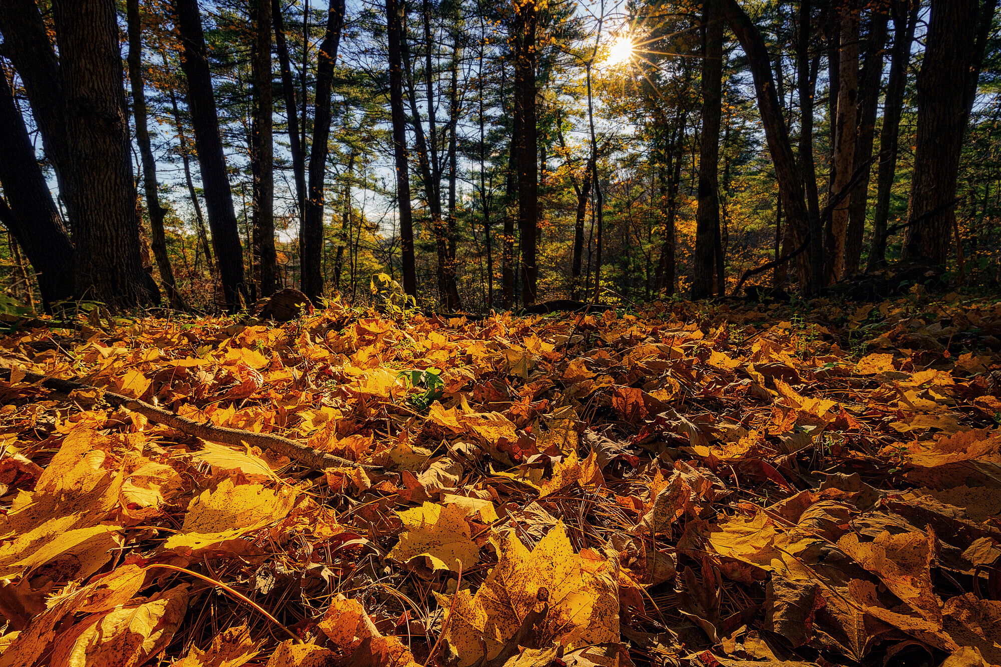
I do think the yellows are slightly too saturated. Yellows can get this way pretty quick when they are in golden hour light. Part of why I think this way is that the shadows are fairly warm in this image, in real life shadows tend to be cooler. Cooling the shadows can actually create more contrast in the image, and the yellow leaves will pop without needing this much saturation.
If you don’t mind here is a rework where I cooled the shadows and de-saturated the yellow leaves. I used a TK Darks luminosity mask to selectively apply the cooling to the shadows only. And then a TK saturation mask to reduce saturation in only the most saturated colors.
Thanks very much for the feedback and kind words. I agree that the 50/50 split in the composition is somewhat annoying, but I definitely wanted that sun star for both the added warmth and depth, and that’s the best I could do while still getting the leaves at the minimum focus distance into the image. And I really wanted that leaf that is front and center at the bottom of the composition to be part of the scene.
Thanks for the comment about the trees and the possibility fo doing some cropping. I hadn’t really noticed them as distractions, probably because that front maple leaf was what drew me to begin with, so I automatically fixate on that part of the image. “Seeing” it through your eyes, I can definitely see what you mean. I’m going to fuss with the yellow channel a bit and I’ll also try a a side-cropped option just for comparisons-sake.
I’m actually a Minnesotan (Twin Cities area), but will occasionally slum it over in Wisconsin when necessary
Finally, I’m terrible at titling my images, and so I really like the inspiration your last sentence has given to me. Henceforth, it shall be called “autumn’s fallen”
David,
Thanks very much for your kind feedback.
Ed,
I really appreciate your suggestions and for taking the time to play around with the image. I like the effect your edit suggestions have and will try to incorporate them into v.2 of the image. I’m starting to get more proficient at how to use some of the TK luminosity tools, but I still have quite a ways to go on the where and when side of using those tools.
Here’s the v2 edit. Kristen, I decided I did not like any side crop because removing the largest trees left me with a square canvas that made the 50/50 leaf/tree split look even more overpowering. Ed, I trried to mimic your suggested edits, and while I think mine still has a bit more yelloe glow on the right side, I like the improvement over the original. I’m curious exactly how you applied the targeted cooling. I ended up adding a photo filter adjustment layer (Cooling Filter 82), then used TK to create a Darks-6 mask, and painted the mask accordingly.
Glad to be of help. That’s what we’re all here to do. Collaborate and share ideas and techniques. I think the re-work is better. The yellows aren’t as hot and the eye wants to linger more than in the original. BTW you can edit your Original Post and add this picture above or below the first one. When you do this we can all flip from one to the other and see the changes pop onto the screen. Very useful especially when the changes are subtle. A luscious fall image.
Oh and, slumming huh? You mean, visiting the best side of the river, don’t you?