I mostly stick to color photography and only infrequently dabble in B&W. But here goes…
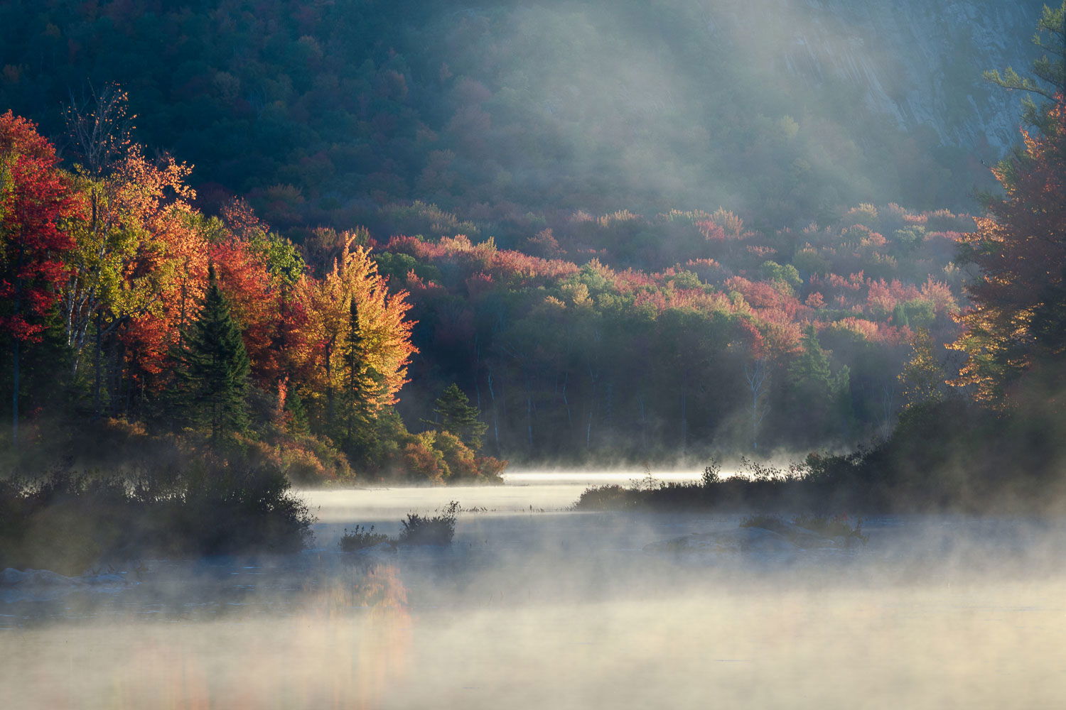
This image is from Marshfield Pond in the Northeast Kingdom of Vermont, taken during the first week of October 2018. I was lucky enough to get some early morning fog and mist rising off the pond during the peak of fall color.
I usually have a hard time converting my autumn foliage images to B&W. The reds, greens and oranges usually do not have much tonal separation in B&W. So generally my fall images are much stronger in color than in B&W. I think this image is an exception. Catching this as the fog and mist were burning off let me take advantage of the strong light and shadows in the scene, as well as the fog. While the color image is still pretty decent, I prefer the B&W version. What do you think ?
Ed, both of these are beautiful, but I’m surprised to say I also like the B&W just a bit more. It’s interesting that an image taken at a time when the color is usually the most powerful element looks better with that color taken out.
I think the brightest trees on the left are a bit too bright in the B&W, maybe tone them down just a little bit. Other than that, very nice!
This is a very compelling image, Ed. Very moody with an almost mystical appeal - sort of Hudson River School but in black and white. While I think this is a perfect candidate for black and white, I feel like you’ve pushed the dodging and burning a little too far in some areas. It is particularly interesting to compare the B&W with the colour version. While I like the B&W more, the colour version is easier to view in that my eye knows right where to go - the bright water in the lower centre of the frame. In the black and white I find my eye bouncing around. In the colour version the lit fog in the upper right portion of the frame doesn’t compete with the light on the water. In the black and white version it does. I would try easing up on the burning of the high fog - more texture, perhaps, but more subtle in terms of brightness. If I were doing this Ps, I would be working with a midtone 1 mask to try and pull out the texture in the fog without pushing the brightness too far. Similarly, I agree with Craig, that the highlights on the trees, particularly on the left, feel a little too harsh. My tendency, again, would be pull back on the dodging in those areas to create a more subtle and therefore moodier picture. Of course, this is all a matter of personal taste so take it for what it is worth.
I also definitely prefer the B&W version. I like the trees on the left as is. Yes you could burn them down a touch as others have suggested, but I like the strong focus on them in this case. As @Kerry_Gordon suggested this may be personal preference. I do agree with Kerry that the fog in the upper portion competes with the light on the water, a little less brightness and texture might be helpful. I took a quick rough stab at it below.
For me, B&W all the way. I really like this one. Great mood and sense of drama. I might be inclined to try a CW rotation, but not a huge deal. Really well processed for me as presented. Most enjoyable.
To me the B&W is more calm and has more atmosphere . The color image is seen next to this B&W very busy. So, Ed, I choose for the B&W as an image full of fine light.
Another vote for the B&W, surprisingly, given the beautiful color of the leaves. I don’t mind the brightness of the trees on the left, but I could see burning the foreground fog a bit.
Thanks to everyone who stopped by to comment on my image, I really appreciate your input. I don’t do much B&W so this was a bit of a departure for me. The luminosity of the yellow tree seems to be the thing that creates different reactions to this image. I think the folks who think the tree is too bright are influenced by seeing the color version, where the foreground fog is clearly the star of the show. My vision for the the B&W conversion of this image was to instead emphasize the tree, and the fog on the mountain.
After seeing everyone’s comments I realized that my mistake was making all 3 things bright (foreground fog, yellow trees, background fog), when instead I needed to emphasize one, or at most two of these things. I think Alan Kreyger’s rework is a big step in that direction. I also did a rework (starting from Alan’s version) where I burned down the foreground fog, to place more emphasis on the trees, and to a lesser degree, the background fog on the mountain.
Count me in for the black and white. I agree with both Craig and Kerry that a few of the highlights are a bit brite, particularly the tree just left of center and the water just below that same tree and to the right. Otherwise, I love the mood you created with the black and white. I have noticed the same thing that when I try and convert some of my fall color photos to black and white they are mostly monotone in tonal values but this is a rare exception and it really works well. This would have been a nice addition to your FOG presentation.