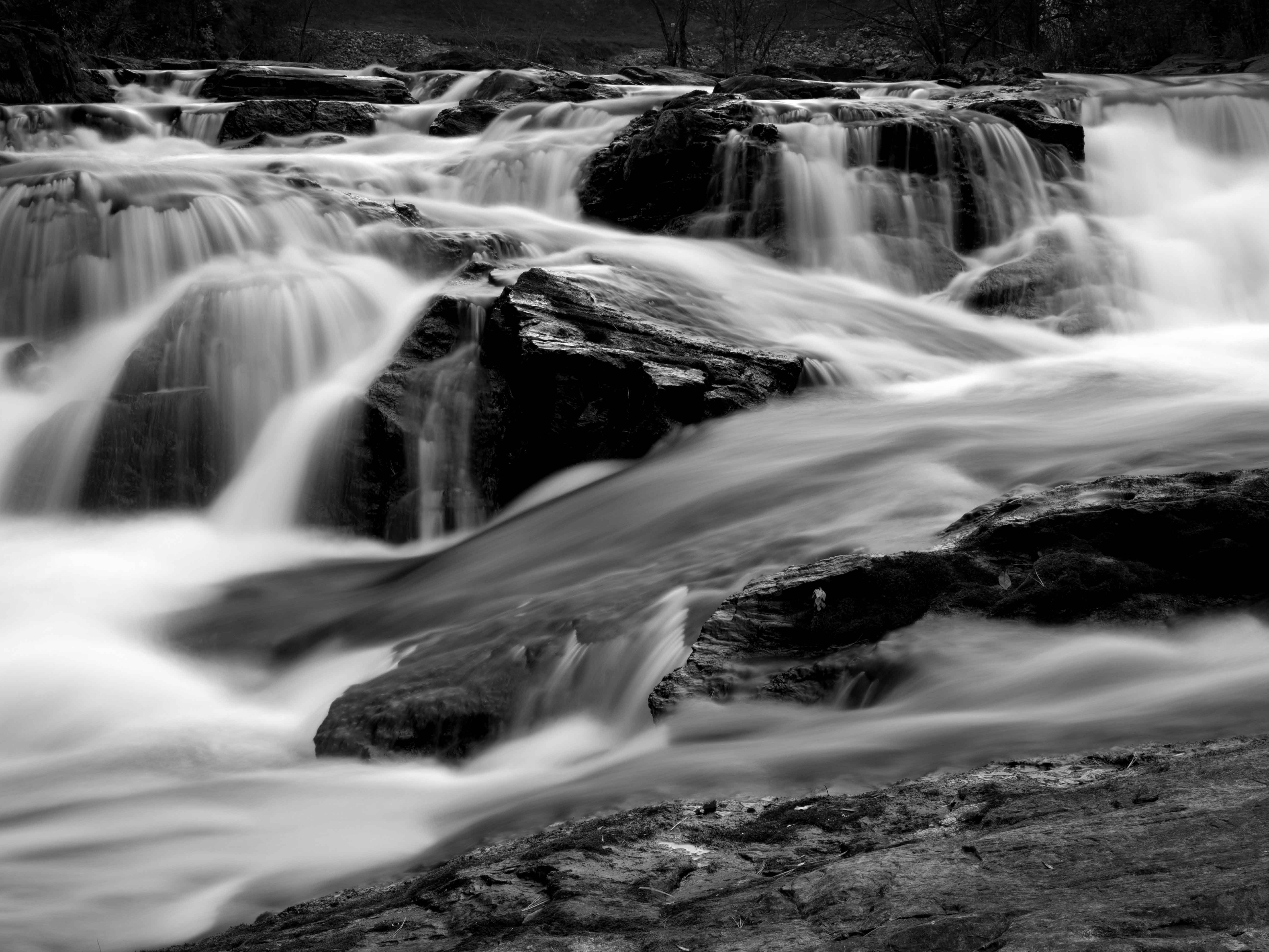
The last one was kind of fun, so I thought I’d throw this one at you. I have this file and a similar one that I’ve never been able to make work properly. It could be that it’s just a bad shot and nothing can be done with it, or there’s a line or crop or something I’m missing.
You may only download this file to demonstrate how you would process the image. The file is Copyright of the photographer, and you must delete the raw file when you are done. Please post a jpg of what you created, along with an explanation of what you did and why you did it.
Based on your raw file, this is my take. It was done real fast and dirty, but it should give you a general idea of where I was going with it. I rather like the scene.
Thanks @Harley_Goldman - glad you had a stab at it. Reducing the presence of the far background helped a lot. Going out on the rocks in this river was a lot of fun, but a bit overwhelming in the sense that there is so much moving and rushing and just there, that it was hard to find slices. I have more from this location that I just don’t quite know what to do with. Hopefully your version and any others help me with that.
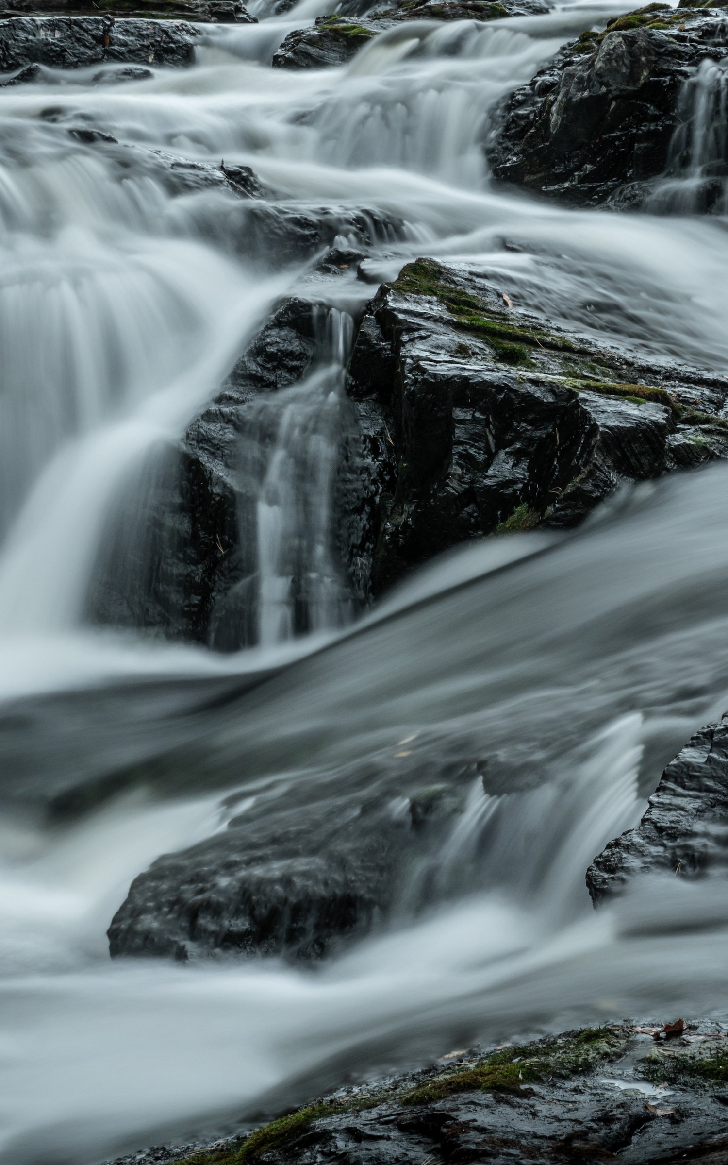
I pulled it in tighter to emphasize the zig-zag line that cuts across the frame and to remove the larger white area of water in the LLC. I lifted some shadows and blacks, increased the clarity a touch to bring out the texture of the rocks to contrast with the soft water, and cooled off the entire scene by just a teeny tiny bit, and the green a tad more so that it had a little blue in it (I find green challenging to get just right, not sure if I pulled it off). I decided to lean into the spring green touches as a contrast to the rest of the scene. I also used a linear gradient on the LRC to darken it a bit. Darkened a few pine needles that stood out so that they blended in a bit more.
This crop was the first thing I thought of when I saw this image, because of the aforementioned zig-zag. I used a 16x10 crop. Other edits are the same as the landscape version. I’m not sure this crop is successful. I tried it wider (5x7); it ended up bringing in more than I wanted, but this might not bring in enough!
Anyway, it was interesting to spend time with this image and try to see it in different ways. I hope these versions offer something to consider as you keep reworking this lovely capture!
Hey thanks for playing, Beth! I like the emphasized zig-zag and that is part of what got me out on the rocks in the midde of the river in the first place. And tightening up on the color palette, but still retaining some gives it a chilly aspect that I hadn’t thought about before since it really was a nice, sunny-ish day when I shot this. Fantastic options and thanks again.
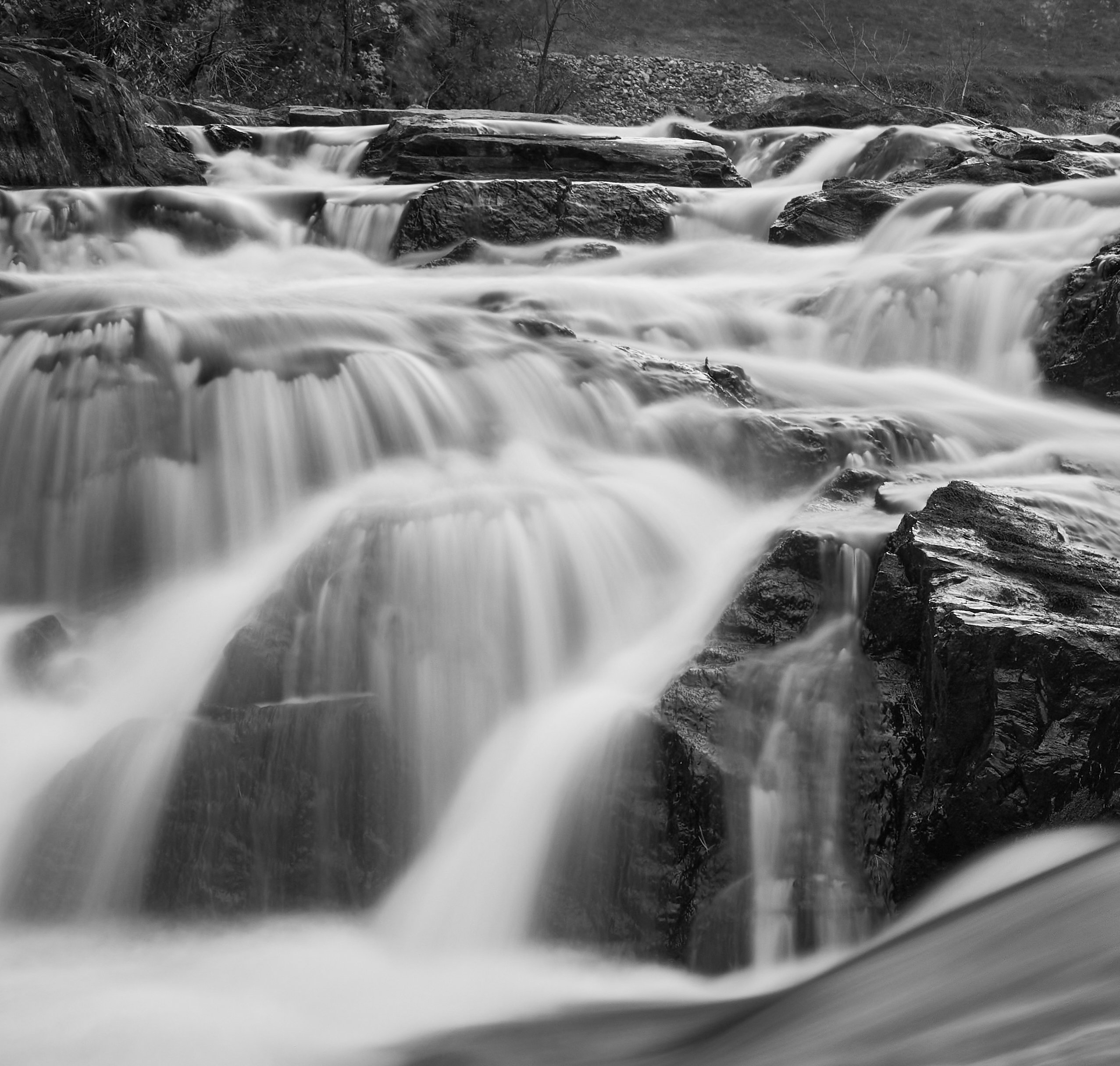
B&W, with a crop that emphasizes the upper left quadrant. That’s where the best water movement and flow is in my opinion. I did some minor tweaks after converting to B&W, added a bit of clarity, a bit of additional sharpening…not much. Some might think the water is too white. But dropping it down took away some of the pop and drama…so there you are.
Look at that - a totally different slice. Maddening isn’t it? But I like it and the way it seems more cohesive than the wider view. And you’ve kept the background, too. That background drove me nuts. It’s at the top of the cascades and is all smooth grass and there’s a dam off to the right that intrudes in wide shots. Thanks for playing along!
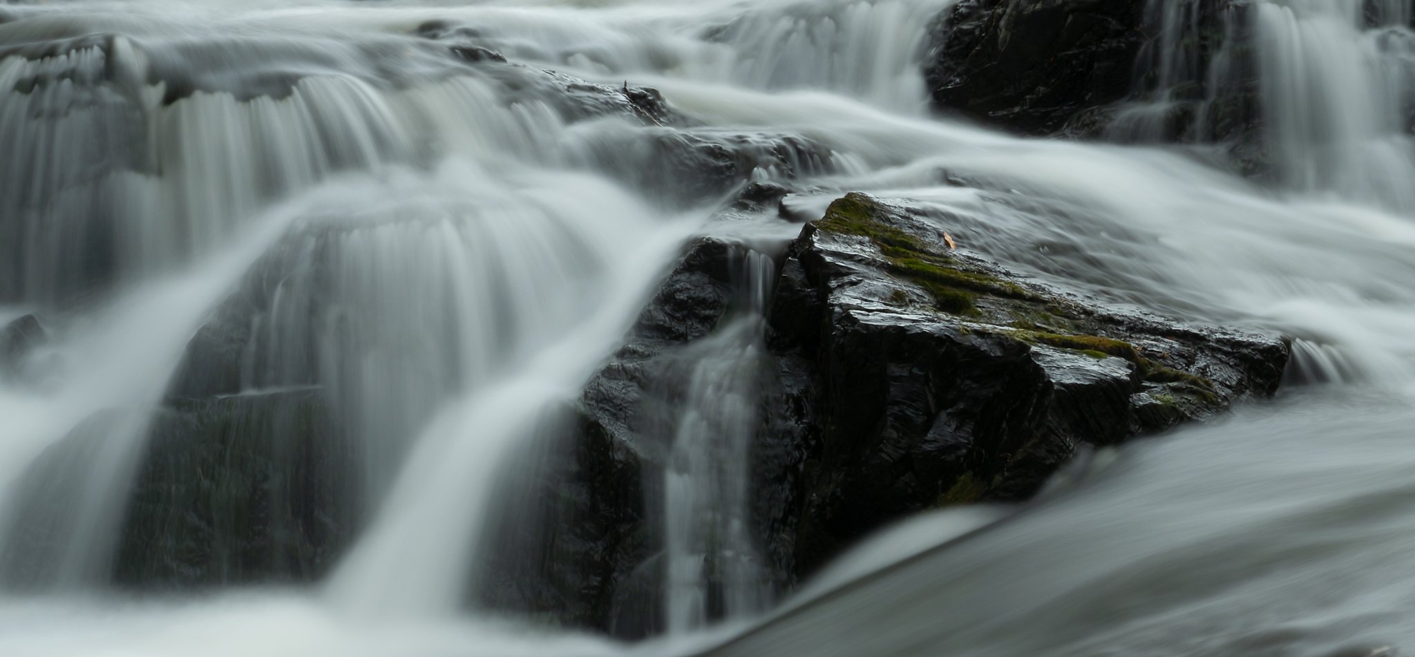
Hi Kris. I was intrigued by all the interpretations of this scene and when I was looking at them I kept going back to the diagonal reef that ended in the large triangular rock. Then I noticed the lone leaf on the rock and I just had to try my hand at this one, even though I’m not a landscape person. Finding a crop that would work was a real challenge in the chaos of this image, so this is probably still not optimal for what I was trying to convey. Other than the crop, just a little dodging and burning and a saturation boost on the leaf. If you go back, please move the leaf just a bit to the left
That is a cool slice, too, Dennis. The gift that keeps on giving! I like the diagonals and the color tone you’ve chosen here. It makes for a nice change. I’m enjoying everyone’s interpretation. I think I’ll have to find another for folks to play with.