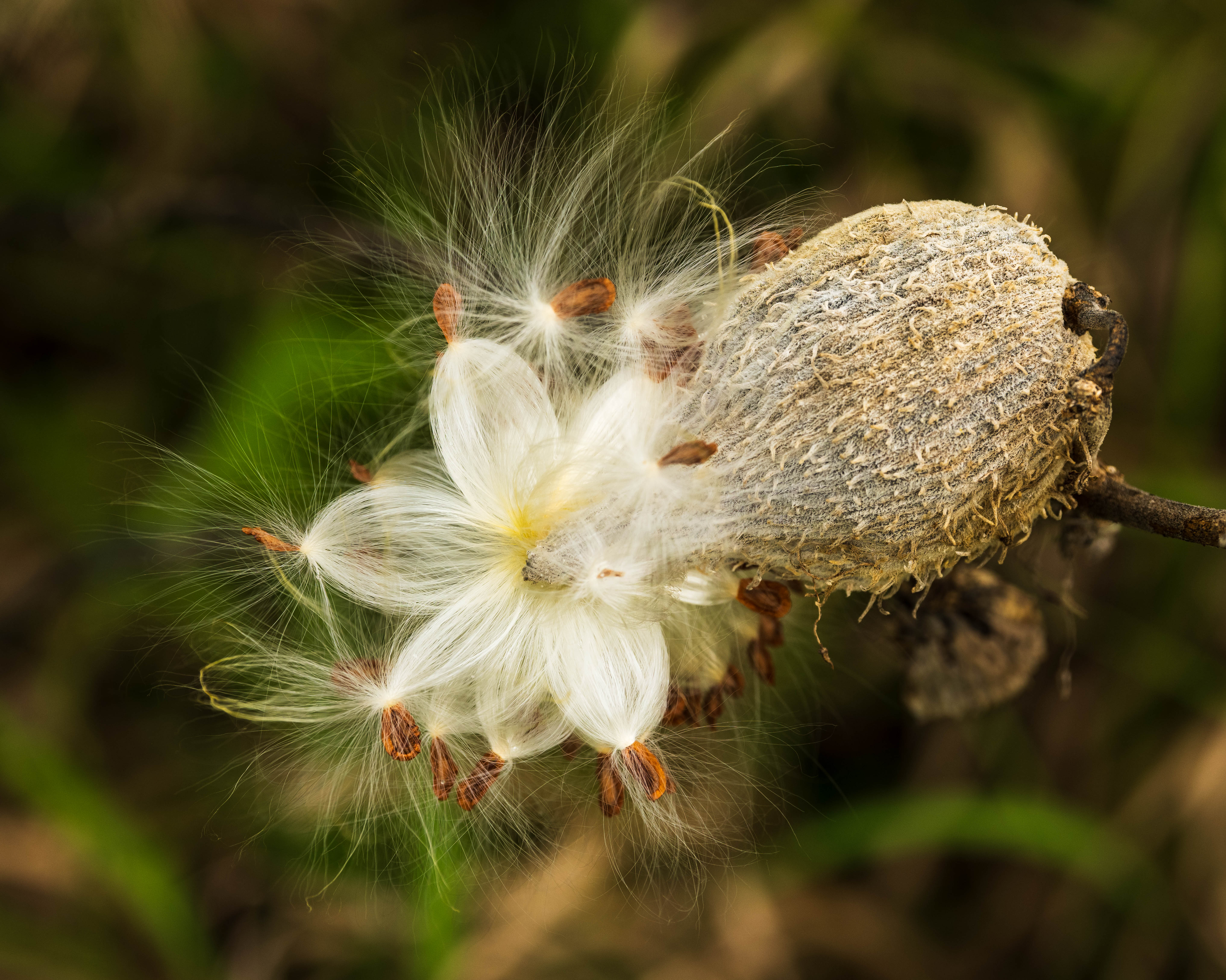
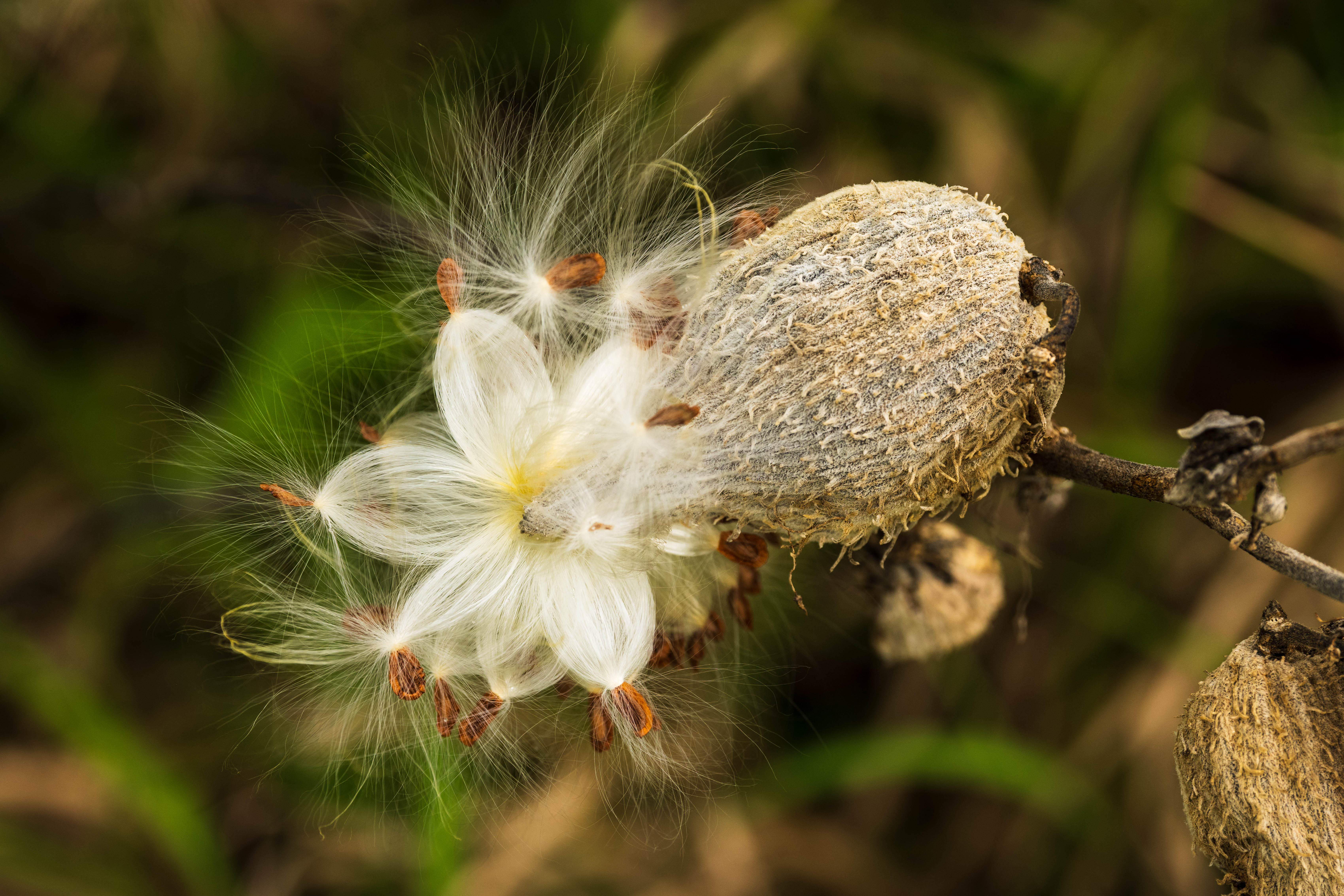
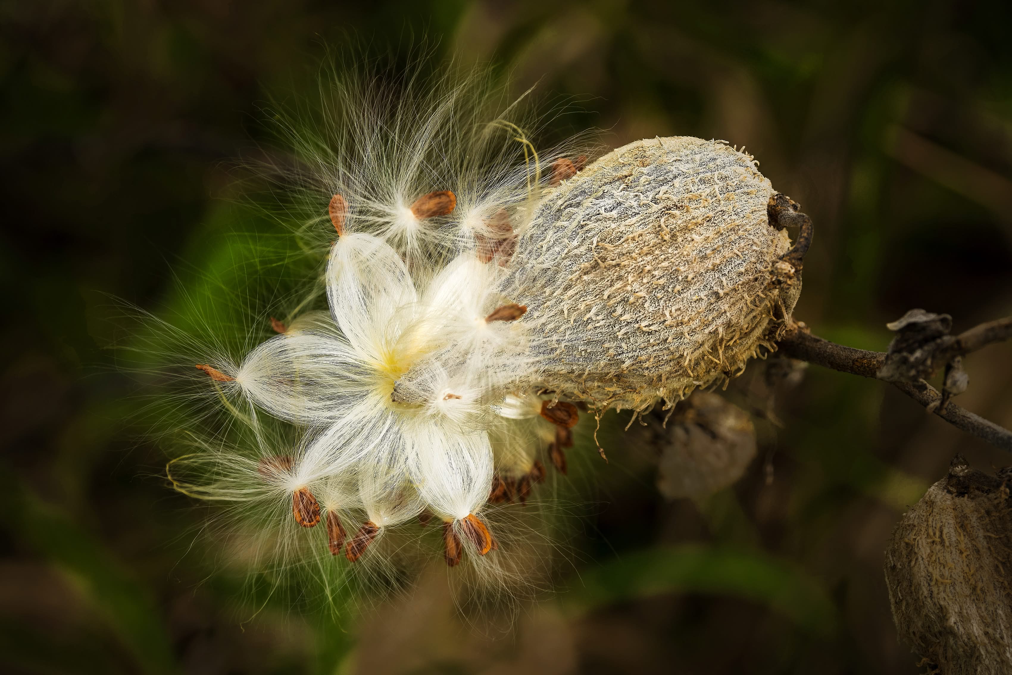
What changed: I tried to incorporate the suggestions of both Dennis and Jacek. I cropped a little more tightly, de-emphasized the background and enhanced the seed fluff.
Added after receiving feedback from the community.
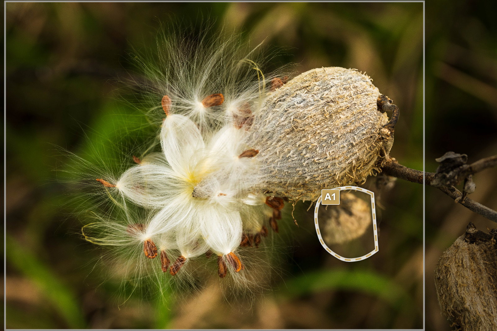
You found a glorious group of seeds, Jim and the focus is right where it needs to be with very appropriate dept h of field. I would crop it to get rid of the stuff on the right that doesn’t feel necessary and I’d probably spend some time cleaning up bright out of focus elements in the background. Whether you burn those areas, remove them or clone over them doesn’t really matter-all would work, but that pod with the seeds bursting out of it really deserves to have the viewer’s undivided attention.
Visual Notes
[Crop] The stuff on the right doesn’t feel necessary to me and keeps pulling my eye.
[A1] This bright out of focus seed pod draws the eye.
Welcome to NPN, Jim. Thank you for sharing your image, nice find. I would try to get a more popping up presentation of the main object. A vignette will help but won’t be enough. Darkening the whole background (as a reverse mask) or darkening green and beige out of focus elements won’t be 100% effective as they overlap with white seeds, however I would try it. I would also try to strenghthen the seeds by turning up sharpness, clarity and structure. I don’t know how far you are willing to modify your image, I’m showing an example of the direction I would go, it’s not a final version, just a quick trial-and-error check.
Wow, thank you for the suggestion! I don’t usually do too much processing like this, but I can see how de-emphasizing the background will really improve the photo. I’ll take a shot at it.
Hi Jim
I love the revision which has addressed the image distractions mentioned above.
ITs lovely now and works really well - a very unusual image well captured.
Welcome to NPN, and welcome to the many benefits of the critique forum. I’m sure you can see already how helpful it can be to receive feedback and suggestions. I love the revision. Really nice!
Looking forward to more of your work and your critique of our work!
Hi Jim and welcome to NPN. You’re off to a cracking start with this eye-catching beauty. The shape of the fuzzy filaments is so cool and the revision just emphasizes its starring role. There are great textures on display, too. They contrast nicely with each other - the floofy down and the scaly seed pod. The toned down background works well to showcase the main attraction and I like that you’ve embraced the feedback of the community since that’s what we’re all about. Glad to have you aboard.