The photographer is looking for thoughtful feedback on the image as a whole, especially around the areas noted below.
Feedback Focus: Artistic / Expressive
About This Image
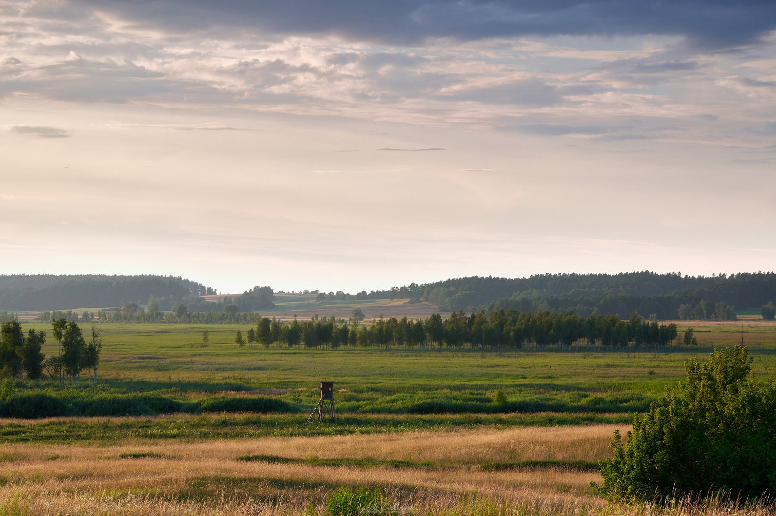
I was hoping to capture clouds in the golden light of the sun setting to the left of the image. Unfortunately clouds were moving away leaving the sky almost clear so not interesting too much. However a delicate mist started appearing above the meadow and on the slope. I was taking photos all the time in order to catch the thickest mist. It didn’t get much thicker but maybe it’s optimal as is.
I used NiSi Lanscape CPL and GND 8 medium, exposure bracketing, edited in Capture One. Gradual filters are supposed to replace bracketing but sometimes I use both. I hope that purists will forgive me .
This is a pleasant and pleasing little scene with some nice lighting. I think you made the most of what you were given. I don’t have any critiques of the photo itself, but I would move your logo over to the dark area in the bush on the right side. It’s distracting where it is. At first I couldn’t see the letters, just the underline. I was gonna suggest cloning it out untill I realized it was part of a logo.
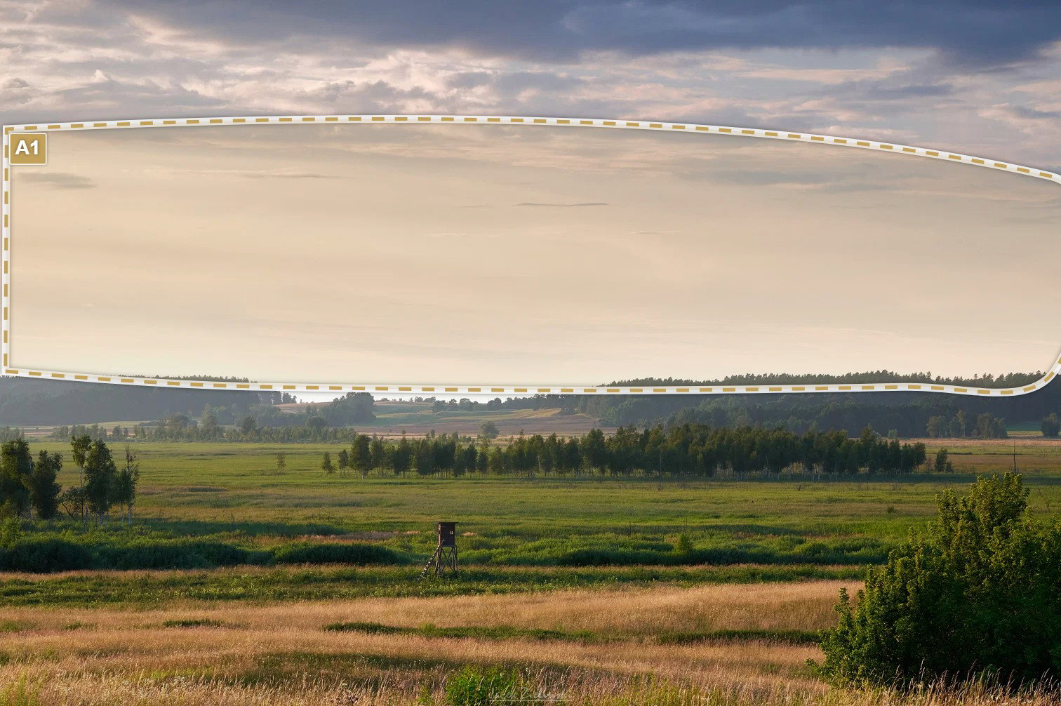
I love the warm side lighting on the land Jacek, especially with the rich layers of gold and green. That part of the photograph is beautiful. However the large amount of bright sky wants to draw my eye away from it.
[A1] I wish there was more detail in this area. I’m a bit surprised the GND didn’t help more here.
This is a very peaceful and pastoral landscape scene and image. I think you did well to capture the atmosphere and that late-light look and feel on the landscape.
I was initially heading in the direction of John’s comments and actually brought it in to PS and tried adjusting the sky. I quickly realized that almost any changes in the sky kinda removes that misty atmosphere. Yeah, I wanted to see more contrast and drama in the sky (nice sky actually), but in doing so, the mood was ruined.
I know I wasn’t there, but I really don’t get the idea of “mist.” To me it really looks like everyday atmospheric haziness. Not a bad thing per se, and that doesn’t change the tranquility or mood, just my observation.
I’m a little torn about the tree/shrub in the LRC. You’ve certainly included enough that I know it’s intentional and it actually works somewhat to balance the weight with the small grouping of trees onthe left. But it begs my wondering what the scene would be like without that element in the corner.
The good news, I don’t think you’ll find any of those “purists” here… There used to be a lot in the film days though…
My logo: I avoid making it a distracting object and adapt it to each image separately, only it’s position is fixed. So maybe this time I set its transparency too high.
Bright sky: I’d love to have more details there but in reality any clouds were hardly visible, I even wanted to stop shooting when that “mist” started forming. I tried to “improve” the sky but any further adjustments were spoiling the image.
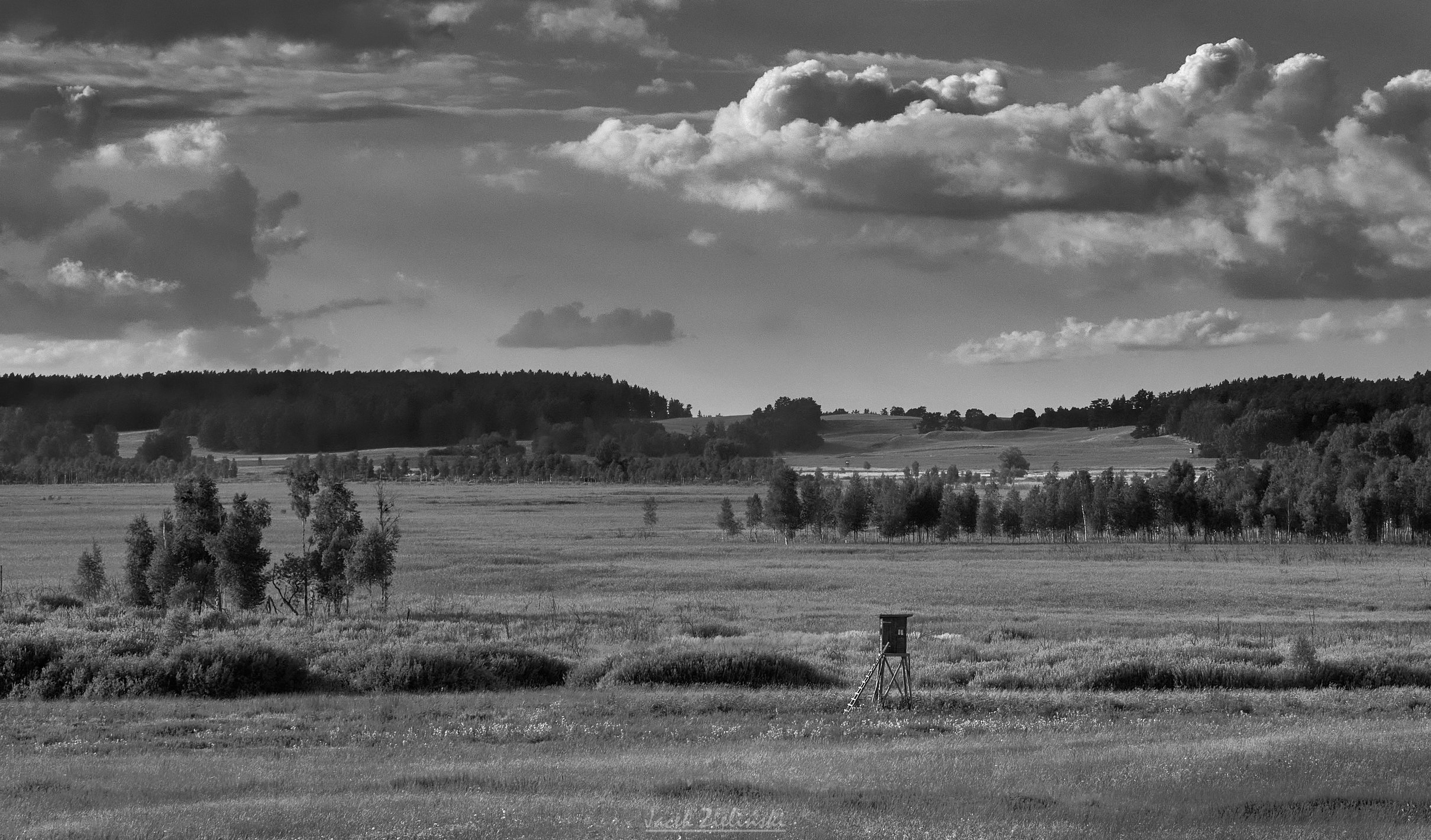
LRC: I’m attaching my black&white photo taken on the same day about 1,5h earlier. It’s without the shrub and with more details in the sky. Within one hour the details were gone. I wanted a more panoramic frame than the BnW version. In the color image my intention was to include the dark clouds at the top, otherwise I would have to leave as little sky as possible due to its brightness. If so, I wanted to make the whole composition based on long horizontal lines and keep it well balanced, therefore the shrub is there.
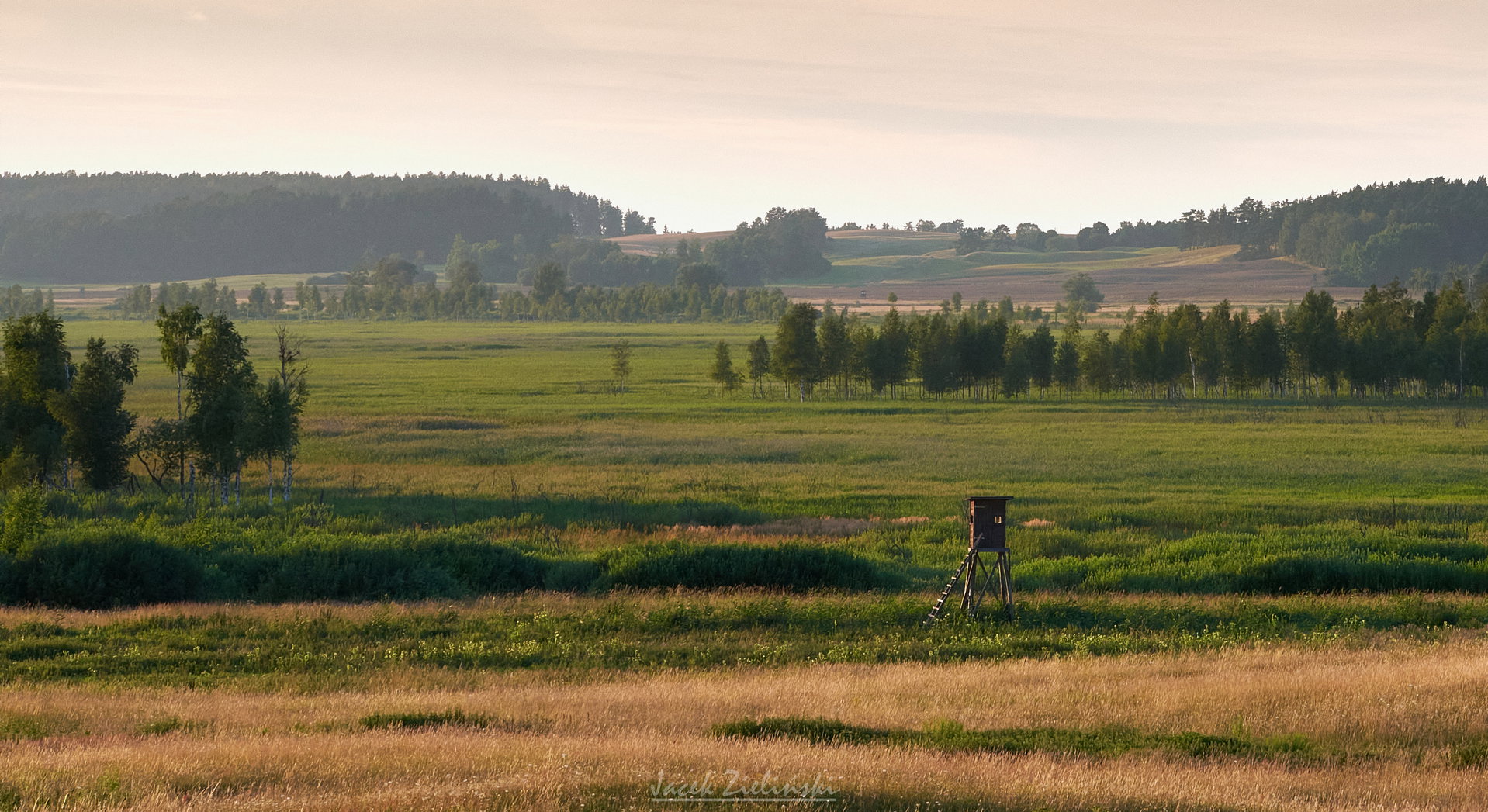
Love the colors and the mist/haze adds some depth to the image. I’d be tempted to crop this even tighter than your black and white version by placing the wooden structure as an element towards the lower right and giving the sky about 20 percent of the top. I feel doing that makes the colors pop and reveals repeating layers of the warm grasses from front to back. After that, I think I’d be tempted to warm the sky just a tad and see how that looks.
@prigano Welcome to NPN. I joined it only a month ago.
Thank you for your comment and suggestion. Here is a quick sample of the crop. Looks interesting, I will probably try this composition quite soon as I visit this place couple of times each year.
 .
.