Critique Style Requested: Standard
The photographer is looking for generalized feedback about the aesthetic and technical qualities of their image.
Description
Springtime under the night sky with some friends in Utah, I don’t think there can be a more fun time. This image was taken over a year ago, but I’ve had some difficulties getting it right in processing.
I like this image because of the FG composing and framing the MW. Scenes like this can be hard to find in such complex locations where it seems like you have endless opportunities, but I feel like I got lucky finding this compositing. What attracted me to this frame was the nice balance on the right and left sides of the frame that tapered down into the background and framed the milky way. I also loved how there were a few boulders in the center that gave a leading line perfectly into the core of the milky way!
I have to say, one improvement for this image could have been a vertical alignment of the Milky Way. Yet, because of the time of year when I took this shot, achieving a vertical MW orientation wouldn’t have been possible, as the MW sits low on the horizon in spring. Waiting for the summer months for a vertical MW would have disrupted the composition due to the shifting Milky Way. Even though this is a blue-hour blend, I use Photopills to ensure the MW naturally aligns with my foreground.
Specific Feedback
Whenever I look at this image, I think to myself that it’s either too dark or too bright/unrealistic, and that I could potentially darken it further. There appears to be a very fine line I’m walking on with this image, and I’m seeking feedback on how I’ve handled it. I prefer the dark aesthetic for my Milky Way images, given their low-light nature. My goal is to maintain a realistic look, without letting them become overly dark and muddy in appearance.
Technical Details
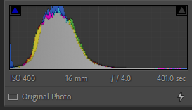
Tracked MW and Blue Hour FG

1 Like
Love this MW shot. If it were mine, I’d be tempted to brighten the foreground just a touch. Just me. What a nifty environment.
This is an interesting image. I love the soft light on the FG and wonder how you got it? The rocks look more softly sculpted than I would expect from last light. However it was done, it’s lovely!
But for me the MW is overdone for color and contrast, and feels too crowded in the frame above the rocks. I think this could be gorgeous with the emphasis placed on the FG and a much more natural-looking faint MW, with more canvas on top. Even in the spring, it will be more vertical as the night goes on, but that would have wanted more canvas for the sky.
I’m curious how you blended an 8-minute tracked exposure for the sky, as that would have given a lot of blur of the horizon. Was the sky shot from a clearer view, away from the FG rocks? (I have no objection to doing what it takes to get a good shot.) I would have attempted what I could with an untracked exposure with the camera in the same position as the FG shot, and then tried to line up the same composition for the tracked shot, which is quite possibly what you did, but I wouldn’t have issues with doing a pano stitch to include more sky. (I assume the camera was aimed higher for the sky shot?)
I’m also curious what tracker you used. There are what look like some star trails but they may only be artifacts of the wide-angle lens – or some shake from the tracker. Stacking several shorter exposures can give better quality, if they can be pin-register aligned. What matters for the final shot is the total integration time, but it can be done in multiple exposures, if they can be registered well. Very careful leveling of the tracker base is important (a good calibrated spirit level is much better than a bubble level), as is accurate polar alignment.
There are a lot of artifacts on the stars, too. Most lenses and sensors will struggle with pinpoint light sources, a good reason not to let the stars overexpose or to push exposure.
I’d love to see some tweaking of the processing here, and hope to see more of your explorations – night sky and otherwise!
Hi Trevor,
very nice image! I’m with Diane here: I love the soft light in the foreground, but I think you could take it down a notch on the MW. I’m not sure with the greenish horizon, too. Otherwise, Awesome!
Hey Markus, thanks for the reply. I ended up taking down the MW as suggested, but the green horizon was indeed natural and I actually toned it down in this image. Out here in the deserts of Utah, it’s a phenomenon called Airglow and it’s the same reaction that causes the aurora. Some nights are stronger than others but it’s really cool to witness in person! https://en.wikipedia.org/wiki/Airglow
Hi Trevor, thanks for the info! Wow, I never heard about the airglow. Awesome!

