If you would like your image to be eligible for a feature on the NPN Instagram (@NaturePhotoNet), add the tag ‘ig’ and leave your Instagram username below.
You may only download this image to demonstrate post-processing techniques.
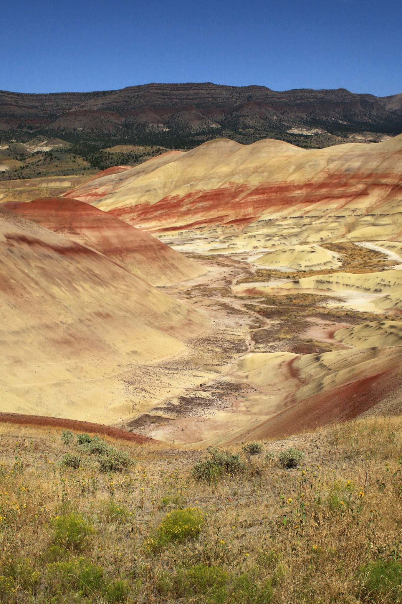
Of the three I prefer #2, more for the color balance than anything else, but I do prefer that composition a bit more as well. #1 color balance has too much yellow and really muddies the sky and #3 has way too much sky for my tastes.
I feel that if you reprocessed #3 it could be your best image because it has the strongest composition. I would crop off some of the sky, raise it’s exposure and desaturate it. I would raise the exposure a bit globally without losing any color saturation. Here’s what I’m suggesting:
Compositionally I prefer image 2. I would however tone down the situation of the blues in whichever composition you chose. I think that would allow the hills to come through stronger in the image which is the key focal point. Below is the direction I would take it.
With a couple of tweaks, I think overall I prefer #1. As mentioned, a bit too yellow. I like the composition with the bottom of the valley showcased and kind of leading the eye through the frame. #2 that bottom of the valley leads almost out of the frame. I do like Igor’s crop for #3; definitely too much sky and too blue sat.
For #1, I also cropped; too much foreground and as presented the foreground a little muddy. I added some global punch with a LAB Color layer and also brightened and punched up a little bit the foreground grasses. Oh, and I used a Selective Color adj layer to pull back on the yellow, a touch more cyan and small decrease in magenta.
Lon, Thanks for your suggestions. Again, thanks to all. It’s very enlightening to read and view the preferences of others. I really appreciate your suggestions and that you have posted consistent with those ideas. All are helpful. Blues and yellows need change with cropping and more attention to composition. I now have 6 images and no favorite. I suppose it is found in a combination of all.