FWIW, although the older site is no longer active, I found that we can go to Archives and see the recent posts. I also noticed that each member’s gallery can still be accessed. And if that remains, then at least for now it’s accessible, which some may find useful.
This will remain in place Bill, I intend to keep the old NPN as an archive as long as feasible.
Thanks, David, for the response. I do find the original Gallery access to be useful.
I was a member of the old NPN, and joined with the intention of creating a portfolio. I also liked the photographers index, because you could look at someone’s body of work, and see the trends or changes in nature photography, or the interesting locals and destinations they were shooting at. There were a couple of Canadian togs on the old system from BC who I really admired and followed.
I let my membership lapse when I had issues renewing my membership on the old system, which was Paypal centric. But I also got busy… and frankly did not have time.
I rejoined last year, with the intent of posting and participating, but once again, did not have time. Only recently have I had a chance to look at this new and revitalized NPN, and while there are many positive changes, I miss being able to look at other photographers work.
The workaround to see togs work described by Mark Seaver is too cumbersome. It could be easily accomplished by having a single link in a signature line. I have been a member of Nikonians.org for some 12 years, and they do have a members gallery, with a link as mentioned. (see attached screen save)

As NPN members are posting images in different categories under their name, surely it would be possible with some programming to group the posts, if they so chose, into a gallery, for easy viewing?
One item I notice on the new NPN I do not like, is how images can be shared by others to Twitter, Google+ and other platforms without someone’s consent (if I understood the intro video correctly). Is there a button to turn this off, to prevent the images being shared outside of NPN?
As to the member profile, how about being able to add some detail in a small “About” paragraph. As it is now, there’s just a name and location and their website, if they choose to add it with no detail. If someone has to click away to see these details, they are leaving the NPN site.
Last item - the avatar size has not changed from the old NPN. Frankly it’s tiny! Surely this could be improved and made larger. Use the Facebook, Twitter or Nikonians avatar as a reference.
Thanks for reading this.
Frederic in Montréal.
FYI - I joined Flikr eons ago, but ceased posting images because of the TOC - Terms and Conditions, granting unlimited use of images to third parties and not respecting copyright. This is true of many photo sites including National Geographic’s Your Best Shot (but that’s another issue!)
Thank you for the feedback Frederic. As I have stated before, portfolios are not the focus right now. This would take a significant investment to have a programmer create this, unfortunately it’s not as simple as just adding a link to the users profile. The focus remains on critiques and community. There does seem to be a fair amount of interest in this so I will keeping this in mind, but it’s not in the cards right now.
All this does is share a link to the post, you could easily do the same thing by just copying the url so it’s really not anything special or something to be concerned with. If someone is not a member and they get this link they will still not be able to see the post if it’s coming from a private forum like critiques, they will be redirected to a page to sign up.
This already exists to some degree, when you click on the users avatar it shows a preview of the users ‘About me’ section of their bio, for example here is Bill’s
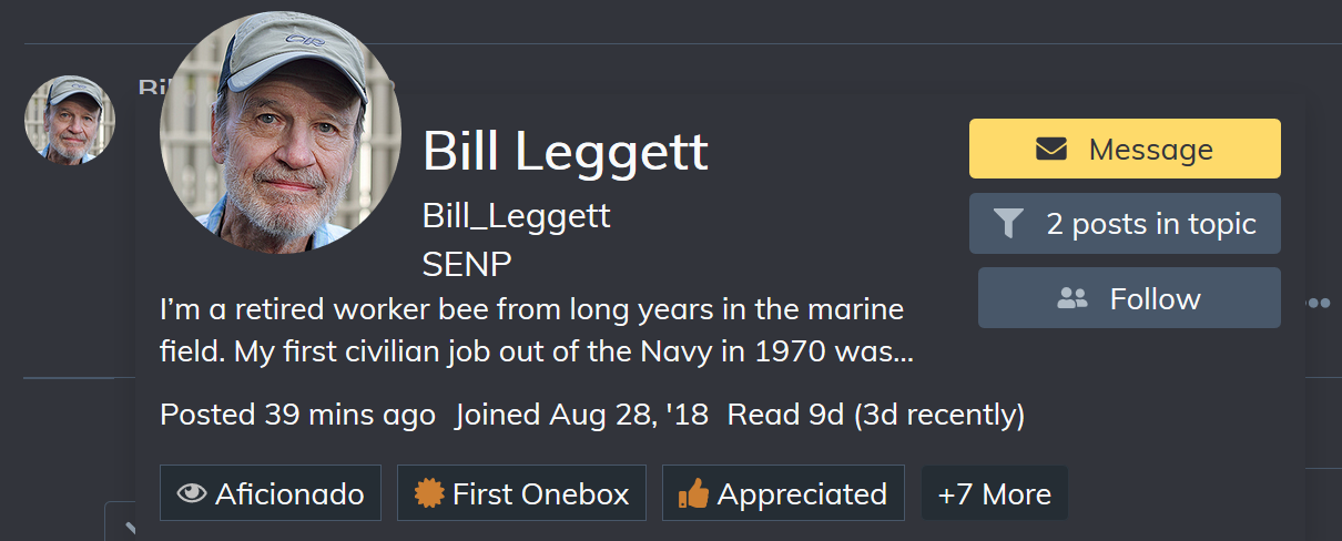
If you want to read more just click has avatar again to see his full bio. This cannot be made longer though as it would become hard to long to fit on a mobile screen. If you do not see this, it means that the user has not filled out their ‘About Me’ section in their profile.
I agree they are a bit small so I have made them all a little bit bigger, but I think going any larger than this is too much and starts to overwhelm the UI (you may need to refresh your browser using ctrl + f5 to see the new size)