Hi Everyone,
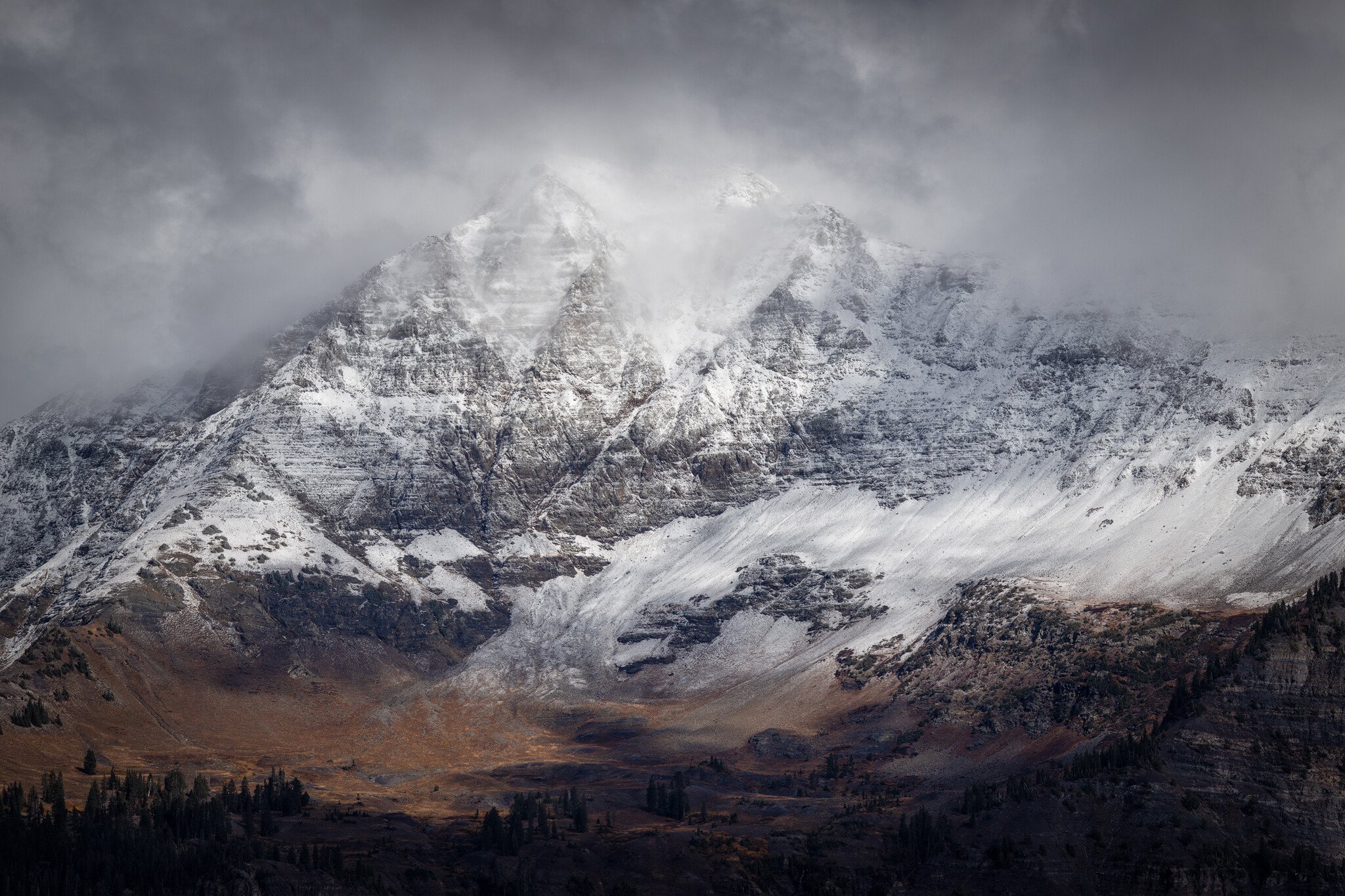
Here’s a shot I took this fall on a moody day with showers and snow squalls passing by all day long. Amazing conditions!
Specific Feedback Requested
I’m curious how the processing looks? Or if anyone would do anything different to it in general.
Technical Details
Is this a composite: No
This is a pano of about 3-4 images, hand held, 1/1000, f8, 400mm, ISO 100, processed mostly in Camera Raw with some range masking, and then pushing mid tones around to bring out detail in the sky.
Christine, I really like the conditions you captured in this scene showing those snow squalls over the mountains. I like this alot just as you have it so don’t see changing anything for my taste. Very nicely done!
Christine, I love the mood and energy in your image. The image is beautifully processed in terms of luminosity and contrast, and does an excellent job of capturing and conveying these dynamic weather conditions. I love how the light just seems to glow here. Outstanding work, I’m enjoying this very much as presented.
Thank you Nick and Ed for your comments, and thank you Kris, I don’t mind any edits at all! I like those subtle adjustments as well…especially coming back with fresh eyes and comparing what you did with what I had.
I would raise the shadows at the very bottom while keeping the darkest tone at that level. That in essence adds contrast as well as lightens the shadows. I would lighten the yellows and reds considerably and saturate them back. That would make the viewer want to look and think about how nice it would be there. I notice that the image actually has a lot of blue. I would raise that saturation but not enough to compete with the warm tones in the valley.
I actually tried this and liked it but because I’m working with a small jpeg the shadows started to look like mud after adjustment. So I didn’t post it.
A spectacular scene, beautifully composed and edited! Amazing detail for handheld. I do like the suggestions above – you have a lot to work with here but you’re starting out at about 99/100.
It’s always important to begin with a good image before doing any work to it, and you have that here! This is a lovely moody landscape; I like the suggestions made about lightening up the bottom right a bit, and a few other tweaks, as suggested by @Kris_Smith to bring out details and create a better tonal balance between the top and bottom of the frame.