The photographer is looking for generalized feedback about the aesthetic and technical qualities of their image.
Description
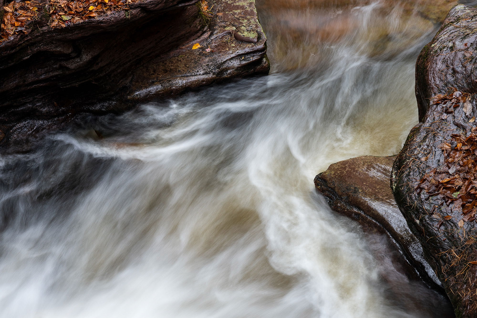
I included this image in my favorites for the year, but did not actually post it for a critique, so here goes. Mike and I made a day trip in October to Ricketts Glen SP, PA with rain forecasted for the afternoon. After the drive we ate our lunch and headed down to Adams Falls. I was really surprised with the large volume of water coming over the falls. I didn’t get any images of just the falls that I was happy with due to the torrent of water, so I concentrated on the area below the falls and found this composition. Usually I do not care for deadfall in my waterfall images, but this one seemed to work as it completed a lovely diagonal with the pointed rock that in turn crossed the diagonal water flow. I took half a dozen images that featured varying textures in the water with this one being my favorite.
Specific Feedback
At first I found myself wishing the fallen leaves had a bit more red in them, but after pondering for a few minutes I found myself liking thm just the way they were as I think they complimented the rocks beautifully. Any thoughts? Does the fallen log bother anyone? Anything else you notice please feel free to mention it.
Technical Details
Nikon Z 7, Nikon Z 24-200 @ 140 mm, f 11 @ 0.6 secs, ISO 200, Kase magnetic CPL slightly rotated to keep a little sheen, cable release & tripod.
Critique Template
Use of the template is optional, but it can help spark ideas.
Vision and Purpose:
Conceptual:
Emotional Impact and Mood:
Composition:
Balance and Visual Weight:
Depth and Dimension:
Color:
Lighting:
Processing:
Technical:
Hi Ed,
What a fantastic shot. Isn’t it funny how we sometimes wish for a different color in part of the image or removal of an object that seems to be a distraction, only to realize things are as they should be?
To me, this image is all about the water, its force, and the nutty brownness of the whole scene. A scarlet leaf may be the holy grail in photography, but I think this feels more fitting.
As for the log, I understand why you might wish it were gone, but I took the liberty of importing the image into LR and using Ai Removal to see if it made it better. In my opinion, it doesn’t improve upon the image.
To me, the deadfall adds some scale and emphasizes the force and the stillness side by side, which is a more interesting image to me. As you note, it also balances the jutting rock on the right and it created a V shape of water flow coming up from the bottom left. Overall, a perfectly composed image.
Nice! I like how the water is like marble at the top, almost joining the two actual rocks. I wasn’t sure about the wood, but @Marylynne_Diggs removal made me realize that I prefer to have it there. The color of the leaves works for me, and would feel fake if they were more red or saturated. I like the current composition but wonder if you have more canvas on the top if you could slightly expand the image to include a bit more of the leaf-covered triangle of rock on the upper left, which feels just a wee bit small or cramped. This would be great as a large print.
Love this, Ed. The composition and deep saturated tones really work for me. Lots of interesting texture and patterns in the water also. I love the log in the image. I think it adds some visual interest and tells a story.
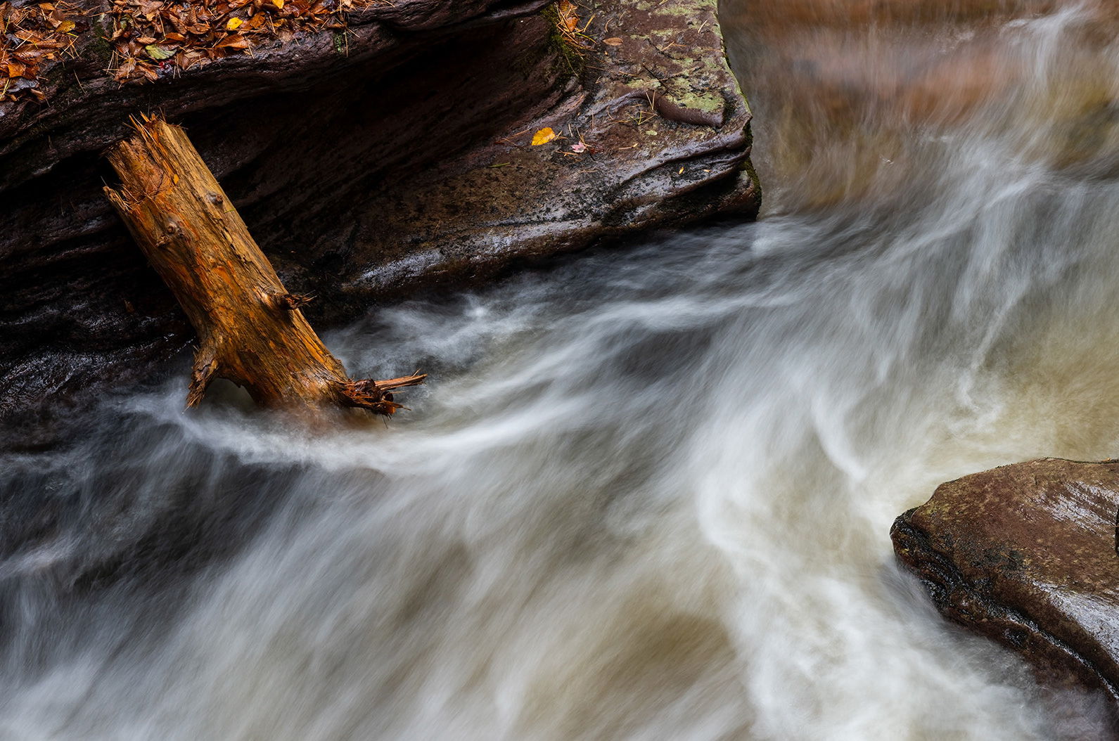
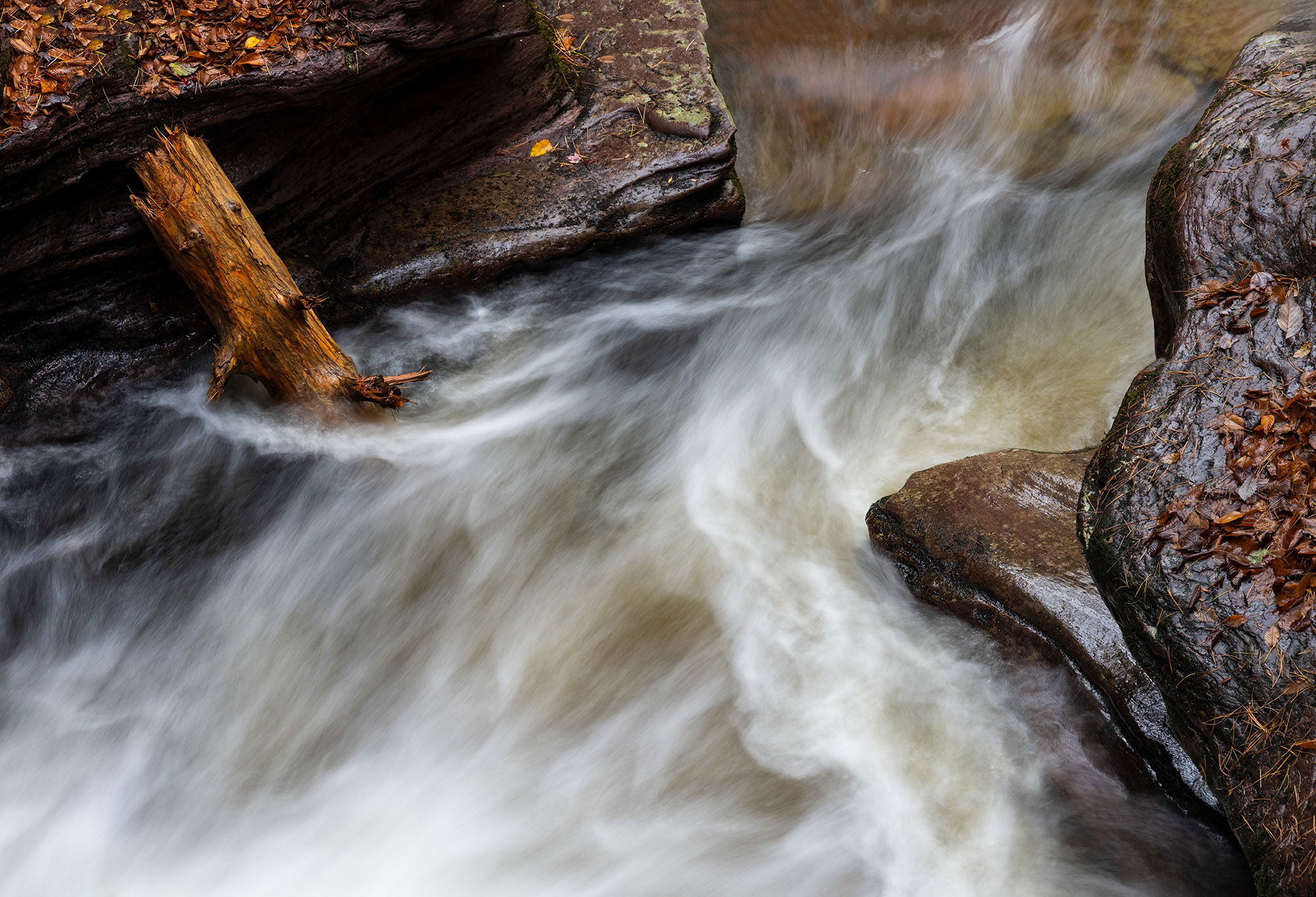
Many thanks everyone @Marylynne_Diggs, @Cathy_Proenza and @Michael_Lowe for taking a moment of your time to leave your thoughts on this image. I am glad everyone likes having the log in the scene as it is located in the perfect position and just seems fitting to me. @Marylynne_Diggs : Thanks for taking the time to do a rework with the removal of the log. I had to chuckle when I saw it as that is exactly what I did and arrived at the same conclusion about leaving the log. @Cathy_Proenza : Unfortunately I do not have any more canvas up top. I wound up cropping it that way as the textures in the water just rapidly dissipated beyond that point. I may try adding a little and see what I can come up with.
Ed, this does a fine job of showing off the moving water and it’s surroundings. I think the deadfall fits well. I like how the water shows more movement as it flows through the frame. The wetness of the rocks fits the scene well.
Thanks so much everyone @Mark_Seaver, @John_Williams and @Igor_Doncov for taking a moment to leave your thoughts on this image; always appreciated. Here is a rework with a little canvas added up top as was suggested by a couple of folks. Better? @Igor_Doncov : Thanks for taking the time to do a rework; that works as well.
I think this is fantastic!! The SS is perfect to show some very interesting detail in the water flow, and the range of color in the water is lovely and interesting! The deadfall echoes the tan/gold colors in the water and is lovely on its own. My only thought, which may not be any improvement, is to wonder about reducing some of the gloss on the rock on the right, just to remove a slight competitor to the water.