The photographer is looking for deeper feedback connected to their intent, creative direction, and specific questions.
Feedback Focus: Artistic + Technical
About This Image
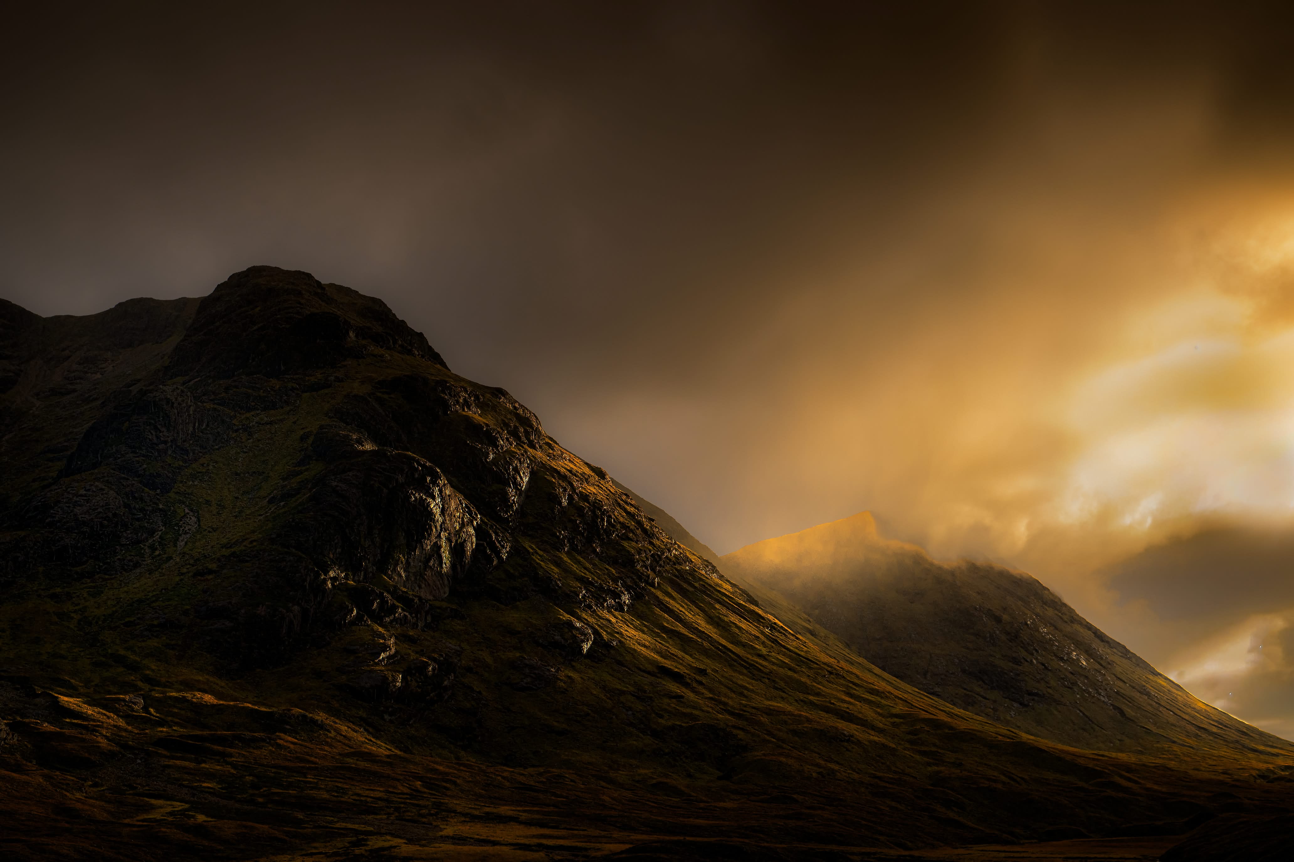
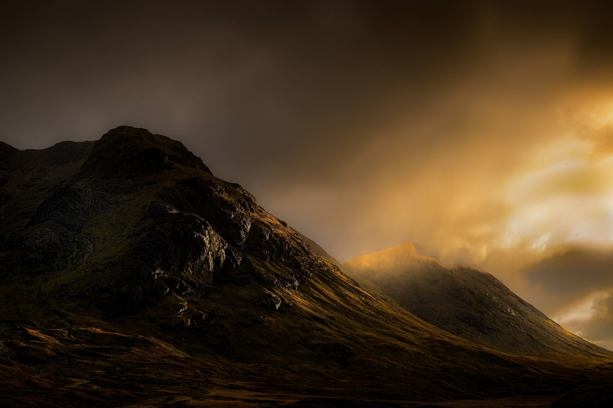
This was at Buachaille Etive Mor in Scotland. The weather was changing by the minute with some nice atmospheric clouds giving way to some sun lighting the mountain from the side. I’m not sure if I am able to describe what I saw
Why This Image?
The fleeting atmosphere especially with the sun breaking through
What I’m Trying to Express or Explore
The drama in fleeting light
Where Feedback Would Help Most
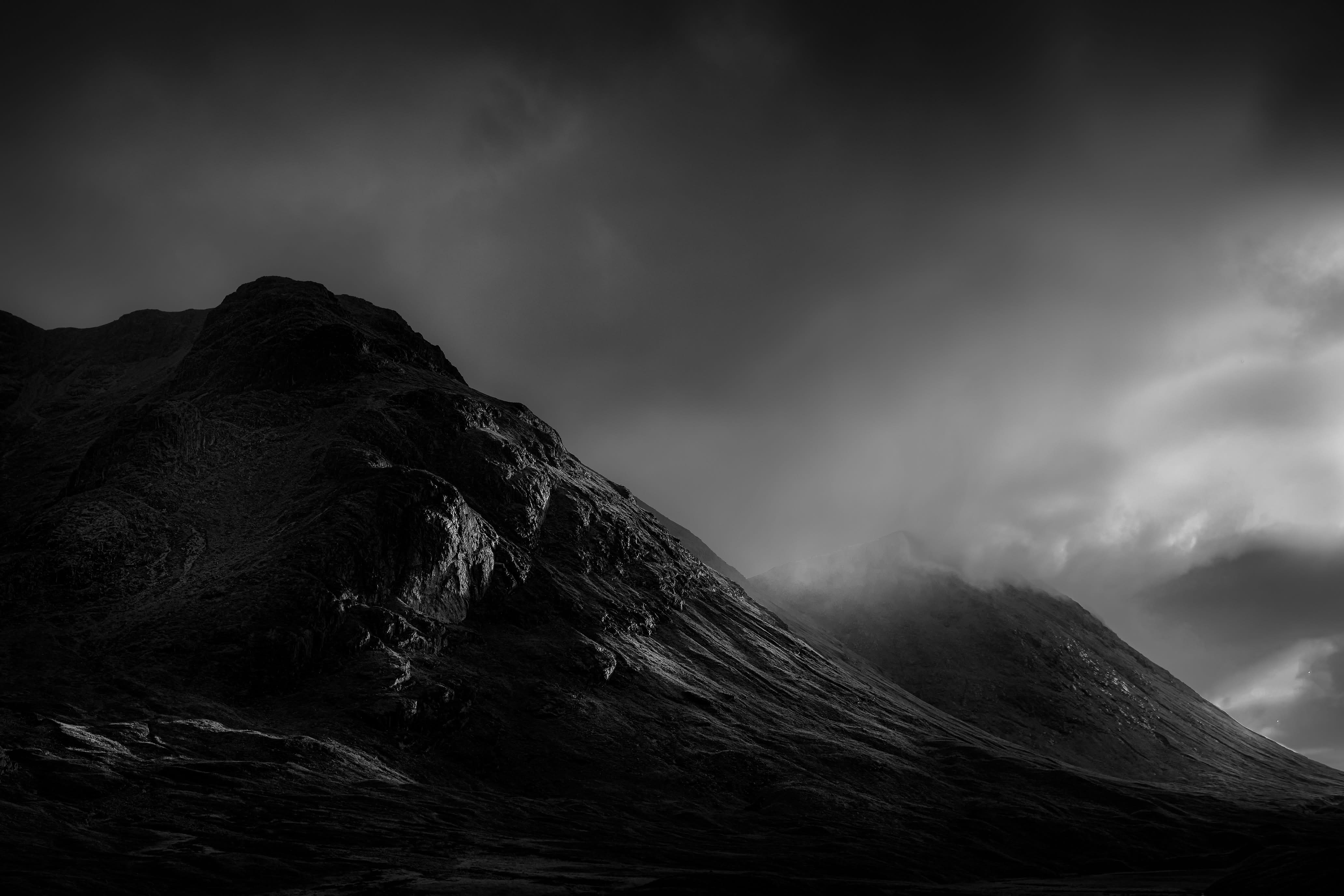
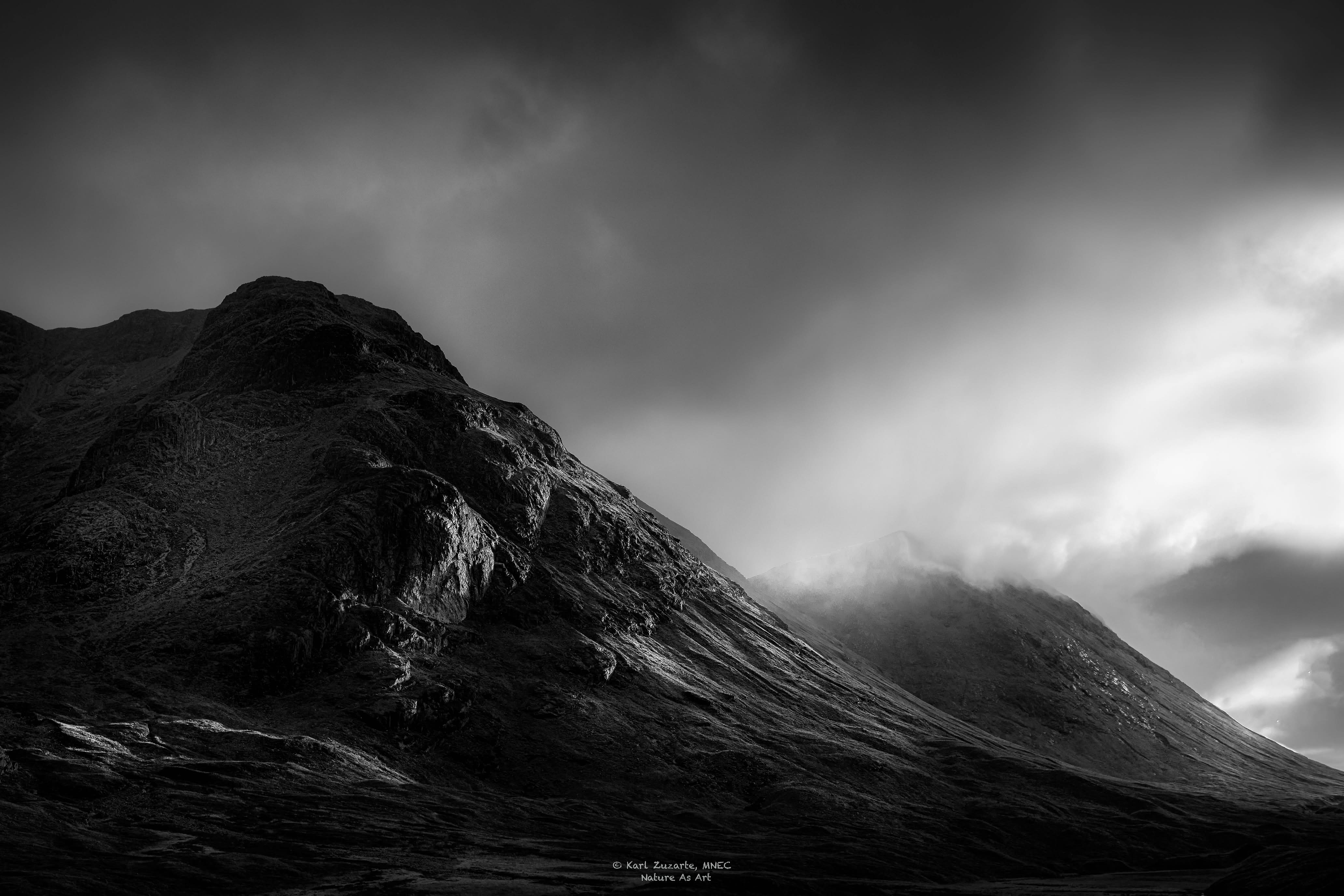
Have i expressed the mood enough? How does black and white compare ?
I like the colour version where the golds and the blacks work so nicely together. The black and white version on the other hand doesn’t have the same impact. At least to me. I do love the light and the drama you’ve got here. Nice work!
Wonderful drama! I also prefer the color, although both are wonderful. The color is just an extra special touch. But it looks like there is actually more interesting detail in the B/W, in both the land and sky – I wonder if more could be brought out in the color version?
Hi Karl, I know just how fleeting the light can be in Scotland. I love the colour images as the warmth is really how it can be with those dramtic clouds.
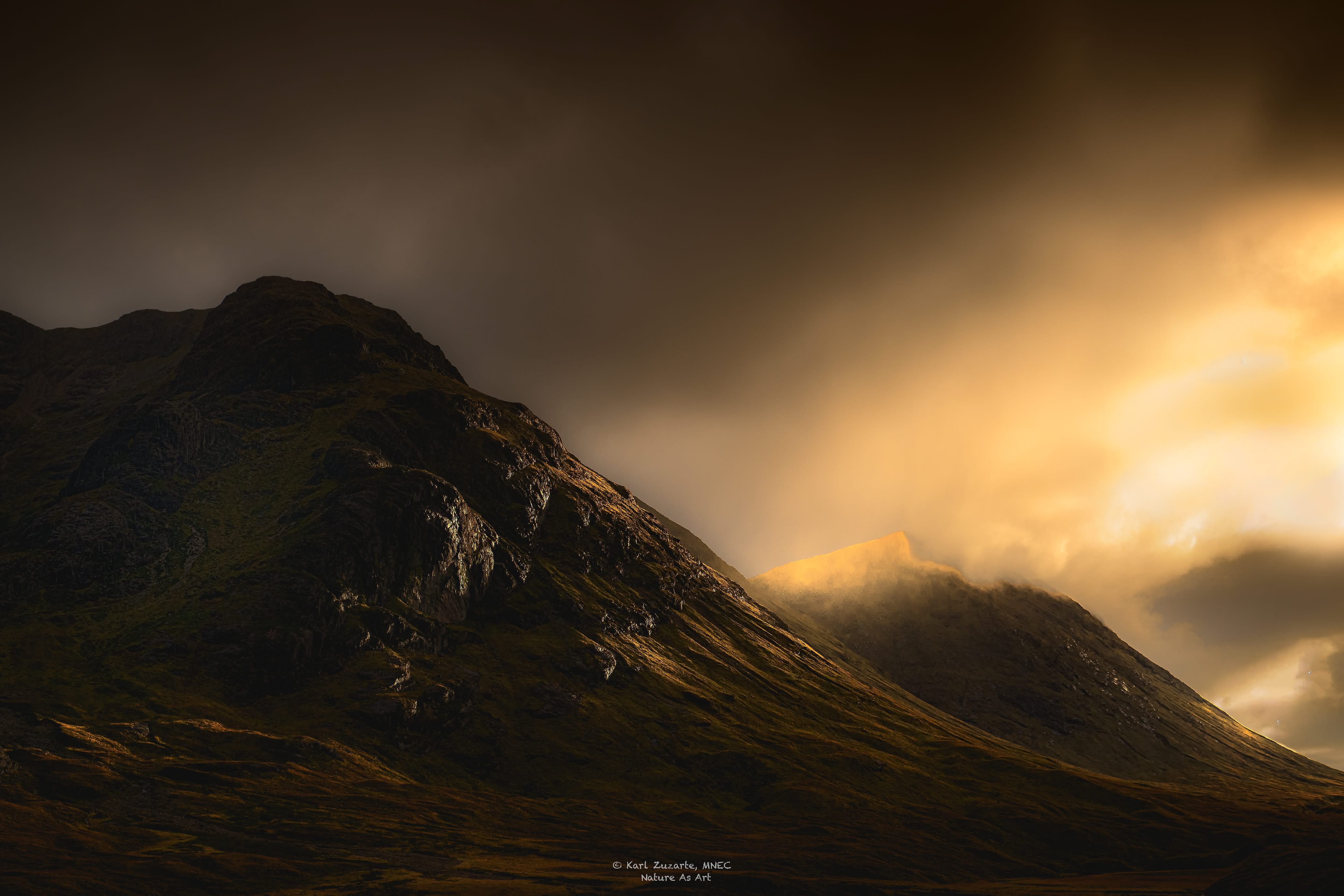
I can see what you have done with the edit2 but you are very close to blowing the highlights in the clouds.
Can you add to the highlights in the rocks in the left foreground as that sidelighting is magnificant.
I have images of the Faroes that i am currently processing, converting to B&W for a presentation on Saturday but like you the conversion seems to loose so much of the atmosphere.
I think you have captured it perfectly in the colour images.
It looks like your trip to Scotland has been exciting and creative! It’s on my bucket list. I like both of these images, and it’s hard for me to pick one as better than the other for showing “fleeting light.” The title, speciffically the word “glow,” makes the color version a favorite of the two.
However, from a purely photographic perspective, if I were looking at these in a big line-up and they were not right next to each other, I would linger longer with and remember the black and white image. It’s storminess comes through and the highlights feel better in it than in the color version. It could be my monitor (not the best and not calibrated) but the brightest parts of the right side feel a little blown and blotchy. Again, that could just be me and my monitor talking, so please disregard if nobody else comments on that element.
Nice work on both regardless. I really like the composition and the mood these two evoke.
All three are gorgeous, Karl, but the color takes the cake for me. That light is so wonderful and it’s just not possible to reproduce it in B&W because it’s the color and it’s interaction with the terrain that makes it magical. The mood comes through very well in this stunning image. After looking at it for quite some time, I thought maybe just a touch more light and warmth in the hollow of the mountain on the left might be appropriate, so I tried it, but I’m not sure it made an improvement. I’m posting it just in case you like it.