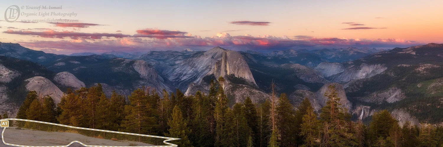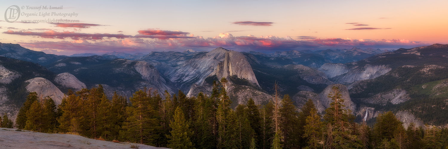
The photographer is looking for thoughtful feedback on the image as a whole, especially around the areas noted below.
About This Image
Here is another panorama from Sentinel Dome that I made just as the sun had set. Years ago I made a similar panorama using a Nikon D2x and I have always wanted to retake this composition with a higher resolution camera (really wanted it on 4x5). this is where I set my tripod that set the stage for the Milky Way Project post I presented, that took place later that night.
Feedback Requested
My only reservation about the photo is the sky. Is it too plain? Should I try to see if there is any blue that I can rescue? Sometimes if a heavy contrast curve is applied, hidden underlying tones appear and blue might be there
Technical Details
Camera: NIKON CORPORATION [NIKON D850]
Focal length: 50mm, 6 vertical frames stitched in PTGui.
Shutter speed: 1/10s
Aperture: f/8
ISO: 100
Each frame was processed in ACR then into PS to convert to a TIFF, then back to PTGUi to assemble the panorama, then back to PS to finish the image. Its large! I can print a 9 foot x 3 foot print without losing resolution! So if anyone wants a wall mural, let me know.