Starting Over +ALT view

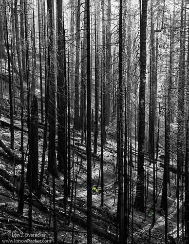
Another image from the fire ravaged slopes in Yosemite from the Ferguson Fire this past summer. I’ve always wanted to capture something from these “drive by” scenes of burned forest we’ve all passed by; but so often nothing comes together once you stop. The haze was heavy as captured in my other two images from here which helps create a little atmosphere. There are quite a few things going on here, but will get to my main point. I spotted the new green growth that had already sprouted up and I knew I wanted a graphic image with the B&W to help tell the story of new beginnings.

What technical feedback would you like if any?

always welcome

Hopefully it’s obvious, but I converted to b&w, then painted it out just for the plant. (Also a couple of smaller plants.) The b&w was simply one of the Nik Silver EFex Pro2 templates and tweaking sliders. In post I did want to emphasize the bright haze and so the top of the image is heading towards high key?

What artistic feedback would you like if any?

Always welcome

Mostly looking for impact and response. Are the green bushes too small to have an impact on the story? Does this work? Would it be better if this was completely b&w? Do the light/shadows across the bottom add much?

Any suggestions in terms of processing!

Any pertinent technical details:

Nikon D800E 28-300mm @82mm f/13

Thanks for any comments, suggestions!

EDIT: Thank you so much for your comments and especially your honesty. You all made some excellent observations in your comments.

The starkness of the subject and going b&w is more than enough to stand on its own. And I agree the plant is too small to have a great impact, although it certainly helps tell a story. without the colorizing, it still tells a story, the contrasts, lines light/shadow all are fitting for b&w.

Personally, I think the reservations of the colorizing technique are simply because we come here for nature photography, and I get the point of view. No doubt though, painting color on to b&w prints has been a creative outlet for a long time; long before digital and Photoshop. It was a controversy back in the early 1990’s at my camera club - deciding what category it belonged in for judging! :roll_eyes:

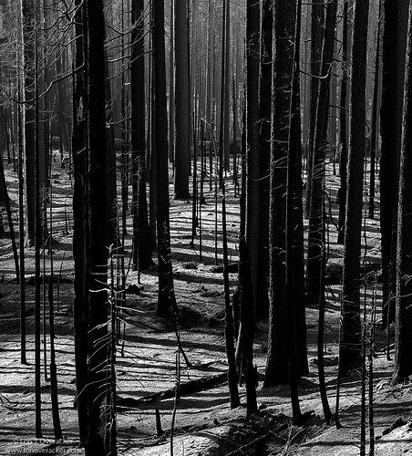
Here is a different frame captured at the same location. First post I was looking about 10 o’clock. This one more straight downhill at about 2 o’clock. For me I really like and try to emphasize the light/shadow/lines on the ash=covered forest floor. So this is cropped from the top by at least 25%. Also, there is another green bush below center, but this is all b&w this time.

Can’t say it’s better or not, just a different angle and composition.

Thanks again!
You may only download this image to demonstrate post-processing techniques.

Lon, this image definitely tells the story you were trying to tell and is very strong as presented. I am a bit conflicted with the small amount of new green growth and I am not sure more would be better. I think this image is strong as a B&W with or without the new growth but the story would change. I tend to be a bit of a purist on B&W, maybe others will offer more helpful insight. Nice work!

Thanks Alan. If you mean by being a “purist” because of the “coloring” of the b&w image, I don’t disagree. In fact by definition this is probably better suited for Photo Art (or Photo Journalism, which we don’t have) Anyway, just acknowledging that. Thanks for your comments!

Lon, I love the story this image is telling. I’ve driven by the destruction of the Ferguson Fire many times since the summer and always wanted to stop to try some shots out. When I first looked at the image I wasn’t sure what the colored part was until I zoomed in. I am conflicted about taking the color out because then I think it would be easy to not notice the growth at all. Unfortunately the story is told by there being such little growth otherwise the image wouldn’t have the same message. I’m not sure if you have other comps that are a bit more zoomed in , or maybe just a tighter crop so the growth gets more space in the image would work.

I see where you are taking this, but I am torn about the couple of clumps of green regrowth, Lon. I would be curious to see them in B&W because I love the starkness of the image along with the soft light filtering in through the haze. The fallen diagonal tree trunks add some nice visual tension to the still standing vertical ones. I also like the additional diagonals with the shadows as they lead in a different direction. This is nicely done and well thought out.

Hi Lon,
This is very unique and quite different (I think) to your normal style. Firstly, I applaud your creativity. However, I’ve seen this approach before and to be honest I’m not sure the mixing of B&W and color works for me, Maybe I just need to open up to more creative styles… In any event I think I would prefer the image in color with perhaps some creative saturation/desaturation to emphasize the new growth. Without seeing the original raw I can’t tell if this is a possible approach.

I’ve been looking for years for a good image of thin trees with shadows that make interesting patterns like this! They’ve just never turned out but you did great. I think this image has great impact and response; the black and white lends itself to the melancholy feeling of a burned forest. I definitely like the story you are trying to tell with the selective color, but as a personal opinion, I just don’t like the selective color technique itself. Not to say you should trash this image, but perhaps you can keep the “starting over” story in mind and keep working on more and varying images with it? I suppose I’m a purist too! $0.02.

Just goes to show that mother nature endures, in places like the Sierra’s and the Columbia Gorge there is optimism for re-birth and growth after a tragedy.

I think I would prefer this as a straight B&W, and not include the dot of color. The size of of what you have left colorized is not enough to generate much interest, but is a potential distraction. I think a straight B&W has a lot of impact in it’s own right, with the graphic shapes and strong contrast. I also like the diagonal lines of the fallen trees, they nicely complement the otherwise straight verticals of the standing trees.

Just my $0.02, YMMV.

I like both images and they tell slightly different stories. The mix of the color and B&W is not working for me at all, though. I find it just looks odd and perhaps contrived? But that is me, a bit of a photo traditionalist. Nice work in the burn area! It is tough to make it work and you did very well.

The alternate image works for me.

Lon, I prefer the alt view here. It has more depth and the space between the trees draws me into the scene. I’m also not a big fan of color/b&w mix, but that’s just personal preference.