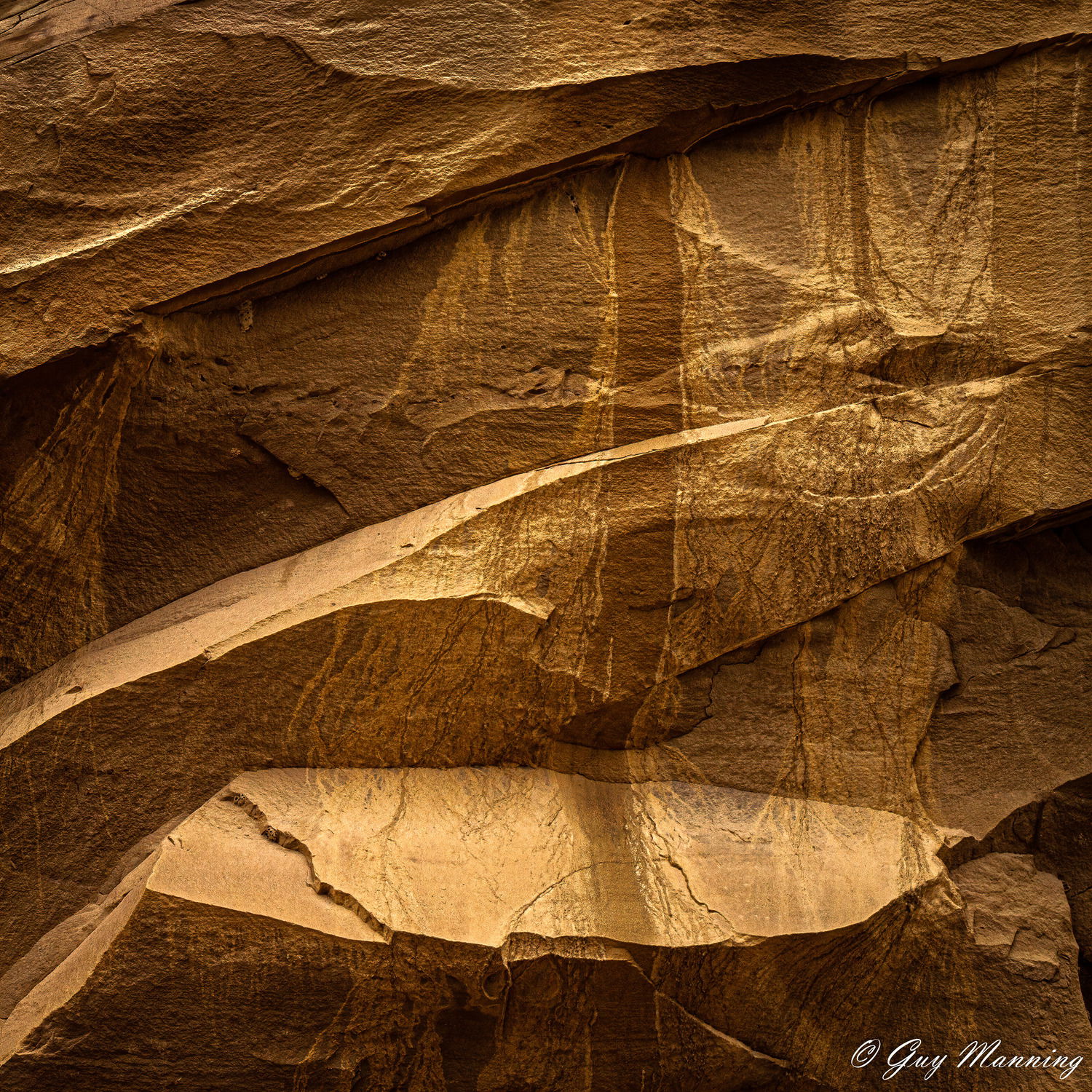
This was taken two years ago on a mid-day hike in Chaco Canyon when a bit of Pareidolia crept in. This is a crop from a horizontal image. I noticed the water staining. I initially thought to do it in B&W but it didn’t work to my satisfaction and I had already gotten interesting results in color. It is interesting to see water stains, both dark and light, occupying the same space and overlaying each other. You would think the flows, coming from the same places above, would be uniform in tone and color.
This was initially processed in LR then sharpened in AI Sharpen as a test for that software. I used two adjustment brushes in small areas to balance tonalities.
I will be partially off the grid for the next few months so I will not necessarily answer promptly. I will only get to this once or, at best, twice a week.
Specific Feedback Requested
Any honest comments welcomed, especially the subjective.
Technical Details
Is this a composite: No
ISO 400, 98mm, f/13, 1/400
Aside from the wonderful composition, color and light, this is a photo that can occupy a lot of time just studying the various designs, and images created by the water.
Beautiful work Guy. I downloaded this one and converted to b&w and saw how flawless the composition really is. I could not find any way to improve it. B&W allows you to play with the tones a bit more and still be acceptable but I found no significant improvement. I then played with the color cast in LAB and came up with something I like better. Perhaps it’s because I’ve grown to see these subjects look differently when done by others. It’s a personal choice but the colors could be improved in my opinion.
Fascinating water patterns! I think a vertical of the right 2/3 would be interesting. @Igor_Doncov’s take on the colors is interesting. I wonder about something halfway in between…
Guy, this is a very strong composition. I just love how the vertical stripes of the stains map against the strong diagonals of the rocks, it creates a very dynamic look to the image. I’m surprised that you were unable to find something that works well for you in B&W. While the color version is very strong, IMO this image has a lot of potential in B&W as well.
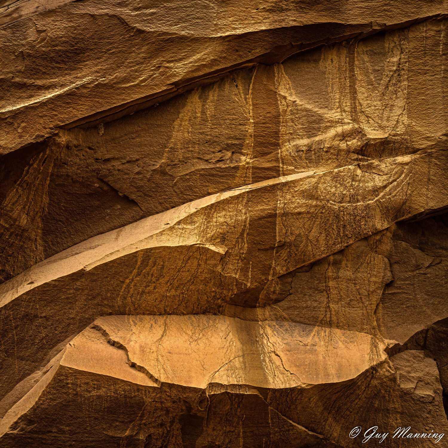
AS presented, I think the highlights in the bottom tier of rock are too dominant, and pull some attention away from the stripes. Here is a rework illustrating where I would suggest taking this. I think teh stripes op more with this tweak
In abstract images like this, color becomes an especially subjective thing. While @Igor_Doncov reworked colors probably are closer to how this actually looked , I prefer the more honey gold tones of the original post as presented.
@Igor_Doncov, I feel the color on your version is more Moab and less Chaco. The landscape would be generally considered yellow-gold over red. Here is the raw with no correction:
@Ed_McGuirk, I like that. I believe I had taken the tones on that shelf down at one time during processing but wanted to retain the brightness of the stone slashes and their affect on the design of the image. I will have to revisit it at some point and reconsider. Thanks.