The photographer is looking for generalized feedback about the aesthetic and technical qualities of their image.
Description
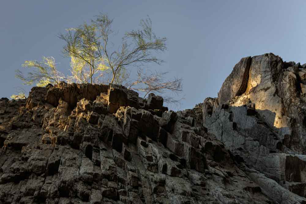
This is from this morning’s hike. I had my 10-18 lens, which I rarely use, and was looking for subjects that it might be appropriate for. When I took this, the tripod was very close to the rock wall and pointing up.
Specific Feedback
All comments are welcome.
Technical Details
ISO 100, 18mm, f/18, 1/8th sec.
Critique Template
Use of the template is optional, but it can help spark ideas.
Vision and Purpose:
Conceptual:
Emotional Impact and Mood:
Composition:
Balance and Visual Weight:
Depth and Dimension:
Color:
Lighting:
Processing:
Technical:
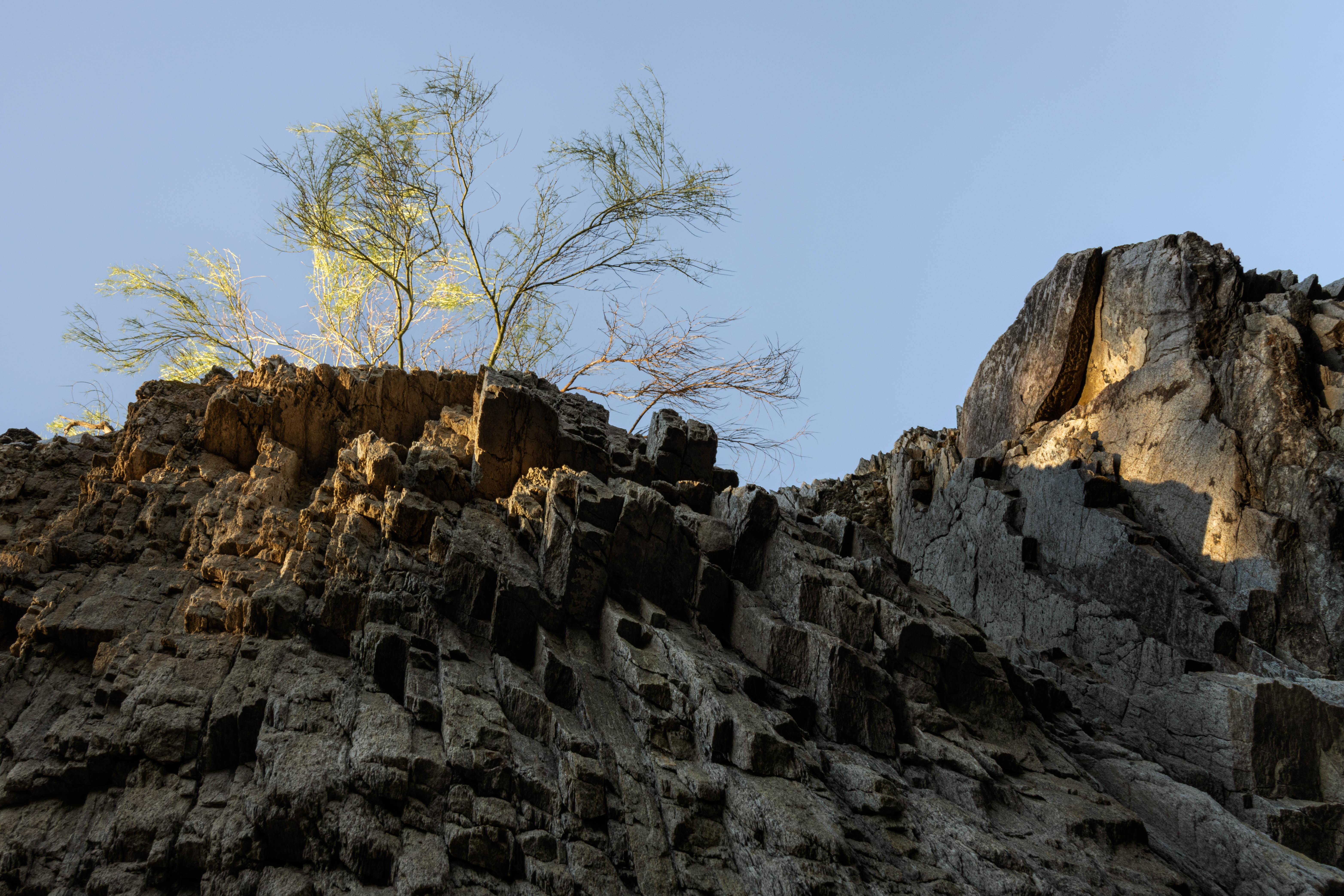
Good question, Diane. When I darkened the blues any more, I quit believing the image. With the black and white version I worked up, darkening the sky worked, but without color the elements weren’t separated enough.
Really great light, Don. I love both the lit up rocks and the bush and with the bush you have dark sections and light sections right next to each other. Very unique light. The left portion of the sky is, for lack of a better word or description, a little muddy looking compared to the right portion of sky which is much brighter. If you can even the blue tones out I think it would improve the image. It may be from the wide angle lens. In any case that’s the only small nit I have for you. The lighting and composition are just right.
Thanks for the comments, David. Yes, the sky varied greatly in brightness due to the wide-angle lens. I worked on it but your comment makes me realize that it needs more work.
Hmmm – I hadn’t consciously noticed it before, but I think the variation across the sky is one of the factors that made it appealing. Would be interesting to see a version without it being evened out.
Don, the light here is very nice and interesting in that it is just touching the brush and the rock on the right. The unevenness of the sky doesn’t bother me at all and is something I would expect.
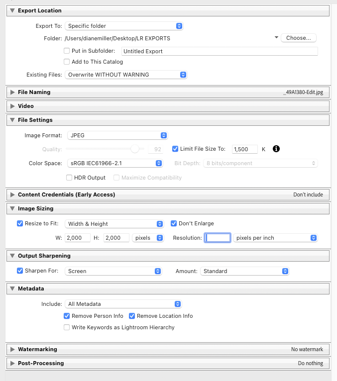
When I view the larger version, it appears to be soft sharpness-wise and then I noticed the file size is <100KB. My SWAG is that jpeg compression is hurting the sharpness and quality of the image. You might consider posting the image at a much higher quality setting.
Thanks for the comment, Preston. I agree that the compression is affecting the image quality but my understanding is that we have to compress images to that degree before uploading them here. I’m not very savvy about computers and maybe I’m missing something.
Image size - The recommended minimum is 1500px on the long edge. You may upload smaller files if image theft is a concern. There is no limit on maximum pixel dimensions. We recommend 2000px for a high-quality display.
Image Quality - Use a quality setting of 6 (Photoshop) or 60 (Lightroom) to reduce file size while retaining visual quality.
Maximum file size - 100 MB, JPEG files. Large files will be slow to load for other users. Setting image quality as mentioned above will keep file size well below this, usually around 1 MB.
Color Space - Convert all images to sRGB, the web standard, to ensure colors display correctly in all browsers.
I use the legacy “Save for the Web” in PS. Using the guideline for image size, and setting the “quality” to 100, my images typically come in at <2MB and they display very well here.
For the occasional image where peering into detail is desirable, I made a second preset with a larger image size (2500 x 2500) but the size can be changed on the fly as desired.
Curious item: Resolution is meaningless for a JPEG export when image dimensions in pixels are specified. It is included for some legacy reason that escapes me.
Hi Don,
This is a wonderful POV and the light on the rock face and bush is quite lovely. I do like your second version better with the sky evened out. I am enjoying the way the cracks in the roks direct the eye upwards towards the bush being kissed with the first rays of light. Very nicely done.
That repost is much better Don. It’s interesting how much that was hurting the original, especially some of the color blotching in the brighter parts of the Palo Verde.