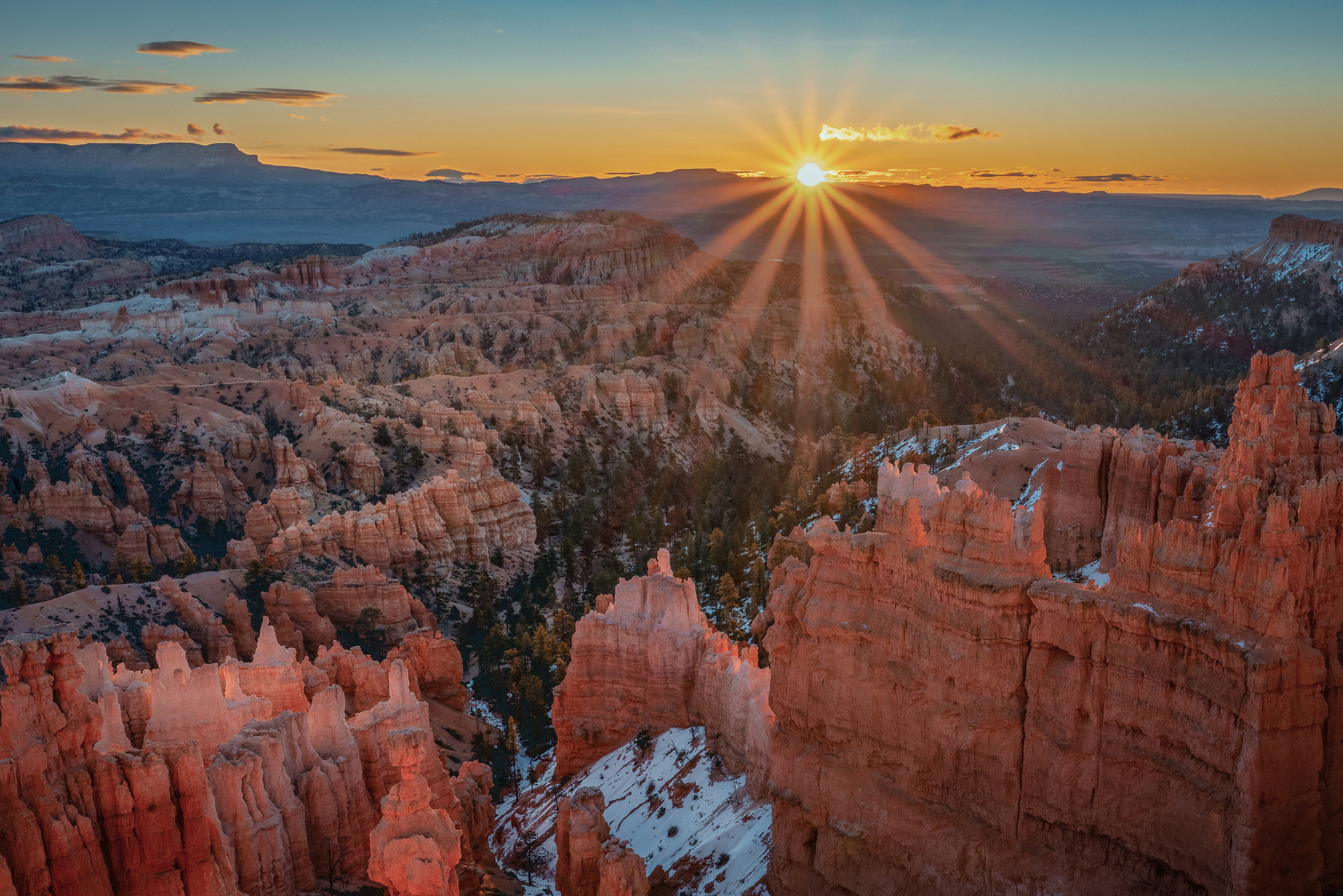
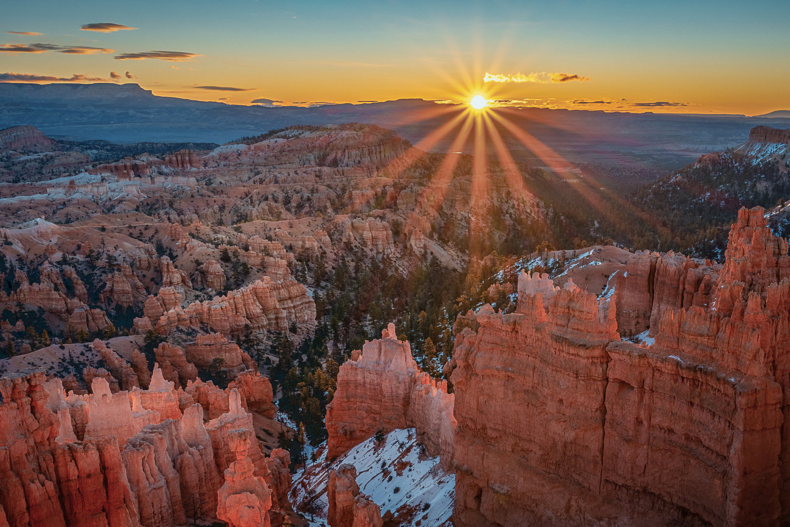
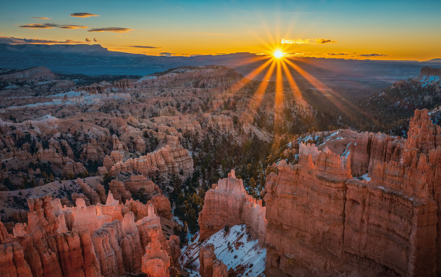
What changed: I completely started over, including the composition. How do the colors look now? I didn’t like having the sun star in the middle but I thought expanding the area made it less about the sun star? All feedback appreciated!
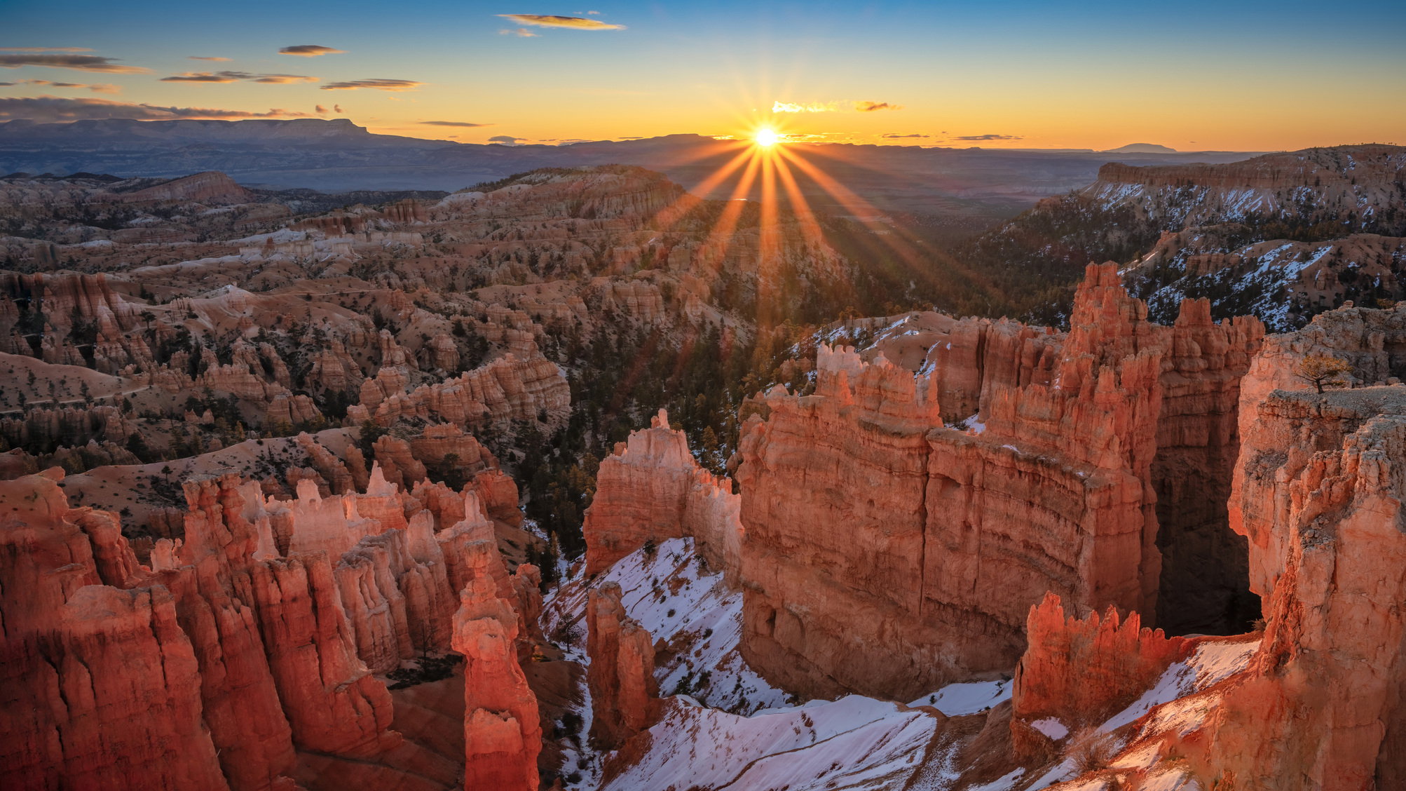
Elizabeth, this is a fine look at Bryce Canyon. The sunstar dominates the view. It is nicely aligned with the valley and especially the foreground hoodoos. I do think that you’ve oversaturated the colors, especially in the foreground hoodoos and the distant blues along with the blue at the top of the sky. The colors in the midground look right. The bits of snow are a fine extra telling about a season with fewer visitors.
Ignore the update messages. I could not figure out why it did not look any different. I was exporting to the wrong folder so I was just uploading the same image and now it would let me because I have done it too much. I’ll try again later.
Okay, now it is updated. All constructive criticism very much appreciated! I did both some global desaturation and in the red, orange, yellow and blues. I also tried to desaturate the sunstar.
Hello Elizabeth. This is a beautiful shot. I do like the less saturated version. I feel the sun rays should be more subtle. They distract me from the rest of the landscape and make the shot all about the rays. And it IS a wonder vista you have captured.
That’s a wonderful composition Elizabeth. I like the way the buttes converge on the valley, and then the valley leads toward the sun.
Although I agree the original appears too saturated, the global reduction loses the “sun splash” hitting the foreground. One idea to play with is to reduce the saturation through a mask that targets the shadows more than the highlights. Here’s a rough example of that:
This is a really nice image Elizabeth, the sunburst is the star but the nicely composed foreground and mid-distance rocks add to the wonder of the scene. Now I agree with Mark and Steve about the saturation in the first post and I think that revision 2 has a better overall colours
This is a wonderful landscape and excelent near/far composition. All the elements are nicely balanced.
I agree with the others and I know you’re working on revisions. I will second John’s edit. That seems to balance the colors and saturation pretty well.
You’ve captured a beautiful scene and I know this will make a beautiful print!
Thank you for the feedback. Yes I am working on another revision. I do have a tough time with the colors, so having @John_Williams image as a guide helps a lot. I’ve actually gone back to the beginning and started over, changed the composition too.
Would appreciated more feedback once I get this one done.