Critique Style Requested: In-depth
The photographer has shared comprehensive information about their intent and creative vision for this image. Please examine the details and offer feedback on how they can most effectively realize their vision.
Self Critique
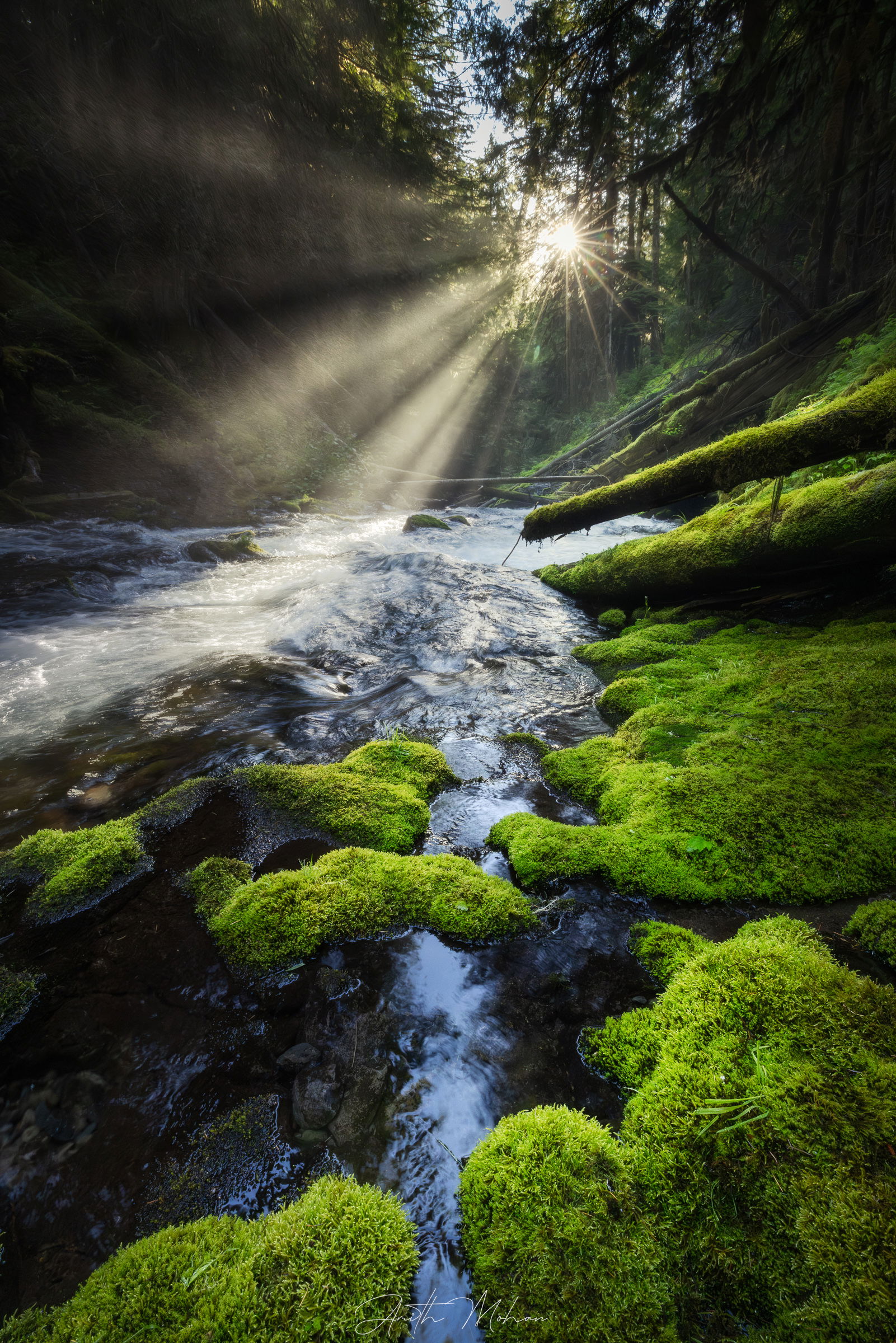
I personally felt that I was able to create a visual that was reminiscent of my time there. I was in two minds if I should have reduced a height of the tripod nearer to the ground compared to the regular height at which this was take. Finally, I like the colors when I see them on my desktop (Benq) but they seem a little saturated on my phone.
Creative direction
I live in the east coast and photographing the mossy woods of PNW has always been my dream. This is my 3rd trip in the last 3 years. I wanted to create an image that makes you feel like you are right there along with the stream, alongside the mossy green land and breathing in the fresh air.
Specific Feedback
I would like feedback on if this is print and gallery worthy. Does this evoke a reaction in the eyes of the audience? Are there any technical corrections that I may have missed out on?
Technical Details
Canon EOS R5
17mm (15-35mm)
1/80 sec at f/16
Used a circular polarizer to cut through the glare
Exposure blended for the sun’s rays
Description
Witnessing this was a special moment. I was part of a small photography group and we hiked to deep into these woods on a mid-afternoon. Behind me was a beautiful waterfall. As the sun’s rays hit the mist from the waterfall it created this moment of rays alongside the beautiful mossy green. Of mosses, green and dampness. And fresh, crisp air.
Critique Template
Use of the template is optional, but it can help spark ideas.
- Vision and Purpose:
- Conceptual:
- Emotional Impact and Mood:
- Composition:
- Balance and Visual Weight:
- Depth and Dimension:
- Color:
- Lighting:
- Processing:
- Technical:
1 Like
Amith, you’ve got a beautiful and unique shot there. Printable definitely. I do think the LHS of the shot is a bit dark, both in the trees at top and the water at bottom.
1 Like
I really like the composition here with the leading lines of the fallen trees and the stream. Yes it invokes a reaction of wanting to be there. I feel it would make a great print to hang on your wall, but as a gallery print, I’m not so sure. I think the color fringing/chromatic abberations in the trees at the top and the clipped sky detract from the image just a little. I really like your website. Made for a nice visit.
1 Like
Very nice photo, Amith. Great visual ‘pull’ into the scene from the bottom of the frame. You have successfully engaged the viewer, I know I’d like to be there right now! I am in agreement with Ed about the sky and chromatic aberrations. Perhaps because you tried to bring in a color to that overly bright sky? If you can tone the sky down, that would help.
1 Like
Amith,
Beautiful image that takes me right there! Your question? Absolutely “gallery worthy” and yes, you should print this!
I certainly think the saturation of the moss is within the realm of personal choice. And like you mention, is going to look different on different platforms, monitors, etc. Might prove difficult to get an acceptable print (that is unless you’re good and making prints! )
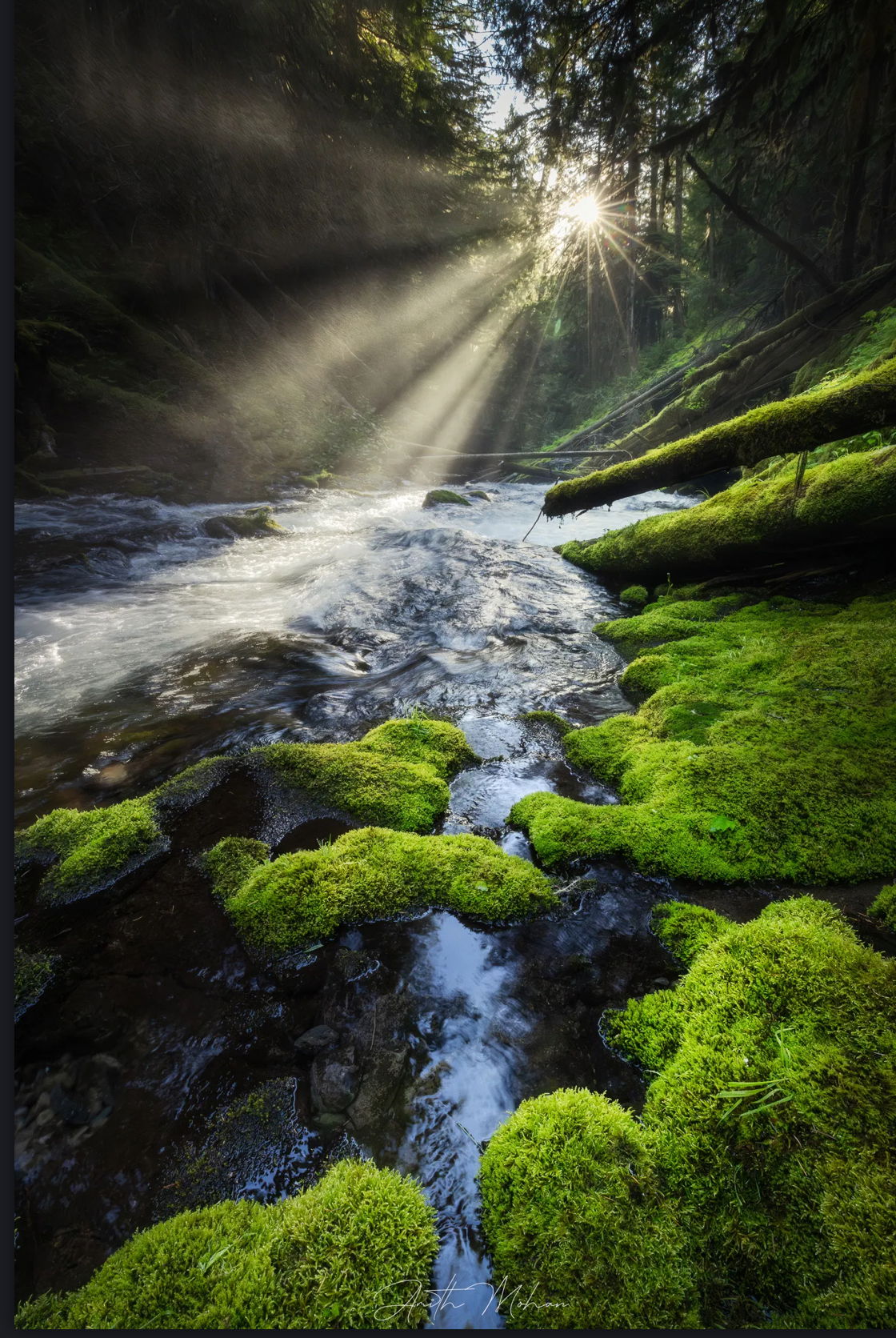
I really don’t have much in the way of nitpicks. My only suggestion really might be a slight crop off the top to remove the small patch of sky. Even that little crop still maintains the relationship between the sun star and light beams with the mossy-lined stream. Oh, great lead-in by the way.
Personal choice, but you might consider warming that “white light” beaming down. minor suggestion.
Thanks for sharing! A Beauty!
1 Like
I live in Oregon and certainly understand the allure of these locations. Regarding the greens, they don’t look to saturated to me. They are often naturally very saturated. There’s a place in the Columbia River Gorge I once described as “greener than the eyes can bear.”
I agree with Lon’s suggestion on a slight crop from
the top and offer this as one option. It puts a natural vignette around the origin of the sun star, and that works for me. I took the liberty of doing a quickie crop using the screenshot function on my phone.
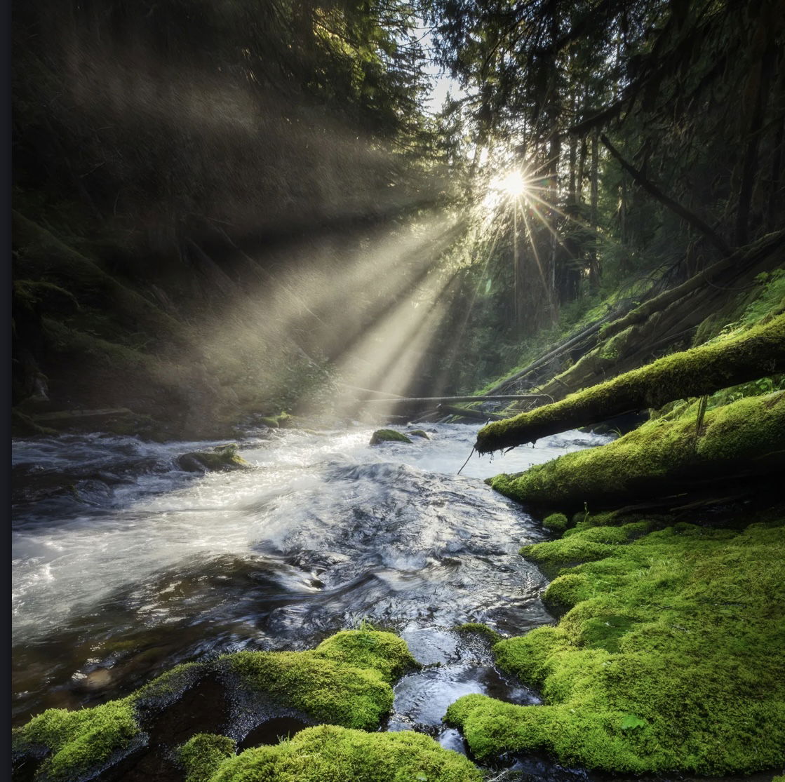
FWIW, I also see a possible square crop removing the leading line if water at the bottom. I find the combination of the sun star and the leading lines of water a bit overwhelming. They compete for my attention.
Of course, it’s your vision, and these are just efforts at simplification. And simplification might not be what you’re going for.
1 Like
I thought of a crop like Marilynn as well. One suggestion would be to add a half vignette that just works on the lower half. The way I’ve done is to create a duplicate of the image and vignette that duplicate. Then I merge the two and erase the upper half of the vignette with a brush. The reason for the suggestion is that it might draw the eye away from the bottom frame and encourage it to continue looking upwards towards the rays. I’m assuming that’s what want.
1 Like
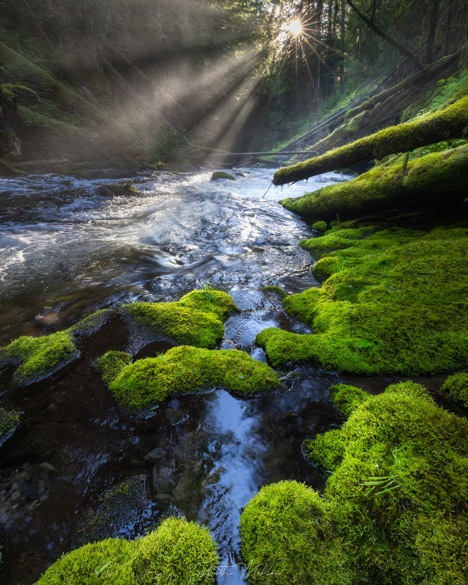
Thank you so much everyone. WOW, what a wealth of perspectives. Certainly caught some mistakes based on the feedback including the chromatic aberration, and darker shadows on the LHS. Here is a re-edited version of the picture and I think I really like the 4 by 5 as it also removes the distraction of the sky above.