The photographer is looking for generalized feedback about the aesthetic and technical qualities of their image.
Description
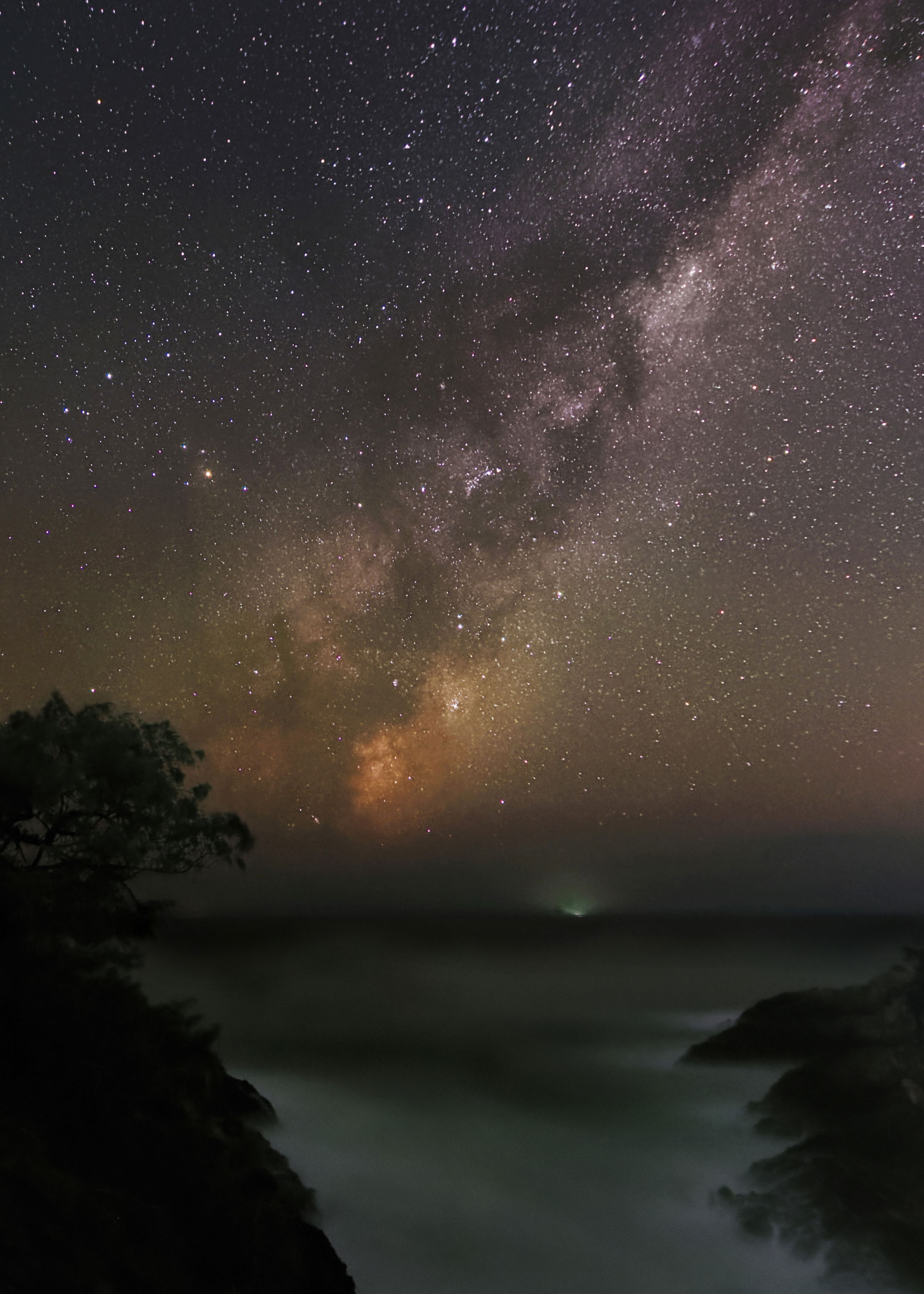
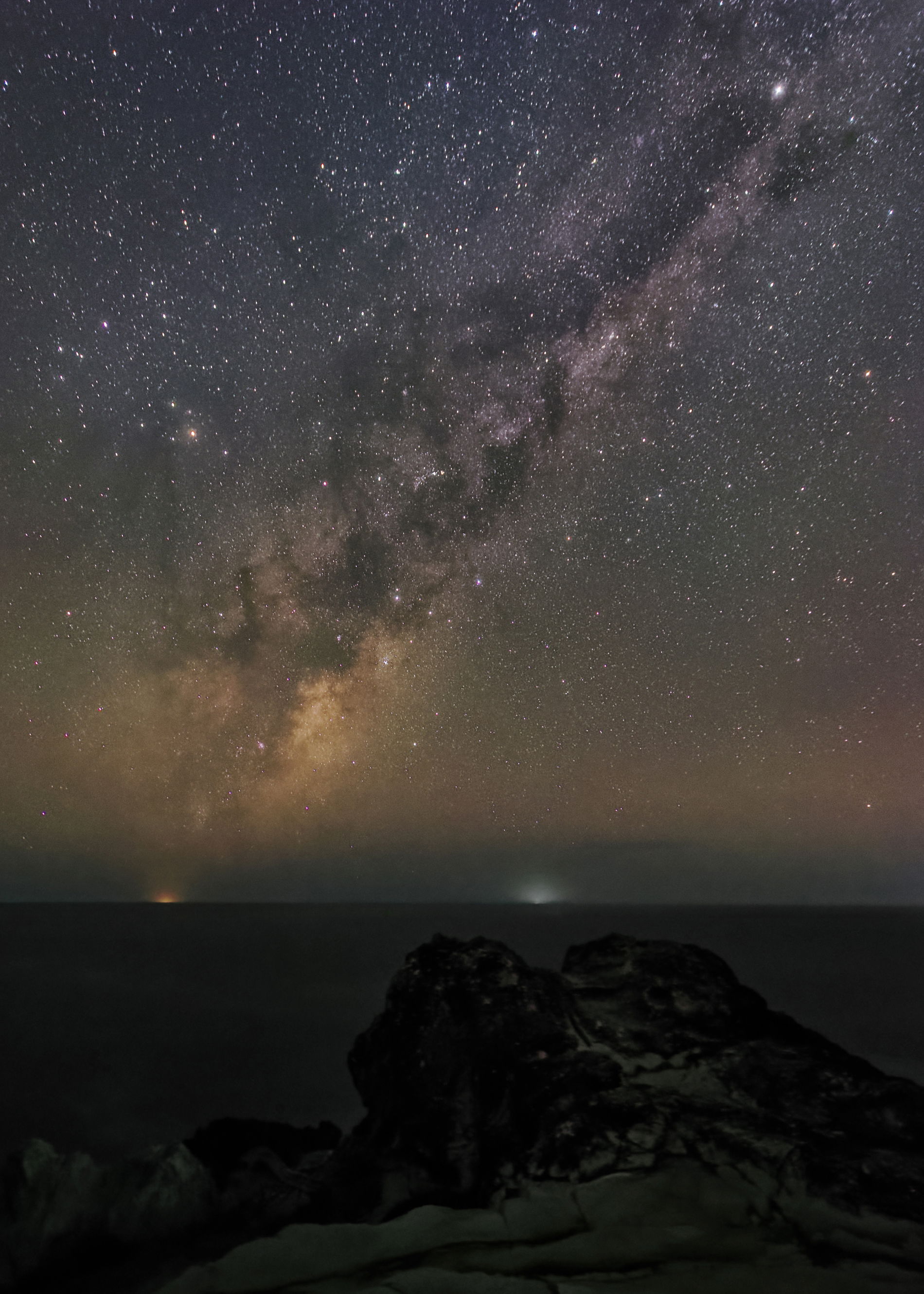
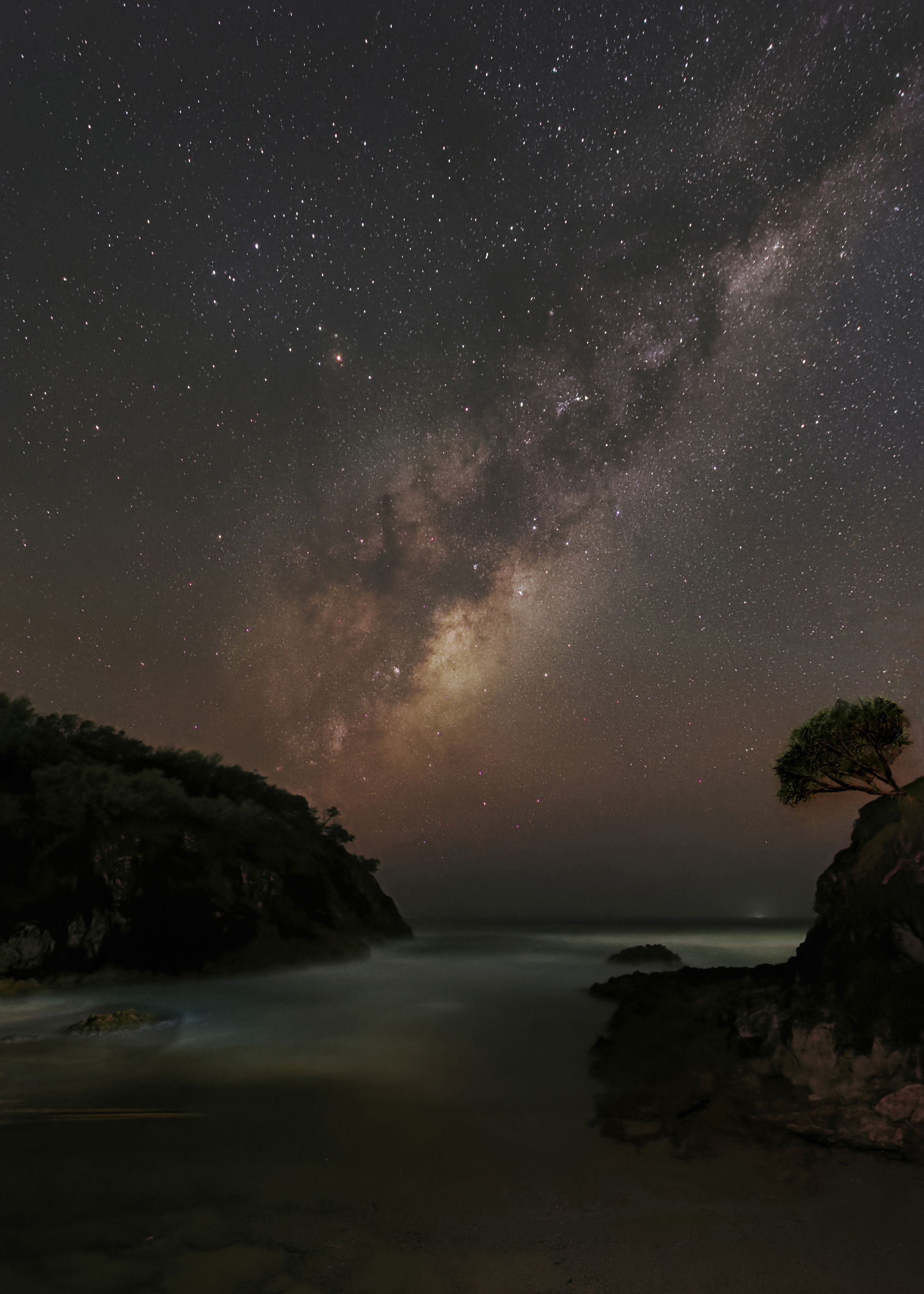
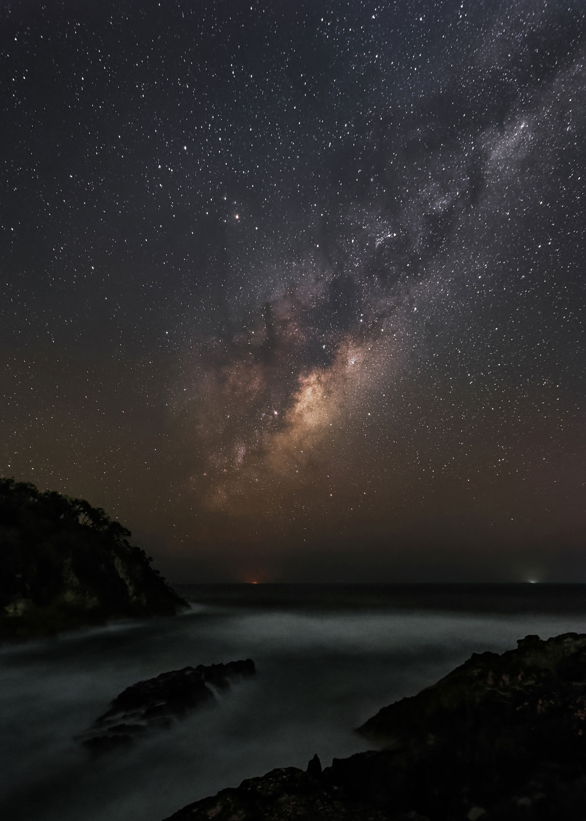
The four were taken the same night on North Stradbroke Island, comprising between 6 and 10 identical photos layered to reduce noise. Each photo was constructed twice, once for the ground plus sea and once for the sky. Some stars were removed by using noise - median and then sharpened. No colour saturation changes but I did use S curves to enhance the contrast from within the milky way to the bright areas. Some of the horizon lights were dimmed.
Specific Feedback
Do these photos work as a tetraptych? Is there anything in the composition I could improve?
Technical Details
Canon 90D with light pollution filter, 11mm F3.5, ISO 6400 and 12800, 11 seconds. Data is in the exif.
Critique Template
Use of the template is optional, but it can help spark ideas.
It is striking to see the Milky way from the southern hemisphere with Antares and Scorpio on the right side rather than on the left side as seen from the northern hemisphere. I am having a hard time seeing them as a tetraptych with them stacked vertically. Are not triptychs usually a single scene broken up into three parts? In any case you have dome fine work and congratulations on the EP.
Your comment re Antares and Scorpio on the Right side…, Indeed, I had a similar problem when in the Northern Hemisphere with Orion. I could not work out why it was upside down, till I realised I was upside down!
I think we have a traditional English problem tetraptych. I looked up tetraptych in various dictionaries and only one referred to my interpretation. It can indeed be four sliced sections of one piece of art or four related pictures separated by a white border. A better description would have been “a series of four photos”. I will use this going forward. My intention was a time related series - the Milky Way is slightly higher as the series continues. Each photo being from the overall area of North and South Gorge North Stradbroke Island, Qld Aus.
I do love seeing a southern perspective on the Milky Way! As far as composition goes, it’s perfect with the way you’ve aligned the core. I do think the two with trees could be moved a bit. One is a bit too close to the edge, and the other has the edge interesting the tree. My preference is for a bit of a lighter foreground, but yours certainly show it more the way our eyes might. Lovely images and I do think they’d look nice in chronological order across a wall.
Paul, agreed about the trees, however the extra space in both is just filled with pieces of more trees and becomes really messy. Framing to exclude them just did not seem to work for me, but is certainly worth considering when the milky way is in a different position. Thanks for your thoughts. @Paul_Holdorf