Can you let us know what this means? I sorted by Latest and that’s where it shows up. I thought it was indicating things I hadn’t opened yet, but it’s not consistent across those in the Latest view. If I use the dropdown for No Replies, it doesn’t appear. If I sort by Unread it doesn’t appear. I can keep trying stuff until I figure it out, but…a little help would be good if you know.
Ok, hovering on the dot shows New Topic, but if it doesn’t appear under that sort from the top, it seems odd. And it doesn’t show for every new topic. Hm. A time limit maybe?? Seems inconsistent.
Oh and I like the new reply counter in blue. Easier to see.
I’m puzzled about a choice of themes, dark and light, but haven’t found the icon. (I’m on a MacBook Pro with Safari – didn’t think to but will go try other browsers.) But my BG is a dark gray that I don’t notice as being different than before. (I don’t think I would care for white or very light gray.) If I go to Account there is still a Change Theme and it has Light, Dark and Auto. It was on Auto, and the Dark choice is darker. I’ll leave it there for now.
Hi Kris, that’s always been there, used to be yellow on the old theme. It just lets you know that this a new topic that you haven’t viewed yet. I’m honestly not sure why it doesn’t show on those other views, but that’s what it means on Latest.
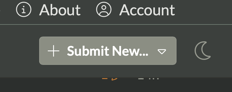
I would try clearing the cache in your browser Diane, you should see an icon here:
Clearing the cache didn’t give me the new icon – in Safari. (Everything up to date.) Maybe I need to restart the computer but can’t until I finish a project in PixInsight. I do have the icon with Chrome. Also very odd – after I cleared and came back in, this discussion went to one from years before that apparently had the same name. On about the third try this current discussion came up.
Now I see the old discussion – it isn’t the same name – it is the first one in the suggestions at the bottom of the new one – I can’t imagine how I clicked on it, as I clicked on the first item on the Discussions page.
Thanks for your suggestion. This is an excellent example of me not understanding how to navigate the site. I selected the link you suggested but I saw no way to bookmark the resulting location. In fact, I couldn’t figure out where to go to read the article? This is where I was taken when selected the link.
Hi George, I agree that mobile navigation is a bit confusing. I’ve changed the shortcuts at the bottom for better navigation. Close the app or refresh and you should see these new options: