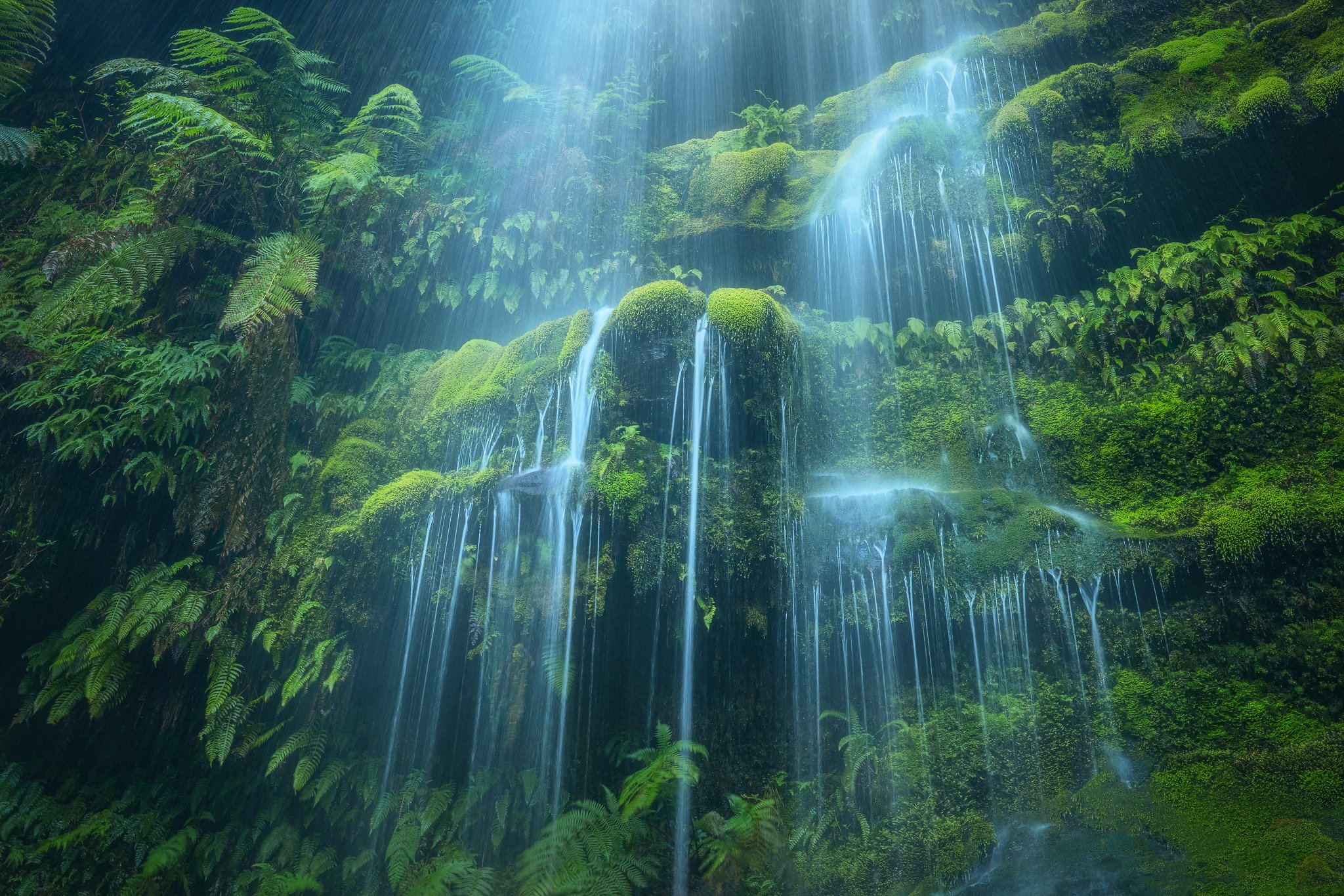
This small(ish) scene was a challenge to capture, with this water flowing much heavier than usual, which resulted in my lens quite quickly becoming covered in spray after each wipe.
Specific Feedback Requested
Are the colours sitting right?
Does the comp/crop create a sense of balance or does it need to be further fine-tuned?
Any elements that need to be cropped or cloned out?
Luminosity/contrast
Technical Details
The upper left section of water leapt out more than it appears here, which I burned down to match the right-hand side and help with a sense of balance. I went for a harmonious colour palette, which required bringing in blue and cyan to the shadows, as well as to the water highlights, as well as homogenising the green tones.
First of all, I love the title and the play on words! As for the image it is every bit as good as the title. I like the way that the water flows over the various tiers in the image and I also like how the water entering the top of the frame leaves a bit of mystery. As for the color, it feels like to me that there is a bit of a blue color cast. It might be worth experimenting with adding warmth in a color balance adjustment. One minor nit is that the composition feels a little tight in the top of the frame with the leaves of the vegetation in the upper right almost touching the top of the frame, but I’m not sure what is out of the frame. Overall I really like the composition and this this works very well.
I did lean the image towards blue as an editing choice. This is more because the day was overcast and there was no sunlight, which is really what introduces warmth to a landscape of cool tones. I did play around with it, and I found adding warmth to the water tended to just make it more grey, which wasn’t too appealing. I did try to bring in a little yellow to the foliage highlights, but perhaps that could be accentuated further for more colour depth.
The crop was also very fickle, so allowing more room up the top for those plants subsequently started bringing in some unwanted elements. Though I can’t quite remember what it was like, so perhaps I could dive back in and see if it looks okay to allow them some more breathing room.
The light is fantastic, really highlighting the water and some tiers of moss. I personally like the colors, with the cool cast, but that is just my opinion. It appears that this was taken as a horizontal image, but if possible I wonder what a vertical aspect ratio (4 x 5?) would look like? That would accentuate the flow of water but maybe that was not your vision for the image. One last thought is to consider dodging/burning to bring down the luminosity a bit along the top edge and a bit up in the central area–I find my eye being pulled a tad to the top.
Hey Dean, thanks for the kind words! I’m a sucker for a cool cast too, which is probably obvious from this image, haha.
I did certainly try this as a portrait, which was actually my intention before shooting this little drop (I’m not the first to photograph it). However, with the mentioned water flow on the upper left leaping out so much from the heavier rain, this was made even more intense when shooting in portrait and showing more of the water. I also really like the ridges on the right, which can only be showcased in landscape orientation.
I’ll play around with some dodging and burning as per your suggestion; I appreciate the input!
I have seen this blue and green treatment of waterfalls in the past and I absolutely love it. The slow shutter speed on the water make it look like light rays descending from heaven. So there is a real spiritual quality to this image. The blue cast is not natural looking but who cares. The question I have is the use of landscape mode for this subject. The dominant lines are all going up and down so why use the landscape aspect ratio and have little interest on either side. I would go with a square here.
Hey Ben! This is a really nice image, and your processing is excellent.
I somewhat disagree with the idea of a vertical crop here, just because the green on the sides in the horizontal serves as some really nice framing and context for the falls - an image that is “all falls” would be totally different, and I really enjoy the green. However, I think the right side doesn’t all need to be there because it’s quite a bit more homogenous than the left, making it feel almost “empty”. The falls are obviously the main subject, but that big fern in the upper-left is another very strong element that needs to feel a little more intentionally-placed. There’s also the fern in the upper-left corner that is slightly distracting, just because of the dark wedge between it and the biggest fern.
Given all that, I think a 4:3 or 5:4 horizontal crop, starting just to the right of that ULC fern and losing a good chunk of the right side, does a good job of making the fern and the falls feel more intentionally placed, and eliminates “empty” space. This requires re-vignetting the right side, as it becomes quite green and bright compared to the left edge.
The other big thing, the blue/cyan treatment of the water, is of course totally subjective. But I do think it’s taken a bit too far here, just in that it looks quite “edited” to me, rather than “cool/overcast”. I think a simple selective color layer with the cyan slider under color: cyans dropped -30% or so, does a great job of eliminating some of the manufactured feel, while still keeping the water blue and atmospheric.
Lastly, the left side of the water coming into the frame from the top feels a bit too glowy and featureless/bright to my taste, so I tried darkening some of the darker tones there (through darks 2) to bring slightly more texture in and make it look less like the lens was fogged or that white was dodged on there.
Hey Alex, thank you for the critique! All fantastic points.
I’m glad you’re on board with a landscape-oriented crop; it just didn’t quite work in portrait despite my best efforts.
Regarding your crop suggestion - I can’t fault any of the reasoning given there. My only thing is that I’d grown quite attached to the water being centred, and I also really enjoy those horizontal green ridges on the right. I’ll need to take some time away from the image so I can come back to it and look at the new framing more objectively. I’ll certainly be cropping in from the left to cut out that ULC fern and making the larger fern look more deliberately placed. If I can’t get past centring the water then I may just go with a 4x3 rather than a 5x4.
I was on the fence about how heavy I’d gone with the blue/cyan, so it’s good to know that it could be reeled in a bit. I’ll dial it back as you suggested to keep it more subtle but still retain the cool tones.
Great final suggestion about the upper left water there too; if I was to darken it down I wouldn’t have thought of lowering the darks to retain texture, and would have more likely just burned it down with a brush.
Thanks once again for the constructive and helpful feedback!
Glad to help, Ben! About the upper-left water: at first I tried darkening it, but then the water looked unnaturally dim. So a trick in that situation is to move down the midtones contained within to change the apparent brightness of the whole area, and leave the brighter highlights mostly intact, so it doesn’t all turn dingy gray.
Regarding the crop: something I didn’t articulate before, but was probably subconsciously aware of, is the fact that the falls appear to be “facing” left due to your perspective being off to the right, and all the “shelves” of green backdrop are tilted up on the right as a result. It kind of clues me into the fact that you were “pointing left” relative to your position in front of the falls, regardless of how much space you left on either side. That’s part of why I felt there needs to be less room on the right - because my attention is immediately on the falls, and then I look left because they’re facing that way. Cropping in closer on the right helps push me to the left naturally, instead of having a sort of “separate” extra area in the opposite direction the falls seem to send me. That said, I think a 4x3 works too.
That is a beautiful shot Benjamin. I think what I like best about it is the way the long exposure draws out the horizontal lines of the water and contrasts them with the horizontal bands of green.
I’ll certainly give that technique a shot, thanks for the pointer!
You’re absolutely right about facing slightly left. I would have loved to get straight in front, however this was made impossible/too risky due to a steep slippery rock section that I was already toeing the line of to get this particular angle. It certainly makes sense as a good case to push the crop further to the left to keep the framing naturally in line with where the perspective pushes the eye. I’ll give it some time and see what my brain likes after a bit of a break from looking at it, haha.
@John_Williams cheers John! It absolutely is a wonderful little grotto. Ironically this is off to the side of a tall and grand waterfall with tumbling cascades (which I also photographed), that tends to steal the attention from this gem hidden behind a section of trees.
Beautiful, graceful and just downright gorgeous scene and capture.
Great discussion and suggestions. I like Alex’s edit for the most part. agree on the left side crop eliminating the errant fern in the ULC (crop is better than clone in this case - you don’t want an empty black corner there.) My personal choice would be to “shave” off the right, but all personal preference and I wouldn’t crop as far. I think Alex nails the colors.
The awesome news is that you’ve got a wonderful base to work with - and the bottom line? You get the make the final call on what you think best fits your vision and wishes.
Might try a faint vignette as well? Just a thought.
I think I tend to agree on not cropping off too much of the right side (though I usually do love a 5x4 crop); I was really going for a centred water composition, so may stick with that while shaving off the right side and that upper fern in the corner.
This is a wonderful image Benjamin. I agree with the recommendations made on the thread and I’m sure with all the editing that you will do, it will only transform the image to the next level.