REWORK
ORIGINAL

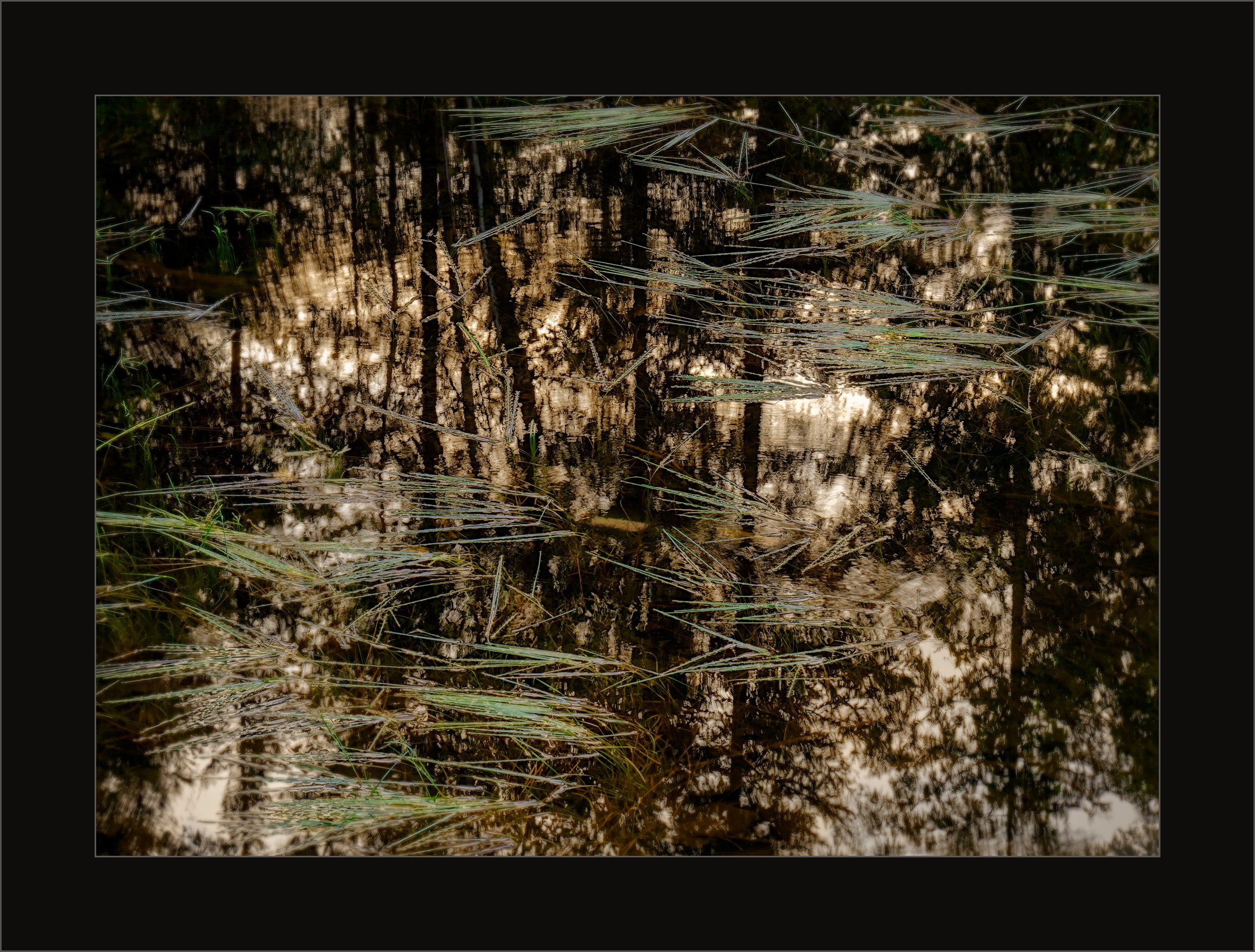
In terms of feedback my needs around this one are pretty straightforward. Do you find this image a) mysteriously evocative , or b) chaotically unreadable? Inquiring minds want to know ![]()
REWORK
ORIGINAL
In terms of feedback my needs around this one are pretty straightforward. Do you find this image a) mysteriously evocative , or b) chaotically unreadable? Inquiring minds want to know ![]()
I find it to be quite curious, Kerry. It makes me want to know more, explore more about the image. . in a good way.
I like it a lot, so chosing between your presented options I chose a). It could be guessed that adding the green grass to the tree reflections would make the image more chaotic, but infact I think it is the opposite. The horizontal lines of grass, with its more overall diagonal apperance help the image to become more calm.
I love this one. I don’t really see it as either of those two things though. I know what it is, and I like it. My only nitpick (you didn’t ask but I’m going to say it anyways) is that the bottom right lacks the needles and I keep looking there for them… and the colors feel a little off to me, but I am not able to put a finger on how. Hope this helps (or totally disregard it). =)
@linda_mellor , @Ola_Jovall - Thank you both for your comments, much appreciated. I agree, Ola. When I’m on a river and see this sort of thing, where the grass is growing up from the bottom and lying on the surface, it always makes me think of water nymphs whose hair is luxuriantly and gently being pulled by the current - calming.
@Matt_Payne - thanks for your thoughts Matt. If you scroll up you’ll see some minor changes that I hope address your recommendations. I too felt a little uncomfortable with the colour and, like you, had trouble putting my finger on it. I think, however, it might be the grass, particularly in the upper right quadrant, which had too much blue and cyan. With great difficulty I tried to isolate the problem by seriously pulling back the cyan and blue, pushing the green a hair and lifting the yellows. It’s not a huge deal but I think it makes enough of a difference to make a difference. As to the lack of grasses in the lower right quadrant, well nature ain’t perfect but then I thought maybe the issue could be partly addressed by toning the brightness down a bit down there by painting in a bit of the sepia brown into the highlights. Again, a small change but maybe enough to draw less attention . Let me know if some of your “discomforts” have been addressed, particularly the colour thing.
Kerry, the rework…works! ![]()
I like your rework Kerry. The grasses form some wonderful horizontal lines that are set against a wonderful reflection that contains vertical lines from the trees.
The rework makes the image even better.
Oh, my kind of image. The change in green tones in the rework is super. Perhaps bringing up the shadows in the ULC would better balance the lighter LRC; that might address the “lack” of grasses in the LRC by making the ULC of similar tonality.
I’m going to be honest - I can’t really tell a difference at first glance. I kind of liked the cyan/green in the needles, but the orange hue of the reflection felt muted or something. I really can’t put my finger on it!!! ARGH. Sorry I can’t be more helpful there.
Edit - I did pull them up full screen and now I can see it. Looks better for sure. Still not there for me though!
I like the rework version. The changes are so subtle but I think it makes the contrast between the green and sepia colors more apparent. Also, I like the clear llr corner balanced against the dark ulc. Nice work!
Love this Kerry! Great vision here and beautifully captured.
The repost is a distinct improvement - which is amazing because it really seems like the change was so small - yet the results so different. The extra luminosity in the grass helps separate from the reflection just enough to be noticed.
To your question, it’s neither mysteriously evocative nor unreadable for me. It’s fairly clear what this is an image of, but what stands out is how you’ve isolated this - no shoreline, no other elements to ground this - which, ok, I take it back, does add a bit of mystery here.
Not sure if this is a suggestion or observation, but have you considered tweaking the color balance? Upon opening the larger views, my general impression was this was quite warm. Which isn’t a bad thing, just an observation.
Again, beautifully seen.
Lon