Trillium Lake and Mt. Hood: A Sunset in 3 Variations (+revised)

Revised Version

Revision 1 (latest)
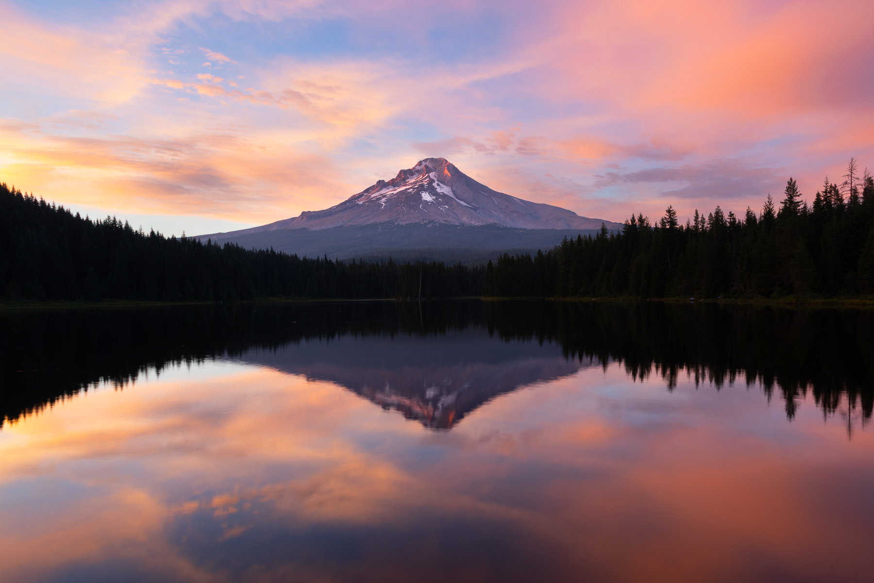
What changed: I added a bit of saturation (I hadn’t increased global saturation at all!!) and cropped off some of the right hand side, moving the mountain closer to dead center. I’m debating whether the shoreline activity (boats and shirts) are now more distracting, and now I feel like it needs a tiny clockwise rotation.

Added after receiving feedback from the community.


Original Version
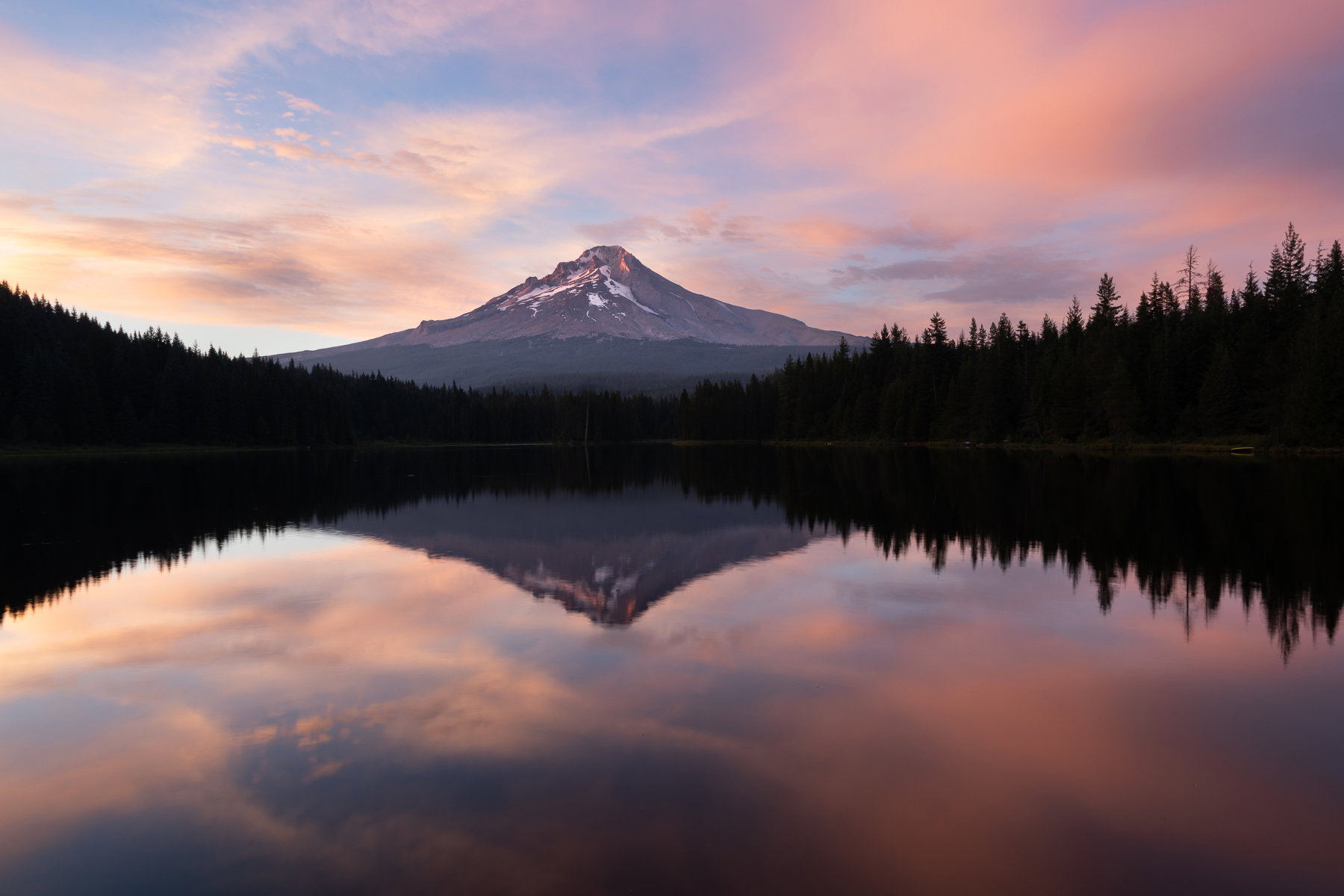
Variation 1
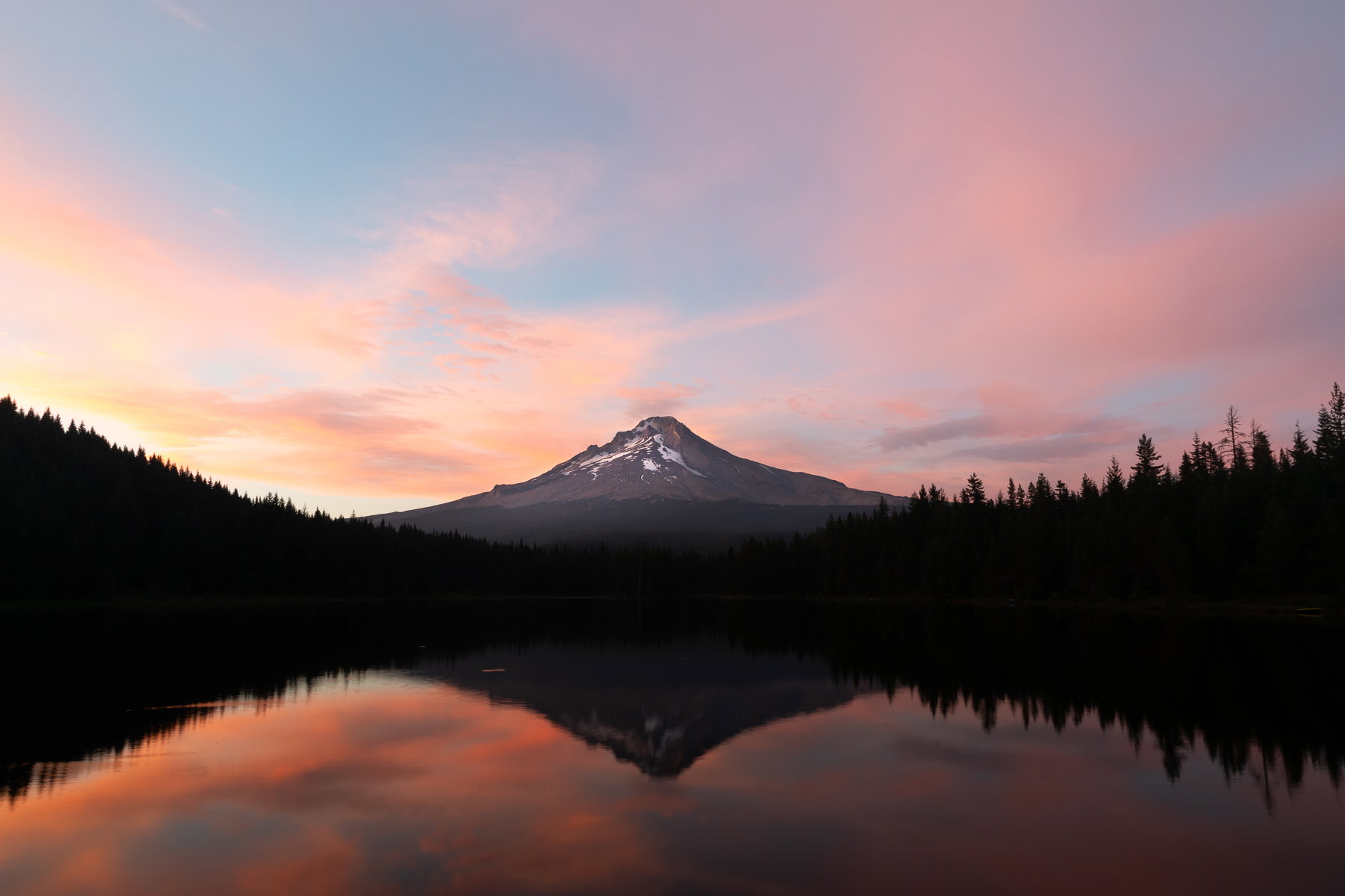
Variation 2
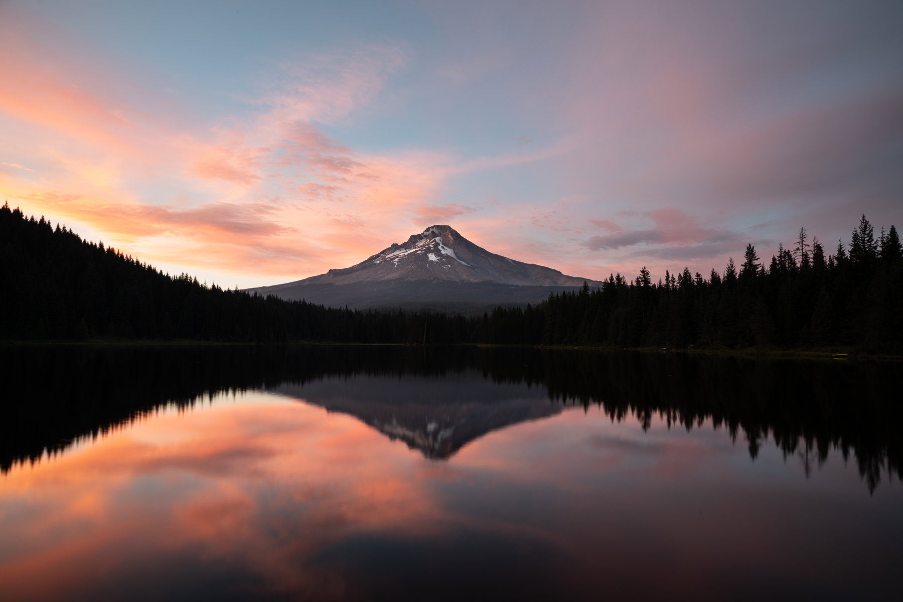
Variation 3

Critique Style: Standard

The photographer is looking for thoughtful feedback on the image as a whole, especially around the areas noted below.

Feedback Focus: Artistic / Expressive

About This Image

This was best sunset of my three evenings camping at Trillium Lake. The other nights were either breezier or the cloud formations were less pleasing (though I might still share one of those). I have shots with some foreground interest (grasses, rocks, a stump, etc.) but my favorites were these from the fishing dock.

Feedback Requested

I like all three of these, for different reasons. I think from a viewer’s perspective the first is probably the best? I’m not sure. I think the lack of water distractions (bugs, fish, poor things just living their lives and I remove them in some pictures) and the amount of light on the mountain’s west side glaciers make it a better image.

The other two have slight variations in vertical and horizontal placement of the mountain, amount of water disturbance, and of course darkness, though I believe I exaggerated it a bit.

My questions are the following:

  1. Which one do you prefer and why?
  2. I remember hearing about leveling using reflections, and I struggled to do that with this. I’m not sure why I couldn’t feel comfortable getting a reflection in line with a tree at the edge. Does angle of light or curve of a lakeshore affect that concept?

As usual, any and all feedback is welcome. I haven’t done much in the realm of “grand-ish landscape” or sunset work in recent years, and I find the process of culling for the best images really difficult and ultimately, perhaps, a bit random. There’s also a part of me that’s like: “Ho hum, another sunset from Trillium Lake,” but I don’t want to avoid icons that I like just because they are popular. I enjoyed shooting this and like looking at these images regardless.

Technical Details

Canon 5DIV with 24-105mm lens at 24mm for all three images
ISO 100, f/16 for all three with shutter speed .8, .6, and 2.5 seconds respectively
7 minutes between the first and third image (8:24 pm to 8:31 pm)
1 Like

Marylynne, I like the first one best, as you predicted. The light seems most believable in that one. I’d be inclined to darken the sky and the water a bit.

I hadn’t heard about levelling with reflections here but I’ve done it often. I tried it here but when I levelled the trees, the peak wasn’t level. One possibility with a 24mm lens is that you got some distortion which prevents things from lining up exactly. The image seems acceptably level to me, though.

Marylynne, separately each of them is fine but if I have to compare all three the first is my choice. Both the sky and the water are moderately saturated. However what I noticed first as a big difference between these images is the light on the mountain top, it’s wonderful in Variation 1. I don’t see any issues about levelling.

I like variation 1 for the great light on the mountain top and the definition in the clouds. I am a contrarian. Everyone else seems to like fuzzy clouds. I like a little sharpness in them. I do like the more centered composition of 2 and 3. I feel being just a tiny bit off center in the 1st seems to make it look more like a mistake. It would look more deliberate if it was further off center. JMHO. I’m not quite sure I know what yoiu mean by leveling by reflection.

I wondered about that left-to-right off-center element. Easy fix.

Regarding the leveling by reflection, I think someone (maybe @Lon_Overacker or @Mark_Seaver ) has noted that when you have a reflection, you can test leveling the “horizon” ( in this case the lake shore) by seeing whether an element above the water is perfectly vertical above its own reflection.

I struggled to do that with the trees here, especially on the right side. I believe I did lens correction on this, but I admit I do like the distortion and subtle vignette of this lens when not corrected. I might have manually dialed in a percentage of correction at some point. I’ll double check that.
ML

Marylynne, I prefer #1 because it feels significantly more dynamic that the other two. The eye movement along the lake does a fine job of leading by to the peak and that lovely sky. As to levelling using a reflection. In principle a tree and it’s reflection must be vertically aligned. However, in practice it’s not nearly that simple. First, it’s rare (and I’ve tried over and over) to have enough resolution to identify a specific spot on the tree and in it’s reflection. Most of the time, there aren’t enough pixels to be totally accurate in that choice and being off by only a few pixels can give you a notable angle if the spacing between the two spots is a long ways apart. Secondly, (and it’s true here) wave motion in the water distorts the reflection so that it’s impossible to find a specific spot in the reflection. Thus, the idea has value if the reflection is notably angled relative to it’s source, but for finding a difference of a degrees or two, it’s not likely to work. In a view like this, it’s also not possible to use the shoreline, because that shoreline is not oriented perpendicular to the camera, meaning that the shoreline MUST be angled relative to the bottom of the frame (as required by the rules of translating 3D views into 2D).

In #2, the reflections on the right do look to be signifantly tilted and off line, so I’d suspect lens distortion.

I like the first shot. To me the shot is about the calm, serene environment and getting the light throughout the smooth lake is essential to your message. What you have done with leveling seems fine, as I don’t get any distraction from what you have done. I hate overly done saturation, but you might want to try a bit more. I think you could do that and the shot would still look natural. Well taken.

Thanks @Don_Peters , @steve12 , @Mark_Seaver , @Michael_Lowe , and @JacekZielinski. I appreciate the feedback and the info on leveling. I’m about to post a revision with a tish more saturation and a more centered composition.

ML

1 Like

The original poster added a revised version of their image.

I like your revision. I don’t feel the boats are a distraction at least on my monitor since the shorelines are so dark. The CW rotation is a tough call. Since the shorelines are not perpendicular to the camera, there’s not much horizon/shoreline to level to. What is visible does look like it needs a slight rotation, but then that might make the cw rotation seem worse because of the right shoreline. I think I would leave it alone. JMHO

1 Like

Your revision is great. I like that image best because it include a large portion of the reflection, which is very beautiful and important for the image.

There is no need for any additional FG interest (grasses, rocks) since the reflection more than well does the job.

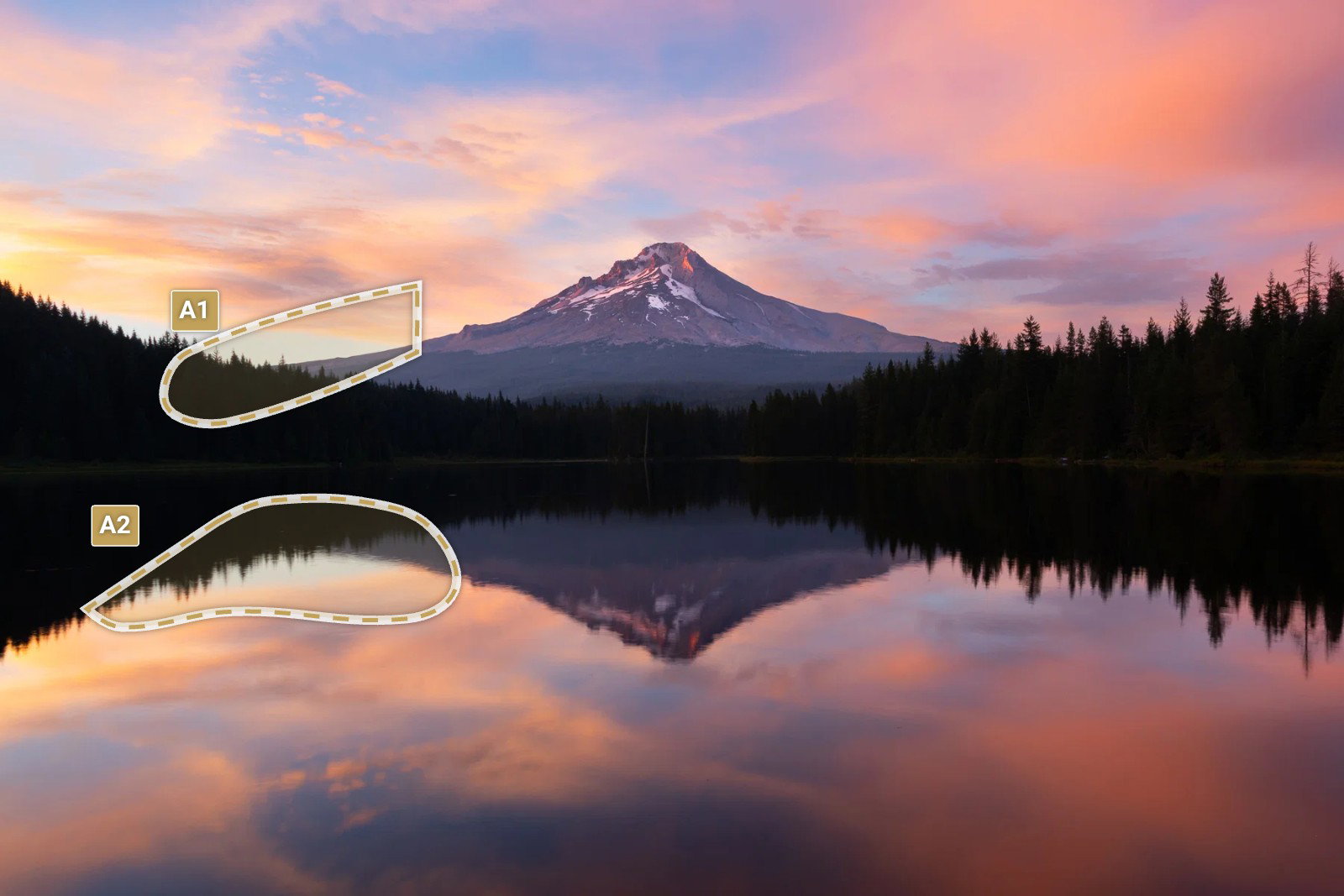
When you icreased the saturation, a small part of sky (and its reflection) draw a little bit to much of my attention. See the visual notes.

Visual Notes for Revision 1

[A1] See text

[A2] See text

1 Like

I do think your revision turns this from a ho-hum (though I’ve never seen a shot of this mountain) to a stunner: the symmetry, the stronger light on the summit rocks and the enhanced reflection colors all give it that extra boost.. Shoreline activity almost unnoticeable. Brilliant!

1 Like

Hi Marylynne,

The original version is my favorite as well. It has this wonderful symmetry about it that I find serene and inviting. I am also loving that small sliver of warm light toward the peak of Mt Hood; almost like a last kiss before the sun sets. I will say that I like the crop on Revision 1 the best, but IMO the reds are just a touch to saturated. Just my opinion of course as some folks prefer more saturation. As far as the horizon it looks just fine to me. there is nothing wrong with shooting the icons. I say if you enjoy them and looking at the finished product, by all means keep on doing it. Looks like a great way to end the day as this is beautifully done.

Thanks, Ola. I got it on my end!
ML

Hi Marylynne, I personally prefer the latest revision of this. The added punch feels realistic to the scene, whereas the original still had a bit of a flat feeling to it. One nitpick I always have with these types of shots is when the photographer keeps the reflection the same exact brightness as the sky, which is unrealistic. The water should always be at least a 1/3-1/2 stop darker than the sky. Yours looks like it’s in that 1/3 stop range, so all good there!

Thanks Zach. I used a mask to darken the sky as it was a bit brighter, but I tried to preserve that difference.
ML