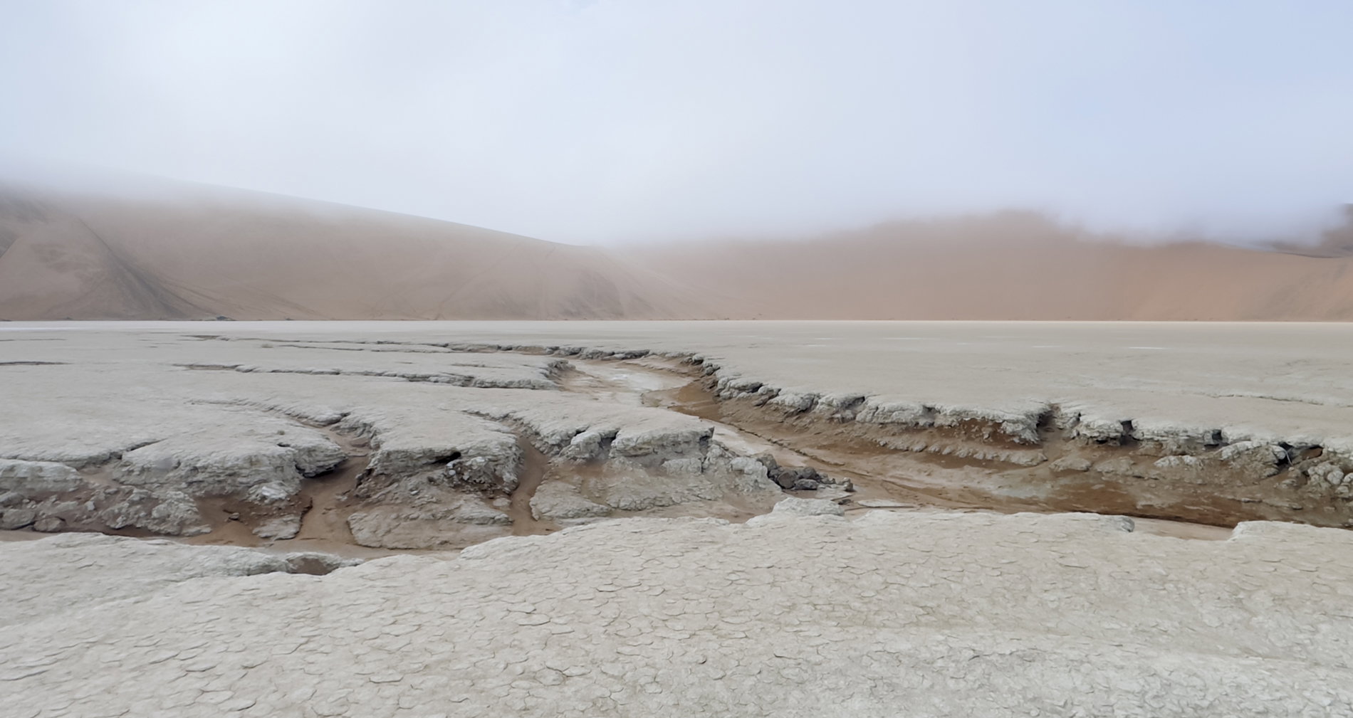
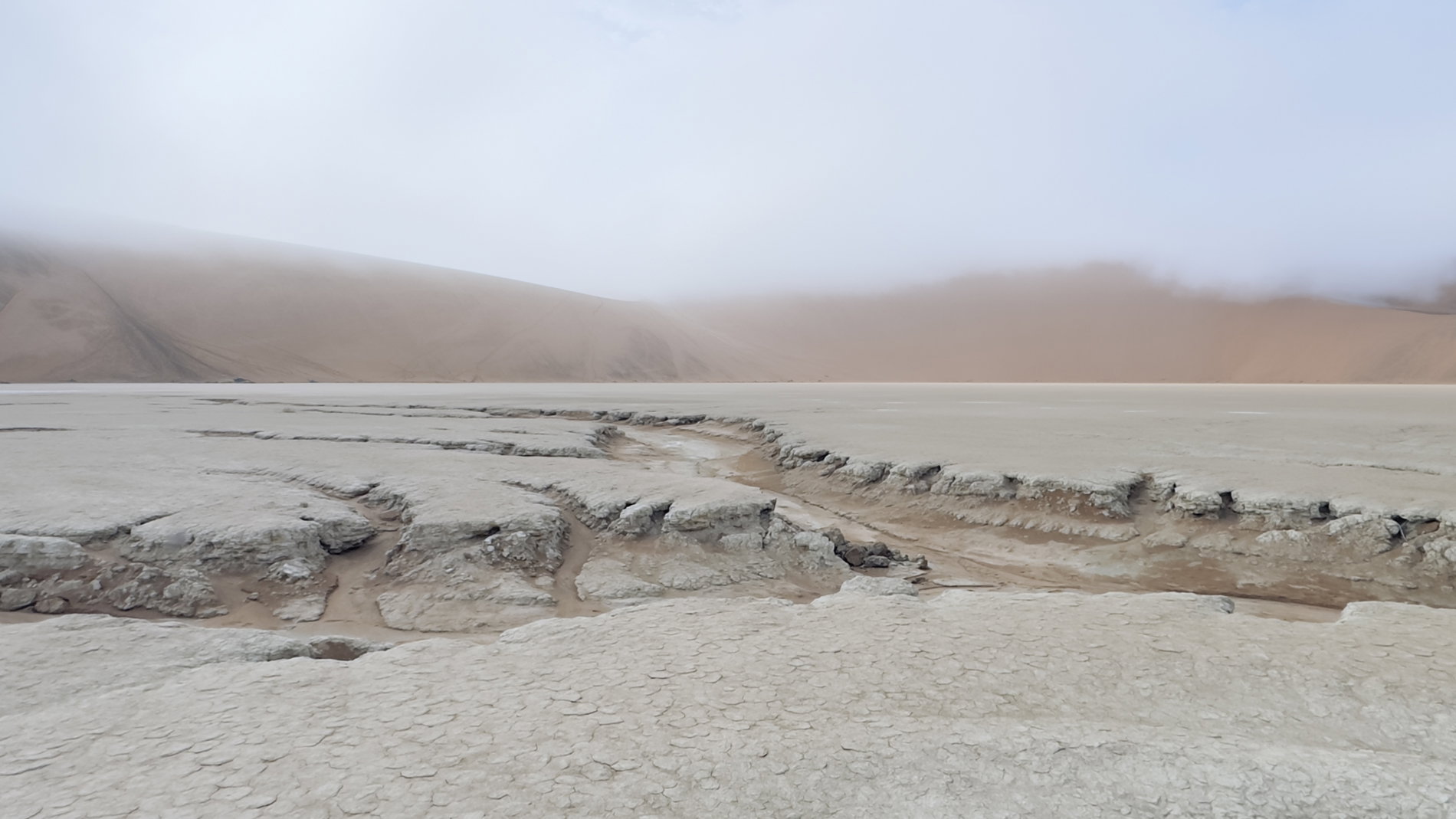
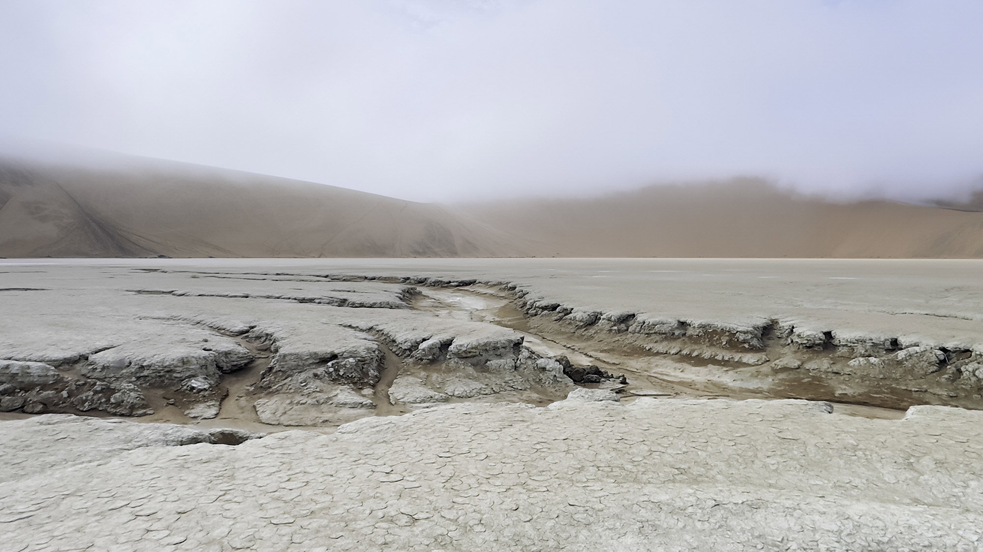
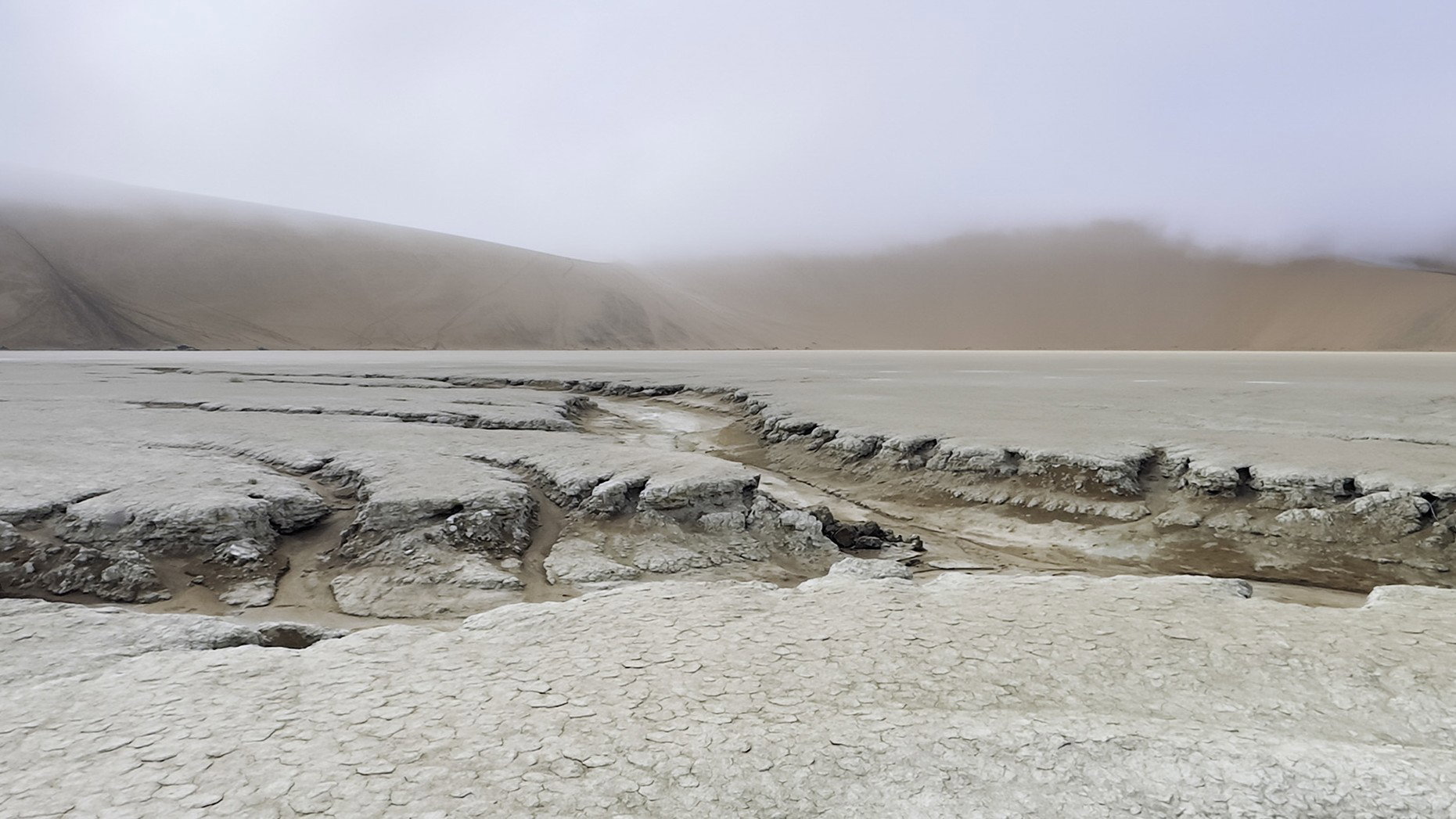
What changed: I cropped a little off the sky, I lightened the foreground and I darkened the trench. I want to keep the color of the salt pan and dirt as close to the color as I first saw it as possible. The salt pan is quite white and the mud is quite red.
Added after receiving feedback from the community.
The photographer is looking for thoughtful feedback on the image as a whole, especially around the areas noted below.
Feedback Focus: Artistic / Expressive
About This Image
This photo was taken earlier this year in Deadvlei Namibia. It had rained several days before and there was evidence in the salt pan of where the water had eroded a path to a low point in the pan.
Feedback Requested
I was uncertain about my crop, did I leave too much sky or salt pan?
Alice, I really like the ghostly feel of this. The subtle color works very well here.
I think you might look at cropping some of the sky. You might also experiment with doing a little judicious burning of the erosion channel to give it more presence.
Other than that, I think this quite nice and tells an interesting story.
-p
This really caught my eye from the thumbnail as I was scrolling. I think the relative proportions of the elements in the frame work. The +/- equal proportions of the foreground salt pan and the sky frame the gully and the background mountains well. Although you didn’t ask about other things, I could see lightening the foreground a bit to make it more visually equal to the sky, thereby enhancing the frame-in-a-frame aspect. I agree with Preston, also, on burning the darks (and maybe bringing up the lights) in the gully to emphasize it. Here’s my idea:
This is wonderful, Alice. I really like the lines and the subtle color differences. I like Bonnie’s boost of contrast in those lines. I think a slight crop of sky might be interesting to consider? Not a ton, but just a tish to help us explore the intricacies of that foreground.
Here’s a crop of Bonnie’s version, just for an example. When I crop in windows, there are sometimes some color shifts. Those are not intentional on my part.