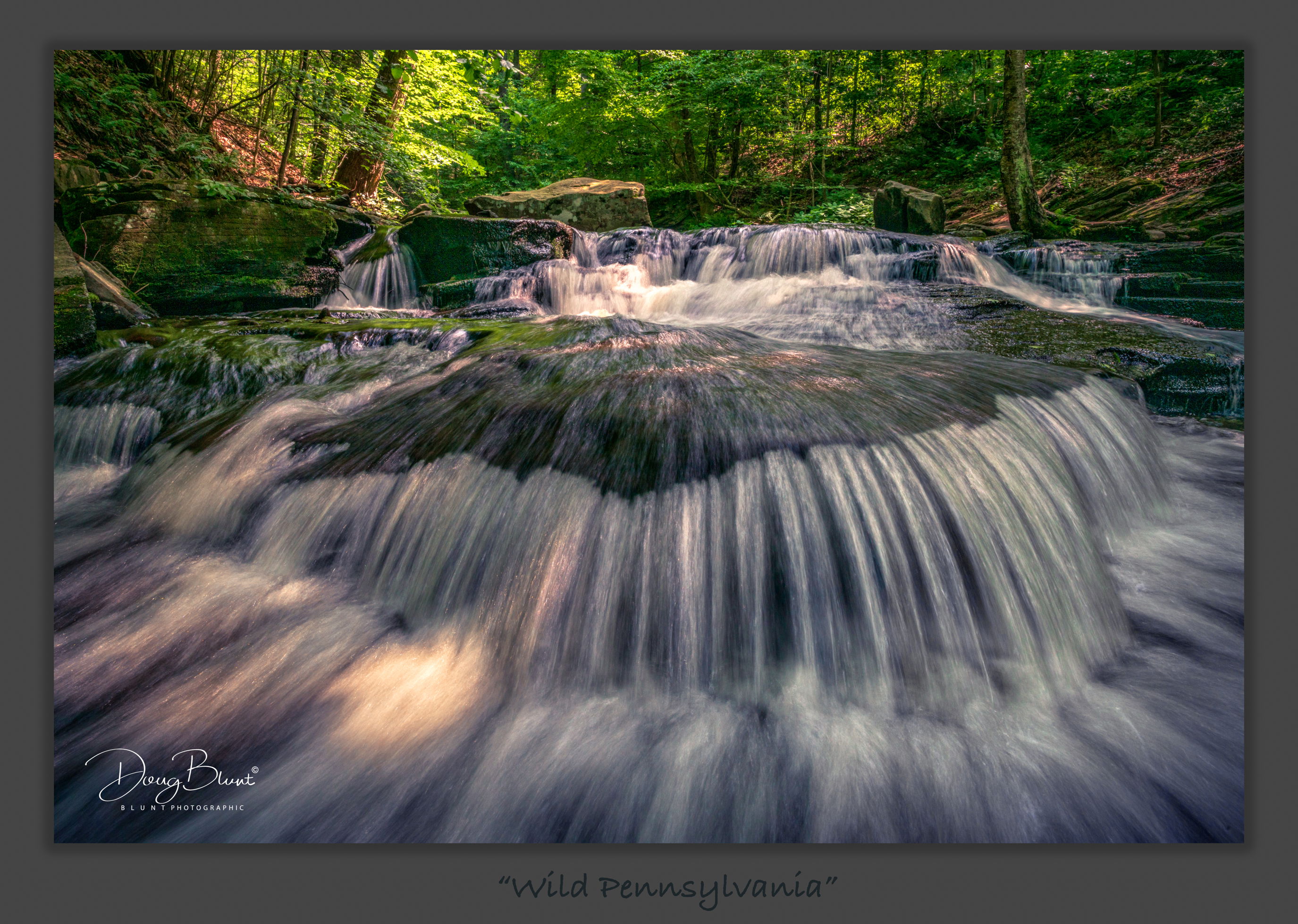
There’s what might be construed as a “hot spot” in the center of the frame (water)…but it actually was ok on the histogram. Just wondering how distracting it is…because when I toned it down, I didn’t like it nearly as much?
What artistic feedback would you like if any?
Is the overall image too dark…?
Pertinent technical details or techniques:
(If this is a composite, etc. please be honest with your techniques to help others learn)
Sony A7R4, Canon 24-70mm @ 24mm, 1/10 sec @ f/22, ISO 500
If you would like your image to be eligible for a feature on the NPN Instagram (@NaturePhotoNet), add the tag ‘ig’ and leave your Instagram username below.
dougbluntphotos
You may only download this image to demonstrate post-processing techniques.
Ah, I know this location well. 99 % of people would walk right by this spot. It’s rather small and ordinary until you get down low and put the camera close to the rock. I would probably tone down the hotspot if you’re talking about the area behind the rock. I would also take some blue out of the water.
I love the composition, and low angle of view that puts the water right in your face. It makes the viewer feel like they are in the stream. And the highlights in the trees are a really nice touch. The processing of color, contrast, exposure looks great.
I do have an issue with the hot spot, my eye just keeps getting drawn there. I downloaded this image and cloned it away (rather than darkening it), and to my eye the image was improved. This gets fairly subjective on my part, but the image feels like it is over-sharpened in the water with too much texture. The background trees look okay, but the water feels a bit crispy to me.
Love the scene - very strong composition; I love how you’ve filled the frame with this very cool cascade. I also think the compositional balance is just right, including just enough of the surrounding environs and greenery.
I agree with Ed that this looks/feels a little crunchy. Part of that could be the effect of the water motion and shutter speed (motion is just right btw,) but somehow globally it feels just a tad crunchy.
As far as the hotspot, I’m unclear if we’re talking above the cascade near the middle of the frame, or the sunlit spot just above and right of your signature? In either case, neither bother me - AND both can be addressed fairly easily. I really like the sunlit spot on the bottom. I do think you could “paint in” just a wee bit of texture to override/cover the brightest center area that’s lost detail. The hot areas in the cascade above are frankly pretty small and at least for me not an image killer. You could try and mitigate if you have desires of printing this one - which btw would make a great print after some tweaks and adjustments.
I agree with the others on the comp. It’s a very immersive framing.
I also agree with Ed and Lon and that the foreground water looks to sharp or has too much clarity. I personally would de-saturate some of the magenta and blue colour in the shadowed water in the foreground.
Very nice composition Doug, it is very dynamic. I would agree with others that the hotspots are very distracting and I would clone them out personally. An even bigger issue to my eye is the amount of magenta in the image, this needs to be toned down considerably. I did a quick hack job to show where I would go, it still needs work but gives you an idea. I also desaturated the most saturated colors to tone down the greens as well. With a little bit of color work this will be a very fine image.
Thank you all! I did lean on the Lightroom texture slider a tad when I was finishing…and I can see why folks would feel that it’s too crunchy for water. A creative experiment. The magenta part was a little more difficult…because the rocks are red in Rickett’s and give a natural magenta undertone. I could have worked it out, but to stay true to what I saw, it’s an honest rendition. Always creative decisions to make, and it can go so many ways…but I appreciate the insights from you guys!