Please share your first response before reading the hidden notes below. The photographer is looking for an unbiased initial impression.
Feedback Focus: Artistic / Expressive
Questions for Viewers
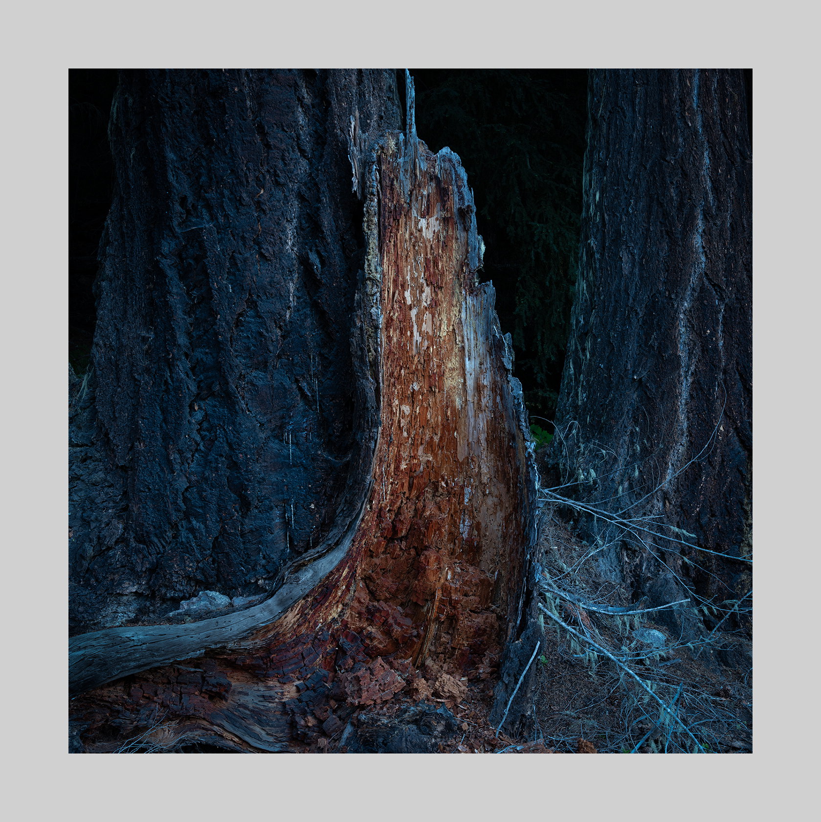
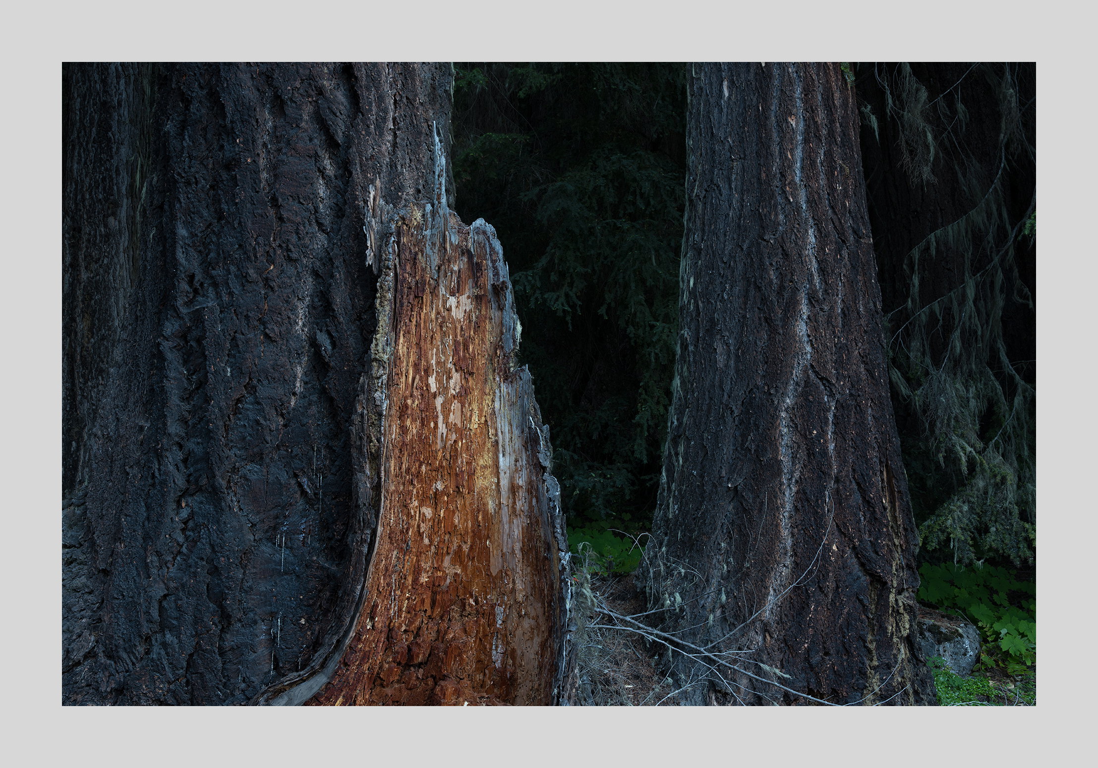
Do you prefer version A or version B?
I’m wondering whether the mood or feeling I was aiming for comes through.
I’d appreciate feedback on the composition — whether the balance, framing, or spacing is working.
Do you feel this is the correct amount of darkness or should the exposure be changed, made higher to reveal more.
I’m curious whether anything pulls attention away from what I want to be the focus.
About This Image
This was shot on the way to Hurricane Ridge. I was driving up to catch the last light at the top when I noticed this stump by the side of the highway. After setting up I decided to make the stump look almost like a beacon in the darkness. I’ve had a very hard time conveying this as a print but I think it does pretty well on the monitor where light comes through.
This is really good.
As soon as I saw it as a thumbnail, I immediately thought of your name and assumed straight away that the dark background was intentional and not a mistake.
I don’t think there’s any reasonable doubt as to what you wanted to show and highlight in this image, including the associated themes of resilience, recovery and hope.
As for the second point, I think the bottom left corner could actually be a bit quieter…
Primordial for sure and it’s pretty clear what attracted you and what you’re showcasing here. Can’t top what João so elequently wrote, but I’ll try.
The darkness is more than appropriate and creates such a mood - um, such a primordial mood. After reflecting on this for a bit, another thing came to mind and this exposed inside bark reminds me so much of a geode… those rock gems. Hey, given enough time, this gem could turn into a petrified rock.
There isn’t really anything significant that pulls the eye away. I suppose one might point to the bushel of small sticks in the LR, but right away I feel like they’re actually a very positive and important element. Get’s right to my Axiom #1, If you’re going to include something, include it on purpose. And that LR corner has purpose.
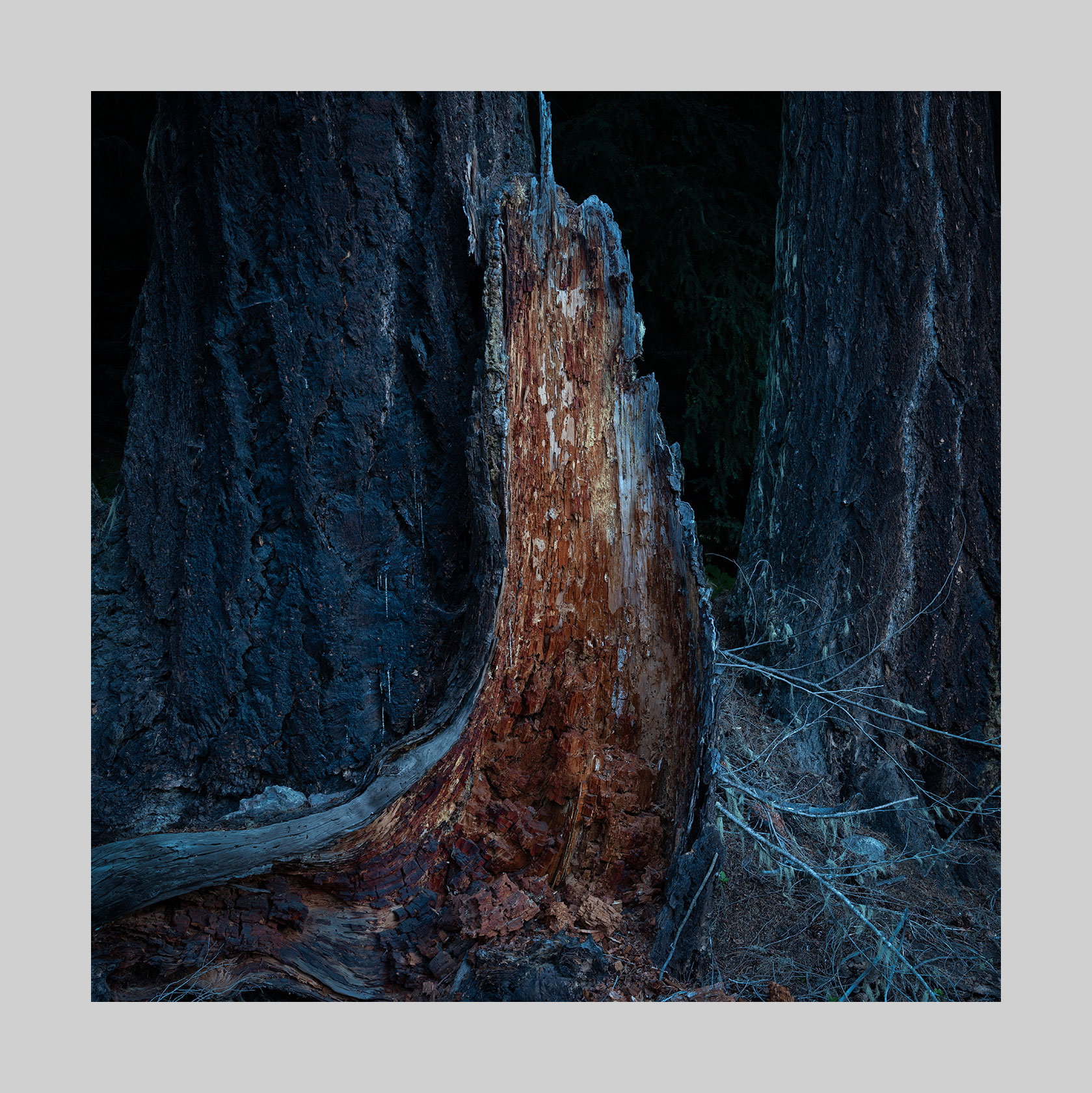
Having said that, it leads to my only suggestion(s) really. Now these are picky suggestions that anyone looking at the big picture would probably never consider. But a pixel-peeper attempting to always make an image the best it can be, I’ll offer these minor tweaks. There’s a long stick on the right base of the main stump. Rather than go all in AI, I just selected and burned and desaturated a tad. There’s also the green tip of a fern? at the bottom of the “V” formed between the stump and the right trunk. Very minor, but I also burned and desaturated the greens there. Lastly, and this may be photographer’s choice, but those said little bunch of sticks in the LR are a bit cyan. Now I say that knowing full well that the overall color balance sways that way, I’m assuming with intent. But for me, the very bottom LR of those brances are a bit strong with the color.
All minor tweaks and most would be hard pressed to see the difference in this edit, but here it goes anyway.
I actually struggled with the composition of this image. I always do. I made the square version and a landscape version (to eliminate the underbrush). Eventually I settled on the square one but was never really convinced that it was the better one. I added the second version up top. What do you think?
Clearly the square version evokes more mood and showcases the exposed little stump - assuming that is what you were attracted to in the first place. The fuller frame horizontal certainly shows more context and the “environment”, but it’s a bit more complex and the exposed stump has less impact. The greens, while adding to the context, are distracting, IMHO. So, love the original post.
Moody and mysterious; I love this! There is certainly nothing wrong with version B, but IMO you distilled A down to just the elements you need and nothing more. The BG darkness really sets thee mood and looks perfect for my tastes. I also think you did a wonderful job of making the tree stump stand out and be the main focus in the scene. I also quite like the cool blue tones in the image as well as they contrast beautifully with the warmth of the stump. I’ve got nothing for suggestions as I am liking this as is.
I definitely prefer the square version because (for me) it is about the stump (and a mood), not just a picture of the stump in the forest.
Processing -wise, I’m good with those lighter sticks in the LRC. I opened this up and tried darkening them, and it just didn’t work. They feel like another character in the frame, along with the stump.
I did get a strong sense of luminosity, even with the overall darkness. The stump seems to glow, especially around the edges.
Thank you for trying. I tried as well and came to your conclusion. There hasn’t been much interest in this image. I like it way more than the previous glowing (which is a meh for me) rocks but that doesn’t seem to be the consensus. This one I like and have tried to print it. I keep going between lots of color and a very restrained usage of color. Lately I’ve been favoring the latter.
Thank you for your observations and comments. It’s time to move on.
I have been going back and forth with color on this one so your observation drew interest. There were days when I felt the colors were right only to look at it the following morning and be horrified. I’m not one to try to create natural looking images but I have my boundaries on how far I will depart. And that’s the problem - there are no firm boundaries. Basically I use as much color as the subject calls for. In this case the only color I was pursuing was that of the inner wood. I felt that was central. But when I saw how well it went with blue I started to play with that idea. And I’ve been playing every since.
Definitely image A is the stronger image for me, like the darker blues and no particular distractions, I like seeing the bottom of the bark damaged area - Lovely vision - great pic
Wow, I love this, Igor! I prefer the B version myself as I like the way the main subject automatically presents itself against its “competition”, whereas the A version feels forced to me. The darker nature of the image adds a lot to the image IMO; wouldn’t change a thing there. Another strong Doncov image, for sure!