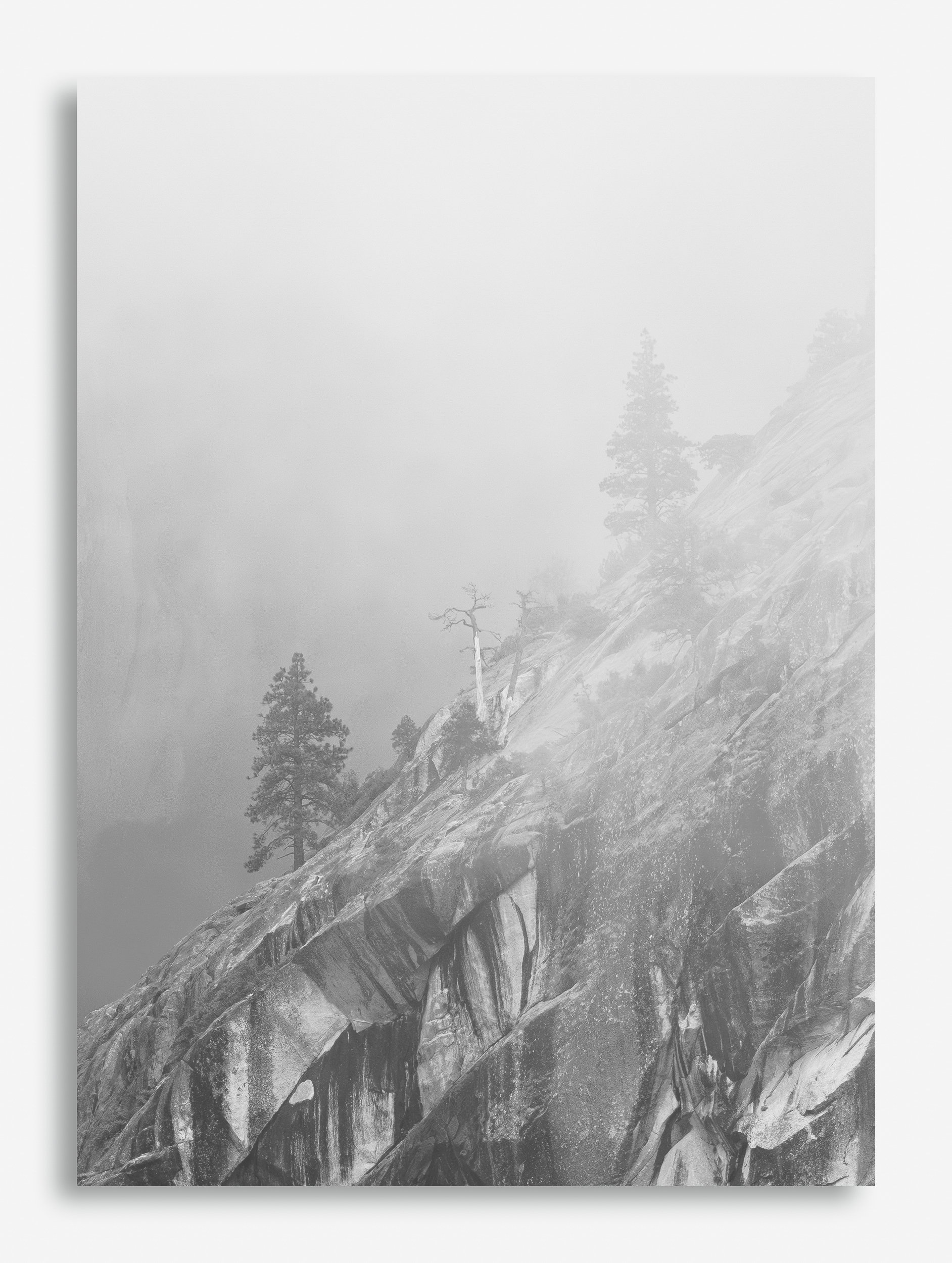
Revised
Per several requests, this is a rework done by
@Igor_Doncov that I think shows what you’ve been asking for. I thought I would do a rework but this is so good I decided to just upload this for review.
Critique Style: Standard
The photographer is looking for thoughtful feedback on the image as a whole, especially around the areas noted below.
Feedback Focus: Artistic / Expressive
About This Image
I’m getting back to some of my images taken on the Yosemite meetup some of the members had in May that I had placed in a folder and forgot about. As many of you know we had weather the entire trip but it turns out that the kind of weather we had, rainy, overcast, foggy, cold, and wet made some terrific opportunities to capture mood just about everywhere. I had to leave the night before the final day of our trip and I missed out on the epic light and fog that most of you have seen from Steve, John and Lon.
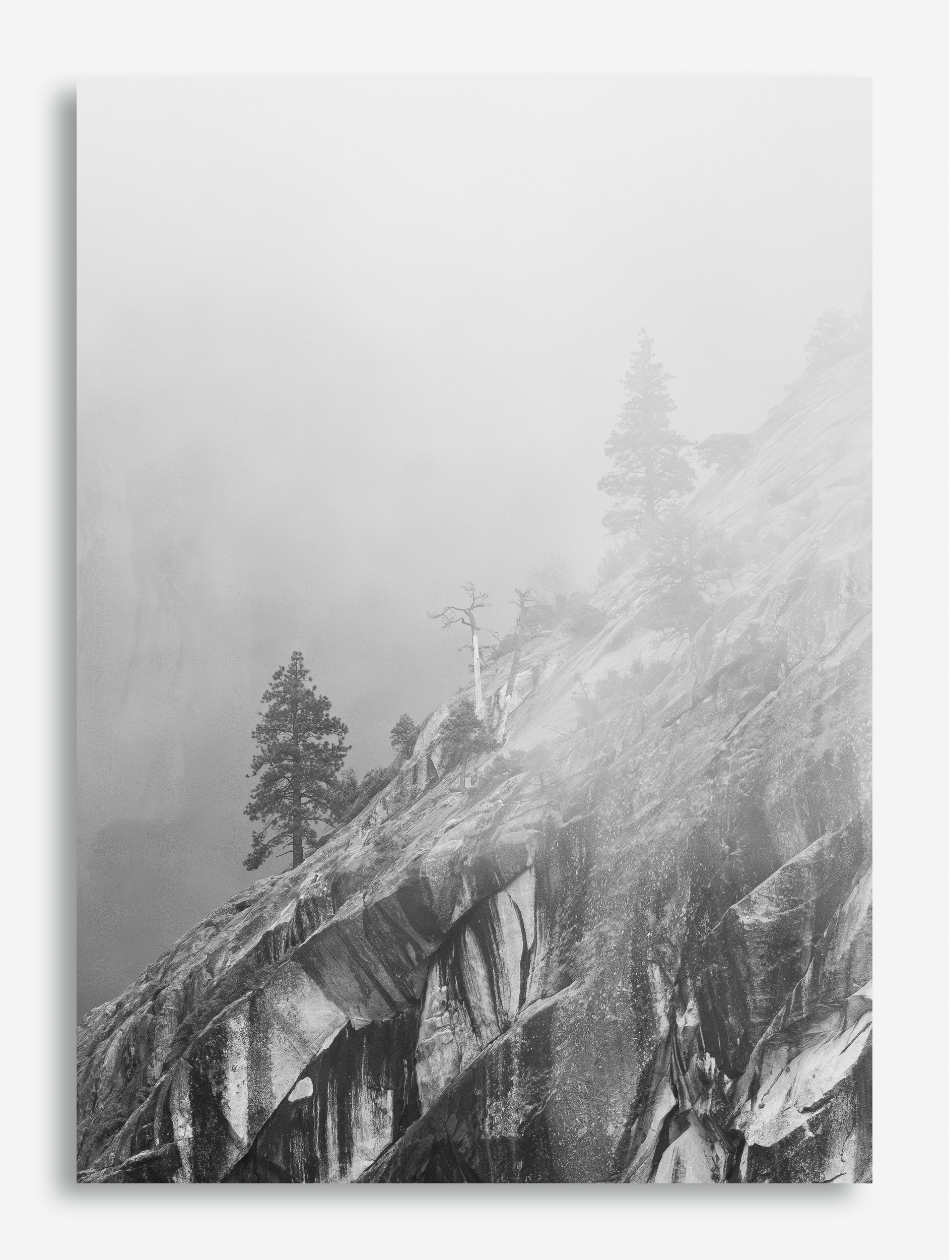
This image is a crop from a landscape made into a portrait. I love the landscape version as well but I think the portrait whittles down some of the frame that might be un-necessary.
I first noticed the two pines poking out of the fog on one of the granite cliff faces and as I zoomed in I then noticed the dead tree trunk in the center of those two pines.
Feedback Requested
I would like to receive your input on the mood, the framing, and the visual appeal of this image.
Technical Details
Camera: z9
Lens: 180-600mm
Focal length: 480mm
Shutter speed: 1/500
Aperture: f/8
ISO: 1000
Flash: none
Hand Held
David, I like the composition with the ridge line avoiding the corners of the image.A lot of mystery here, wondering whether the BG is another cliffside and how far it continues up into the veil. Well done.
David it is a striking image, and I love the mood you conveyed. The two pine trees are central, but supported well by the rock visually. The little bit of mist is a nice touch. I think your composition is perfect. Food for thought, dropping the contrast in the bottom 25% to soften that area a little, it really catches my eye (which isn’t necessarily a bad thing).
This is lovely, David. I find it very visually appealing. The gradation from clear foreground to very faint background gives this huge depth. I could see lowering the contrast/brightening up the very LLC as Jonathan suggested, but not by very much. You want to keep the visual balance between the darkness and light.
David,
I like the contrast between the angled lines in the lower right half of the frame and the total absence of any detail in the upper left half of the frame. Then the trees add vertical eye movement from the bottom half to the top half. Nicely done.
I think this is quite dramatic. The trees fading to nearly obscured is a nice touch.
I agree with perhaps reducing the contrast in LLC as has been mentioned. Also, in the arch directly below the left-most pine there is a bright spot where a chunk of rock has fallen off. It’s kind of an eye grabber.
The balance of lights and darks work very well. Nicely done, sir!
It’s been sometime since I photographed in Yosemite and what initially struck me about your image is that it is not your stereotypical Yosemite image. I really enjoy the softness, cool and quiet mood that resonated with me at first glance. I think the composition works very well, especially the contrast of the streaky granite and upper left foggy atmosphere. I want to know what is behind those clouds! Well done!
I like the idea of it fading from bottom to top. Some have suggested that the bottom is a bit too dark so I experimented it. It may also be that the bottom is a harsh subject for this type of image. Anyway, I tried following the recommendations and came up with the following. Now the lower part looks as though it’s in fog as well, but a less dense fog.
1 Like
David, your b&w processing is spot on in my opinion to show the graphic quality of this scene, thereby telling a story about the resilience of these trees.
Thank you for your input on this Yosemite image @Michael_Lowe. @Jonathan_Cothron, @Bonnie_Lampley, @Youssef_Ismail, @Preston_Birdwell, @Keith_Flood, @Igor_Doncov, @Peter_Richter.
The common theme was that the bottom portion and particularly the bottom left portion of the image with the granite rock face in high contrast doesn’t sit well with the rest of the soft diffused light in the rest of the image. I agree. Thanks for pointing that out to me. It’s a great catch. I actually reposted Igor’s version since I think it nails what you all have been asking for and I didn’t think I could do any better so please check out the rework and let me know your thoughts.
And yes, this isn’t your typical stereotypical image of Yosemite. AS most of you know by now, we had very heavy fog and lots of rain on this trip making grand scenics quite difficult but it gave us all a chance to zoom in and grab some unusual images from the valley. The light was dramatic and fantastic on the entire trip.
Thanks again for your thoughts.
2 Likes
I love what you’ve done with high key on both this and Yosemite NPN Trip 1. @Igor_Doncov’s version makes it even better. This really captures the overall mood of that trip, nicely done!