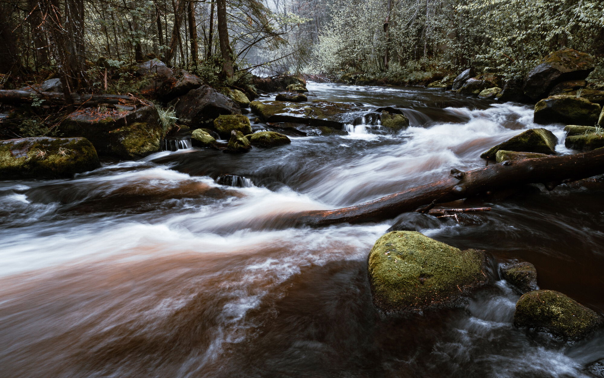
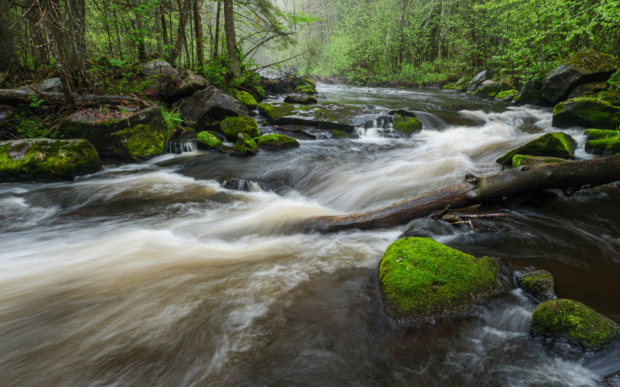
The second of three posts I’ll do from this session on the Prairie in the rain. These two shots are from a boulder just to the left of the one I was on for the first post. I’ve explored this whole section of river now and will move onto more, but I will be back to this one to finesse more views and details.
Sometimes I like to get a little creative with presets for my photos instead of going for straight up reality. This is the same image, with the same local adjustments made, but different overall treatments. One based in Adobe Natural, the other a reality-bending preset.
And here’s the Camera Matching profile for comparison against Adobe Natural -
Which do you prefer? Any other comments or advice is welcome, too.
Technical Details
Is this a composite: No
Lumix G9
Lumix G Vario 12-35mm f/2.8 @ 12mm (24mm equiv.)
f/18 | .6 sec | ISO 100
Tripod & polarizer
Lr processed - lots of adjustment brush work in the water, the banks and the trees. Just managing tones, eye movement & clarity. Also lens correction for this extreme wide angle. Cropped from 4:3 to 16:10 - one with a preset & one natural.
I prefer the first one. I find the greens very warm and inviting. Your comp works well for me, with the front rocks anchoring it well and the flow takes me nicely through the image. Getting picky, I might burn or clone the almost vertical rock about 2/3 up along the right edge. No other suggestions. Looks good.
I prefer the reality version of the first image in this case. The greens of spring are so vivid and the heavy flow of the river really brings home the season for me. Very nicely done!
Hmmm. It’s with some trepidation that I like both. Each for a different esthetic.
Yes, the first is realistic, but there are some subtle brightnesses (is that a word?) in the second that pushes it over the edge of reality into fantasy. That isn’t an anomoly since the basic composition is rock solid and pleasing. The brights have details and so do the shadows and near blacks. With those elements, you could transform any of the various shades of green into any color that pleased you.
After looking at the two frames, I wondered if you could do two more, with different themes, place them beside these, and have a single set ala Warhola’s Marilyn Diptych (1962)”
Just thinking of course, but I feel strongly that the elements of the image are much more of the esthetics than the color, which is seen very differently by each individual. You nailed the elements.
This is like those choices you have to make for a profile in Adobe Raw. I can never decide. I was all set to pick the first one due to the wonderfully colored moss on the major rock. Then I looked at the images on a larger screen and I may prefer the second. Naw, it’s the first. The blacks are a bit too dominant in the second image. And yes, it’s the moss on the rock that makes the first image. Great composition. There’s a lot of energy from the diagonals that go with the moving water.
Not trying to stifle your creativity, but I prefer the first image to the second. In the second image it was what the processing did to the colors on the mossy rocks that made me choose the first image.
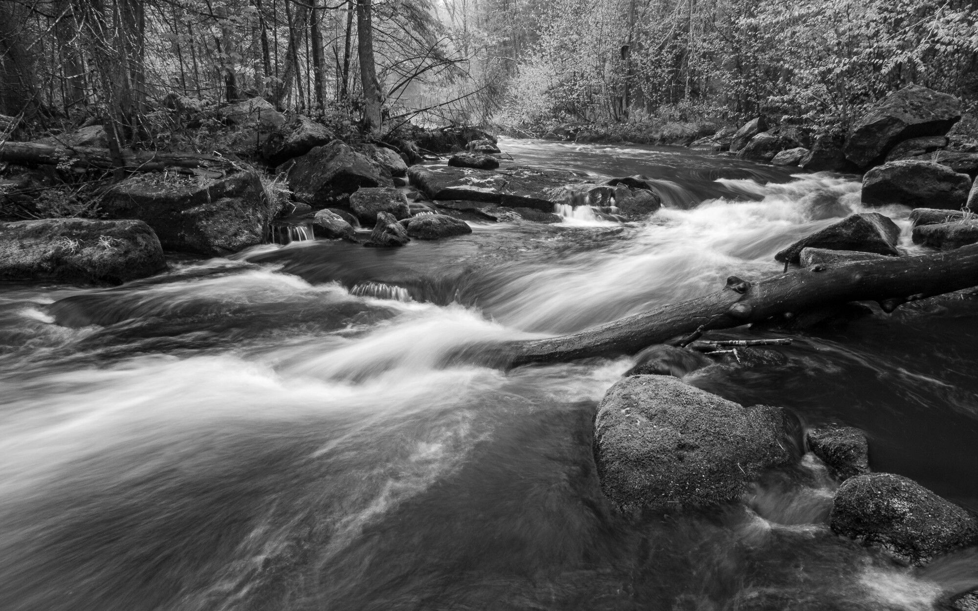
I agree with Paul’s comment. In fact I think a conversion to B&W would further play to the strengths of the image’s elements. I it would boil everything done to tonality, contrast and shapes. B&W is a great route to go when you want a non-literal look.
Thanks everyone for your positive comments about the elements & strength of the composition. I guess the natural version wins out. I like it, too, but sometimes I can’t resist the extremes of what processing can produce. Not in the realm of photo illustration, but definitely entering more of a fantasy feel as Paul notes.
And speaking of processing and Igor’s comment about Adobe profiles, my default is Camera Matching and in this case it’s Scenery. I also usually have an S-curve dialed in camera for a little extra contrast. I’ve added that version so you can see how differently the Adobe Natural profile treated the shot. Everything else is the same or really close. It’s much warmer and has a greater variation in shades of green. I think reality was somewhere in the middle if I remember rightly.
Also included a B&W version for comparison. I like it, but it removes the positive feeling of spring that us northerners relish and crave every year (and Ed, I know you’re a New Englander like myself so I don’t think this concept foreign to you). FWIW I usually save monochrome for less vivid times of the year. Not that it’s wrong or doesn’t work, it’s just my natural inclination to include green after 5 months of missing it.
Anyway…I am still noodling with them since I can’t choose a final image. Not that I have to, I can make as many as I like. Maybe I’ll stick a Campbell’s soup can on a rock as an homage!
Do you have a setting on the camera that allows you to save a raw file to the chip that has not been manipulated in anyway? That setting is the image that comes off the sensor. No manipulation by the camera’s computer. When you open it in LR, use the camera neutral setting.
What you first see is horrible! But you have the most data the sensor can provide, and a blank canvas. From there, build your own profiles.
Yes and no. It’s a misapprehension to think that RAW files are not manipulated by camera software - they are. This is why the same scene with the same settings with 2 brands of camera will look different SOOC. However, the level of change is something we can dial in if we choose. I can choose Standard Camera Setting and file type RAW - I can manipulate this setting in four areas - contrast, sharpness, noise reduction & saturation. I haven’t done that, but it’s an option I’m considering. Better images to begin with need less post-capture manipulation and I’m all for that.
This is one of the reasons I chose Camera Matching as my default import setting instead of Adobe Standard. I wanted to see how I was doing in camera v. how Lightroom shows me the picture. Does that make sense?
Kris, Thank you. You have corrected my thinking, and yes, the RAW files are indeed manipulated even with the camera set on “FLAT” Picture Control Setting. The FLAT setting does have an “extended, low contrast dynamic range” but is still manipulated and not a linear sensor view.
I have learned that the view on the LCD screen is manipulated and is a JPEG rendition. That impacts my work with white backgrounds. My 1st step is to adjust the background flash so that the “blinking red screen of death” encircles the plant. However, when I pull the raw image into LR or Bridge, the amount of red is very different.
When you choose “Standard Camera Setting,” is that in the camera or in LR? I understand where you are with using “Camera Matching” the import setting. I’m going to dig into that term to find what CM really means.
Have you ever used Adobe Bridge? I used it before LR was born and then moved. Recently I looked at AB again and now begin to wonder why there is Bridge and Lightroom.
I agree with you on less post-capture, except if you decide to create something beyond the original scene/object. Sometimes pushing sliders in all the wrong ways is tremendous fun and produces fascinating results.
Thanks again for the clarification. Keep up your exciting work!
Digital photography has so many complications film didn’t have that we’re always learning new stuff. I advocate going through menus and manuals periodically - whenever I do something I overlooked always jumped out at me. Plus it’s kind of fun in a nerdy way.
One of the reasons I upgraded to the G9 was for the improved EVF - the EVF in the GH3 was truly horrible. I hardly ever used it, but I use it a lot on the new rig. It’s so much better. And I find reasonably accurate in terms of light, color rendition & contrast. Of course those can all be manipulated by the user. Same with the screen on the back…both of these are OLED on the G9 I think, so even better. But I always check how things look on those v. how I see the scene.
When I do jewelry photography, I do the same - crank the whites and manually change white balance for the best color rendition of the stones or materials I used in the piece. Even with that I have to do a fair amount of post processing to get it where I want it. I have many saved presets that I use that get me either all the way there or most of it.
In camera. Panasonic calls it Photo Style, actually.
From what I understand, Adobe is using camera profiles to emulate what the camera setting does.
Nope, never. Lightroom has been my primary editor & organizer since late 2009. I used version 3 in beta for something like 5-6 months before actually buying it.
I’ve looked into using it because of the frustration when the LR catalog gets corrupted. The biggest drawback I see is that every function in AB works at a folder level. You can’t see the contents of all your folders at the same time. Each has to be opened individually and looked at. You also can’t search all folders at the same time as by keywords. And if you put all your images into one folder there better not be a lot of images because it reads every XML file in the folder to display the page. That’s my understanding from my readings. Please correct me if I’m wrong.
I feel your frustration. I’m just now rebuilding a catalogue that made a numerous files invisible to LR, but they are still on the Archive Raid Drive. I’m just afraid that at some point LR will begin to delete files! That’s why I have an mirrored raid drive, a cloud back-up, and monthly do a hard back-up to a external file and that file is kept at a different physical location.
I’m using Adobe Bridge incorrectly. Bridge is the storage software and it isn’t as robust as LR. What I should be asking is about Camera Raw. I go to my folders in Bridge, pick an image, then open it in Camera Raw. After working there, I go to PS for final minor adjustments.
Camera Raw is almost identical to the “Develop” adjustments in LR.