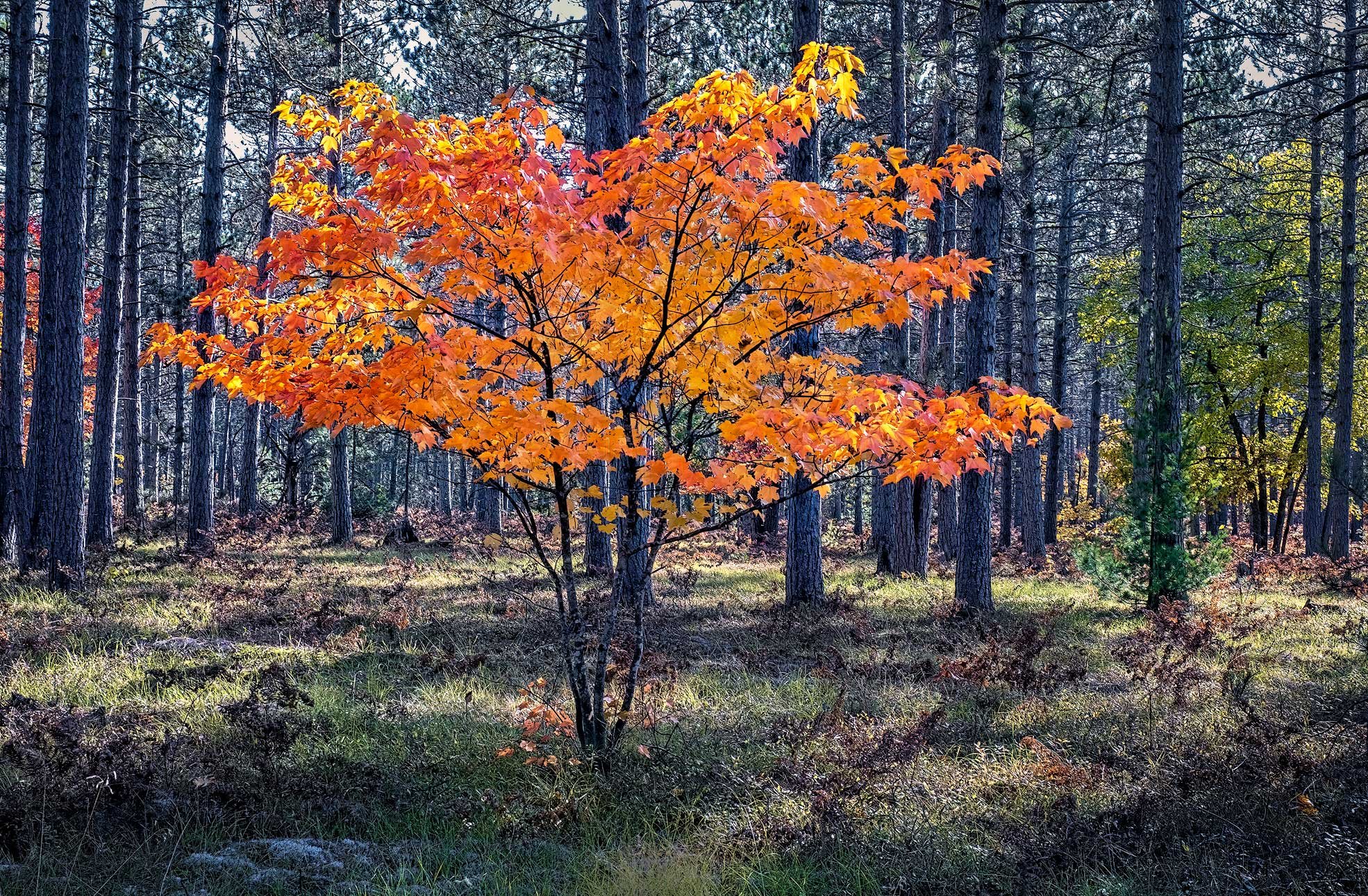
This was taken in the Upper Peninsula of Michigan. This tree stood out like a light in the forest. After watching the video conference on Trees with Sarah Marino and others, I thought this might fit into what they were trying to convey. Any critique welcome.
Pertinent technical details or techniques:
Single image, Fuji XT3, ISO 500, Fuji 16-55 @32mm, 1/40 sec, f8
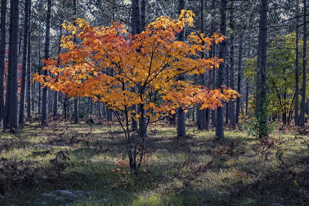
Revised image with Igor’s comments:
If you would like your image to be eligible for a feature on the NPN Instagram (@NaturePhotoNet), add the tag ‘ig’ and leave your Instagram username below.
I love the idea of this flame in the forest. I’m not sure how much the tree has been enhanced in postprocessing but I would do it further. What do you think?
@Igor_Doncov Thank you for your kind comment and the suggestion. I did enhance it a bit, but I can look at doing more.
Roberta, I’m reaching a point where I value an artistic interpretation more than reality. I don’t know how you feel about that. I see this as a flame in the darkness but that may not have been your intent. I’ve been told recently that each photographer has their intent and one should not impose yours over theirs. He has a point so I feel more reluctant now to offer such suggestions. On the other hand, technical recommendations, like the bright yellow grass at the very bottom, bore me (I would burn that in).
1 Like
@Igor_Doncov. Yes! I agree that I like artistic more than realistic. I have taken your idea and used topaz studio glow on the tree, and I like it better. Don’t be reluctant to offer your suggestions, at least to me. I will post the revised photo here.
Hi Roberta - Your repost image is definitely a light in the forest.
Roberta, I listened to the Tree’s Webinar as well, and this is a great example of the “Lone Tree” motif that was discussed. I like the direction that @Igor_Doncov took with his rework, this is a case where a more artistic interpretation can have more visual impact than reality. As photographers, we have license to place emphasis on those elements that that are the most interesting in a scene. By enhancing things for creative effect we can tell stronger stories. My own philosophy is to enhance for creative effect, but keep it believable and tasteful.
My own view of this image is that the title might better be stated as “A Burst of Light in the Forest”. Igor’s rework does a nice job of emphasizing the luminosity of the maple tree, making it pop out of the darker forest. I might even suggest taking this creative license with luminosity an additional step further, and add a strong vignette to place even more emphasis on the maple. This would even further re-inforce the “Lone Tree” motif. I started with Igor’s rework, and added a strong vignette to taste, YMMV. I also like what the vignette does to the dappled splashes of light on the forest floor.
Thank you @Ed_McGuirk! I like your version with the vignette, and I will make that change. What program do you use to do the vignette?
I’m not sure if you saw my re-work of the photo above, but I did highlight the tree more and added a vignette, but your rework has more vignette.
Thanks again.
Glad you liked the vignette. I used the TK Actions vignette tool for this rework, but only because I usually do NPN reworks directly in Photoshop so I don’t have to import them into Lightroom. TK Actions is a paid panel you can plug into PS. For my own work, I usually do vignettes directly in Lightroom, my primary raw processing software. In the Develop module it’s under the “Effects” panel, you have sliders to add vignettes. I have made some custom develop presets that add vignettes of varying degrees of strength, that can be added with one click.
Thanks @Ed_McGuirk . I have the TK Actions and I do use the vignette in Lightroom and in Camera Raw. I need to get better at both of them. I’m always afraid of using too much vignette, but it really works well in this photo! Thanks so much for the info and for getting back to me so quickly. Have a great week! Stay well.
With the TK vignette, the default opacity of the layer it adds is 50%, which I often find to be too strong. So I usually find myself dropping the opacity to 20% to 25%. And the other trick I use is to paint on the TK Vignette mask layer with a black brush at like 10% to 20% opacity on the brush, to reduce / remove the effect of the vignette in certain parts of the image, whenever that helps the image.
The TK vignettes are pixel edits, the nice thing about Lightroom vignette is that it is non-destructive (even on a finished TIFF file), so if you are experimenting with different vignettes, it makes sense to do that in Lightroom, you can just keep tweaking it until you are happy.
Wonderful, thanks @Ed_McGuirk!
What a lovely find! I like your rework, with the brighter tree. I’m thinking a tighter crop might make it even more of a stand out. Those green trees on the right catch my eye, taking me away from the yellow tree. I tried cropping from the right, to a 4:5 ratio, putting the golden tree right in the middle, as it’s so naturally symmetric. I also did a couple of hue/sat layers to desaturate the greens and strong blues in the background, so the colors don’t compete with the main tree. At any rate, it’s a perfect “lone tree”.
@Bonnie_Lampley thank you for taking the time to rework my image! I apologize that I missed your response and rework until now. I have been busy with other projects and am just now getting back to NPN. Everyone’s comments have been very helpful, and yours are valuable as well. Many thanks.
1 Like