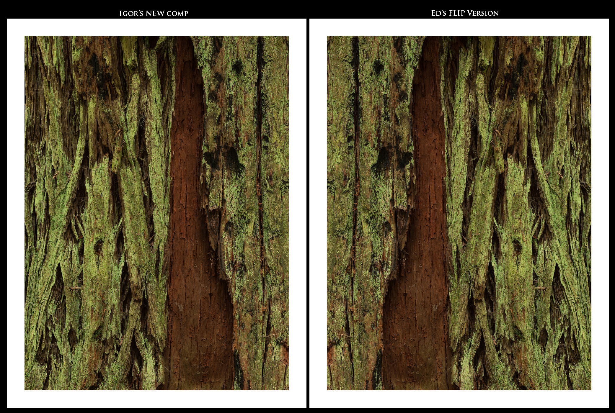
They are both are very nice intimate images but I like the new comp better Igor. The color seems to pop and I also like the details in the bark better better. It has a bit more visual complexity than the original.
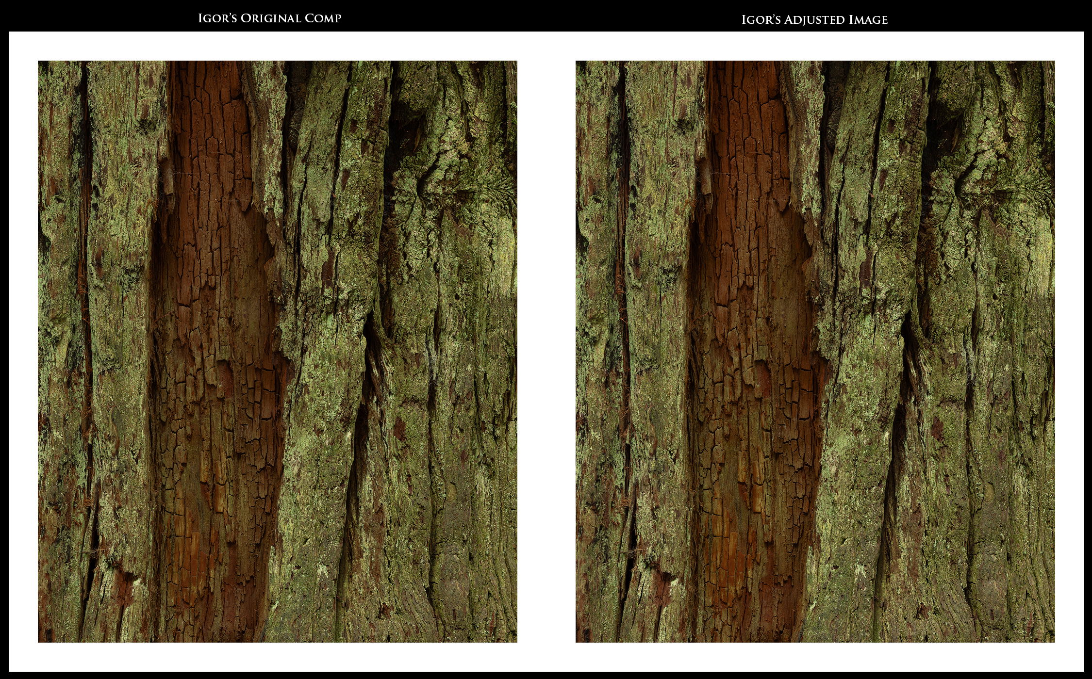
Ok, admittedly, I’m a bit confused… First post, orig post, orig comp? Who’s on first? I recall the broader scene with the same tree, “Redwood Intimate” (where both of these comps are visible…) I’m pretty sure the one labeled “Orig comp” was never posted before, just new to this thread. And confusing myself even further… these are two different frames, so technically both originals… ![]()
![]()
![]()
![]() Please ignore me.
Please ignore me.
For me, I like the setup and arrangement, balance of the “adjustments to the original” last posted. the caveat being I would like to see the colors and processing applied here from your “new comp” which is the original posting of this thread. I think (see above). See Mark’s comments; I agree except for using yellow to boost the greens. I think hue is fine, just a little boost in color/sat.
It’s been a while since I’ve feasted my eyes on the “putrid green” fungus on the trees, but I’m guessing the more muted greens is a truer rendition. However, the punchier greens and the added richness of the reds just look better.
As far as flipping, it’s easy for me. Both comps can be flipped either way and be equally strong.
Please feel free to ignore this post as it may not help in any tracking you’re keeping of which version is preferred.
Lon
1 Like
You think you’re confused? I’m confused even more by the responses. Correction. I’m confused on how to fix the issue I see with the very bottom image, which is a version of the “original comp” (see the post). The variation in the reds and oranges saturations are just wrong. I believe the processing introduced that.
1 Like
LOL, it does get confusing. I’ll vote for the new comp Igor, I like that triangular shape of the bark in the moss. (I’d vote for dropping the frame too. I used to use a white frame myself, but the glare robs from the beauty in the image here.)
I still prefer the second image titled: “Original Comp:”.
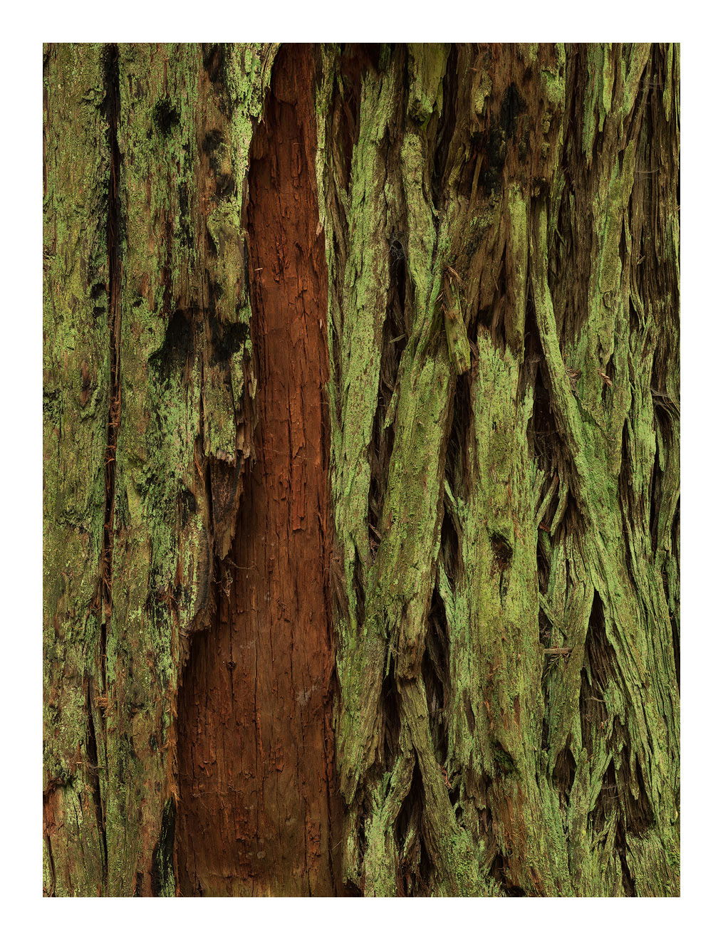
FWIW, I prefer the very first image in the original post. I like not getting to the red wood until 2/3rds through. In the others, my eye never explores the right half. There is less simplicity in the textures of the bark and the various fungi, but that randomness kept me interested.
ML
This is getting too difficult. It’s hard to compare when you can’t see them side by side, so I combined them so we can do just that. Hope you guys and gals don’t mind.
Igor, after I post this I will actually compare and then post my thoughts.
OK, after looking at them, here are my conclusions (opinions).
Comparing your Original comp to your New comp, I prefer your Original comp. Here’s why. Even though I prefer the processing of your New comp over the Original. To prevent confusion, I’m NOT comparing your original to your adjusted original at this point. Both comps are very nice, and like I mentioned, I prefer the processing of the New comp, but after studying them both I played a little game of quickly going back and forth just to see which one has the most immediate visual impact and, for me, it was your Original comp. Now, to compare your Original to your ADJUSTED Original - I definitely prefer your adjusted image. I think raising the highlights worked well, but honestly, I think it would benefit from even more adjustment to the highlights and a bump in contrast.
Now, to the comparison between your New comp and Ed’s Flip. I like your version best and here’s why. All things being even, I like the position of the barkless area better in Ed’s version, but when you compare the upper left corner in both images, your image immediately jumps out at you because it’s brighter and more saturated, and it has more texture and is more pleasurable to view as you have more for your eye to explore. Since most eyes are trained to look immediately to the upper left anyway, I think that makes a big difference to the viewer; at least it does to me.
That’s a lot a nit picking and, honestly, all versions look great, but since this is a critique forum, I’ll critique it being picky - LOL.
Thank you, Bill for organizing this well and for your thoughtful analysis. I do see your point about Ed’s version. I actually never thought about it that way. I think I may agree with you.
I, too, have had some more time to dwell upon this and have decided that although both came from literally inches of one another they are remarkably different. One is more flamboyant and the other far more subtle. You see this when you print them. The ‘original comps’ look better with less contrast, blacks which aren’t as deep. It’s a more subtle beauty with small cracks and grooves. The ‘new comp’ is more of a screamer. As someone noted, it’s redwood opening does, however, have a more attractive shape.
Well, this has certainly been an exhausting exercise. I hope the next ones are more straightforward.