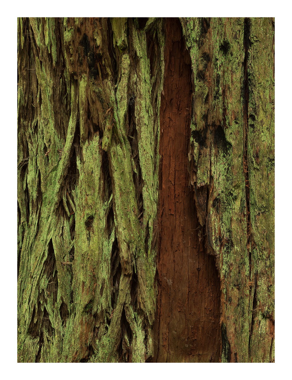
One of the most endearing aspects of coastal redwood groves is their darkness. As your eyes adjust things start to glow. This ‘glow’ is more easily shown on a monitor than a print.
This is an intimate of a redwood that I posted earlier from a greater distance. I shot several compositions of here and as usual the best one came at the end, and not the one I thought was ‘it’. It took several weeks to reconcile to the fact that the image I thought was the best in the field was actually not the best. It’s often like that for me.
On second thought, rather than me decide that the new version is better than the original I’ll show you both. Please give me your opinion.
This is a really interesting and intriguing abstract, Igor. Nice patterns and colors.
I often find the one I thought was a home run when I made it in the field turns out to be an infield pop-up. The unexpected one can be the one that shines. Moral of the story for me is experiment and be open to various images in the field.
I like this a lot Igor, it’s simple but powerful at the same time. I especially like the warm green/yellow color of the moss. I also like the secondary framing created by the thin line in the bark on the right. This getting pretty nitpicky, but I am slightly bothered by where the bare strip of brown trunk intersects with the top edge of the frame. To the left there is a small diagonal bit of moss (pointing to 7 oclock) that just keeps grabbing my eye for some reason.
I often find surprises about what’s best back at the computer. In my film days I would bracket for exposure, on digital I now bracket for composition, and find some pleasant surprises from that experimentation.
Igor, I’m really enjoying the “glow” of the lichen and how that contrasts with the clean strip of reddish bark. This is a fine intimate view with excellent contrast and textures. Yes, “letting things settle” often results in a change of heart with respect to what seemed best at the start.
Great eye to see and isolate this intimate, story-telling, image of the redwood. I think you’ve certainly captured those colors beautifully; and the missing strip of bark anchors this one nicely.
I’m sure we all experience those times when what we are excited about most in the field, turn out to be duds back on the computer and some other captured image will emerge as our favorite. I know that’s exactly true from my most recent outing. But on the rare occasion, it’s reassuring to know that sometimes we do come home with what excited us in the field. Case in point, my recent “Crowning achievement” post I was very happy the results came thru and even exceeded my field expectations. Yet on the very same trip and from the very same campground perspective, another image I was excited about… well, won’t even make it through ACR…
Anyway, an image like this must be satisfying even if it wasn’t on your list as the best from the field experience.
I was wondering if I could trouble you to look at the post again. I’ve decided to post both comps to see if you agree with me. I actually reworked the original and it seems to look better. The new comp produces a better print for some reason.
I like the second one better than the original post. It seems to have better left to right visual flow for my taste. and i like the crack/knot in the URC.
And it leads me to think of this, original post flipped horizontal, this too has a better left to right visual flow for me…
Lon, I really like what Ed did to the image. I think it’s very balanced to my eyes. As for the two images in the original pane I like the one labeled “New Comp” better. The richness in the texture of the mossy bark is really really attractive.
Some more adjustments to the original. Raised the highlights and added more color to the red. Better? I just think the reds are much better in the newer version so I’m trying to match them.
Igor, both versions look very good. I like the extra texture and the knot hole in the 2nd post, but it’s missing the subtle glow in the greens that looks so good in the original. The 3rd version is a subtle improvement, with more texture and color in the reds. How about adding a hint of yellow to boost the green glow in V3?
@Mark_Seaver and @Preston_Birdwell, Actually the original had more yellow and I didn’t like it. The fungus that grows on these barks has a distinctly putrid green color which I like and am trying to preserve. Thank you for the suggestions though.