The photographer is looking for thoughtful feedback on the image as a whole, especially around the areas noted below.
Feedback Focus: Artistic / Expressive
About This Image
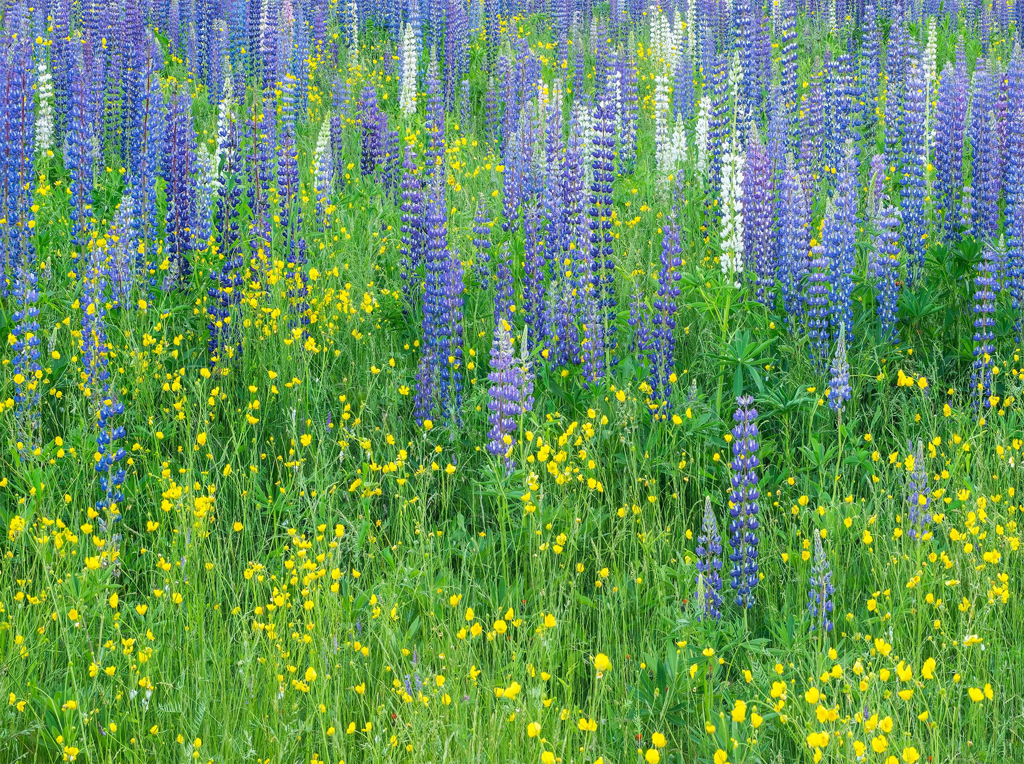
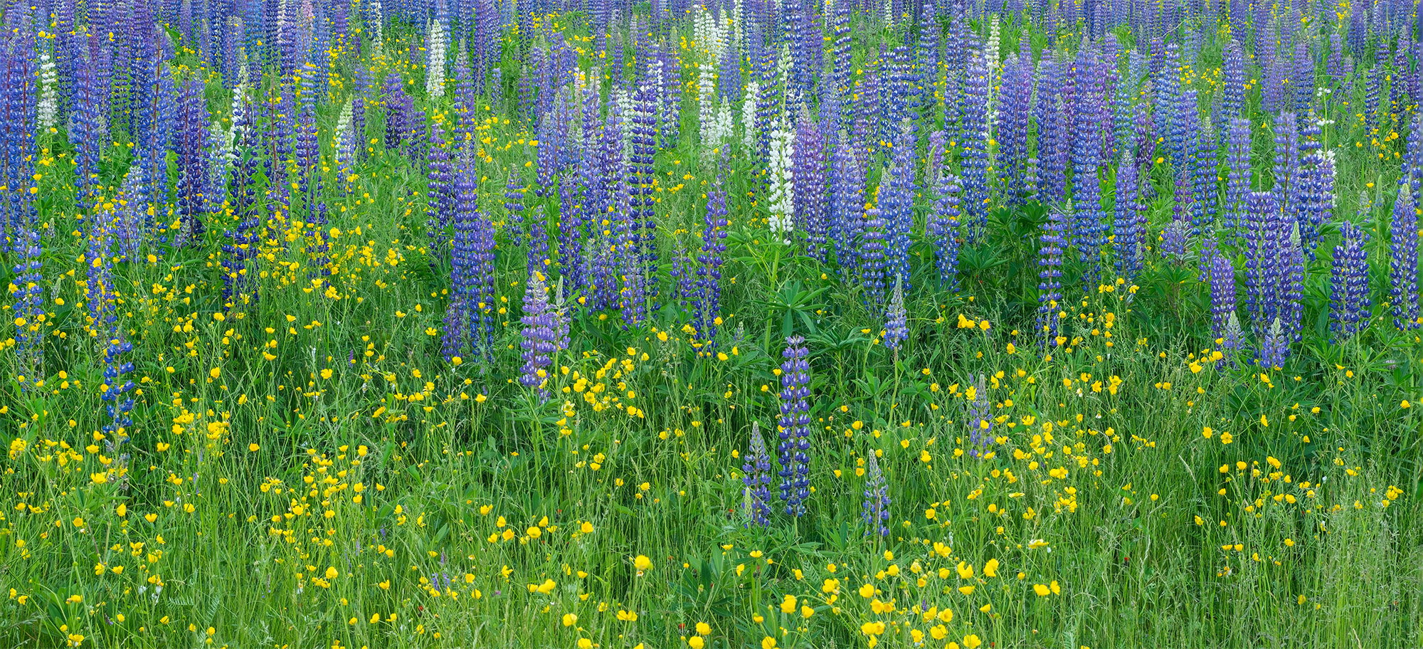
This scene of lupines and buttercups was captured in one of the fields dotting Sugar Hill, NH during The Lupine Festival which takes place every June. The upper fields are usually pretty crowded with people and as a side note have been pretty decimated by some invasive plant/weed. This particular spot has very limited parking so we spend most of our time here scouting for compositions. The overcast skies were perfect for rendering the lush colors and wind was fairly calm. This is a four image stack for DOF.
Feedback Requested
Both images are crops from the original version. I waffle back and forth on which one I prefer so I thought I would see what thoughts other folks might have. Anything else you notice please feel free to mention it. Right now I am favoring the first one as it makes for a wonderful print and looks quite nice in a photo book I just received from Mixbook. After typing this maybe I answered my own question.
Ed, the first one gets my attention more than the second one. I like the expansiveness and it accentuates the vertical nature of the Lupines. I also like the warm/cool contrast between them and the Buttercups which act nicely in a supporting role.
The exposure and processing look great to my eye. No nits.
This is gorgeous! I’m with Preston that I love and prefer the top, 4x5-ish version. It really pops and there’s a wonderful balance between the purple, yellow and greens.
I’m assuming no changes with the pano in terms of processing, only cropping? Which is kinda weird since the pano version seems to have less contrast and/or pop. I do like the pano version. The only thing holding that one back is I feel like the yellow flowers and foreground in general is a bit cut off; especially the larger cluster of yellow along the bottom just right of center.
Otherwise, no nits or suggetions. The color and processing look spot on to me.
I think one could have a “field day” at this field of lupine. Just beautiful. Print and hang it!
Hi Ed,
I’m glad Lon mentioned the perception of less contrast or pop. I had the same reaction. When I first looked at the two on my phone, I thought I preferred the pano as it made the lack of the tops on the top-most lupine feel more intentional, but on a larger screen, the opposite feels true (just an interesting difference in viewing method).
For me, the top image just feels like a more full scene, and with the lupine having more space, the ones along the top edge don’t feel decapitated, just a smaller percentage of the whole field of lupines, I think.
It’s lovely. No nits and go with the more expansive format.
ML
Ed: I’m joining the crowd preferring the first image. For me any shot with lupines (bluebonnets in Texas if you please ) gets my attention and both of these are excellent. I like that you have a nice sprinkling of the lighter colored variety and like where they show up in the frame. Well seen and very nicely captured and presented. >=))>
Ed, add me to the “prefer #1” crowd. I like how it’s nicely balanced top (mostly lupines) vs bottom (mostly buttercups) and find that it’s shape works better with the vertical elements (lupines and grassess). Having the topmost bit be fully lupines is a fine extra.
Not to be contrary, but I much prefer the panoramic version.
I think it has a much better balance among the various elements, especially the yellow flowers, which end up being more intrusive in photo #1"
I’d agree with you about the first one. The aspect ratio is more pleasing to my eye, and it omits the area of more solid green in the lower right of the second image. Overall more balance and depth. A very pleasant image.
Another vote for the first of the two, Ed. To my eye, the vertical nature of the lupines just doesn’t fit with a panorama format unless it was taken from much further away or at a wider angle. Perhaps the pano would work better with the buttercup area on the bottom pretty much removed and just concentrating on the lupine area.
Going against the grain here…but I prefer the pano image. The buttercups are more of an accent to the lovely array of the lupine colors. It also gives more of a feeling of being involved and engaged with the scene. The top one is lovely, but I like the balance of the pano best.
 ) gets my attention and both of these are excellent. I like that you have a nice sprinkling of the lighter colored variety and like where they show up in the frame. Well seen and very nicely captured and presented. >=))>