Critique Style Requested: In-depth
The photographer has shared comprehensive information about their intent and creative vision for this image. Please examine the details and offer feedback on how they can most effectively realize their vision.
Self Critique
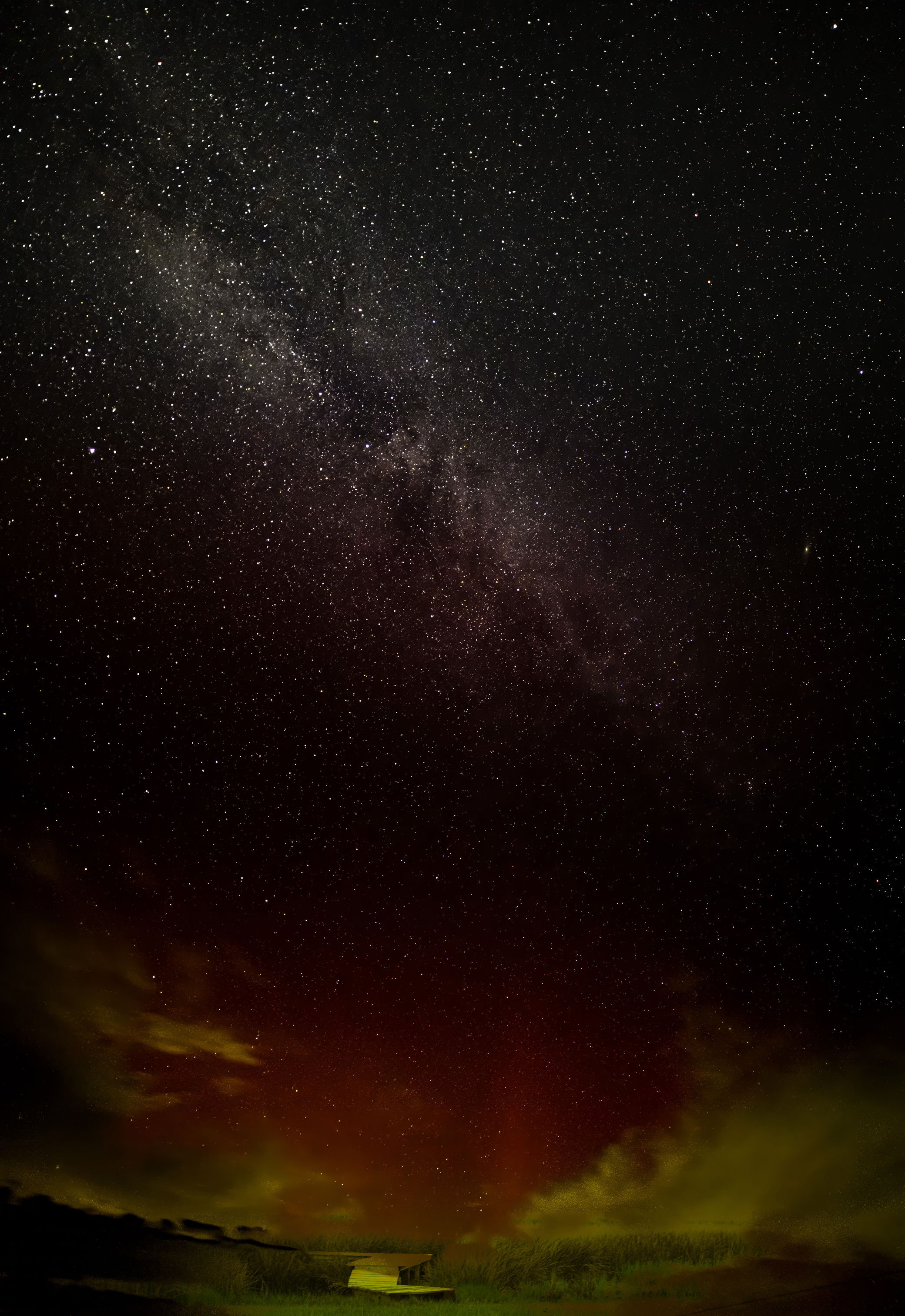
This is a composite image that combines a single sky image (Aurora and Milky Way) with a foreground takes in the same location (opposite direction) at blue hour. Overall I am pleased with the color contrast and the level of detail of the stars. I am a bit concerned about the blending of the foreground appearing contrived.
Creative direction
My vision was to visually tether the dock in the tall grass used for canoeing to the duck blind with the celestial awe of the Aurora and Milky Way.
Specific Feedback
My concern is that the image appears contrived. The primary astro image was beautiful with minimal processing in LrC, but I did not think it was complete with the foreground. I blended a foreground from the same location (different direction and different time of day) in attempt to achieve visual continuity.
I intend to print this image. I am also looking for suggestion on a paper type (or potentially a semi-gloss canvas) that will capture the colors and mode of this image.
Technical Details
Astro image single exposure: Sony a7RV, RAW (24MP) to reduce star trails, Rokinon 14mm f/2.8, s=13s, ISO 1600, (2 AM).
The foreground: Sony a7RV, RAW (61MP), 24-70mm F2.8 GMII, f/13, ISO 125, s=2s (blue hour).
Post processing with LrC – cropped some wires, color and WB correction, removed (partially but not fully) spherical abberations introduced by the Rokinon lens.
Blended the foreground (dock and high grass) with astro image in photoshop, correcting for opacity (blending mode = darken).
Description
August 12th was the peak of the Perseids Meteor Showers. The night was clear with minimal clouds, so I set out to a Bortle 2/3 dark sky area 1.5 hours from my home in Annapolis, MD. After some blue hour images and a nap in my truck, I set up my intervelometer to capture 2 hours of 13s images at ISO 1600 with my favorite Astro lens. I was upset with all the “light pollution” that should not have been at my shooting location, and reduced my planned ISO and shortened my planned exposure settings.
The light pollution turned out to be the Aurora Borealis which dipped all the may down to the Midatlantic. The Aurora was in the news, but at 2 AM it is hard to think too clearly.
After 2 hours, I capture 10-20 meteors but I realized my camera was pointed at too high an elevation, and Ileft still annoyed at the “light pollution” where no light sources were present.
After a few days (I am not retired yet and that pesky work things is infringing on my editing time) I processed the imaged from that evening and Aurora and Milky Way appeared in my image. The photo lacked a foreground, so I blended my blue hour images of the dock and tall grass to create a light path leading to the sky.
Critique Template
Use of the template is optional, but it can help spark ideas.
- Vision and Purpose:
- Conceptual:
- Emotional Impact and Mood:
- Composition:
- Balance and Visual Weight:
- Depth and Dimension:
- Color:
- Lighting:
- Processing:
- Technical: