The photographer is looking for generalized feedback about the aesthetic and technical qualities of their image.
Description
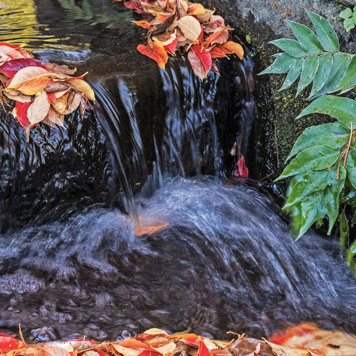
Having just bought a new camera and lens, I went to Ueno Park in Tokyo to try them out. I came across this small scene and tried to capture the flow of the water with the attractive colors.
Specific Feedback
Do you think the colors are too saturated? I liked the contrasts, but maybe went overboard with them.
Technical Details
Olympus OM1 + 60mm macro 1/13 f5 ISO200
Exposure and Contrast adjustments in ACR, then into PS for tonalities and Smart Sharpen.
Mike, whereas in the other image, I thought the colors were fine, on this entry I find the reds and greens, in particular too rich. Probably, you could experiment with a second edit toning down the overall saturation or just those two hues. I don’t know if it’s just my eyes or whether others may experience the same. This location seems very peaceful and inviting. Your photos show that.
This is a very lovely and intimate scene. I think you did well to include all of the elements and agree and think the repost looks better as far as the saturation goes.
For me, this is almost like two separate images. I could see either the right, including mostly the green plant complimented by a little cascase and some fall leaves, OR concentrate with a crop of the left that is all about the fallen leaves and delicate little cascade. Not sure if that’s your vision, but I think you have two crops with strong subjects, one without the other and vice versa. Hope that makes sense.
Yes, @Lon_Overacker - that helps a lot as I rarely attempt small scenes like this. My idea was to show diagonal movement from TL to BR, but then the green plant is a bit of a distraction, I guess. Your vision of 2 separate shots makes sense to me, especially the left hand portion. Here’s an alternate crop based mainly on the left-hand part:
Excellent! Thank you for considering the feedback and taking the time to rework. Honestly, I think you’ve combined the best of both world’s! I wrote about the left and right halves, but I think your alternate verion keeps the best of both sides. Well done. I think this is an excellent version of your original.