Please share your immediate response to the image before reading the photographer’s intent (obscured text below) or other comments. The photographer seeks a genuinely unbiased first impression.
Questions to guide your feedback
I look forward to getting your impressions and feelings as you view this image. For me, it’s all about a mood and I’ll be interested to see the extent that your take on it is resonant with my intention (see below).
Other Information
Please leave your feedback before viewing the blurred information below, once you have replied, click to reveal the text and see if your assessment aligns with the photographer. Remember, this if for their benefit to learn what your unbiased reaction is.
Image Description
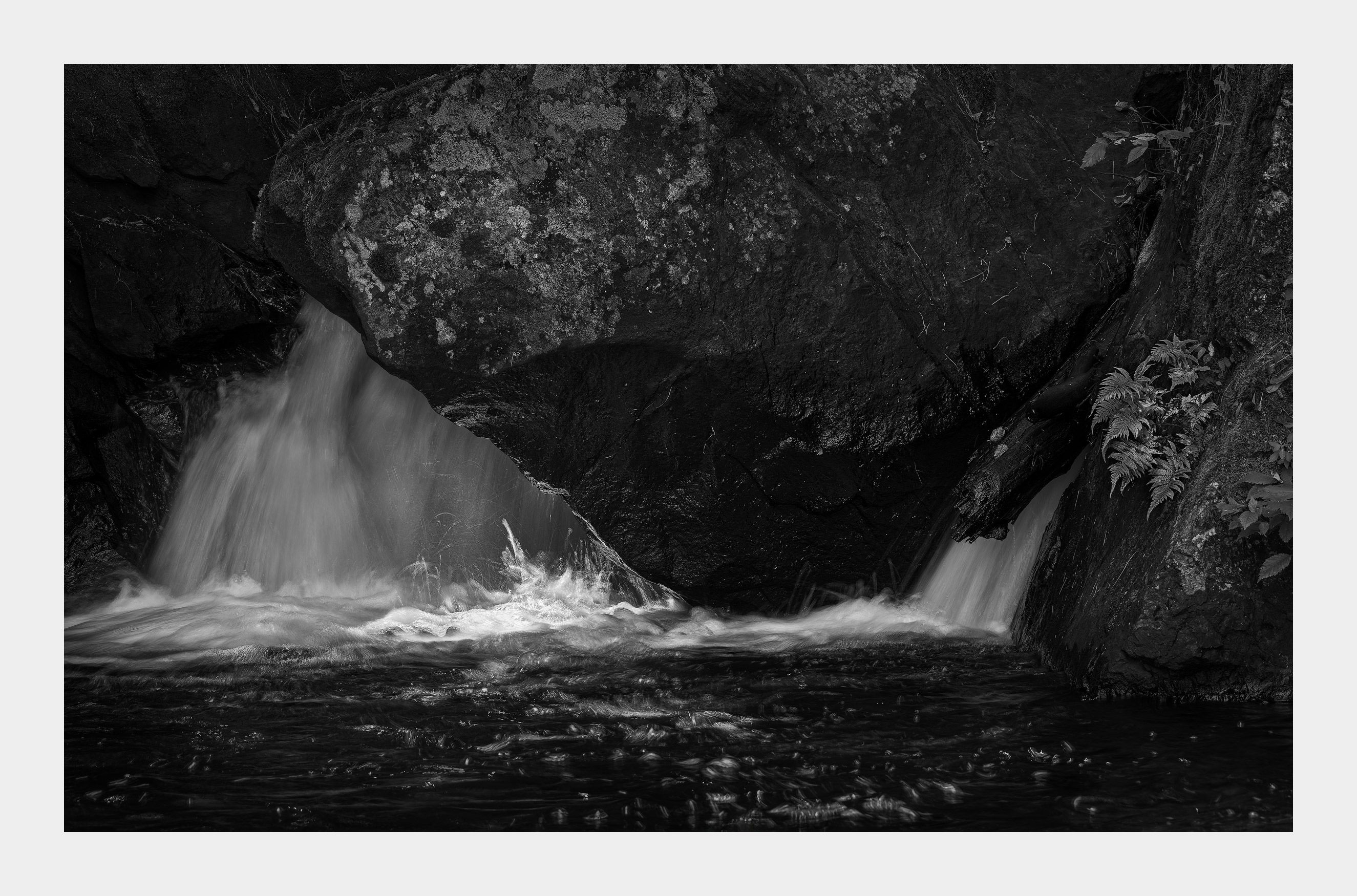
I’ve titled this image, “Bereshit”. The first word of the Torah (the Old Testament), it translates in English as “in the beginning”. My intention for this image is to evoke a sense of the primordial ground of life’s arising – the massive, immovable outcropping of rock speckled with primitive life, juxtaposed with the light breaking through on the energy bubbling up from the falls. And all of this seemingly enclosed by the surrounding darkness.
Hi, @Kerry_Gordon. I don’t know that the image evokes a mood in me necessarily but I certainly do enjoy it. Is that spotlighting on the little splash of water at the bottom? If so, what serendipity! Even though they’re close to the edge of the frame I think dodging the ferns while leaving the background as-is would add some additional interest. Everything else looks great. Love the composition.
This image has a playfulness that I really enjoy. That little party in the brightest section is where the fun-loving kids hang out, and the fern and moss are the introverts enjoying the view from the edge of the dance floor. I really like how you’ve been using chiaroscuro in your images (and that you taught me that word), but here I might use just a little less.
Kerry, the emphasis on the little splash is good fun, but the rest feels too dark for me. I too think that the ferns on the right are attractive and could use more attention. I’m a big fan of the details in the lichen on the big rock (top center). I also like all of the small splashes in the water coming back to the right. They feel like they’re dancing, along with the bright splash.
Hi Kerry,
I have come back to this intriguing scene a couple of times as I try and decide what mood this evokes. The overall darkness is foreboding while that bit of light on the splash seems to be keeping the surrounding darkness at bay. I could see the fern on the right lightened just a little as I wouldn’t want to destroy the mood here. Very thought provoking image.
As others have pointed out this is a very playful and fun image yet the edit provides a contrast with a darker mood. A lot of wonderful textures in this image to keep the eye interested. One small suggestion is to bring a more balance with the ferns on the right, I would light where I can the shadows on the rock on the left side. They are primarily in the very dark grays and blacks which throws the image a big of balance. Just one person’s opinion however.
This isn’t evoking a ton of mood for me, although I have perceived a sense of mystery with a bit of dark mood, interrupted or perhaps “rescued” by some energetic spotlight. For me, that patch of light is mysterious because we don’t know the source of light; that source actually could be from within or below… hmmmm. The large rock obscures where the water comes from, also creating some mystery.
The longer I look, the more I’m seeing two images. Yes, the water at the bottom and the large rock connect the two halves, but still I find myself wandering back and forth between the two. I love the log and the ferns, details/texture on the right; almost could see this as a stand alone scene. The ferns are placed nicely and show well, but I think they are begging to be seen green!
I feel the same way. I like it but can’t exactly pinpoint my reaction. I’m in Hawaii right now and have seen scenes like this. In fact I tried to make an image like this. It doesn’t evoke fear in me. It’s more a sense of excitement. The light makes you alert. My first reaction was that the shady white should be a tad brighter but you decide.
@Igor_Doncov - Excitement makes sense. For me, it was more a sense of awe that drew me to make the image. I did a revision a few days back before you posted mostly based on the previously posted comments. I was struck by the suggestion that a few people made that they loved the ferns and I should make them brighter. My response was to do the exact opposite. This isn’t a picture about those ferns at the edge of the frame and if viewers’ eyes keep going over there I felt the image would be strengthened by making them darker not brighter. At the same time I also made the falling water a little brighter (as you also suggested) and I think, overall, it directs the viewer’s eye more where I’d like it to go. Personally, I like this image - I find it seductively eccentric. In any case, I always appreciate your comments.
Igor, this is stunning. Exquisitely moody with just enough light to celebrate the darkness, the very essence of chiaroscuro. (Tiny, tiny, tiny, tiny nit - I’d desaturate the dot of red bottom/centre.)