The photographer is looking for generalized feedback about the aesthetic and technical qualities of their image.
Description
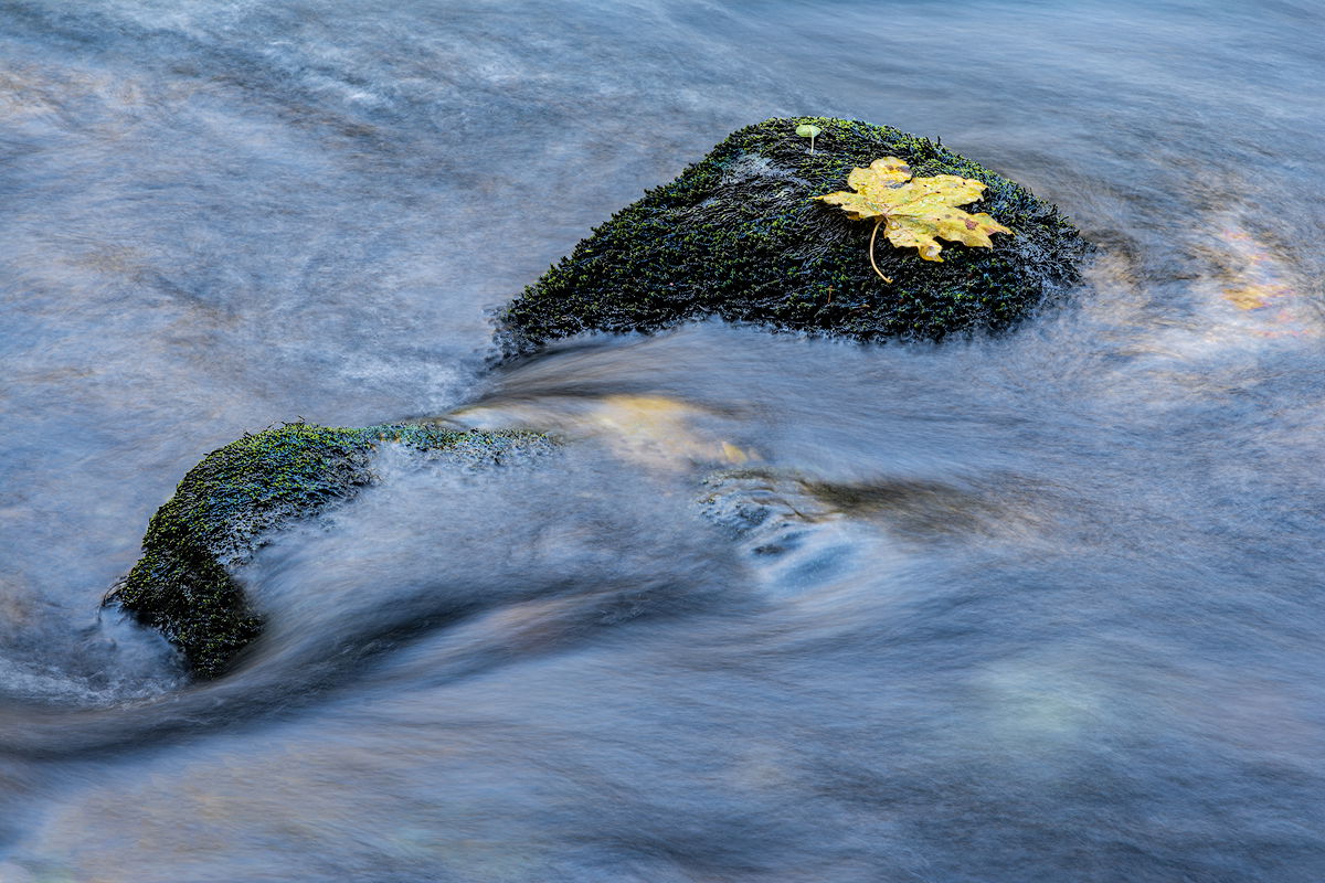
I was wandering along the edge of the Merced River late one Autumn afternoon and saw this little scene. The Yellow maple leaf caught my eye at first, but the blue of the sky reflected in the water seemed to dominate. I selected a longish shutter speed to blur the water.
Specific Feedback
Is the blue to much? Do you have any other thoughts or suggestions?
-P
Wonderful scene!! And I love the blue – it feels just right, and the splashes of gold, browns, cyans and whites keep me exploring the scene. My only thought is to wonder about bringing up the darks a bit to lower contrast in the rocks. No way to know if that’s a good idea without trying it, though.
Heya Preston, I like this image! The blue definitely did not strike me as being too much. I enjoy the contrast of colors and textures you’ve captured here. The softness of the water contrasts nicely with the texture in the moss, and the orange accents in the water itself are nice echoes of the leaf.
If it were me, I might play around with the crop and framing a bit, perhaps moving the scene more toward the LRC. Perhaps a skinner vertical crop to emphasize the water movement. Might not work out, just a couple thoughts to try if you feel inclined
Preston. WOW what a great composition !! Printing Big should give a great result . As a small nit I should make that brown wave left under dark blue as the other waves down under. Just my opinion for this amazing image Ben
Maybe a bit like my rework? Where the distraction has gone I think.
I love just about everything in this photograph. The composition is excellent with the big leaf maple anchoring the scene. The texture in the water is perfect and even allows flow/motion to come through as well. And the blues - just right; we often overlook reflected colors and then somehow think the WB is off. The trick here is getting the hue/tint such that blue looks like the reflected blue of a sky. And I think you’ve done that here.
I’m good with the contrast in the moss/rock; it actually creates a nice visual balance between the light and darker areas across the scene.
I just noticed Ben’s crop - which I like very much! I didn’t think much could be improved, but the crop does a couple things. One, removes the brighter wave in the LLC that he points out. But also I notice there’s a bright orange/yellow spot in the wake on the far right. I was going to suggest selectively bringing down the saturation in just that spot in the water. Ben’s crop also accomplishes the same thing. Yet, his crop also doesn’t crowd this intimate scene. Your original sings just as loudly!
Thank you all for your comments. They are always instructive and appreciated.
@Ben_van_der_Sande and @Lon_Overacker : I gave a lot of thought to the crop idea for the brownish spot in the LLC. To me, the crop unbalanced the diagonal flow of the composition, so I came up with a solution that I’d like your thoughts on.
Now, I do not normally remove large elements from images, but this seems to be a case where Content Aware Fill might solve the problem. I never really used it before but with Lon’s always excellent tutelage, I used it here to remove the brown spot and that lighter spot to its right.
Please see the reworked image in my original post.
The repost looks great! Excellent job (and good application of the tool!) There’s a little triangular remnant (for lack of a better term…) in that very bottom LLC. I’m pretty sure just going thru the selection process in the CA Fill dialogue box you can get a rendition that doesn’t have that little triangle thing. As with most things in PS - just a matter of experimentation. But it sure looks like the CA Fill did a great job in this image. Good job!
Preston, I’ll be the odd fellow and say that I prefer the original. I like the angled trio of interest starting with the small hump near the corner, then a partially covered rock and finally the clean rock with it’s leaf. The blues set off the lighter bits (again something in all three centers of attention) well. Your shutter speed smooths the water flow a bit, while holding detailed structured.
Interesting comparison with removing the brown area, but I rather liked it. If there is any extra canvas from a crop, maybe go just a bit wider so things are less crowded? Or maybe just tone down the brown area bit? Using a soft-edged quick mask and using the selection for a Selective Color layer should let the warmer tones be cooled slightly without messing with the blues.
I prefer doing color or tonal adjustments to any sort of cloning or fill, when possible – easier and fewer artifacts, and truer to the scene. (But certainly not always possible.) Expanding canvas with content-aware fill or generative fill (choosing the most minimally-altered offering) is often successful and strikes me as changing the scene less.
Hi Preston,
What a peaceful looking intimate landscape! IMO the color palette is wonderful as are the details in the water and that yellow leaf is perfectly placed in the image. My only suggestion was taken care of with your rework. I also think that @Ben_van_der_Sande’s crop works very nicely as well. I am also liking those two moss covered rocks too. I could see myself sitting along the bank of the Merced River and relaxing to this scene.
@Ed_Lowe : thanks for your kind words, Ed. As I said earlier, using CA Fill is not something I do lightly, but, aside from the small artifact @Lon_Overacker noticed, it worked pretty well.
That said, I like @Diane_Miller’s idea of using a mask and Selective Color adjustment to that spot and I might try it just for fun.
This what I love about NPN! Folks helping one another to make their work better.
-P