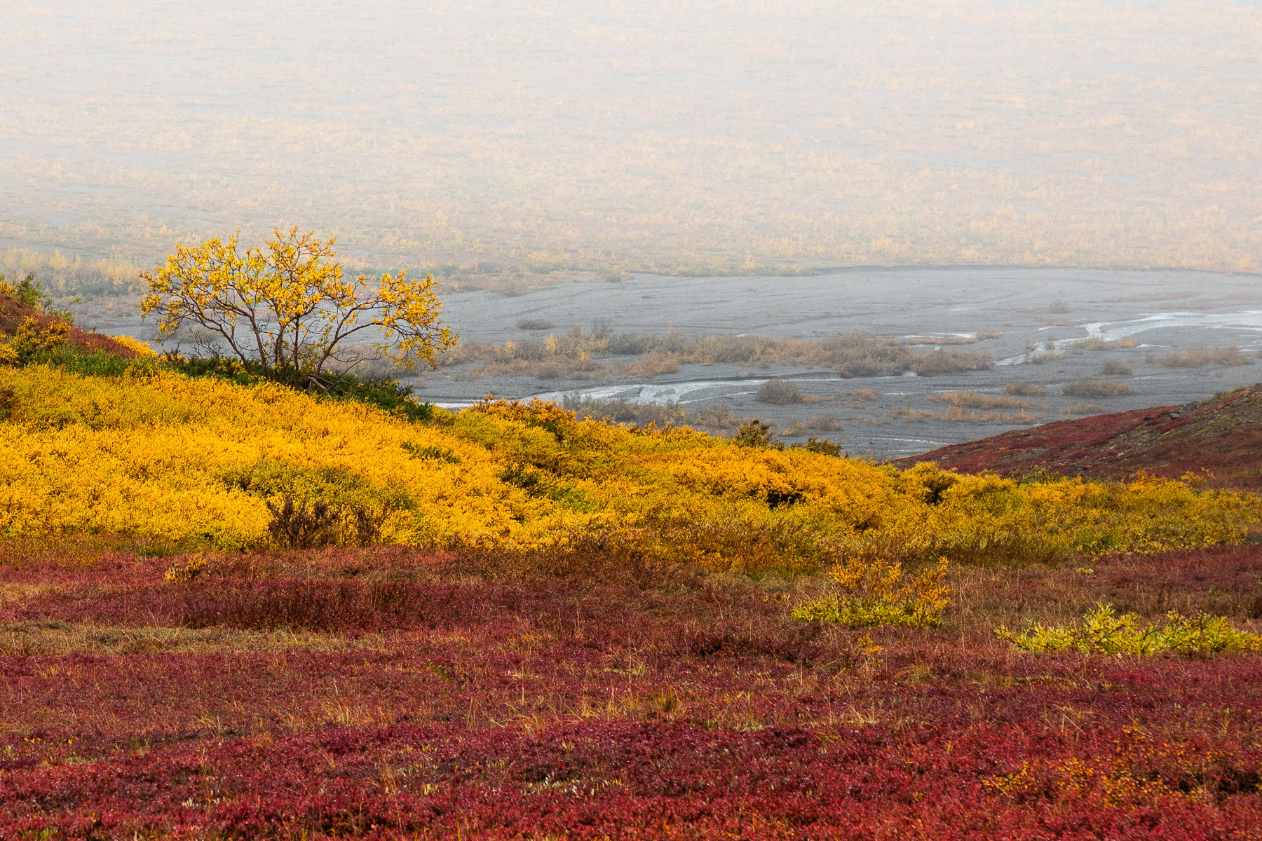
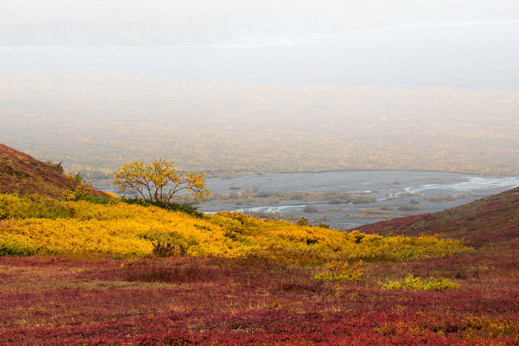
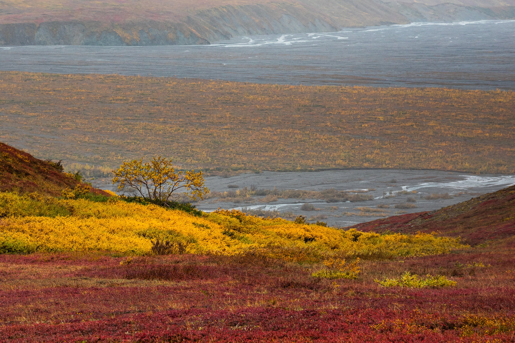
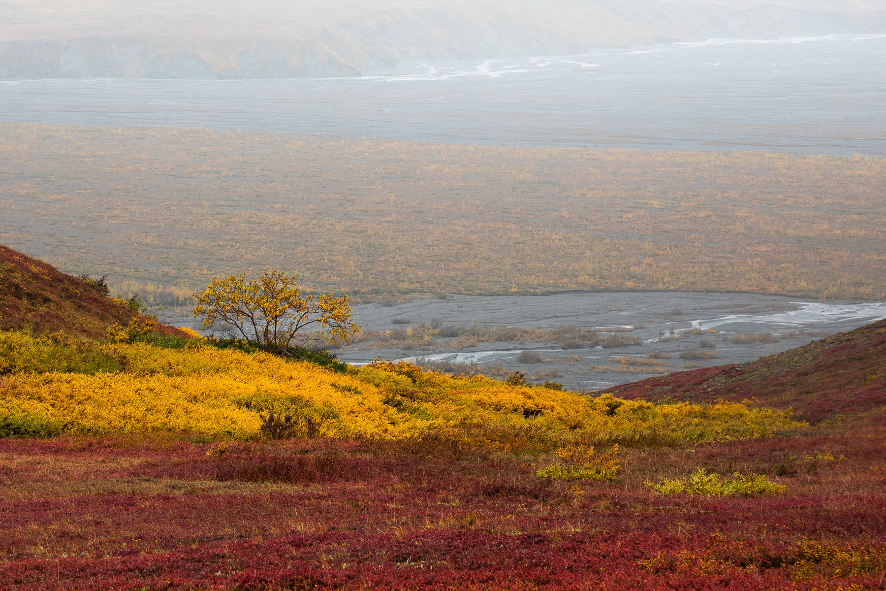
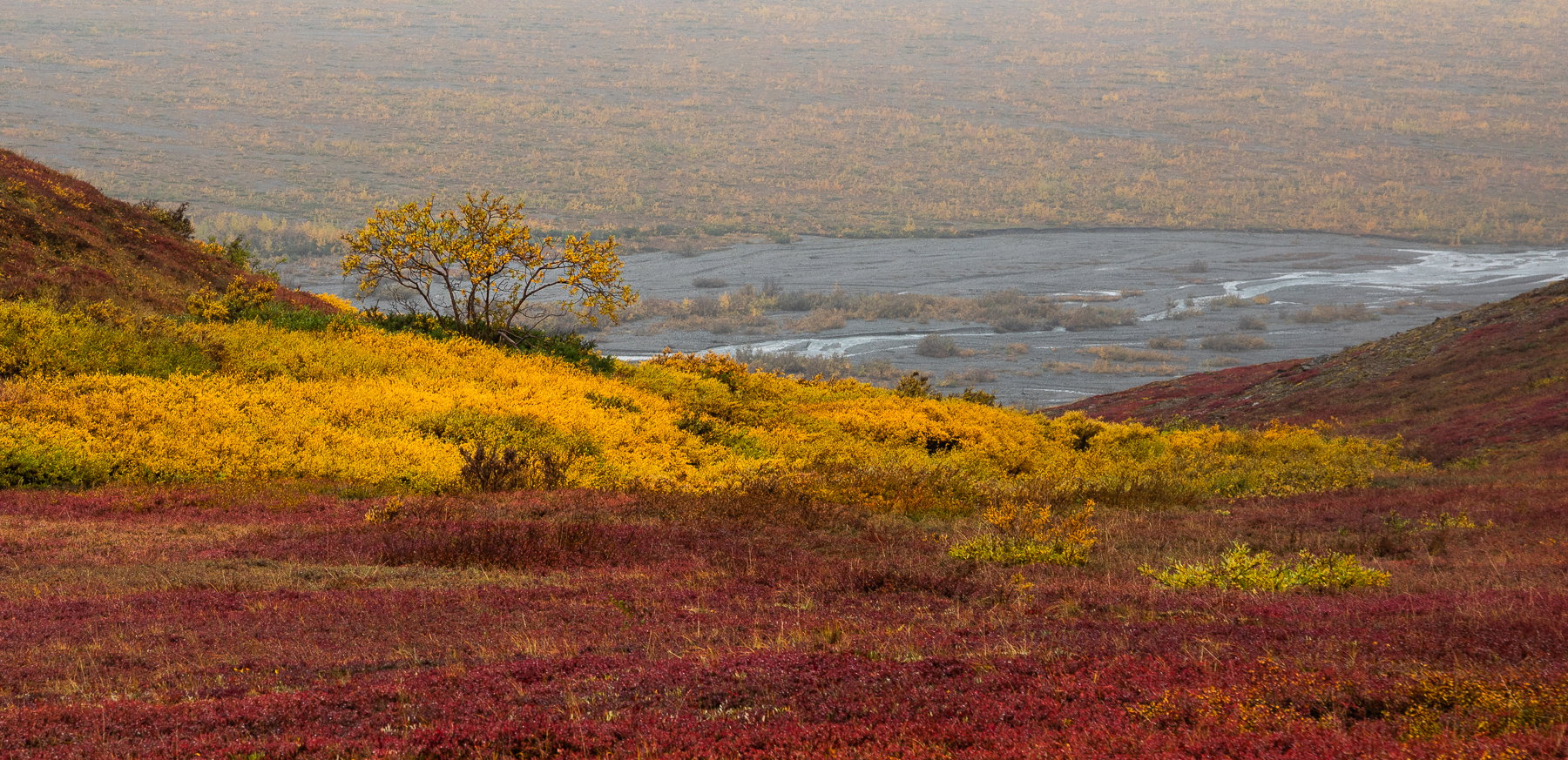
What changed: I did a crop to remove the opposite bank but accentuated the haze. I could also crop this even lower. I did one with the pano crop and dehaze, but I hit the limit before posting it. It’s like Michael Lowe’s but a tish brighter.
The photographer is looking for thoughtful feedback on the image as a whole, especially around the areas noted below.
Feedback Focus: Artistic / Expressive
About This Image
Hi Everyone,
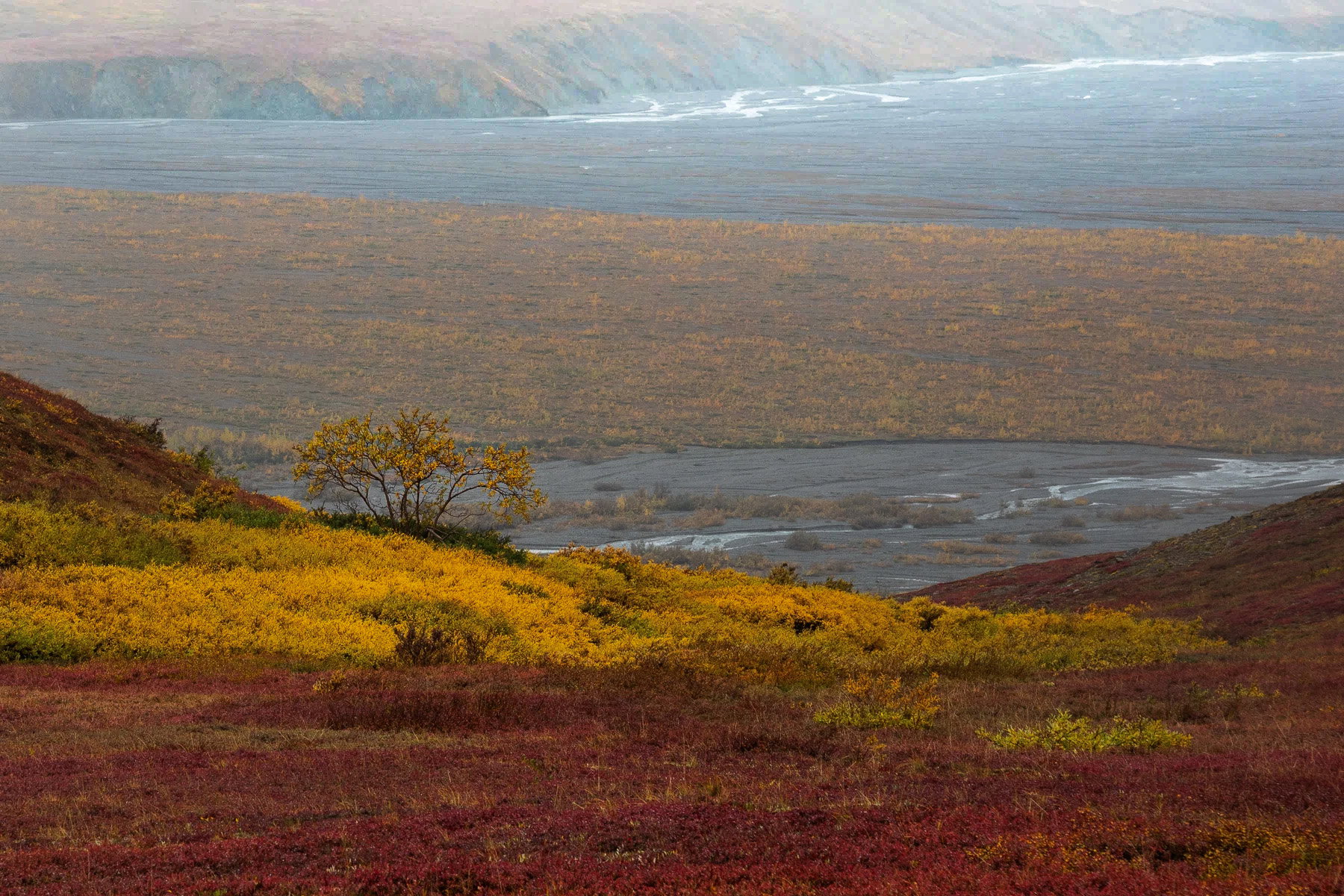
I’m mostly participating in the Weekly Challenge with this one, but I was struck by the contrast between the dwarf birch (yellow) and blueberry foliage. I think the small shrub might be a willow? I’ll ask one of the guides if he knows. This was a grab shot as we were standing around looking for wildlife. I often found myself not looking for wildlife and instead looking at colors and lines. At the time, I had wished for a clearer day (rained most of this day), but in retrospect, the background river valley would have been a bit busy if we had not had gloomy weather.
Feedback Requested
I’m always open to any and all feedback. With this one, I’m wondering the following:
Should do more dodge and burn to bring out the shrub, or enhance or diminish the background more carefully? I used some layer masks (both linear and radial) to emphasize the foreground colors and the shrub.
How about cropping: closer? Crop to remove the far bank of river? Crop to bring eliminate some of the right hand side?
Thanks for any and all feedback. I always appreciate the generosity of your attention as I continue growing as a photographer.
ML
Technical Details
Canon 5D4 with 24-105mm at 105mm
ISO 320, f/10, 1/60s
LR for some contrast, saturation, and luminance boost
I think the processing is just fine as is. All the colors look perfect to me. As for cropping, I would probably lose the river. I don’t think I would crop any from the right because I am a big fan of opposing diagonals in an image. Well done.
You got some fabulous colors up there, Marylynne. To me it’s a very intriguing scene.
I think I’d try not to crop this one, but I’d see if I could add a some contrast to the upper half of the image and maybe darken it a bit. Since you use LR, I tried the dehaze tool and also lowered the luminosity curve.
I am loving this! The soft subdued light is perfect for bringing out all of those lush reds and yellows carpeting the landscape and the fog/mist helps with the separation of the FG and BG. . My thoughts as to the processing and crop pretty much mirror those of my brother @Michael_Lowe; although I could see dodging the yellow leaves on the tree ever so slightly to make them stand out a little more. This is a wonderful consolation prize in my book.
Marylynne, you’ve got a great colorful glow in the foreground. It’s contrast with the fading colors of the lowlands and river is a interesting juxtaposition. @Michael_Lowe’s crop works well by emphasizing the colorful slopes while retaining some of the distance contrast. The white water at the top adds significantly to the visual impact of the river, so it becomes a question of what’s the story that you want to tell.
Marylynne: @Michael_Lowe’s crop makes this a totally different image and I like it. My observations of the original coincide with @Don_Peters and I like what he did a lot as my first immediate impression was, “needs Dehaze.” I remember these colors from our trip several years ago so thanks for bringing back fond memories.>=))>
Thanks, @Bill_Fach@Mark_Seaver and @Ed_Lowe for the additional feedback. I’ll share several revisions above momentarily. I’ll have to think through what I want the story to be. It’s interesting to think about using dehaze to bring out v. increasing exposure to push back the opposite bank of the river. I’ve done both above, as well as some crops. I’ll have to sleep on my preference for the next few days, but as always, I’m always interested in what is most interesting and impactful for you.
This is gorgeous! If I might say, I think this might be my favorite landscape photograph that you’ve presented. And I don’t think I’m going too far out on a limb, but I think your original is the best and most compelling version - for me anyway.
The great thing here is that composition and subject matter is so good, that the alternate crops and versions, are viable and beautiful too. No wrong answers here!
To explain why I think this is a near-perfect image, I have to go back to the discussion of “Ma” (which I now carry with me most time when reviewing images…) Old school, the upper half might be considered “empty space” and thus the reasoning for cropping. Makes sense. But if we think of that “space” as providing value with it’s presence, then I think the image and story are really enhanced. I love how the background is obscured with the haze, raising questions as to what we’re really looking at regarding the background. As presented, I think the far bg could be coastal headlands and waves crashing. But knowing the tundra and geology that is AK and Denali, the bg just adds depth and meaning to the image.
I haven’t even touched on the foreground yet! Gorgeous! Gorgeous colors and so classicly autumn on the tundra. The placement of the birch is perfect. I also really like the opposing diagonals - and so no cropping off the right!
I’m just loving this as presented. (can you tell?) No nits or suggestions. Kudos for such a grab shot!
Took me too long to get to this one, Marylynne. I’ torn between the original, revision 2 and revision 3. The original is just fine and I like seeing the background disappear into the haze (hence not favoring revision 1) . Revision 2 give the foreground more presence while the background still has a fine role to play which I like. Revision 3 is a totally different image, giving a lot more foreground impact and making the birch a dominant element of the composition. In fact it gives the impression of changing the point of view by lifting the birch up in the frame. To me, you have a least a three-fer here.
What a fantastically beautiful image! The colors are so rich! Choices, choices on the different revisions:o) Personally, I love Revision 2 because of the dehaze that enhances the richness of the colors, but would like to see the waves and rocks in the upper part of the frame a bit more (like the original). The haze in the original is effective but maybe a bit too much in this revision. I also really like Revision 3. It really is an entirely different photo because of the missing BG, but the attention on the golds and reds and the tree is wonderful! Either way…you have winners!!!
Thanks @Lon_Overacker. That’s more than I ever expected, but I know that when I was looking at over 500 images from the week, this one was in my top 10 immediately, and I think it’s the mystery of the haze and the way color pops when haze is behind it. The more I think about all of the variations, I’m liking my Revision 2. Tomorrow? Who knows. Thanks for kudos and compliments! Truly.
ML