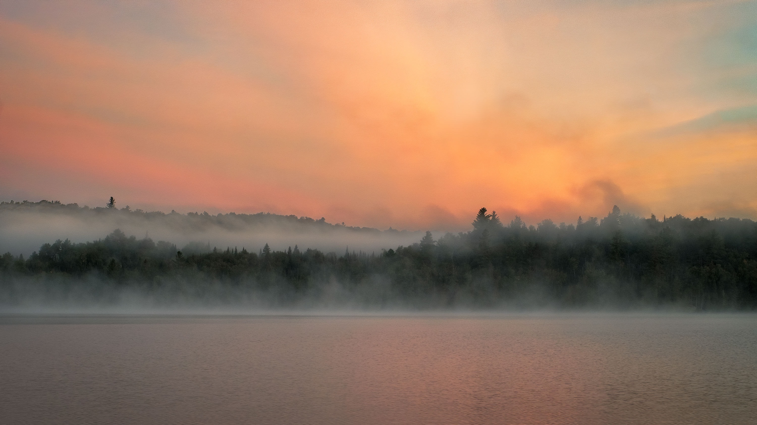
Obviously, there’s little positive to say about COVID-19, except that, to the extent it has disrupted the flow of my everyday life, it has forced me to slow down and take time and reflect. One of the things it has allowed me to do is go back through my Lightroom catalogue in search of hidden gems that, for one reason or another, I missed or dismissed the first time around. This is an image that, after initially downloading my RAW files, I went right past without giving it much of a second look. The RAW image was awash in a magenta cast and visually quite flat and uninteresting (as RAW files can so often appear to be). But stumbling on it a few days ago, now six months later, I saw something in the sky that I thought, if I could bring it out, might make for a dynamic image after all. I did a quick tweak in Lightroom to see what might be there, which encouraged me to take it all the way in Ps . What I felt the image was about was the relationship between the dynamism implied in the vibrancy and the diagonal lines of the sky and the relative sedateness and horizontality of the water, shore and fog bank. I would like to get some feedback on the extent to which that relationship between dynamism and calm makes for a compelling frame. I would also like to get feedback on the colour palette and the extent to which it feels coherent.

I like this Kerry and I totally agree that you’ve got a little gem here. I see the lines you’re talking about, but I’ll be honest, that I didn’t fully appreciate them when I first pulled the image up larger. In other words, there may be some opportunity to enhance them somewhat, but I’d be interested in the thoughts of others.
Now, what may be happening here is that the significant darkness of the line of trees on the bank is dominating the horizontal so much that it overpowers significantly the gentle diagonals of the sky. I wonder if this image wouldn’t be more successful if the contrast were reduced substantially in the land…and whether that wouldn’t be more congruent with the lighting at the time?
Kerry,
Great find and recovery! This has great mood and I think you’ve processed this beautifully. I would say the colors are spot on - if not even a little understated actually, certainly well contained and accurate.
I think the contrast, the fog and the landscape are done well also, although I could see experimenting as Jim raised some good thoughts.
Here is my one and only nit. It’s the more clear and dark strip of tree tops on the left. For me, that’s a pretty strong eye magnet. Usually it’s the bright things on the edge, but in this case the darks throughout most of the frame are mixed and diffused by the fog. But not that little sliver on the left. If you’re so inclined (many are not and that’s perfectly fine) you could clone or otherwise mitigate the sharp contrast and darkness of that little strip. I would say no biggie, but this time, at least for me a distraction taking away from the wonderful mood throughout the rest of the image.
Lon
@Jim_McGovern. Appreciate your taking the time for your thoughtful feedback. I don’t want to beat the reader over the head with the diagonal theme. I would be rather disappointed if someone were to look at this image and marvel at the diagonals. All I meant to say is, they are there and I think they have a subtle impact in the way the sky plays off the land. But maybe I’ve just been reading too much theory ![]() As for your suggestion to bring down the contrast in the tree line, I will give it a try but I really did want to make something of the contrast between the horizontal lines of the fog bank and the horizontal lines of darkness in the trees. However, I’ll play with it a bit and see.
As for your suggestion to bring down the contrast in the tree line, I will give it a try but I really did want to make something of the contrast between the horizontal lines of the fog bank and the horizontal lines of darkness in the trees. However, I’ll play with it a bit and see.
@Lon_Overacker. Once again, I’m amazed at the little things I miss. You are quite right, that dark bit on the left side of the tree line doesn’t do a thing to help the image and, taking your advice, I used some frequency separation (all praise TK7!) to tone it way down. At this stage in the game, I prefer to err on the side of too little than too much. But in this version I have punched up the contrast in the sky a tad more. Thanks to you both for your thoughts.

The fog for me implies the motion. The lines of orange light also create energy to me while inspiring calm due to the warm tones. The quiet water with the orange light also inspires calm to me.
I really like the contrast between the colorful sky and water to the foggy tree line.
Personally, I don’t have nits as this feels very calm and sedate to me. The colors and image support that well.
I’ve only seen that on the panel - but have no idea when or why one would use it - let alone how. Guess I’ll have to go in to his or Sean’s tutorials. I played with it and clueless as to how you “toned” it way down. Of course there’s a gazillion ways to do things in PS.
BTW - repost is awesome.
@Lon_Overacker. It can be an incredibly useful tool. It basically separates tone and colour so that you can work on one without affecting the other. In this case, for example, I didn’t want to change the texture of what was already there. So working off the colour portion I was able to clone in just the greyish fog on top of the existing texture. Similarly, sometimes you might want to remove lens flare ( on water, for example) and with this tool, you can do that without losing the texture of what’s underneath the flare. It’s really simple to use, actually, and, as I said, sometime quite useful.
Thanks so much, Michael.
AHHHH, I get it. duh. Simply painting on that layer, painting, cloning or whatever modification you would me. I was playing with like opacity and trying to figure out how you darkened.
Learned something new today. Thank you @Kerry_Gordon!!
@Jim_McGovern. Here’s a version where I’ve reduced the darks contrast a tad. I think maybe it improves the image as you suggested.

Kerry, I’m late coming in here, and you’ve already gotten some great advice. I formulated my thoughts on this image before reading the other’s comments, but the last rework (just above my post) really captures the spirit of what I was going to say. In the original image the land was too dark, and too cool, to convey the sense of calm that you had in your vision for this image. The rework is more successful in that regard.
I also think @Jim_McGovern made an important point about making the light in the land more congruent with sky. The relative luminosity difference between the light in the sky, and the light in the fog and water is important. With a sky like this, I might even suggest very slightly increasing further the highlight luminosity in the orange water, and the fog on the left. And with this warm a color in the sky, perhaps some TK color dodging to increase luminosity while adding a slight hint of the sky color might be the way to go.
@Ed_McGuirk As always, Ed, your input is much appreciated. Here is one last version (I think) incorporating your suggestions. I have used light painting to add some of the orange into the fog bank as well as bumping the reflected light in the water.
It makes a very subtle, but nice difference.
I like this better…again, not my vision, but yours to see through. I like it even more with Ed’s input. Nice image Kerry!
I like the sky in the third post with the darker trees in the original. BTW, if you repost the rework in the original thread at the top, the software lets one arrow back and forth between versions. That makes it easier for me to compare versions. However you dice it, it is a beauty of an image. Lovely light and great mood. A sure winner for me.
Way late to the party here but I love the final edit with more light reflected in the water, the shadow recovery in the tree line and the overall feel of it better than the original. These are all very subtle differences but they make a nice impact on the edit. Good for you to spend some of this Covid-19 time to jump through the catalogue and find some hidden gems.