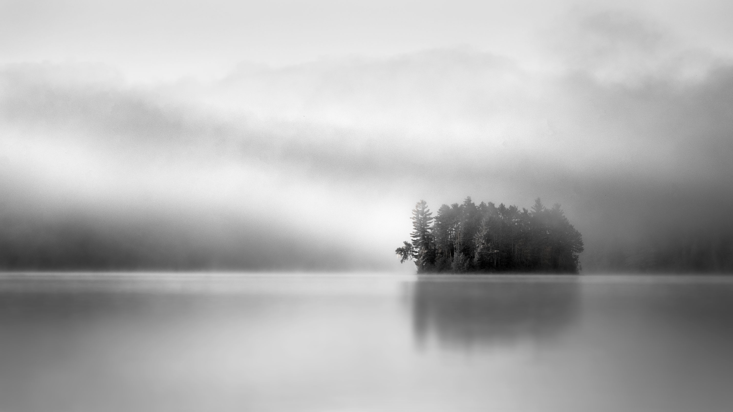
I posted a colour version of this same image last week and thought I’d post this black and white version as well. I am very impressed by how these two – colour and black and white - are different and distinct rather than better or worse. The colour version is very soft, emergent and, I would say, Feminine whereas the black and white version is much more contrasted and forceful in light and line and, I would say, Masculine in expression. I like them both, but they really don’t want to be seen side by side since that only begs comparison, which is kind of meaningless. I’d be interested in your take on the black and white. I fussed with it quite a bit at the end. I find that with monochrome images, I tend to go too dark so I’m learning to trust my histogram for getting the blacks, black and the whites, white, which is, I think, where they need to be in this image. Any thoughts about my handling of the contrast and the general luminosity of the image or, for that matter, anything else that strikes you about it, would be most appreciated.
Hi Kerry,
I like the high key presentation here with the contrast To the tree island. The contrast makes the island pop for me But I think you’ve nailed the gradual tonal transition from the island to the foreground
Just beautiful, Kerry. The conversion looks spot on to my eye and the image wonderfully dreamy. No need to compare to this to the color, both have completely different moods and feel, both are excellent. Outstanding work.
I like the light and dark layers through the image. Very beautiful layers and tones in the clouds. A quiet and peaceful scene.
Kerry,
Both versions work very well IMO; they just represent different moods to different people. This has a wonderful range of tones and the atmospherics are just as wonderful and moody. I particularly like the tones of the water along with the mystery as the far shoreline and trees disappear into the fog. Outstanding work on both versions!
Stunning shot, Kerry! I really admire the calmness this image emotes. If you don’t mind me asking, was this shot in Ontario? Has a “morning in Algonquin Park” feel to it.
The black and white processing looks spot on IMO. Spectacular capture!
I agree. They’re both good in their own way. Each has positives that the other doesn’t.
@Nathan_Klein, @Harley_Goldman, @Mark_Muller, @Ed_Lowe, @Igor_Doncov - thanks for taking the time to offer your support. Just goes to show that sometimes it isn’t a question of this or that but can be both. @ChrisNoronhaPhoto - well, you’ve clearly spent time in and around Algonquin. This is indeed “The Park”. Booth Lake is accessible through the Madawaska Rd. entrance, roughly half way between the West Gate and the eastern edge of the park.
Kerry, I wondered when you would get around to doing this image in B&W. It’s not really fair to do this, but I can’t help but to compare and contrast this to the color version you posted earlier. I find it interesting that you chose to flip the B&W image horizontally, I like how the glowing fog “points” to the right to the island, and then how that lovely small tree points back to the left. I think this flip is a much stronger composition, and would recommend doing it with the color version of this image as well.
I really like how the water looks in this B&W version, when you view the larger size image, the silvery water has a very metallic quality to it , and it looks great. Good decision to convert this to B&W, although I love the color version too.
@Ed_McGuirk Thanks Ed. Actually, in the my final post for the colour version I did flip the image horizontally as a final change. I realized that the strong diagonal line of light, in both versions, is that much stronger reading left to right instead of right to left.