Bridalveil Creek

Original

Rework

Critique Style Requested: Standard

The photographer is looking for generalized feedback about the aesthetic and technical qualities of their image.

Description

We had been up to the Bridalveil Fall in Yosemite viewpoint one Autumn day. As we wandered down the path I saw this intimate scene. I liked the zig-zag of the stream through the boulders and also noticed the various colors of them.

Specific Feedback

How do you feel about the saturation here? I punched it up just a wee bit. Did I go too far?

Any other thoughts or suggestions you may have will be appreciated’
-P

Technical Details

Nikon D-7100
Nikkor 18-140 @105mm
ISO 100, f16 @ 1s
ACR, PSCC, Neat Image NR


Critique Template

Use of the template is optional, but it can help spark ideas.

  • Vision and Purpose:
  • Conceptual:
  • Emotional Impact and Mood:
  • Composition:
  • Balance and Visual Weight:
  • Depth and Dimension:
  • Color:
  • Lighting:
  • Processing:
  • Technical:
1 Like

Wow!! Those golds popping out, along with a green and pink here and there, are fantastic!! And of course the structure, with the arrangement of rocks and the SS to show off the water flow, are top notch! My only thought is to maybe reduce contrast in the BG rocks in the UL corner.

Preston,

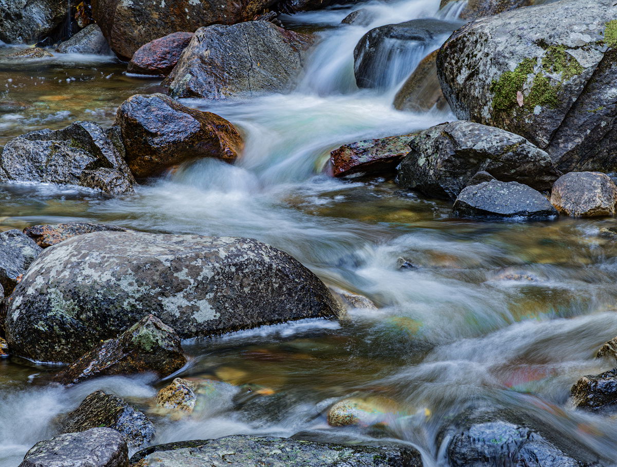
What a gorgeous and intimate image. Composed beautifully and the flow top to bottom is just wonderful - including the seemingly perfect shutter speed to show motion/flow - AND texture in the water; and without blowing anything out! Saturation and colors look just right to me!

I really hadn’t thought about it or even noticed really, but Diane’s comment about reducing the contrast up top got me thinking. And actually I started thinking, hmmmm, the contrast is a bit heavy globally - not so much that honestly I never would have commented on, but again, got me thinking…

So, hopefully you don’t mind, but I’m experimenting here. I’ve never done this on a straight landscape image, but most recently with some abstracts, I’ve been playing with the Clarity and Texture sliders in ACR. The combination of the Texture/Clarity/Dehaze options in LR/ACR can actually be very helpful, if not overdone, or applied carefully and with purpose. So I took your image and applied negative clarity and positive texture and wow, the global contrast was reduced (I’m ignoring the ULC btw and went global.) The change is subtle and am now wondering if viable.

All this based on my own thoughts - "you can make a good image great, and you can make a great image awesome, and you can make an awesome image masterful, but you can never make a bad image masterful… " I’m just mentioning because your image was awesome to start with and any little tweaks are simply trying to elevate it further. Hope you don’t mind! This may or may not be your vision of the scene.

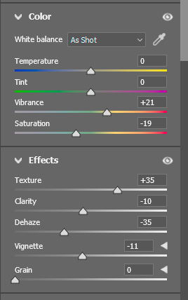
Here is a screenshot of the ACR settings;

Is the image elevated? I dunno… but what I can say for sure, is that I’m learning and growing!

Oh, I should explain the settings. First, in my own workflow, I tend to favor Vibrance over Saturation in genera. As I’m sure you know, vibrance increases the color/saturation of the more muted colors whereas the Saturation adjustment boosts all colors - namely the bold ones, yellow, blues, greens, orange, red, etc. I often reduce the big saturation and the bring all colors back with Vibrance.
The Texture/Clarity/Dehaze. Dropping the clarity softens (thusly reducting contrast) and text seems to bring back, or keep in check the original detail/sharpness. Dehaze is also great for increasing contrast OR decreasing it. Now when Dehaze is reduced, it also brightens the image somewhat and so the Exposure, whites/highlights might need adjusting as a result.
Vignette tossed in, well, just because I could.

Preston, this is a very inviting look at this section of creek. I like the zig-zag of the main flow and the clarity of all the rocks and the slower moving water. It does feel too blue to me. I put a copy into PS and found that a Saturation layer where I dialed back the Blue by -60 looked good to me. I also burned in slightly the flow exiting in the lrc and the top of the flat rock, center left so they get a bit less attention.

Hi All,

I have posted a tweaked version in my OP above.

@Diane_Miller: Good idea! I created a selection of the area and used a simple Brightness/Contrast layer, adjusting only the contrast.

@Lon_Overacker: Quick question. Is there a way to open a *.psd file in ACR. I had already used TK’s Luminosity masks and some Burn/Dodge layers in this image, so starting over from the *nef file in ACR was not something I wanted to do.

I see where you were headed with your adjustments in ACR, and I’ll keep them in mind for another image. In this case, I used a Wide Mids TK mask to reduce the contrast a bit. Thoughts?

@Mark_Seaver : Thanks, Mark! Good idea. I reduced the blue Sat quite a bit and used a soft mask to retain a little blue in the water. I also burned down those spots you mentioned.

My thanks to you all for your comments and suggestions. Any further thoughts you may have will be appreciated.
-P

I like the composition very much and the shutter speed for the water is pretty optimal. My first impression, however, is that it looks HDRish. I know it’s not so I don’t know how it got that way. Lon’s rework makes it less so by reducing the colors saturation and some contrast. But there is something about it that looks artificial (maybe over sharpened).

Preston,

Great job on the rework. You certainly did drop the contrast a little and it looks great. All hindsight now of course, but in the rework, you could bring back the whites a little in the water, but I’m getting picky… Thanks for taking the time and considering the feedback.

Good question, from what I can tell, no you can’t open a PSD file in ACR. However, you can create a “Camera Raw Filter” layer in the stack. I typically do that in as a Smart Object layer. We can chat offline some time if you like, but one must remember, the ACR “layer” is based of a pixel containing layer… so you might have to flatten your current adjustments (so you don’t lose your work!) and then build from there. You might be better off duplicating the image to make sure your original work and adjustments aren’t lost or forgotten.

But this gets to a much bigger topic - and that’s just a photographer’s workflow. I know mine has changed just in the last year or so and I’m sure we haven’t chatted about that.

In short, some time back after I kept reading how so many togs use LR for their initial adjustments, or honestly the heavy lifting, then polish and fine tune in PS. Well… I’ve long refused to not use LR (for an entirely different reason…) but needless to say, as far as I’ve known, the “engine” for processing is the same in both LR and ACR. Sooooo, my basic workflow goes like this:

  • Open RAW file in ACR
  • Perform basic work that may include TK Linear profile, cropping, dust spot and minor image cleanup and minor cloning. WB adjustments, Highlights, shadows, etc. etc.
  • Once I have most of the basics and “heavy lifting”, I’ll open in PS.
  • Before the next step and whle I don’t have additional layers, I will do any major cropping, CA-fill if needed, any other major pixel altering changes before creating the next step
  • I now have an Action that copies the bg layer, creates a Smart Object layer and loads the Camea Raw Filter. This way I can always go back in to ACR to tweak - like using the Texture, Clarity, Dehaze options, etc.
  • Now from here, my top layer is the ACR layer and remember it’s a pixel containing layer. Anything above that would be other PS adjustments; dodging/burning, vignettes (also can be done in ACR)
  • Most times I also add the Topaz DeNoise AI as an adjustment layer within the same Smart Object Layer; above or below the ACR. Doesn’t seem to matter.

Anyway, we can chat more if you like one of these days. But for sure it would likely be a workflow change for you. And if you’re like me, change doesn’t come easily… :wink:

Oh, here’s a screenshot example of the stack for my Color of Summer ICM posted.

@Igor_Doncov: I used TK Web Sharpen for both images. After reading your comment and looking at the rework again, it does look a tad crunchy. I usually use an opacity of %50 in web sharpen, but I pushed it up a notch for the rework. I guess I went too far. Thanks for noticing that. I’ll be more discerning in the future.

@Lon_Overacker: Thanks for all the info! Let’s chat off-line about workflow soon. I try to obey the Prime Directive: “Keep it simple, stupid!”
-P

1 Like

Hi Preston,
This is a lovely intimate view of Bridalveil Creek as the rocks seem to be perfectly placed while creating that wonderful zigzag flow of water. While slowly looking around the image I got to savor all of those subtle color variations in the rocks as well as the water. Your chosen SS has created some wonderful textures and details in the water. IMO you nailed it with your rework; although I quite like the original.

The RP is a nice change, but I think you could bring back some of the blues. This is such a nice image that any interpretation works well.

There is something special about Bridalveil Creek – maybe just the light through the trees and the dancing path through the stones.