Hello all - This is Amith here and I am a budding landscape photographer. This is my first post here.
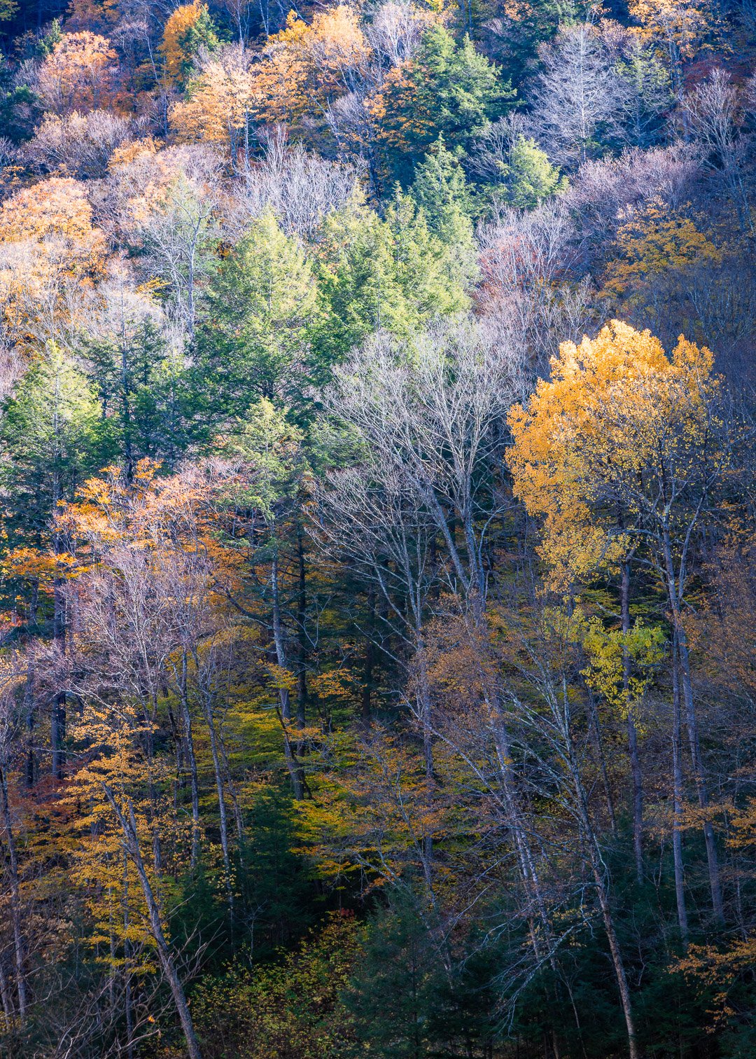
It was mid-afternoon and we had stopped on the side of a road on the Mohawk Trail to gaze at a mountain dispersed with a vibrant splash of colors. What caught my attention was that the top diagonal half of the mountain was being lit up by the afternoon sun and with it came the glow of the yellow and orange colors. Plus, the leafless tress gave the feeling of snow.
What is funny is that I was almost ecstatic at having captured this but my friends that I showed it to later, not so much.
What technical feedback would you like if any? I was wondering what is the general feedback about my picture?
What artistic feedback would you like if any? Is my vision of capturing a diverse set of colors combined with rays of sunshine coming through?
Pertinent technical details or techniques: Nikon D850 24-120mm 105mm f8.0
(If this is a composite, etc. please be honest with your techniques to help others learn)
If you would like your image to be eligible for a feature on the NPN Instagram (@NaturePhotoNet), add the tag ‘ig’ and leave your Instagram username below.
amithmohan
You may only download this image to demonstrate post-processing techniques.
You need better friends.
Just kidding. I like this for it’s less saturated autumnal colors. Nice change of pace. I think the bare trees contrast nicely with the others. I think you achieved your vision.
Welcome to NPN, Amith, this is a nice first post. I think late season foliage can be an interesting subject, with a mix of color and bare trees.
I have a couple comments about your quote. First, I’ve found that photographers and people who are not photographers (your friends), look at images very differently. Photographers are attracted to the quality of the light and contrast, as you were here. Non-photographers are likely to have expectations of seeing peak fall colors against a deep blue sky, with a barn and cows in the foreground (classic New England Calendar image), they are not as drawn to the qualities of light.
Second, while I can see the attraction of the strong side lighting and resulting contrast here, it’s important to realize that your camera’s sensor can’t record the scene the same way that your eyes see it. In this case, the dynamic range is more than the camera can handle, even though it looks great to your eye. The top of the image has nice light, but it looks washed out, because you used an exposure to get detail in the shadow areas. You cannot get a good exposure in both without using Grad ND filters, or exposure blending in post-processing.
To some degree, I think you really have two images here, that compete with each other for attention. And you need to pick one or the other, and then compose/process accordingly. If it’s the strong light, then compose to emphasis that. If it’s the rich color below, then compose for that. Again, it’s also about simplification, and less is more.
Welcome to NPN. Western MA had some beautiful colors this fall. To get a little more “pop” to the colors try bumping up the saturation a little in post processing if you don’t have the filters to use when taking the shot. I like the angle you shot this at and the lighting you captured. Look forward to seeing more of your images.
Thank you, Patricia. I appreciate your feedback. I was debating between too much and too little saturation, guess, could bump it up a little more. Will try it and see how that comes out.
Thank you so much Ed for the detailed feedback. “Washed out” is exactly what I felt when I printed this image and now I realize why. I did use a polarizer to reduce the glare but I should have had two different exposures one for the highlights and the other for the shadows.
Would you recommend using the Nikon bracketing feature (taking two to three shots across a range of exposures) and combining them in Lightroom later for such situations?
Again, I appreciate the thoughtful analysis and your square images for reference.
You are welcome Amith. I shoot Canon myself, so I can’t speak to the Nikon system., maybe someone else can chime in. If the Nikon feature produces Jpeg images as output, I would avoid it since creating raw output is always desirable for more control after the fact.
There are a number of other ways to deal with this though. Your image above could be adjusted using the Lightroom gradient filter (essentially a digital grad ND filter). I’d put one on the top to reduce exposure and highlights, and possibly a second gradient on the bottom to lift shadows. This is a relatively easy way to balance exposure, as long as your raw file does not have totally blown highlights, or blocked up shadows.
Lightroom also has a Merge to HDR feature where you can combine more than one exposure, where you bracket exposures for highlights and shadows separately and combine them. A variant on this is to double process a single raw file. Create a virtual copy and significantly reduce exposure until the top looks good, and then do the same for the bottom shadow area. This is a “cheating” method to create exposure brackets after the fact if you did not do it in the field.
A more advanced method is to create exposure brackets and blend them using layer masks in photoshop. This can be done either manually or using Luminosity Masks such as TK Actions. This approach gives you more control, but is more complicated to do.
Welcome aboard, Amith and a nice first post, too. I might tone down the highlights a little bit, but otherwise, the processing looks good to me. You present a nice range of light and color and some fine layering, too. It works quite well.
Hi Amith and congrats on a beautiful first upload! Interesting light and I agree that the leafless tree add interesting elements here. Like written before, the highlights look a bit washed out and I think I see a bit a of pink tones in them? If you have this in raw from the D850 I’m sure you can lower the highlights some and pull more detail out of them. I personally never use the bracketing feature on my Nikon (D810), I just do it manually, here you wouldn’t need more than two shots, maybe 2 stops apart, just keep an eye on the histogram. But a single D850 raw processed twice should work well here too. I like the cooler shadows, but would try warming up the highlights a little bit and see where that takes you.
Thanks Ron. It is good to get a perspective from a fellow Nikon user. I am going to try both the methods next time (on the field bracketing and single file processed twice).
I am quite honestly overwhelmed (in a positive manner) by all the comments I have received for my photograph. One learns so much more through constructive criticism.
Thanks @Ed_McGuirk for your continued engagement. I had a chance to reflect on everyones feedback and here is an edited version of the same image. Not perfect, but I am really beginning to apply what you guys have mentioned.
Welcome to NPN! A terrific first post and we look forward to you joining and participating.
Lot’s of good feedback and suggestions so far. First, I think the best thing you’ve done is isolate this composition, concentrating on the elements that attracted you - the colors and light.
We can all comment on the light and make processing suggestions to mitigate the “washed out” or bright areas. Of course there’s bright, direct sunlight there, so from the git-go you have a challenge; bracketing and layers, masks in PS/processing can help with this as suggested.
I’m gonna go a step further and talk about the conditions and timing. Of course, we are often put in a location where the time of day and light isn’t the best for what we may want. I see the light here is side lighting - but more importantly it’s more front light than back light. When scenes are more front lit, they are reflective and thus tend to have flatter and more easily washed out colors. With more back lighting then the autumn colors take on a glow - are translucent rather than reflective. Another condition is waiting for the hot light to drop over the ridge creating open and diffused lighting; overcast and diffused lighting - while perhaps losing the drama and beauty of back lighting, often brings out the richness and diversity of colors…
Having said that, I know that you recognized this as a beautiful scene, the colors and light caught your eye and I think you did a great job composing and capturing this. The only reason I mention the light and scenarios above is simply for future reference (And of course if you have the opportunity to revisit this spot again - different times of days, seasons… but alas, I know there are times and places we just won’t be able to get back to - that’s part of it all, yep.) Said another way, some times we’re at a place and we see and recognize the beauty and stop to capture it - the next step though just might be, to ask yourself, what I came here at first light? What if it was cloudy, foggy, what would the scene look like? With leafless trees and a dusting of snow?
Well, enough for now. We welcome you and look forward to more and your participation.
Thank you so much, Lon. Yes, your distinction between back lighting and front is very useful. I am definitely heading back to Mohawk trail next year. I feel it is easier to obtain back lighting in a forest setting and less so on a mountain because as the sun goes behind the entire front area of the mountain goes away from the light. That in itself is an interesting composition.