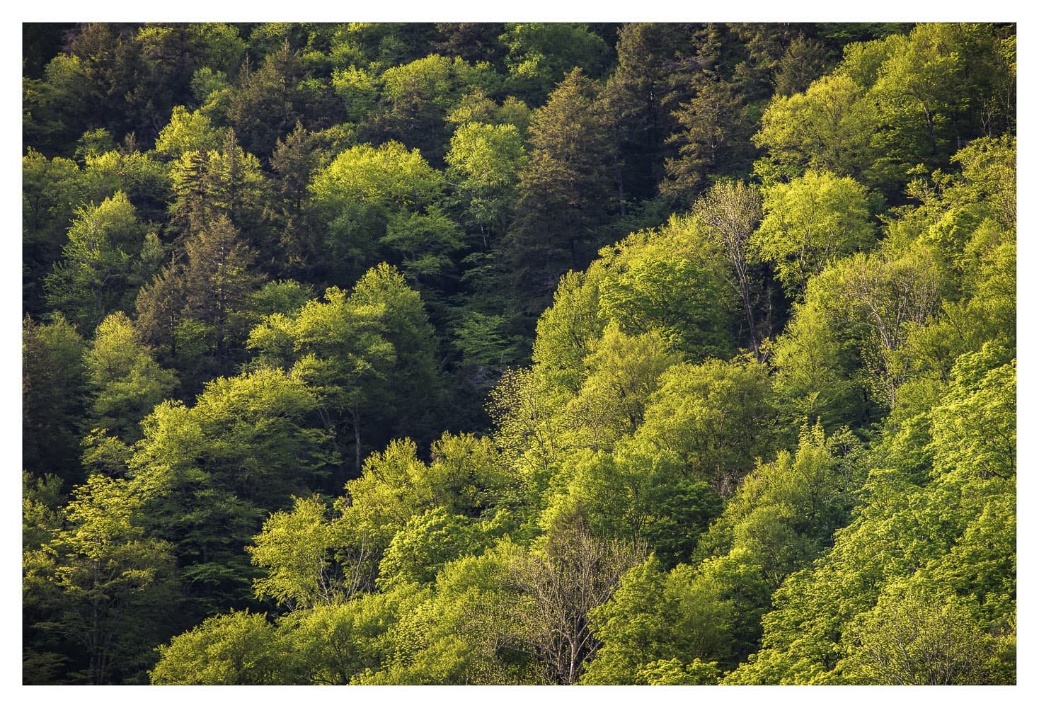
Well, Florida Massachusetts that is, which is along the Mohawk Trail highway in the Berkshire Mountains. And this is spring foliage, not autumn, this shot was taken on 05/22/21. This section of the Mohawk Trail goes through a narrow gorge, before climbing up to a mountain summit. I wanted to catch the spring foliage on this hillside in early morning sunlight for some variety, because last year I shot this section of the mountain in fog on a rainy day.
I’m finally getting around to processing the bulk my images from spring 2021, so will post a few of those coming up.
Specific Feedback Requested
any critique or comments are welcome
I’m interested in knowing if people think the yellow saturation is too intense here. It needed contrast to deepen the shadows, but it very quickly got over-saturated. I backed saturation off somewhat with TK Saturation masks, but I am looking for opinions on whether it needs even less yellow saturation.
Technical Details
Is this a composite: No
Canon 5D MK4, Canon 70-200mm f4 lens, at 200mm, ISO 200, 1/15 sec at f11
This is very nice. As @Igor_Doncov puts, there’s some nice diagonals in the pictures. I really like your composition.
I do like the color balance and for me there is nothing wrong with the color saturation.
I think it looks just like a Northeast spring. I think it could be a little more spring greenish, brighter, not sure if that means more yellow or not. I don’t think it’s oversaturated at all! Nicely captured!
A really nice image, as already pointed out the diagonals add to the quality of the image. To me, the colors look good, but I could also understand the proposal from @Vanessa_Hill.
thank you for your comments, I appreciate the input.
Ola and Vanessa, I went back and forth on yellow vs. green here in processing . It was predominately yellow in real life, partly due to it being early spring, and partly due to it being in direct sunlight. I’ve attached a rework with a little more shift to green, what do you think?
I think I like your first one better, but I think I meant to make it more yellow than green, but maybe that wasn’t an option. Like more close to how you saw it. Because if I understand correctly on your original post you took out some of the yellow?
I too vote for the original. It’s not so much the yellow or saturation, but the original with those yellows creates more color contrast and color variation. Even the slight edit making the yellows more green, at least to me that color contrast went away.
Amazing how such subtle changes in color, contrast, etc. can make in an image.
Beautiful! What a spectacular image from such a simple scene. Well, it’s not really simple, but it’s a view that I’m sure thousands see daily and don’t think to make it into an expressive statement of forest lushness.