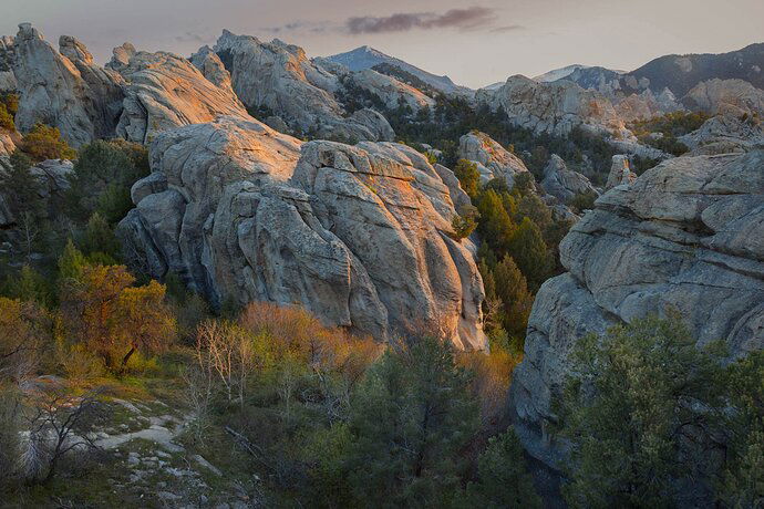
Another City of Rocks morning.
What technical feedback would you like if any?
Any at all, of course.
What artistic feedback would you like if any?
Cropping is the biggest question. There is a perfectly wonderful image in the middle/left 2/3 of this image. But I wanted to include the distant rocks, which brings in the nearby boulder face. Turned out to be a play of yellows and blues, which can be pretty nice.
Aiming at a tour for the eyes, and avoiding the question “What is the subject?”
Your thoughts?
I like how the sunlight hits those rocks and the tops of those trees. I would try a comp without some of the right side. An 8x10 of the left side. Almost a square.
Real nice warm light and a fine inviting path through the image. I would consider cropping about 1/5 to 1/4 of the large rock on the right but would leave the rest. It contributes nicely to creating that visual path. The subject for me is a wander through the trees and rock to the left and then through the canyon to the right, exploring the detail on the way. This is a real nice, tranquil image.
This is a very intriguing location Dick, those rock formations are fascinating. For me the subject here is he warm light as it moves from left to right across the image. The light on the trees, vegetation and rocks is the star of the show for me, with the rest of the rock formations serving as the vehicle to showcase that light. The processing looks great, wouldn’t change anything about that.
My suggestion would be to crop from the the right, and slightly from the bottom, to place more emphasis on the sunlit areas. Here is a rework reflecting my suggestion.
Beautiful light indeed, Dick. And I like how the rocks are complemented by the vegetations. I like the direction that @Ed_McGuirk took here but I will crop the right even further to something closer to a 4:3 or a 4:5.
OK folks, I see unanimous votes to chip away at the ll boulder. I hated to move the distant light closer to or beyond the right margin. Then I realized tht there is noting really horizontal or vertical in this image, so I could rotate and crop. Maybe you did that @Ed_McGuirk
Also included 4x5 as suggested by @Adhika_Lie
Thanks to all @Harley_Goldman @Igor_Doncov
1 Like
The 4x5 wins it for me. It looks very balanced.
Nice crop, Dick, the image works better for me this way also. Great location.
Yep, the crop takes the cake. Removing some of the rock on the right does not hurt the balance of the image and it didn’t contibute very much to the scene anyway. This is about warm light flowing through that valley and hitting the tree tops and the rock tops and the crop has all of that still in it. And, you included the warm light on the rocks at the very top of the URC of the image so this is an easy win for the crop. Beautiful scene by the way.
I think the landscape is the subject. The quality of light as well as the unique form of the rock formations capture my eye. I also like the warm light hitting the trees. This is a case where there is interest throughout the frame so in my opinion it is not important to have a single “subject”.


