The photographer is looking for generalized feedback about the aesthetic and technical qualities of their image.
Description
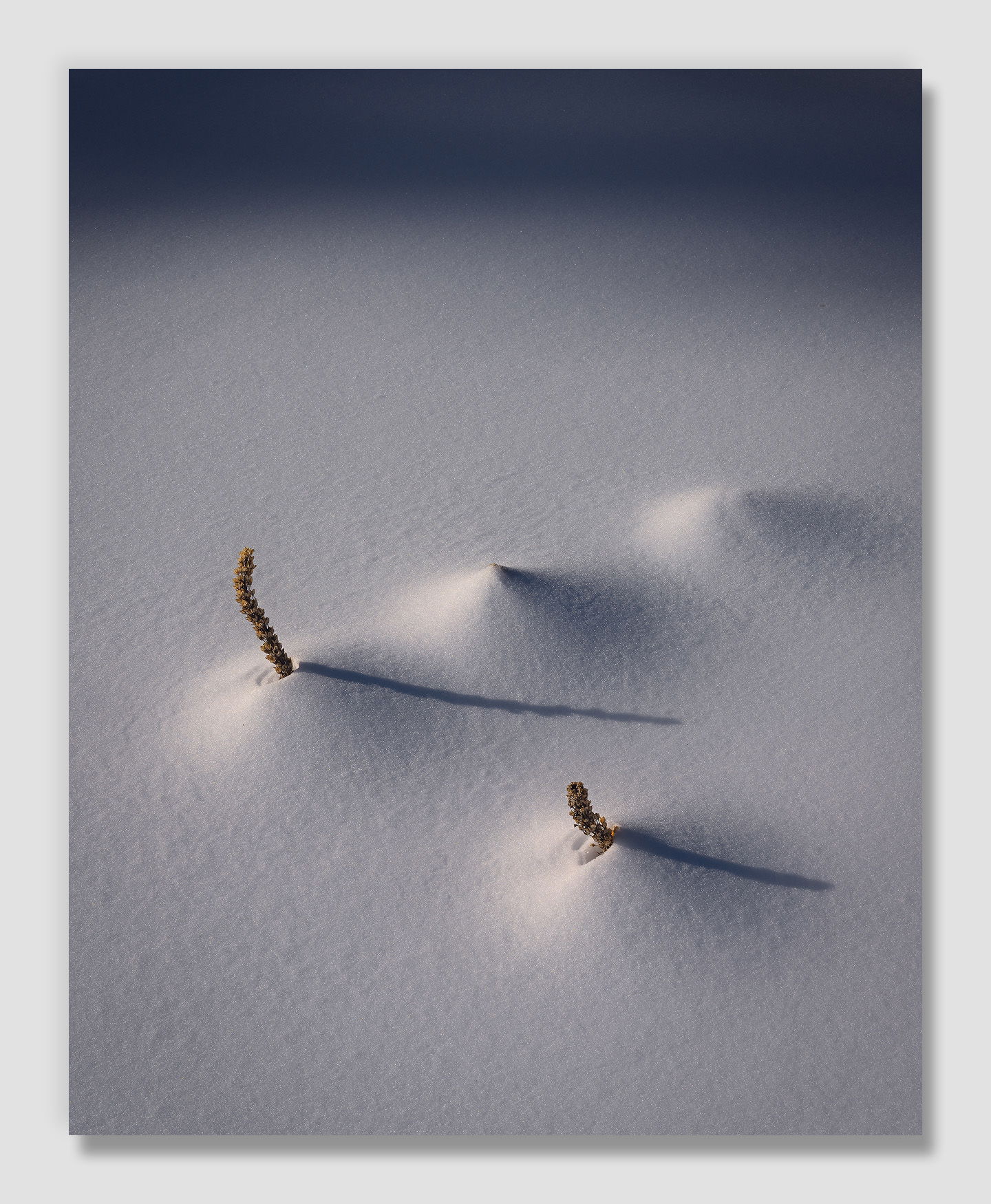
Cascade snow has been challenging this year. We finally received a good dump this week, when I can’t get out there, and sadly rain is supposed to return to the mountains next week. As such this is a photo from back in January, one of several I’ve been fence-sitting on.
Specific Feedback
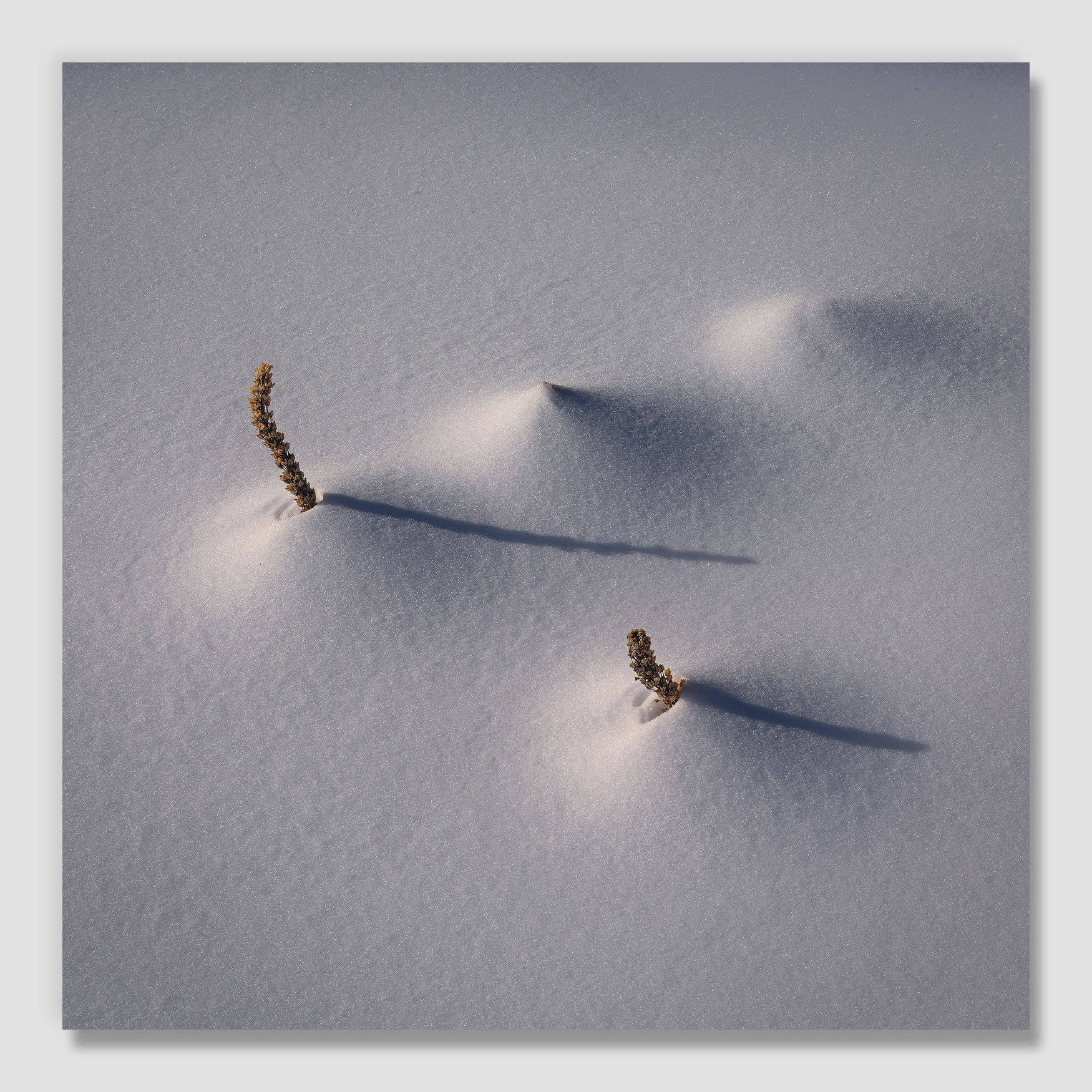
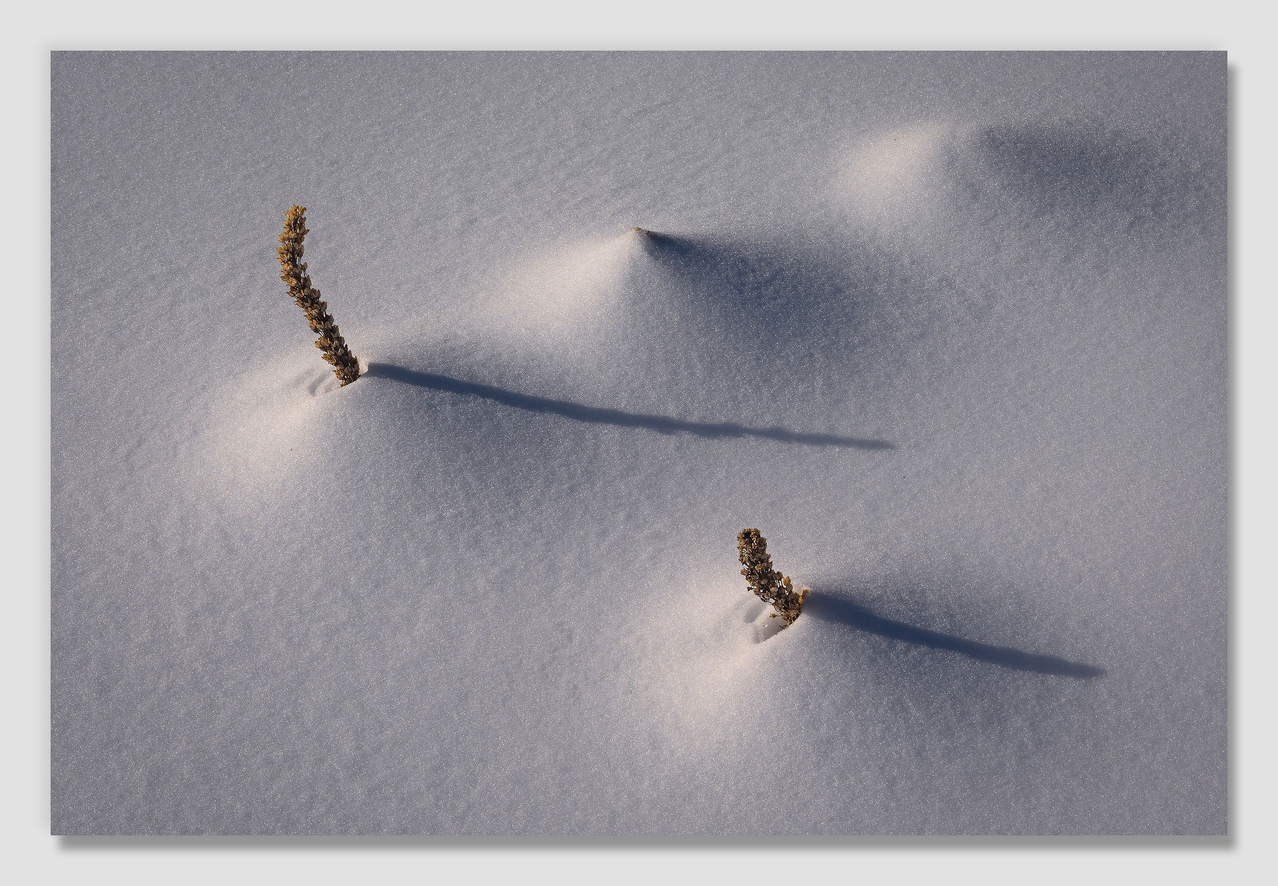
I spent an inordinate amount of time playing with crops for this. I took landscape versions too, but unfortunately they ended up being a little tight on the bottom. (I really need to do a better job of forcing myself to zoom out slightly from my composed image so that I have a safety margin, and then crop a little in processing. I don’t know why I get so pixel greedy, the chances that I will need to make a 6’x9’ print someday are about the same as being struck by lightning…) I’d love your thoughts on this vs. square, etc.
The morning light was just creeping into the scene, and I’ve tried to be faithful to that. Too dark overall?
Technical Details
NIKON Z 7II
NIKKOR Z 24-200 f/4-6.3 VR at 60 mm
1/320 sec. at f/16.0 and ISO 64
Handheld
I agree with you completely. I’ve been debating with myself on this for ages. The old masters (Weston et al) considered it a sacrilege to print that which you didn’t see in the camera and since I admire them so much it had a lot of weight for me. But whether it’s my personal weakness or not I don’t see everything when I’m shooting. Oh, I see it physically but I don’t see all of its meaning in that time. And if I do it’s usually a shallow image. So I agree with you. Shoot conservatively by considering many viewpoints and distances from the subject.
Thinking of this as a snow image, I’d probably bring up the shadows a bit, John. Thinking of it as a piece of art, I wouldn’t change a thing except possibly to get rid of the dark band along the top, which doesn’t add anything for me.
Hi John,
I can see how this one confounded you in post. There are so many cropping options. I have to say though, I like it as it is, with the dark band at top. That adds a depth, a mystery, and even though it’s abstract, a sense of place, something in the distance to wonder about. You could share some of your other crops and people can vote, but really, this is one of those images that has 2-3 fantastic variations, and all are print-worthy.
FWIW, when I got my Canon 5D4 (yes, last decade’s technology but 34mb), I was amazed at how much I could crop, so I have now begun zooming out for security.
ML
John, the details in the snow with the “lumps”, shadows and flower stalks look great. I’d crop off most of the dark band at the top, since there are no details showing.
This is a well seen opportunity beautifully rendered. Its ability to present interesting little questions to my mind is what makes it quietly rock. I enjoy the snow texture, and the dark band at the top makes me wonder what else is out there. Terrific art piece.
I like the third (landscape) crop best, as it focuses in on the plants and the shadows, and leaves off the dark upper band which, I agree with others, doesn’t add anything. I’m with you on giving myself better options by zooming out a bit in the original shoot. I make that mistake often (zoom in too close), and find that I wish I had more to work with. I’m also a bit of a purist in terms of post-processing, but I am learning here that that is all part of the art. And right–do I need all those pixels because I might make a huge print of the thing? Unlikely.
Seeing all three crops, I’m most drawn to the square one. That said, the mysterious dark band still draws me. It’s creates a question, whereas the square one simplifies life and feels quiet.
ML
John, I Love this image so I hope you have enough data to be able to print a 6’x 9’ for me. Do try and avoid that lightning strike while doing so.
Ok, seriously, I love the first image at the top of the page with the dark band across the top. I love that band but I might bring up the exposure a little so it’s not so shocking but maybe it’s the shocking look of it that draws me in. I don’t know but I know that’s the one I like best by far. The little plants are relatively uninteresting to me so it’s not really about them per say but rather the light and shadow play that they create in the highly textured snow. The light is just beautiful John and I can see why you took this image.
I too would love to not have to crop an image but I find myself not seeing the edges entirely while in the field shooting and knowing I have a high MP sensor helps to reduce my fears of having to crop later in post. But I do get the greedy part of wanting a full frame capture and printing a full frame capture. Great image!
Hi John,
For my own personal tastes I am loving the square crop. I can’t really articulate why other than to say it just feels and looks right to me. The soft morning light is quite lovely as are the textures and details in the snow. I also quite like the shadows of the two young trees poking through the snow. I hear you on zooming out from the composed image although I have the opposite problem as I sometimes include to much instead of taking that extra time to finalize exactly what it is that originally caught my eye. Anyway, this is a wonderful intimate snow scene that most of us would have not even noticed; myself included. .
For me, the square crop feels strongest. The placement of everything just works to my eye.
Toning: we know what we’re looking at. It’s not a snow scene, it’s an art piece. Be as moody as you wish.
Also: I am constantly preaching in my photo clubs to shoot with margin. There are many reasons to do so, not the least of which is to have choices when cropping in post. “Getting it right in camera” only mattered when one had no options.