A new approach on a different file.
I reduced the vibrance from +25 to +10
Reduced saturation from -10 to -15
Also reduce reds and blues 25 points each in the saturation luminance slider in ACR
In Photoshop, I only made a few very subtle adjustments to the reds and yellows with selective color. One to the reds reducing cyan and increasing black. One to yellows reducing cyan and increasing black. Then a new layer increasing cyan and black slightly for the evergreens. This was to attempt to keep the yellows and the greens a separate as possible. Or to actually increase slightly the tonal separation between the fall colors and the evergreens.
A very small curves adjustment.
A very slight almost non existent glow effect.
And that is it!
I think this is dialed in to more of the realm of reality now.
(If this is a composite, etc. please be honest with your techniques to help others learn)
D800
24-70 2.8
If you would like your image to be eligible for a feature on the NPN Instagram (@NaturePhotoNet), add the tag ‘ig’ and leave your Instagram username below.
You may only download this image to demonstrate post-processing techniques.
This still looks a little over saturated! I pulled a lot of color out of this. 20 points of global saturation. and additional reduction of the reds and blues in ACR.
What a beautiful array of fall foliage. Saturation looks fine on my monitor - even somewhat muted. The luminance looks a little low however. Otherwise your comp. and processing look good.
Thanks, Dave!
When I open this on my monitor at home, it seems nice and bright to me. It does look a little dark on my phone though. I did process this a little less exposed than the previous post.
Amazing image. The one distraction is the triangle patch (top left) of blue air, the shape and color are out of place…it can be cropped out or cloned over with something. All subjective.
A consideration for tripod users:
This image could have been made in a single row panorama method. Shot vertically with a sharp 50mm lens on a $40 home made rig…4-5 images digitally stitched. The result would be about four times the amount of digital information recorded (going to image quality) without the various distortions caused by all wide angle and zoom lens.
Color bomb is an appropriate title. I love the color and detail. The only thing I might play with would be the cropping. A tighter crop or one that takes out some of the hillside above? But then that may not allow the eye to flow through. Love the colors even subdued.
Thank you!
The Blueish area upper left is actually a mountain side in shadow. I included it because I didn’t want to cut off the evergreen. I have my previous frame that is tighter.
Not sure which one I prefer as far as the comps go. I like that I have both.
Gorgeous scene Chris! I think the color/sat is a bit more tamed than your previous. This one still pops and the colors are wild; this time in the realm of believable.
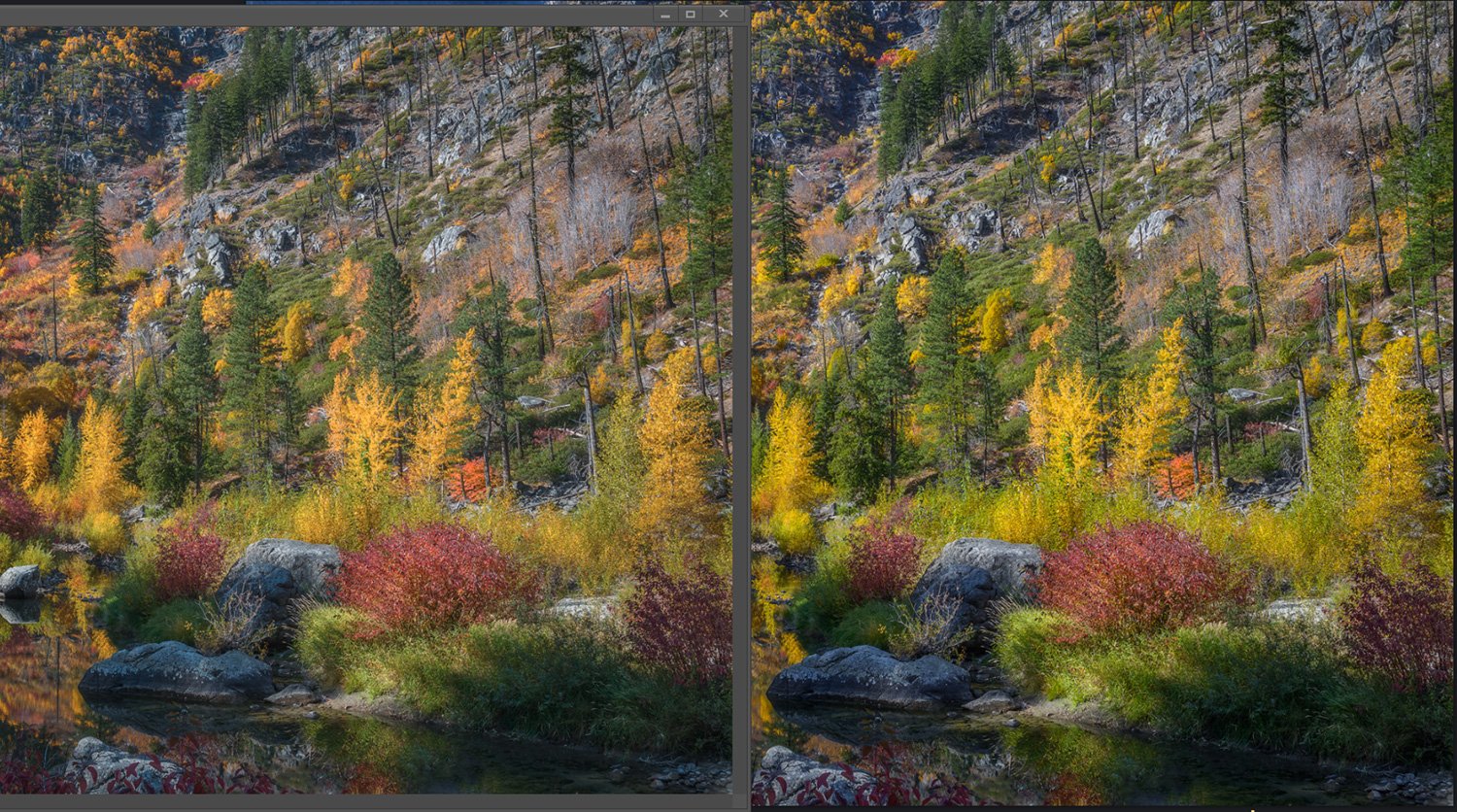
I’m baffled. I downlaaded and opened in PS CC17. I put the downloaded version right next to the large version that is opened up in Chrome. there is clearly a difference and am now baffled as to why. I’m sure this belongs in a discussion folder, but if anything it goes to illustrate how we all must have troubles with color/saturation from time to time. the part of the image on the left is PS, the one on the right is Chrome. Makes me want to go back and compare some of my images as well.
Anyone have a clue as to why they may be different? the colors, especially the “yellow” is more orange in the PS version and also the contrast is a bit more flat. very, very weird.
Beautiful image Chris, I’m afraid I’m no help with this color/sat thing.
Beautiful. I have no complaint with the colors. I think I would bring the crop down from the top left and remove the triangle and the tree on the far left. That will also take off a lot of hillside. Maybe a 1 x 2 crop. Great shot.
Well Lon, I sure have no clue as to what might be contributing to the color variation. The only place I view my images is in photoshop, and here. I do post on Facebook and Instagram too. This was edited in the Adobe rgb color space. Then converted to srgb for the web.
I think that it may have to do with the color workspace you’re working with in PS or ACR. The Chrome image seems to be closer to what I’m seeing in Chrome or Safari on my computer.