B&W
Critique Style Requested: Standard
The photographer is looking for generalized feedback about the aesthetic and technical qualities of their image.
Description
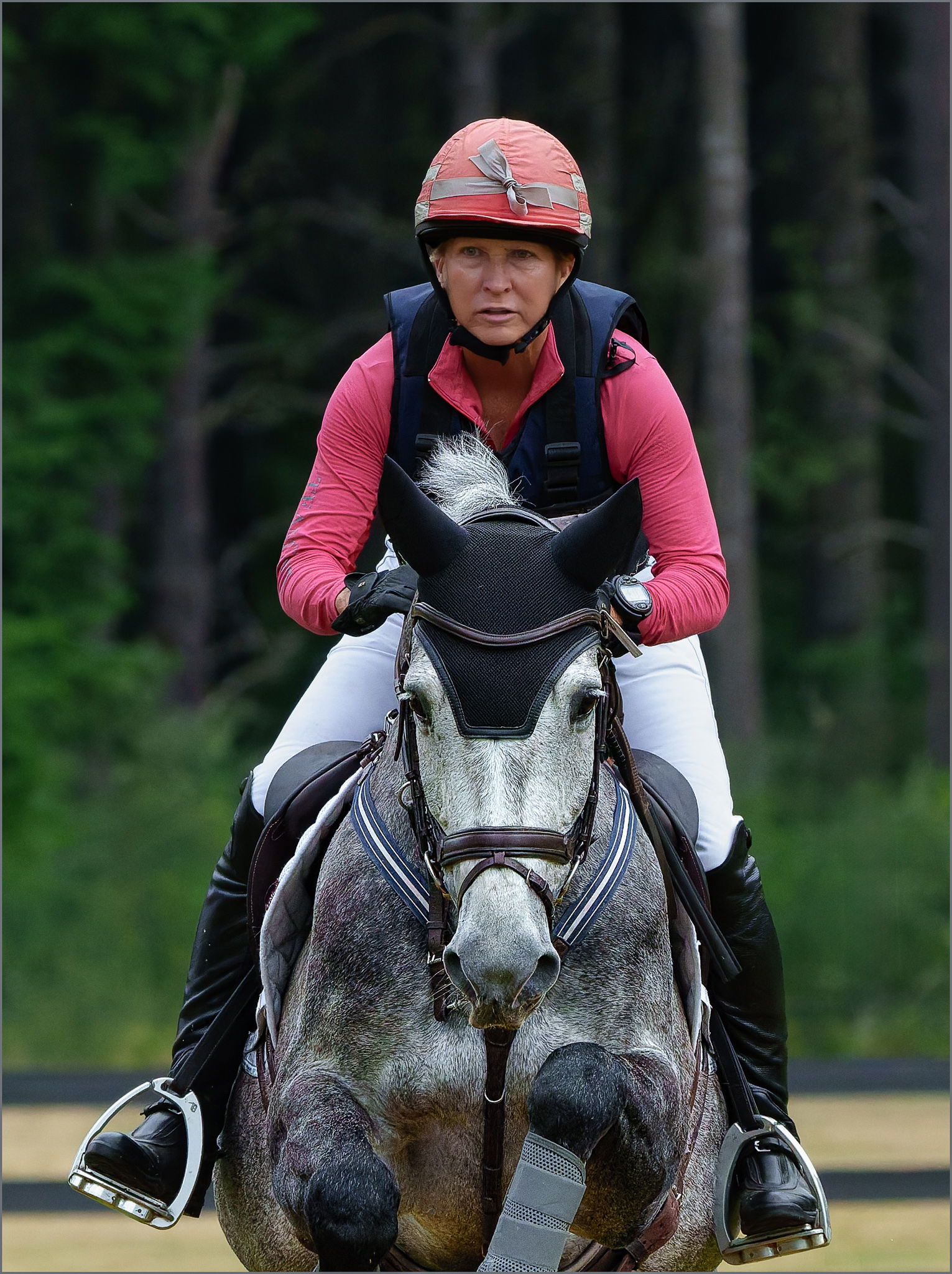
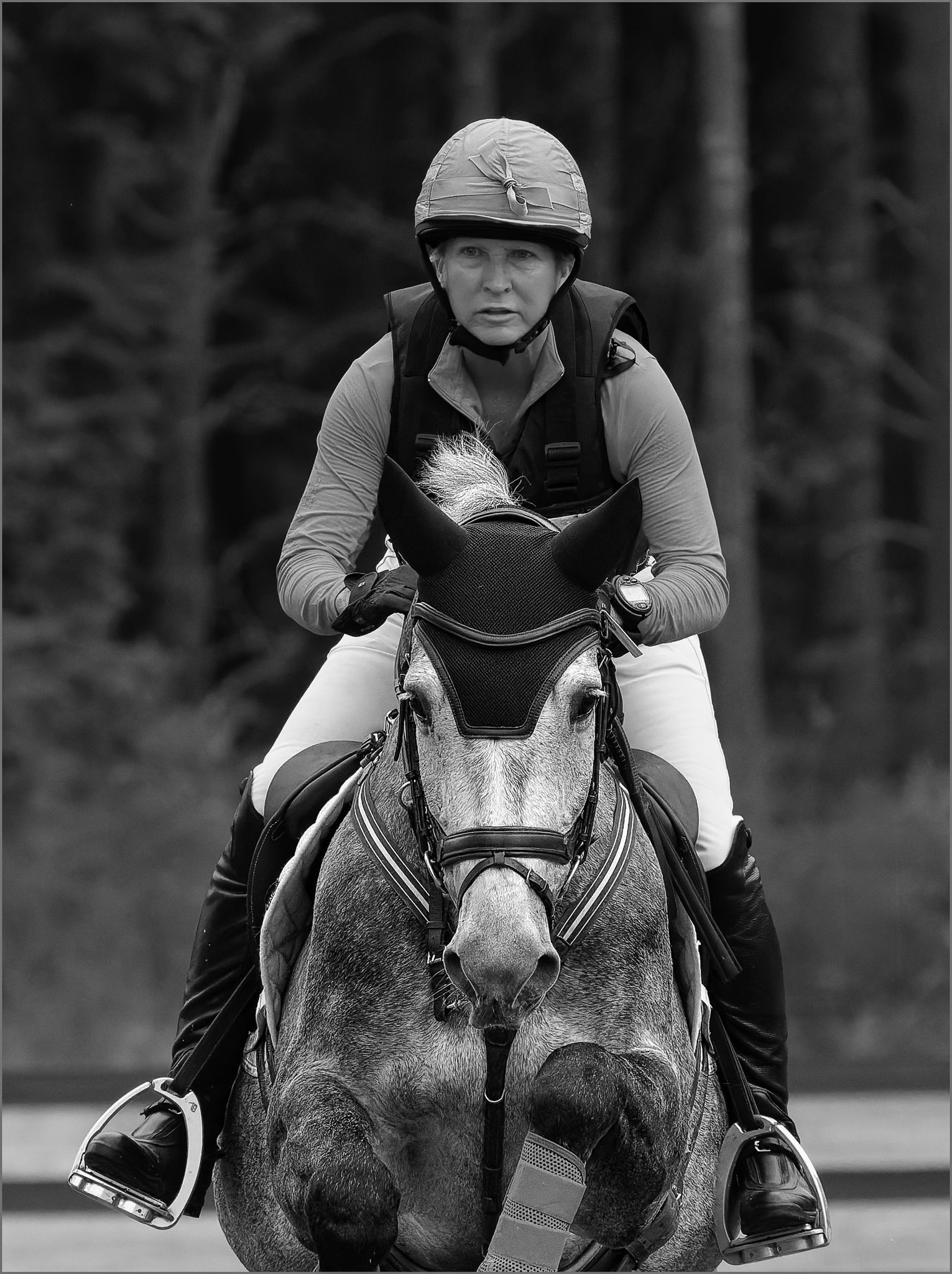
Another image from the Cross-country eventing I photographed Saturday.
Specific Feedback
In the processing of this image I was trying to make the horse the star of the image with the rider as an extra. I’d like feedback on how I did on that for both versions and suggestions for doing it better.
Technical Details
Sony A1, FE 200-600 @ 353 mm, monopod, f/9, 1/3200, iso 2500. Noise reduction with DxO PureRaw 5, processed in LR & PS CC. This is a pretty large crop so the resulting file was 2246x3005 before reducing further for posting. The main processing to focus attention on the horse comprised boosting the texture in him and reducing it in the rider and also increasing brightness of the horse slightly.
Critique Template
Use of the template is optional, but it can help spark ideas.
- Vision and Purpose:
- Conceptual:
- Emotional Impact and Mood:
- Composition:
- Balance and Visual Weight:
- Depth and Dimension:
- Color:
- Lighting:
- Processing:
- Technical:
2 Likes
Nice shot! Having owned and showed horses for 35 years, I can appreciate the difficulty in getting horse and rider in great poses. I’m more partial to the color version. Is there any room to grab the front hooves?
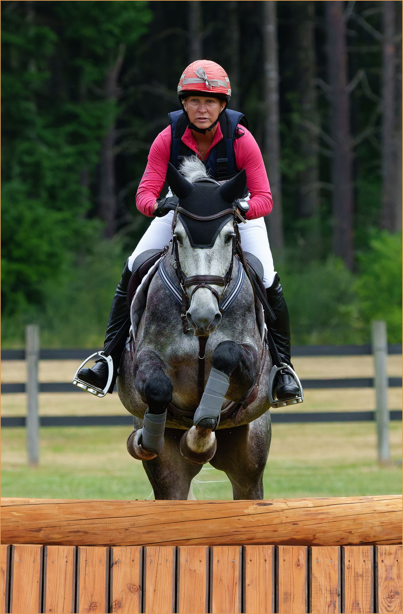
Plenty of room, Christine. I have another version going to the bottom of the jump, but I wanted to make the horse’s face the star of this one and while I like the broader view, the face becomes a bit small in the frame.
1 Like
Great action happening here. The concentration of horse and rider has been well captured.
I’m with @framingtheuntamed . I realise you want to capture that concentration, but cutting off the horse’s hooves doesn’t seem quite right. I really like the uncropped image.
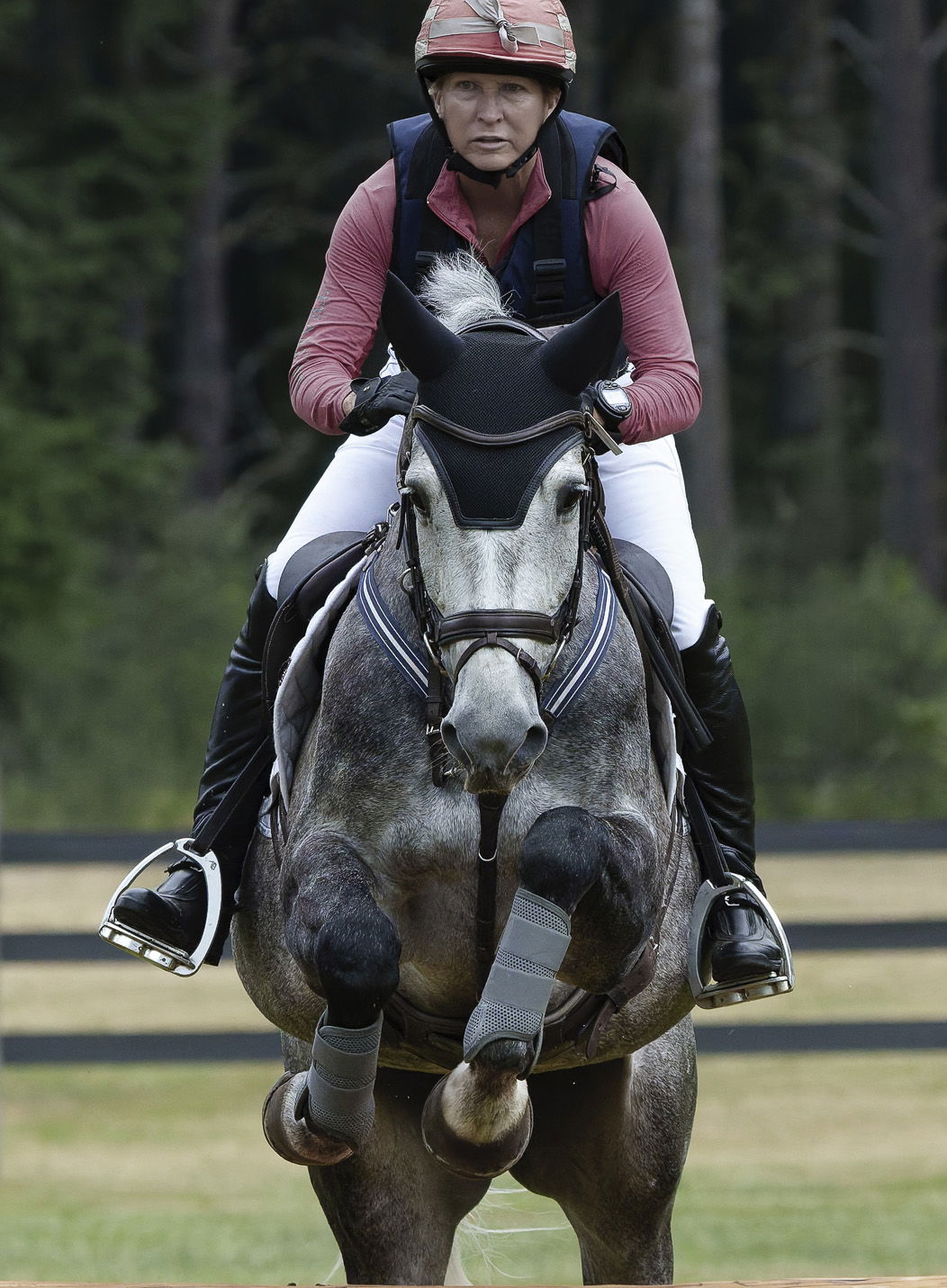
You’ve done well with the processing by reducing texture in the rider and increasing the brightness of the horse. Maybe desaturating the pinky/red shirt and helment might reduce the focus on the rider.
Here’s an idea – some crop – but I think I should have left a little more of the jump. Desaturated red, green and yellow a little. Maybe gives a little more prominence to the face but for me the hooves are important. And the rider’s face together with the horse’s is a great element!
Keep 'em coming – fun to see these!
1 Like