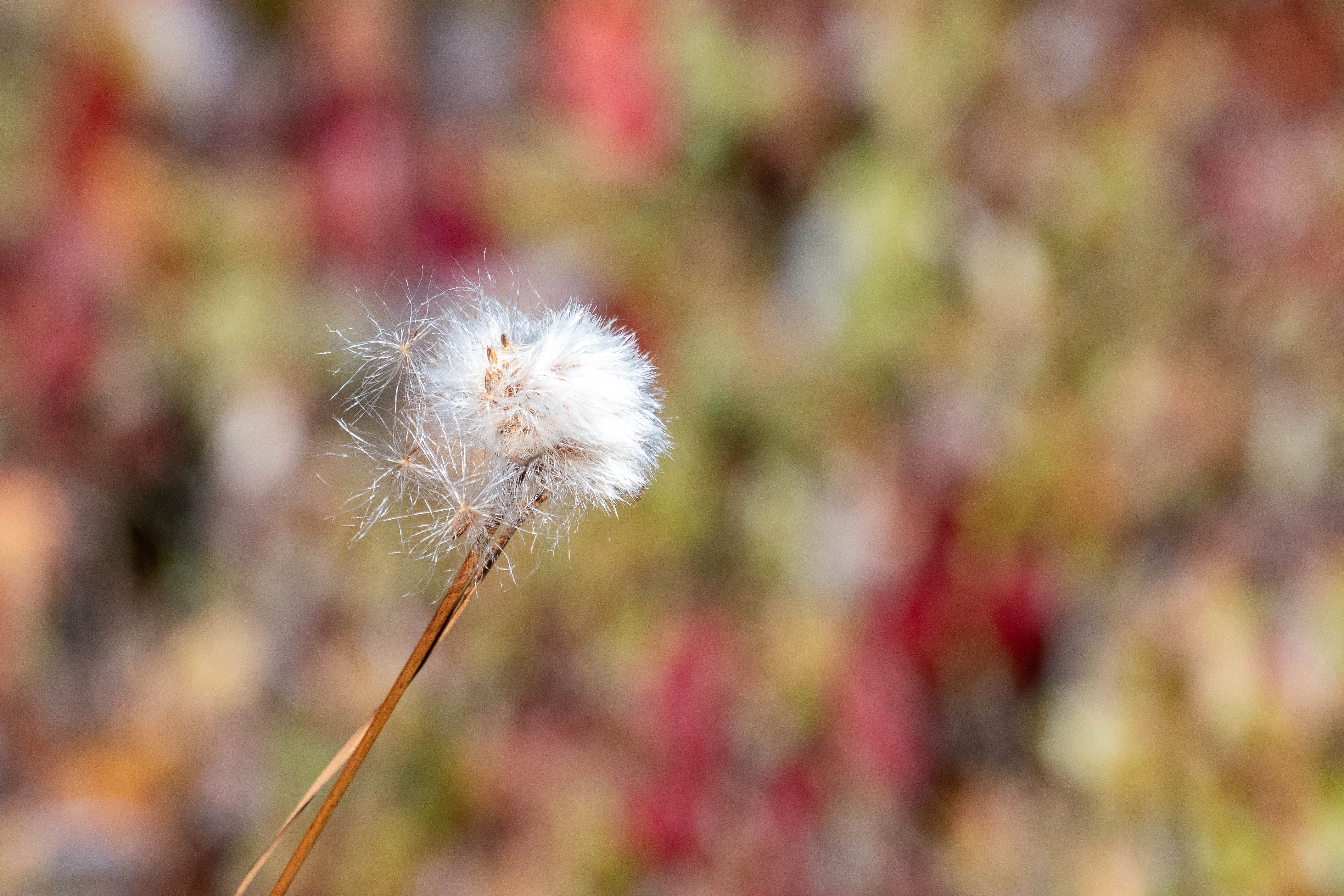
A very worthy subject, but a couple of thoughts – the whites look blown – you don’t give information on processing but raw converters have a lot of leeway to bring down whites and reveal highlight detail. The BG is competing more than my eye wants – both for color and for focus. A wider aperture would have tamed it a bit but also cost focus in the seed head. A tighter crop would help minimize the BG.
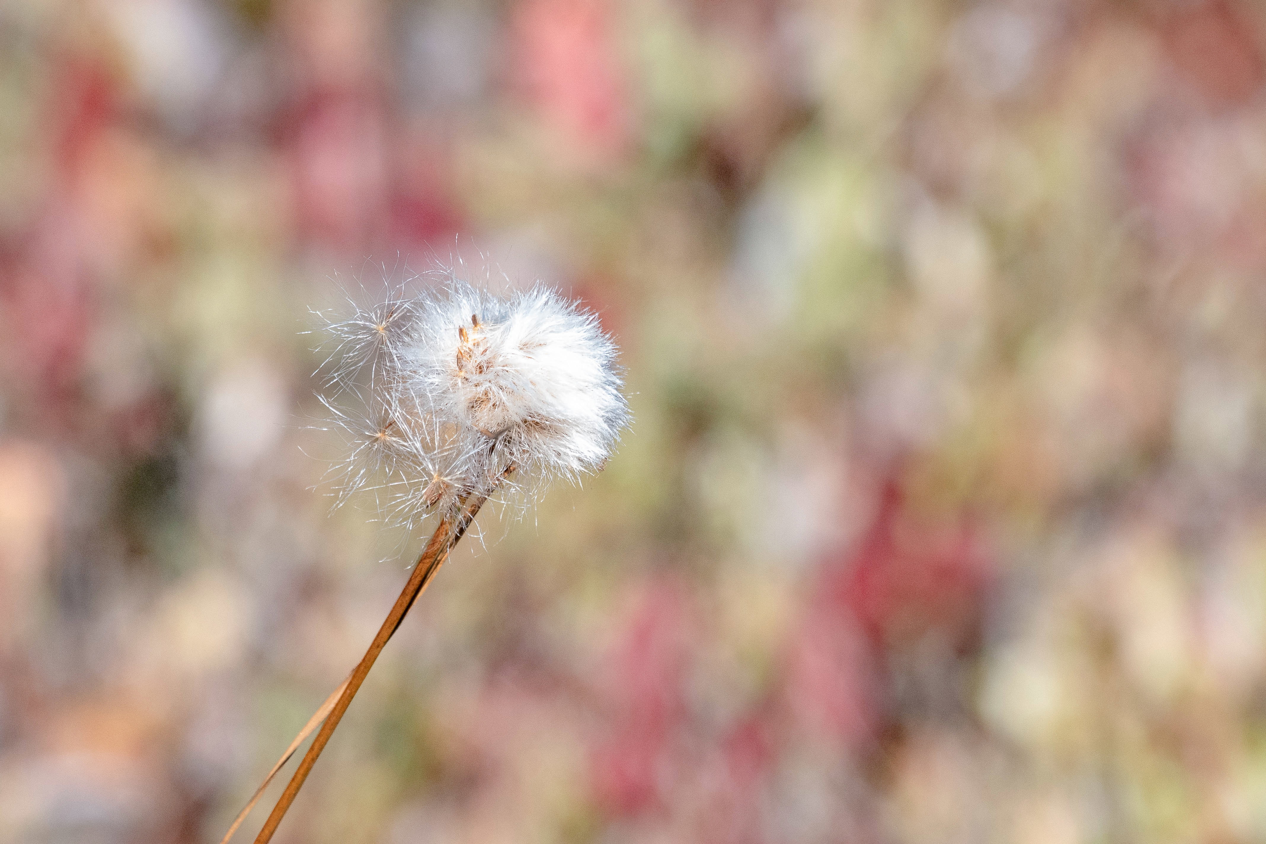
Elizabeth: We so often seek the pristine perfect subject but this worn seed head is a terrific star of the show. I like your DOF and on my monitor the whites look OK. The BG is a bit too intense for my old eyes and some lightening and desaturation give the seed head more prominence IMO. Back to you. >=))>
I’m getting a strong message about the very white sun illuminated cotton head against an amazing colourful background. As presented this message is very strong - because of the very white head (so white that it is a little blown) - but this means the message is even stronger if you dont mind leaving the expected technically imperfect bit for the sake of the symbolism of pure white.
I’m sure the story is still strong in toned down whites and colours but I like bending a few rules/expectations. I like Bills alterations, I can see what he means about the seed head showing better against slightly muted BG - but your original SHOUTS less subtle way and feel it’s white enough to stand against the original BG .
Elizabeth, the whites are bright, but look fine on my calibrated monitor. I like how colorful the background is, since it shows lots of “fall colors”. Some slight burning-in of the brightest whites would show a bit more texture there. I would also suggest dodging the darkest areas in the background. Reduction the contrast in the background will keep the colors but reduce how much attention it gets.
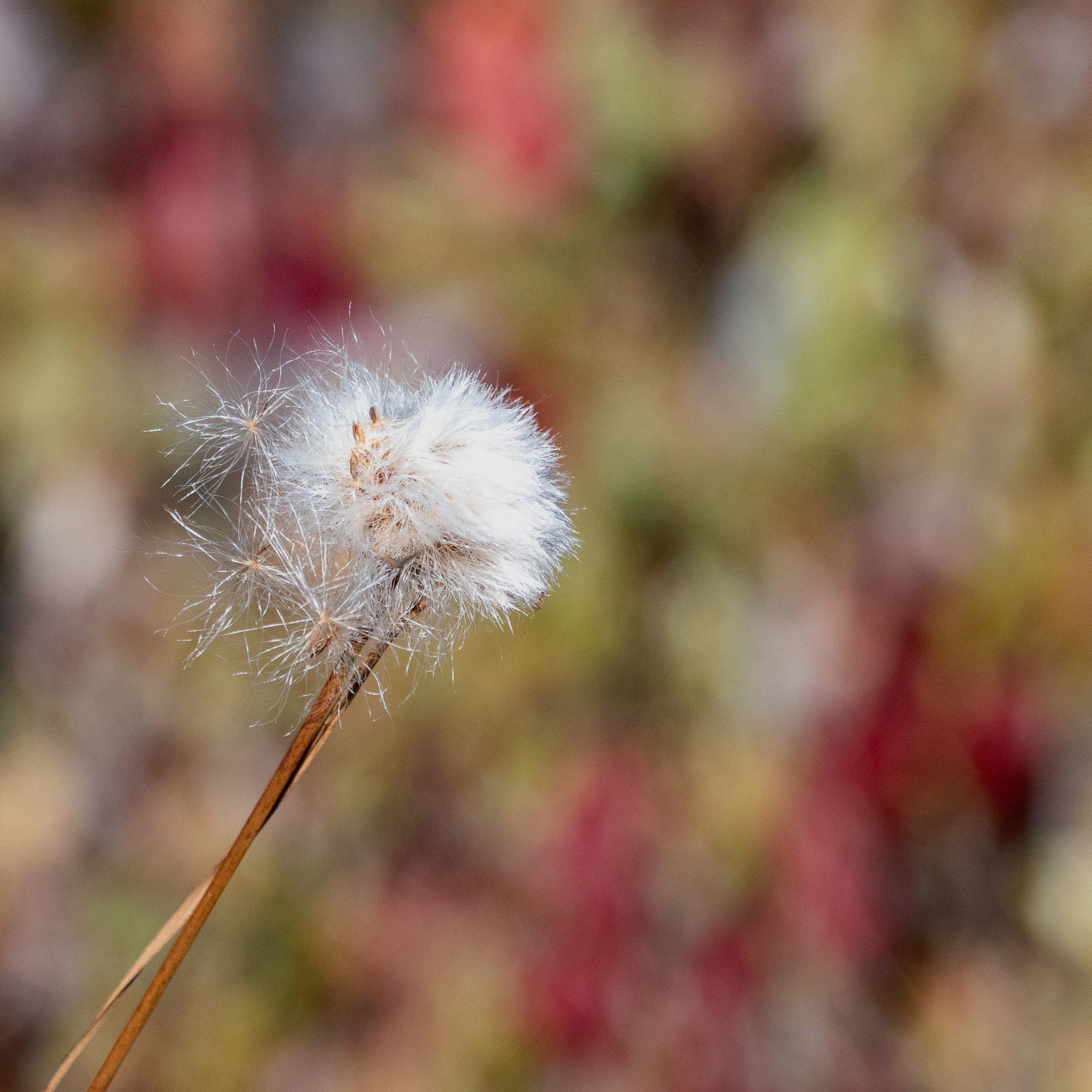
A wonderful background for this beauty, Elizabeth. Personally, I like the background as is. I could see bringing down the whitest whites just a bit, though it is always a delicate adjustment to avoid them looking too gray. I’d try to get just a tiny bit of texture showing in the whitest areas. Lastly, while that background is gorgeous, it does overwhelm the seed head a bit so you might think about a vertical crop-maybe 4x5 or so.
This is lovely, Elizabeth. It’s interesting that people see the whites as bright. For me, that’s what helps them hold my attention amidst the particolored background. I love the fall colors in the background, by the way. For me, it’s the dark bits on the left that distract. I thought I would take the liberty of playing with it a bit, just in Windows Photo Editor (my way of keeping LR hermetically sealed).
For me, an interesting approach to this was to crop it square, giving the seed head more prominence, and darkening everything a little, including the background, and then lifting highlights just a bit on the seed head. I’m not suggesting this is better, but it has a different feel. It’s a slightly more somber, end of a season feel more than the original’s feeling of the bright, crisp beginning of autumn. I can imagine also doing a reverse radial filter in LR and applying a clarity reduction to make the background feel a little more out of focus. But really, I like the original, and I’m offering the above as an alternative interpretation.
The question, of course, is which one you prefer for the experience you wanted to convey.
In danger of being in disagreement with most reviewers: I like the way the BG takes about half of the attention, if not more. It makes the viwer think about what that might be. The FG ist perfectly in focus. The clear white stands out from the colorful spotted BG. I find this very interesting, and unusual in the best sense.
Being in disagreement is never a danger here. It helps us see all the possibilities. When it’s my image being critiqued, I like mixed impressions and contradictory suggestions. It reminds me to think it through and figure out what effect I really want to achieve.
ML
To all of you–Diane, Bill, Huw, Mark, Dennis, Marylynne, Karl, and Horst, What a fun (and, well, enlightening) discussion! It is really helpful for me to hear different points of view on the same image, and it reminds me that much of this is about taste and preferences. I personally like the color of the background, but Marylynne’s crop and edits give more attention to the seedhead, which I think is good. Thank you all for the great feedback and help!
One way to think about it is, is a lovely BG competing with a subject? If so (and too much) maybe re-compose without the subject and make it about the BG – even if it is then an abstraction.