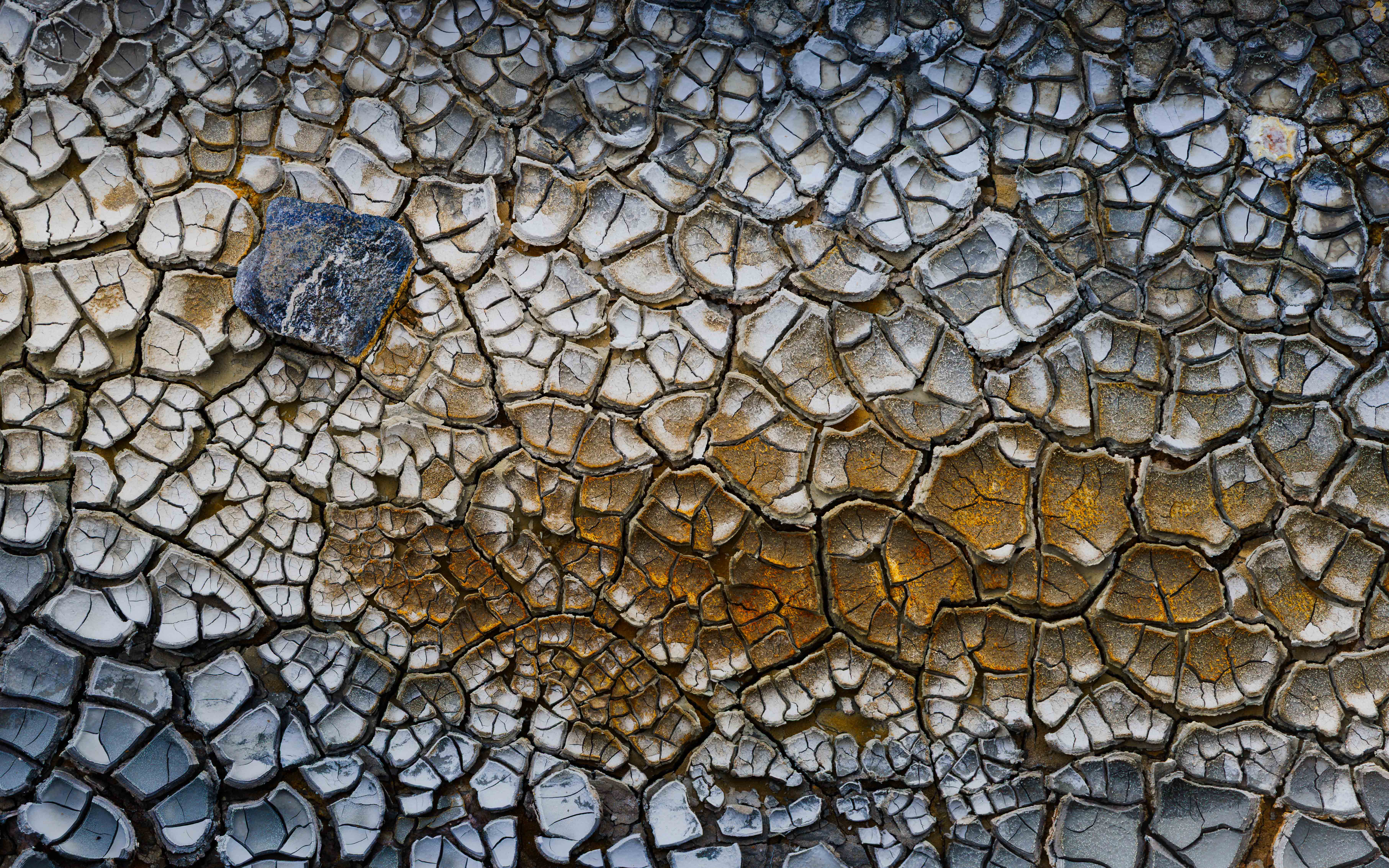
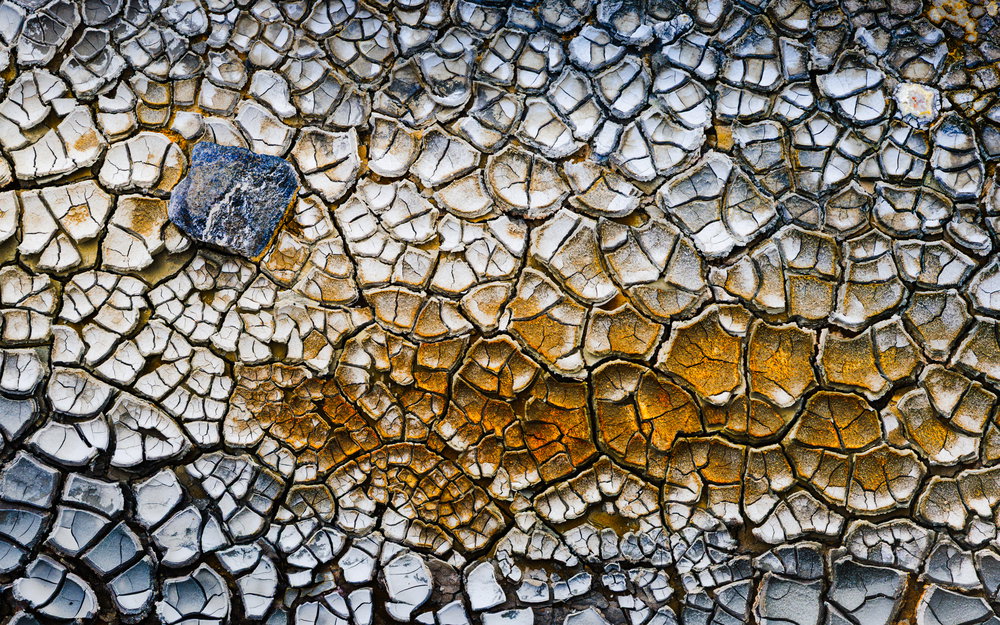
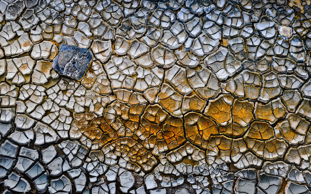
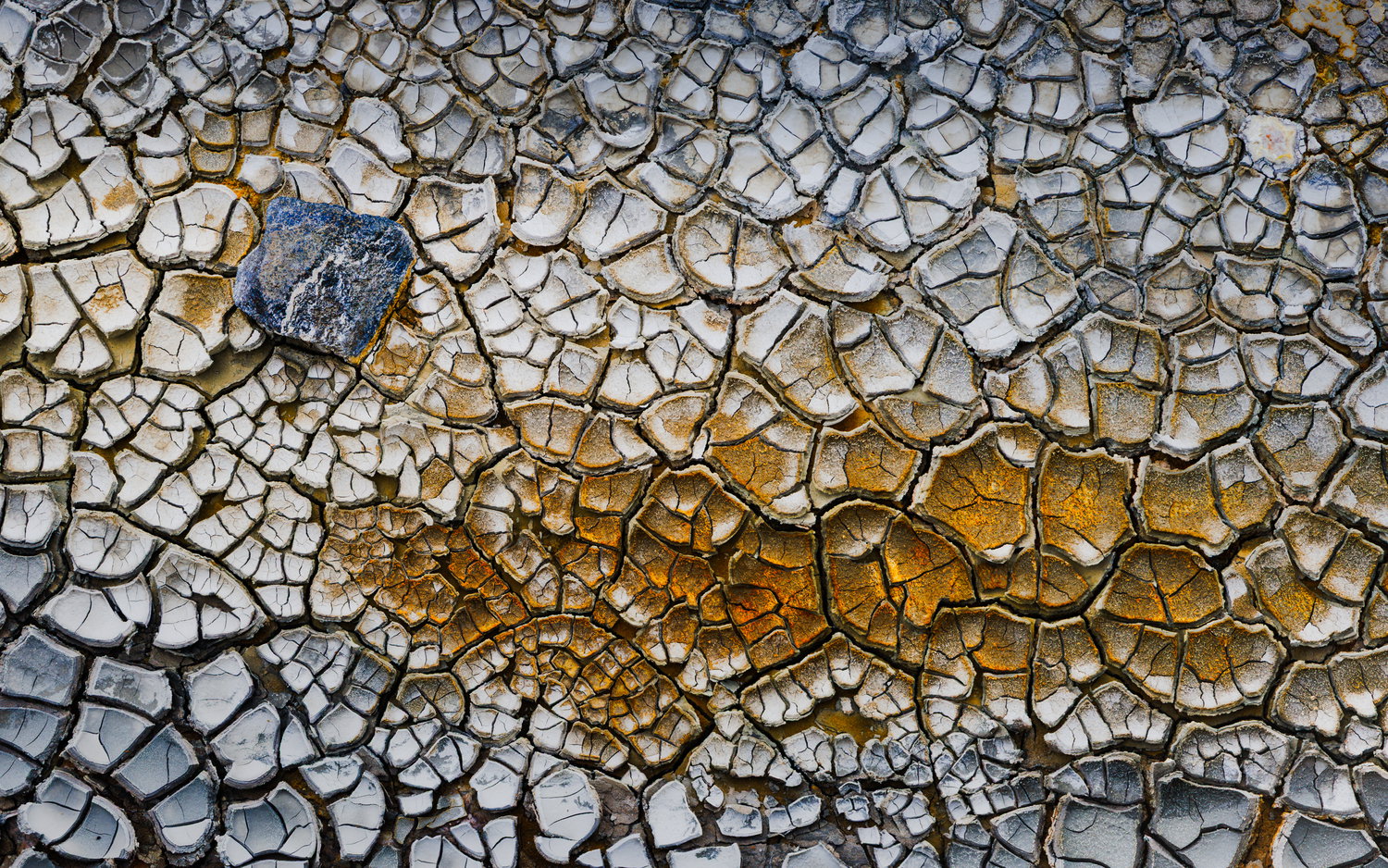
What changed: I toned down the saturation and highlights. I couldn’t bring myself to tone down any more - it just seemed too flat to me. Maybe I’m too close to it now.
Anyway, I’ve tried to repost in a much larger size per suggestions and thanks to @Bill_Fach for his guidance about the 3mb rule. I’ve exported it from LR at 2.9mb limit at 7253 x 4533 so hopefully that works better. Added after receiving feedback from the community.
A very strong and interesting first post. I believe it fits the weekly challenge very well indeed. Reminds me of stained glass. the colours and their layout work very well in your chosen crop.
I cant think of anything in particular - the saturations could be played with, but I like your current levels.
Hi Douglas, beautiful image. I love the colors and the varying sizes of the polygons. Fascinating. I think the composition is great, with the rust color offset by the blue.
Hi Doug, and welcome to NPN! What a lovely first post!! It fits the theme very well and would be a very strong image even without the pattern-breaker – what ever it is. I love the mud cracks and the gold ones are wonderful! I think I would still be there, trying to find every composition! I think your choice of composition a just right, as is the processing.
I hope to see lots more of your work! One of the best things here is the back-and-forth on processing. You don’t need anything here that I can see, but for most images it’s always helpful to include something about the processing. There is so much leeway these days it’s hard to know what to say about any suggestions.
Doug, welcome to NPN and the Weekly Challenge, this is a great look at these mud cracks. The cracks stand out well. Their various colors look good also and (of course…) the single stone makes a fine extra that you’ve positioned well in the frame. Did you do some edge burning along the top and bottom. While this looks fine as presented, I do wonder about some dodging along the upper right edge and the lower left corner. That would bring out the colors in those areas a bit more and give fairly even lighting throughout the frame, which I think is good in an abstract photo.
Glad you’ve joined the fray, and I’ll fall right in line in applauding your first post. You’ve got a great mix of color and texture, and the rock does a great job of adding contrast to the mud.
I do have a couple of thoughts you might play with. (Our typical flow on NPN is to toss out ideas, realizing some may fit your vision and some may not. Feel free to toss anything that doesn’t in the Recycle.)
To my eye, the whites are very bright and it may be worth adding a bit more contrast to them. Here’s a rough example:
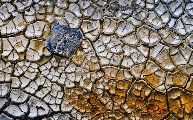
I love what the rock brings to the image, and think it would be worth moving it into the more classic Rule of Thirds position. I don’t know if you had slightly more room to the left and top to do that, but here’s a crop moving the rock a little more towards the center just for illustration’s sake:
Hi Mark - Many thanks for your comments. Yes, I did use Lightroom to burn a fair bit on the top right and bottom left, and added a bit of blue hue too. I was trying to direct the viewer into the centre, but maybe i’ve overcooked it. Here’s the amended image with less burning. Thanks for the suggestion.
Hi John - Yes, i agree with both of your suggestions. I think it does look a little hot. And I hadn’t thought about that different crop. I don’t have a lot of room on the left but like your idea of cropping on the right to make the rock more central. I got slightly stuck on the notion of balancing the orange smear with the blue rock, but I like your crop to shift the focal point to the rock itself and making the smear support that. Thank you for your suggestions!
Welcome to NPN. This is a great first post. Certainly better than mine many years ago. This image for some reason reminds me of the tile mosaic art of the Mediterranean by the Greeks and even earlier. My initial reaction was that the processing was too harsh for the subject matter. By that I mean the individual ‘tiles’ are too dark around the edges and the colors are too saturated. Perhaps the cracks are just wide. But that’s just my take. Others may like this aggressiveness. People’s opinions vary greatly here.
Doug: My apologies for being so late to welcome you to NPN and thanks for a really nice first post. As others have said, “stained glass” came immediately to mind. Wonderful colors and textures and I like your comp pretty much as is. I do hope you will post larger images in the future. Site guidelines recommend 2000 pixels on the long side so you could present this significantly bigger. In fact, if you’re so inclined repost using the Share Revised Version link at the top of your post. Great to have you aboard and looking forward to more of your work and involvement with the community.>=))>
Welcome aboard Doug. This is a fine introduction. Please keep them coming. The polygonal patterns are amazing to look at. I like the composition and the color scheme. My only suggestion is in the future please post larger images so it can be analyzed properly. I would go at least double to 2000 pixels on the long edge.
Welcome to NPN. Reading over the critiques looks like you received some wonderful feedback for edits. Lowering the intensity of the whites pushes the image over the top. Well done…Jim
Hi Doug,
Welcome to NPN. I love this image, and I have nothing to add beyond the critiques above. This is what I love about NPN: not just “likes,” but sincere suggestions which invariably improve upon my original. I think you will like it here.
ML
Thanks for the feedback, eveeryine - and for your encouragement. I’ve taken your suggestions and and have toned down the saturation and posted in a much larger size now. Thanks again.
Doug: You’ve traded one set of problems for another. When you send a full size image to the site that is above 3Mb the site compresses it severely, even to the image’s detriment. Your revision comes in at 907x567 which means the site downsized your image over 98%!
As I mentioned to you earlier I don’t resize with Lightroom so can’t offer you any hard suggestions but if you post a question in the discussion forum I’m sure you will get some answers. I do most of my global adjustments in Lightroom but my sizing, sharpening and final processing in Photoshop. If you have Photoshop I can give you a step by step workflow. It’s somewhat cumbersome but I’m an old dog and once I’ve learned an effective method I tend to stick with it. If you look at my most recent post you’ll see the size is 2000x1333 @ 1.67Mb. This assures that what I see on my screen is what shows up unaltered on the site. I think that 3Mb is the limit that the site will allow without altering a post automatically. I hope this helps because your raw material is outstanding and will be even better when you get the presentation glitches solved.>=))>
Thanks Bill! Didn’t know about the 3mb limit. the last one i posted was 39.6mb so I exceeded that limit by just a bit! Gonna try this again - edited my revised image above.. This one says it’s 2.4mb at 7253 x 4533. Thanks again.