Critique Style Requested: Initial Reaction
Please share your immediate response to the image before reading the photographer’s intent (obscured text below) or other comments. The photographer seeks a genuinely unbiased first impression.
Questions to guide your feedback
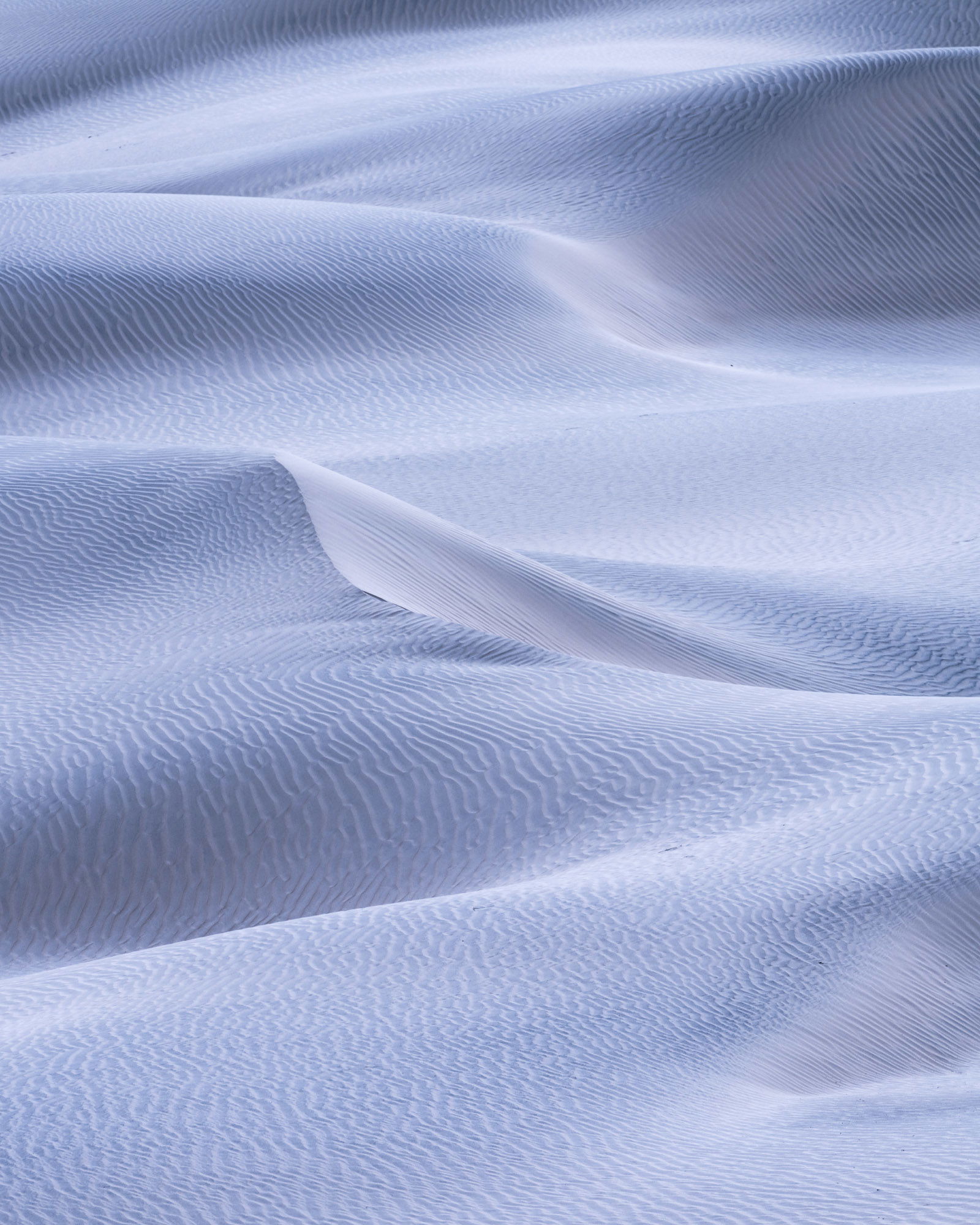
This is a companion to a prior post (Creative Direction - #4). I’m tying to nail down a “direction” so to speak for some of these images on the dunes in Death Valley. The light was exceptionally flat for the majority of the time and I’m soliciting feedback on a few different approaches. Those of you who saw the first, I’m curious which resonates with you more from a processing stand point. I know compositionally there were some challenges with the first.
Other Information
Please leave your feedback before viewing the blurred information below, once you have replied, click to reveal the text and see if your assessment aligns with the photographer. Remember, this if for their benefit to learn what your unbiased reaction is.
Image Description
Clearly this one is a significant difference from the first and a greater departure from reality (which for these isn’t really critical to me). I go back and forth on them so much in terms of processing I need to pick a path and forge ahead. Neither is right, neither is wrong but I find the processing strikes me differently each time I look at it. Sometimes I love it…sometimes I don’t. Who the heck knows!
Technical Details
400mm ISO 100, f/16, 1/80.