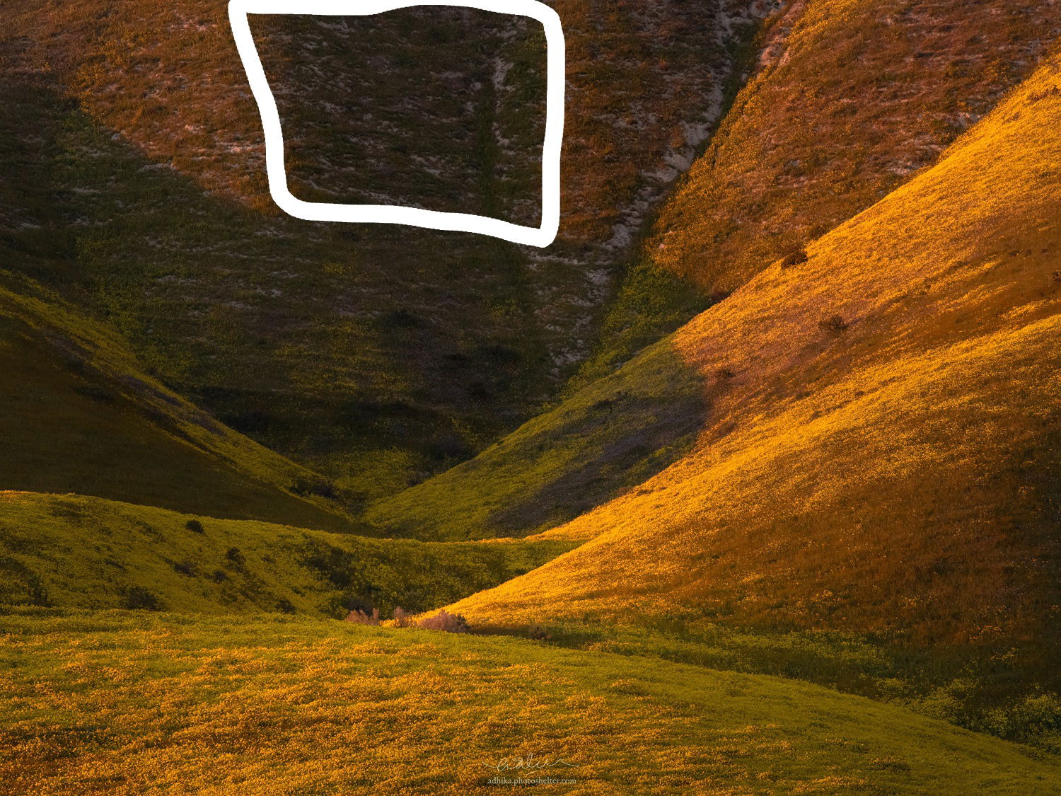
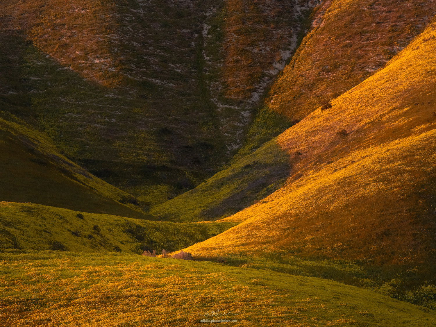
From this year’s "super bloom…
I like the light and I like the curves but something is bothering me and I can’t put my fingers on it. Thoughts?
@adhikalie
From this year’s "super bloom…
I like the light and I like the curves but something is bothering me and I can’t put my fingers on it. Thoughts?
@adhikalie
Hello Adhika
Well I have to say nothing at all bothers me about this picture. I think it’s gorgeous I love the image structure. Perhaps the only thing I might do is lighten the dark area of the golden and rust coloured slope on the extreme right hand edge but its pretty minor.
This is a really fine composition. In a way it’s a Death Valley composition but with flowers. I can’t guess what’s bothering you but for me there is an illusion that the green running along the slopes on the right are actually shadows. The green on the upper left appear to be shadows so it appears that those shadows extend to the right. This is particularly true because the green to yellow demarcation is a smooth line. A smooth line is often produce by the shadow of a ridge but almost never at the edge of a bed of flowers. So there is some visual ambiguity. But, like I said, that’s just my initial perception and may not be what others see.
I really like the vibrant yellows combined with the more subdued greens. I feel the luminosity is optimal in that it’s exciting without being done so artificially in post processing. But overall it’s a very pleasing pattern of golds and greens.
This is an excellent image, its a wonderful “grand abstract” as Alex Noriega put it. You have absolutely nailed the color/saturation/contrast processing “strong for effect but realistic”. This image is more contrasty than your other super bloom images, but I love it, and it is perfectly appropriate for this light and subject. Nothing bothers me about this image, I think you should be very proud of this one, it is outstanding as presented.
If I wanted to play twist the Rubiks Cube, I think a second interpretation of this might to flip it horizontal. This plays to the English speaker’s bias of wanting strong lines to lead left to right. If flipped the yellow ridges point to the center in a left to right manner. A lot of great abstracts can be oriented in multiple ways and still work very well, and for me that certainly applies to this image. Flipped is not better, just different.
Congratulations on a wonderful image !!!
I like this composition. Maybe what’s bothering you is that nature hasn’t provided a perfect curve as though a human made garden would. That is the green on each ridge line creates a zig zagged line. This also makes the image intriguing
I like this quite a bit. It has great abstracts shapes and colors. It is very minor, but I might mask off the dark green area on the big right side ridge and brighten it up just a touch to more closely match the foreground greens. I did a really quick and dirty version. Like I said, very minor and it looks great as presented.
Adhika, I find this a very intriguing image, in a good way! As with most good abstracts it seems you can find many ways to “see” this one. The colors and curves are of an unusual combination and that forces the viewer to engage. Well done!
Well seen and photographed! Great color combination and curves. Maybe a slight crop off the top to better focus the eye on the center where everything seems to be converging.
Adhika, this is a wonderful image. Your processing and color balance looks spot on. I agree with Igor that when I first looked at it I did think the green were shadows from the adjacent bluff. It took me a little while to sort everything out The more I look at this the more I like it.
Thanks, guys!
@Igor_Doncov: I like your analogy to a Death Valley composition. I didn’t think of Death Valley per se when shooting it but now I can certainly draw that connection.
@Ed_McGuirk: You are too kind, Ed. It’s very humbling to be considered in that category. I followed your suggestion to flip it and see how it looks like and wow what a different image. I like how it can be presented in multiple different way.
@Harley_Goldman: That’s very subtle! I have to overlay the image and turn the layer on and off to see the change. Thanks for the suggestion.
@Ian_Cameron, @Nathan_Klein, @Alan_Kreyger, @Allen_Brooks, @John_Moses: Guys, I am really glad that you find the image intriguing.
All,
I had a chance to read your comments and contemplate a little more. I am really touched by your kind words. I guess one thing that bothers me is how the light doesn’t completely hug the upper side of the hill but instead creates this triangle on the UL corner. I think in my mind, I want it to be continuous and sort of hug the hill creating a fan on the top side of the image. I went through my files to look for that to happen but I guess that just didn’t happen.
Adhika,
This is fantastic! Great vision to isolate the light, color and shapes. To me, I first thought of some kind of abstract vortex; all the ridges, shapes and color somewhat curling in and around the center. I find this one fascinating and definitely beautifully seen. Have no idea what is missing for you. The light striking the open ridges is balanced nicely with the colors and parts of the hills that are in shade.
My only thought would be a personal preference thing. (and great idea BTW of overlaying someone’s changes over your image to just be able to turn the layer on and off to see the changes - I’ll have to try that!) This may sound like an oxymoron… but I think the scene is a little on the warm side. I guess maybe the yellow could be cooler? Like I said a personal choice because clearly the sun is low on the horizon and the light is physically and definitely warmer. Very minor thought and so I won’t post. Just a thought.
Lon
Adhika,
I am not sure what’s bothering you in the scene, but I love it! To me this is all about light and the warm colors of the bloom, but what I find most fascinating is the way you have composed this so that ridgelines of the hills all radiate outward from the center of the frame just as the petals of a flower would. This is beautifully done; I have no suggestions.
Thanks, @Lon_Overacker and @Ed_Lowe! Very kind words. Perhaps I am just being too fussy about it but this might help illustrate something that bugs me a little bit. I am a little bothered that the marked area is in shadow. I guess I am hoping that the warm light continues across and make some sort of a fan on that upper right-hand corner area… I will probably eventually make peace with it.
Adhika,
I see what you are saying about the shadow area on the upper right-hand corner but I think it adds to the abstract feel of the image. This is a very cool photograph and it reminds me of aperture blades.
Adhika, I think this looks great as presented. The mix of light/dark and flowing shapes is lovely. I like how they all point to that bit of shrubbery peeking up behind the first ridge.
@sigfrido_zimmermann and @Mark_Seaver: Thanks, guys!
Admittedly, this image grows on me. I say your encouragements have helped me make peace with it. I really appreciate the feedback here.
If its that shaded area that’s bothering you the most, you may want to consider color dodging.
I use the TK actions panel, and it has a dodge tool that is more effective than photoshops. You normally paint with a white brush at low opacity (10%) to dodge an area, using a TK dodge layer mask. You can also paint and dodge with a color other than white. In this case I sampled a color from the ULC, changed the sampled color’s brightness to 100% and reduced saturation to 30%, leaving hue unchanged (trick I learned from Alex Noriega video) and dodged using that adjusted sampled color. Here is a rework with my attempt at color dodging, it may not be perfect, but you get the idea. If you don’t own the TK panel, there is also a way to do this same thing just in PS.