Not sure if composition is working in this one… I feel its lacking a bigger subject in the middle.
What artistic feedback would you like if any?
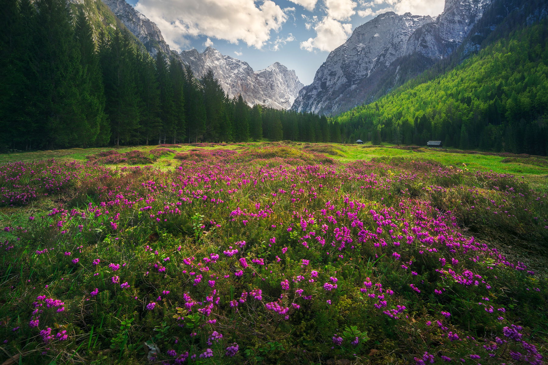
I know the light is not perfect. This was actually taken in the middle of day on a family trip. What do you think about the final edit?
Pertinent technical details or techniques:
2 shots for focus blend and one darker shot for sky at 16mm
If you would like your image to be eligible for a feature on the NPN Instagram (@NaturePhotoNet), add the tag ‘ig’ and leave your Instagram username below.
Dang…this is some stunning scenery! Sheesh…really puts me there! What a beautiful scene! What a gift you were able to be there!
I don’t think there’s any issue with a “mid ground”. From a compositional perspective, the long meadow of flowers out into the distance leads to a nice diminishing pattern that maintains interest to my eye. I really like the bank of conifers on the L. and R. side, and serving as a beautiful frame for the distant mountains. That they recede into the distance helps keep them from serving as a barrier to the visual flow, at least to my eye. The distractions include the white ?path/street to the L. of the image and the “dead areas” in the flowers on the R. margin of the image and less so on the L. side of the clump of flowers you’re in. Not sure how easy that would be to address.
From a light perspective, the brightness of the sky seems a bit off compared to the light of the rest of the image. The sky and snow-capped mountains seem like they should be the brightest (but with less contrast due to atmospheric haze) part of the scene in order for it to look a little more “natural” . Of course, this depends on your vision and desires.
Regarding color, the greens are a bit heavy on saturation to my eye, especially the yellows within the greens. The foreground flowers are fairly heavily saturated too. These color comments are of course a matter of taste and you may be very happy with them. However, it seems a little bit inconsistent with the relatively desaturated blues/cyan in the sky.
I tend to be verbose, so sorry if this is too long…hope it helps.
Thank you very much @Jim_McGovern for your valuable and detailed feedback! I think I addressed all your tips and I like it much better now. Especially the tamed yellows and more fresh and springy feel. I think colors are more harmonious now. Also agree on sky that it was too dark.
Gregor, you have a a great composition, and the color combination of magenta flowers and green foliage is absolutely killer. I like the suggestions you got from @Jim_McGovern, and i think your rework is a big step in a good direction. My only suggestion (starting from your rework), is that I think the distant sunlit mountains are still too washed out, and would benefit from some reduced luminosity, and increased miditone contrast. In real life, distant thongs are usually lighter and softer, which you kept here, but I think the far mountains are still slightly out of balance with the foreground in this regard. While this is a matter of personal taste and style, if this image were mine I would try to re-process it more in this direction.
Thanks @Ed_McGuirk, I think you are totally right that it was too washed out and light. Toned it down now and really think it looks more balanced and natural now. This is some hard stuff but I like training my eye
Greg, I think this is the best image you have posted on NPN so far. I love the bowed look to this meadow and how all the other elements point into the center. I also love the freshness of the scene that the colors provide in the meadow.
I have to say that I’m a bit disappointed in the direction that the reworks have taken the image. The removal of yellow seems to have taken the sunlight out of the image and made it flatter. It’s sucked the life out of the image. If the original was too oversaturated it would be those green trees on the right.
One of my pet peeves is the arrangement of the clouds in the sky. Having clouds cut off the the frame is something to consider before pushing the button.
Very beautiful photo! My suggestion falls into the subjective category and also involves personal decisions around how much we are willing to “remove” pixels to make the photo more pleasing. My own philosophy is that my editing tries to present the scene as my eyes saw it, as I remember it. Our eyes and cameras and screens are different. My original photos often evoke a very different emotion than my memory of the scene, because in a photo many elements seem much more noticible than that which my eyes saw. Often forest scenes, and scenes like this, with lots of growing things, seem way more annoyingly busy than they do in person. To that end, I often “clean up” such a scene, by getting rid of some of the busyness. I use the Spot Healing Brush Tool in Photoshop and just paint away some of the branches, or stalks, or bright spots, like I have done in this version of your photo in which I just removed some of the brighter plant stalks. Again, this style of photo editing is a very personal one and I realize it is not everyones cup of tea.
Thanks @Igor_Doncov for your thoughts. I reduced the desaturation layer opacity a bit and brought back some more yellow to give it more life. And thanks for the clouds tip. If only I wasn’t in a rush with two small kids running around
And thank you @Tony_Siciliano for your feedback and advice. I’m not even aware or not think of this kind of detailed cleanup and it really does make a BIG difference so thanks again.
Everything has been said about this. It is a beautiful scene, Gregor, and I really think your initial processing is not too far off from your final one. My only nit is the barrel distortion here. I am not sure why I am bothered by the curving horizon so much.
Gregor,
This was a beautiful image to start with, but with each small tweak this just keeps getting better and better. I have one more suggestion and this is more of a personal preference and not a critique, but the bare spot on each side of the wildflowers bothers me a little so I thought a little crop from each side would work. Something like this. Just a suggestion of course as this might not have been your intent.
Real beautiful scene and an interesting thread to follow the changes. I like your final version and uncropped, but I would agree with Adhika about the barrel distortion look. Maybe a little lens correction and see how it looks? Otherwise, I think you nailed it.
Thanks to everyone again, it was great learning experience developing this image. In this version I only tried to fix horizon and think I like it better.